
It’s October: the leaves are falling, the air is changing, and the warm knits are coming out. As a small business, you may be wondering what color palettes you should be using for your brand’s new campaign, social theme, or autumn-inspired products. Don’t worry – we’ve got you covered. We asked Picsart’s in-house designers what their favorite fall color combinations are, so that you don’t have to spend hours figuring out what works and what doesn’t.
What are the best colors for fall?
Color selection relies heavily on personal preference and your brand’s niche. Consider who you are looking to appeal to and what purpose you are driving.
For a timeless fall palette, consider rich earthy tones and deep, warm hues. Think burnt oranges, golden yellows, and deep burgundies that are reminiscent of the feeling of crisp autumn days. Paired with neutral shades like taupe, beige, and charcoal gray, these colors provide a versatile base that can be adapted for your campaign.
For brands looking to add a modern twist, try softer shades such as blush, sage, or even light blues for a fresh take on autumnal color selections. The key is to blend warmth with a subtle contrast to create a cohesive, inviting look that resonates with your audience. Take a look below at some of our in-house designers’ favorites.
The Nostalgia Palette
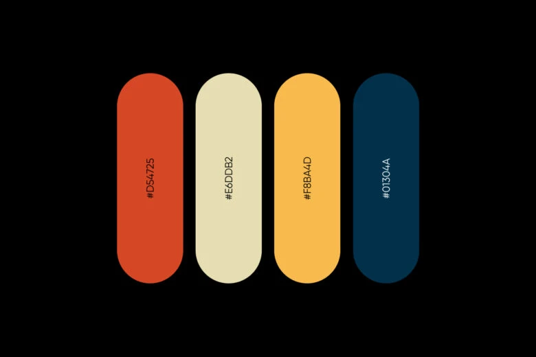
The “Nostalgia Palette,” with its muted yet bold tones, prompts a strong sense of the 90s aesthetic. During this time, burnt oranges, soft creams, golden yellows, and deep navy blues were popular choices. This palette leans into a retro vibe that’s perfect for small businesses wanting to draw on nostalgia to connect with an audience. Vintage clothing shops, home décor brands, and even lifestyle blogs can use this color scheme to create a warm and inviting look. Pair these colors with retro fonts or graphic elements for a cohesive look that appeals to those who love a throwback feel.
Our suggestion: Use navy (#01304A) as a grounding color for backgrounds and main visuals. Add burnt orange (#D54725) and golden yellow (#F8BA4D) as highlights to draw attention to specific products or call-to-actions. Adding a touch of neutral cream (#E6DDB2) will balance out the boldness.
The Classic with a Twist Palette
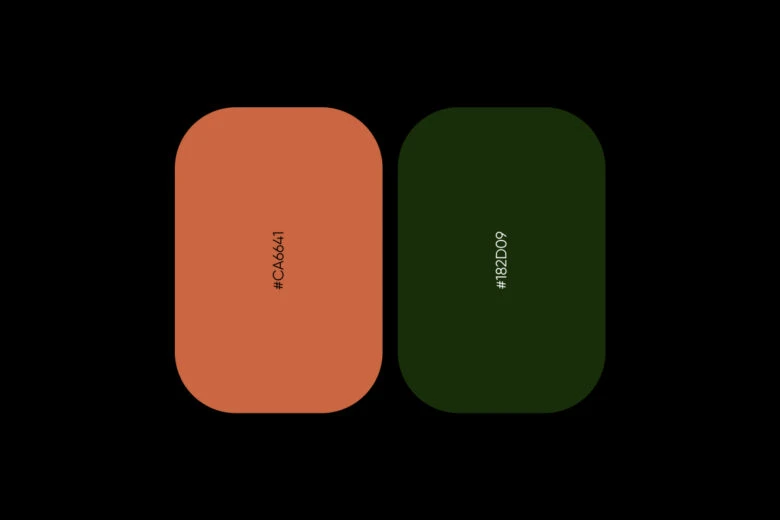
The “Classic with a Twist” palette draws on traditional fall and Halloween colors, but with a modern edge. The warm rust-orange (#CA6641) instantly draws out memories of falling leaves and pumpkin patches, while the deep forest green (#182D09) adds a rich, moody contrast. This palette is perfect for small businesses who want to use classic seasonal themes, but with a warm sophistication. Think boutique coffee shops, candle brands, or artisanal crafts who want to embrace the essence of autumn while maintaining a timeless appeal.
Our suggestion: Consider using the deep green as a background color or for elegant typography. while the rust-orange can be a focal color for product packaging, promotional banners, or social media highlights. These colors work well in rustic settings but can also shine in modern, minimalistic designs when used sparingly. Adding subtle texture or gold accents can further elevate the palette, creating a blend of classic fall nostalgia with a refined, contemporary twist.
The Cool Palette
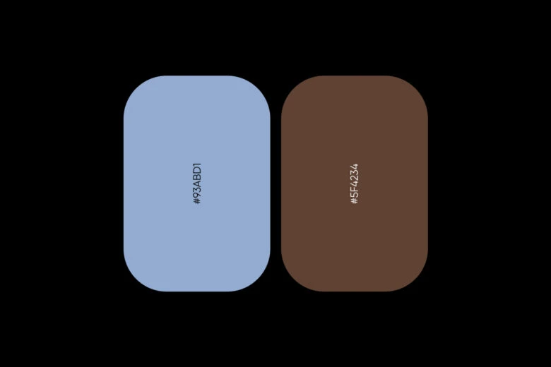
The “Cool Palette” features a refreshing combination of a soft periwinkle blue (#93ABD1) and a rich chocolate brown (#5F4234), blending cool and warm elements for a balanced autumnal look. This palette is perfect for small businesses who want to stand out from the traditional fall color schemes, but still embrace the cozy nature of the season. This is a winning choice for interior design studios, wellness brands, or even tech startups looking to create a calm, inviting presence with a hint of earthy warmth.
Our suggestion: Periwinkle blue offers a calmness and serenity that can work well as a choice for backgrounds or product displays. Chocolate brown serves as a sturdy accent, great for typography, borders, or packaging details. This conveys professionalism and stability while maintaining a fresh, modern appeal. Adding metallic accents like bronze or gold can elevate the cool tones, giving your brand a polished, elegant look for the fall season.
The Sunny Day Palette
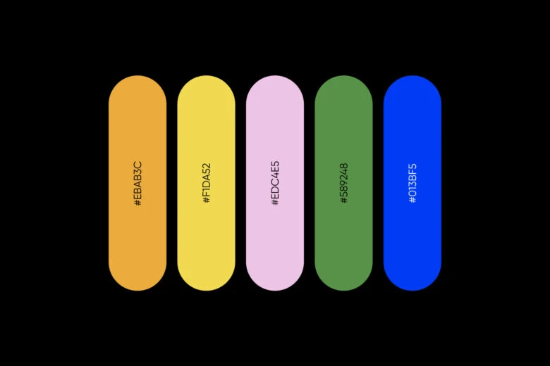
The “Sunny Day Palette” is a vibrant and cheerful mix of bold colors that recreate the brightness and joy of a sunny fall day. This palette balances warmth with a playful, almost spring-like freshness. Warm golden tones #EBAB3C and #F1DA52 are paired with a soft, pastel pink #EDC4E5, while an earthy green #589248 and a striking, energetic blue #013BF5 create a contrast, making this an excellent choice for brands who want to convey optimism and energy. This palette is perfect for small businesses like cafés, florists, or children’s boutiques, where a fun, friendly atmosphere is key to brand identity.
Our suggestion: Use the warm yellows and pinks for backgrounds or product highlights to create a sunny, inviting feel. The green can be used to add a natural, earthy balance to marketing materials, while the bright blue can make calls-to-action or brand logos stand out. This palette creates a lively and engaging visual experience, ideal for brands which thrive on positivity and creativity.
Choosing the right palette for your brand
Fall is the perfect season to refresh your brand’s color palette and capture the feelings that resonate with your audience. Whether you’re going for a retro vibe, classic autumn tones, or a playful approach, choosing the right colors can elevate your brand’s visual identity and help you stand out. Choose which color palette works best for your brand, and you’ll be ready to craft campaigns that reflect the season and speak to your unique brand identity.
Head over to picsart.com or open the Picsart app to find the perfect fall color combination for your brand.
Empowering the Creator in Everyone
Picsart is the world’s largest digital creation platform. Its AI-powered tools give creators of all levels the ability to design, edit, draw and share photo and video content anywhere. It’s used by consumers, marketers and content creators for both personal and professional design, and is available to businesses via API partnerships and integrations. Picsart has collaborated with major artists and brands like Discord, PopSockets, Shopify, Taylor Swift and more. Download the app or visit picsart.com.


