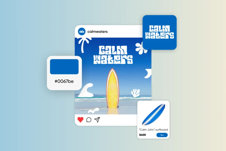
Color symbolism is the use of colors to convey meanings, emotions, and messages.
It uses color psychology— the effects of different colors on human behavior, emotions, and perceptions. However, it also takes into account cultural meanings and individual contexts.
In short, by understanding color meanings, you can make people feel and think differently.
In marketing, for example, you might use colors to create specific associations with your brand. Or as a designer, you could use color symbolism to convey cultural sensitivity and communicate messages more effectively.
In this guide, we explore color meanings and their influence on design. We’ll also show you how you can find the right colors for different settings.
Color psychology: The importance of choosing the right colors
The right colors create a connection between you and your audience, but the wrong colors can alienate them.

One famous study even showed that between 60-90% of an initial judgment of a product is based on color alone.
Meanwhile, another piece of research showed that 39% of people feel color is the most important visual aspect of a website.
Choosing the right brand colors is particularly important because they will play a huge part in the identity you create. Your audience will come to recognize and associate you with those colors… And with the feelings they get when they look at them!
Color meanings by category
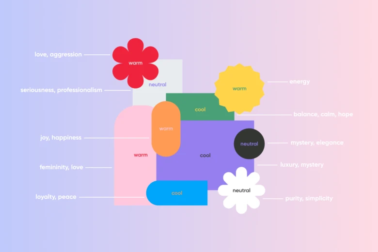
Before taking a look at individual colors and their meanings, we dive into the main categories of color: warm, cool, and neutral.
Warm colors
Warm colors have the longest wavelengths; this means when they enter the eye they are perceived as coming closer to you. The result is a feeling of warmth, energy, and movement.
This also means these colors are typically associated with passion, happiness, and creativity.
Cool colors
Because cool colors have shorter wavelengths, they appear further away from the eye. This makes them feel less demanding and calmer. As a result, cool colors are often linked with trust and quiet positivity.
Neutral colors
Neutral colors are neither warm nor cool; instead, they are created by mixing both tones. The result is that they provide a blank slate, and an air of sophistication, purity, and balance.
Color meanings and their influence on designs
In this section, we explore what colors represent and how they can influence your designs. Check the table below to get a quick idea about common emotions and cultural connotations.

A note on cultural variations in color symbolism
The table above will already show you how much color meanings can vary across cultures.
To take a look at an even clearer example: White represents the color of mourning in many cultures while black symbolizes death in others.
Different hues of the same color can also have different connotations in different cultures. For example, gold is associated with success in the United States, but yellow is linked to cowardice in some Eastern cultures.
For this reason, it’s important to carefully check which colors you’re including in your international campaigns. Colors that represent emotions in one place can mean something else entirely elsewhere.
Applying color meanings to your designs
To find colors that have the desired effect on your audience, follow these steps… And don’t forget, Picsart has tools to support you no matter what stage you’re at in the design journey.

- Research the cultural and emotional connotations of each color to find those that suit your brand or project.
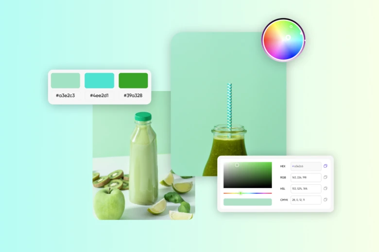
- Find your perfect shade using the Picsart color picker. Pick a color and then play around until you find a shade that makes you feel something!
- Figure out the best color combinations. These will complement each other to create the same feeling or tone.
- Use Picsart’s color wheel to test different pairings. This allows you to make sure you’re creating a cohesive design without even thinking about it.
- Take into account the specific context of your project. If you’re trying to find a logo or brand palette, for example, be sure to define your brand’s personality first. This will help you understand how you want people to feel when they interact with you.
- You should also write down your color codes so you can use them consistently across projects. You can save these in seconds with Picsart!
Using color meanings for better marketing & design
Refer to our guide next time you’re wondering what color represents hope or you’re trying to build trust with your audience.
There’s a color for every emotional connotation and, by properly understanding the cultural context, you can build more meaningful projects and brands!
Our range of color tools are designed to make this as easy and fun as possible. Go experiment with shades, and let us know what you create.


