

Contents
Open Grok Imagine 2 when the thing you are making is drawn, painted, or built in a style. Open GPT Image 2 when it has to look photographed, or when there are words in it that somebody will read. Both models are current flagships and both are in Picsart, so the choice is about the job, not about which one is better.
Grok Imagine 2 is the newest image model from xAI, trained to hold up across three areas at once: photography, design and illustration. Editing is part of the model itself rather than a layer added over the top of it. GPT Image 2 is OpenAI’s newest, and it is built around two things it does unusually well: skin, light and surfaces that read as a real photograph, and letters that come out correct.
Comparison table
| Grok Imagine 2 | GPT Image 2 | |
|---|---|---|
| Who makes it | xAI | OpenAI |
| Strongest at | Illustration, stylized and designed work | Photorealism, and words that must be correct |
| Handling text | Plans typography and layout as a composition | Around 99% character accuracy in six scripts |
| Keeping a look consistent | Carries a style across separate generations | Up to 10 matching images in one run |
| Editing what you have | From an instruction, no selection to draw | From an instruction, plus extending the frame |
| Largest image | 2k | 2048 by 2048, with a 4096 by 4096 beta |
Here is how that plays out across the work most people actually bring to an image model.
Illustration, pixel art, and art styles
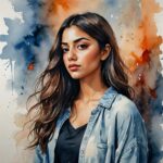
This is where Grok Imagine 2 is the one to open. Its range across visual languages is the point of the model rather than a side effect of it. Halftone portraits made of fine white dots, classical ink painting, soft manga pages, watercolor journal spreads, retro pixel art, vintage travel posters: it moves between those registers without being talked into them.
It also holds to an instruction closely, including the small parts of it, which matters more in stylized work than people expect. A style request carries a lot of specific baggage. Pixel art has a resolution logic. Halftone has a dot structure. Ink painting has rules about where the brush lifts. A model that only approximates the style gets those wrong and the piece looks like a filter rather than a drawing.
GPT Image 2 will produce illustration too. It is just not what it was tuned for, and the difference shows in the pieces that depend most heavily on committing to a look.
Photos that look real
GPT Image 2 is the stronger pick here, and its specific claim is worth knowing. The two tells that used to mark an image as generated, a warm cast over everything and skin with a waxy finish, have been trained out. Pores and fine lines survive. Shadows sit where the light source says they should. Depth of field falls off gradually instead of all at once.
That makes it the model for product shots, for portraits and headshots, for interiors, and for anything going into a place where a real photograph would normally sit. A catalog page. A press kit. A slide where a stock photo would look obviously stock.
Photography is one of the three areas Grok Imagine 2 was trained on, so it is far from a bad photographic model. But when the test is whether a viewer would assume a camera made it, GPT Image 2 is the safer bet.
Text inside the image
GPT Image 2 again, and this is its single most reliable advantage. It renders text at around 99% character-level accuracy across Latin, Chinese, Japanese, Korean, Arabic and Hebrew. It holds up on fine print, on curved text that wraps around a shape, and on multilingual labels where a wrong character is not a typo but a mistake.
So: packaging with a real product name on it. Signage. A label in more than one language. A chart whose annotations have to mean something. A mockup with real interface text instead of placeholder shapes.
Grok Imagine 2 handles type well in its own way. It works out type and layout the way a designer would, so a dense visual made of several parts holds together as one composition instead of collapsing into a pile of elements. That is an arrangement strength rather than a spelling strength, which is a genuinely useful thing on an illustrated piece where the lettering is part of the artwork. When the words themselves have to be exactly right, use GPT Image 2.
Making a set of matching images
Both models do this, and they do it differently enough that the difference decides jobs.
GPT Image 2 returns a matching batch from a single prompt, and in Picsart you can ask it for up to 10 at once. You describe the thing once and the whole set comes back together. That suits a product series, a storyboard, or a set of variants where the whole set arrives together.
Grok Imagine 2 works the other way. What you feed it survives from one generation to the next and through edits, so a look carries forward across images made separately at different times. That is how you build out a world: a character in one generation, the places she goes in the next few, the objects she carries after that, all holding the same style. For game assets, a comic, or a video project that needs a consistent visual bible, that is the more useful shape.
Editing a photo you upload
GPT Image 2 is the more specified editor, and in Picsart it is also the more capable one.
It names its operations: patch a single area, extend the picture past its original edges, take an object out, replace a background, restyle the whole frame. All of it from a written instruction, with no selection to draw first. Extending past the frame is the one worth flagging, because it is the operation Grok Imagine 2 has no answer to.
Grok Imagine 2 edits from an instruction too, and editing was built into the model rather than bolted on. What it does not offer is a way to push the picture beyond the crop you started with, so a reframe still has to happen somewhere else.
Vertical, square, and ultra-wide images
Grok Imagine 2 has 13 frame shapes, and the interesting ones are at the extremes: 19.5:9, 9:19.5, 20:9, 9:20, 2:1 and 1:2. Those cover a phone screen edge to edge, and the long thin banners that ad slots ask for.
GPT Image 2 has 7, running from 1:1 out to 16:9 and 9:16, plus an auto setting that picks the shape for you. It reaches widescreen in both orientations, but it cannot be persuaded into a 20:9 banner. If you already know the slot this image has to fill and its shape is unusual, check the list first. No amount of prompting adds a frame the model was not given.
Which model to pick for each job
| What you are making | Open this |
|---|---|
| Anything illustrated, painted, or in a defined art style | Grok Imagine 2 |
| Pixel art, game assets, sprites, icon sets | Grok Imagine 2 |
| A product shot or a portrait that has to look photographed | GPT Image 2 |
| A label, a pack, or a shopfront sign, in any script | GPT Image 2 |
| A data graphic or a screen mockup whose labels have to be legible | GPT Image 2 |
| A character plus locations plus props that all share one look | Grok Imagine 2 |
| A matching set of variants delivered in one go | GPT Image 2 |
| Pulling a frame wider than it was, or swapping what is behind the subject | GPT Image 2 |
| A full-bleed phone frame or a very wide banner | Grok Imagine 2 |
| Deliverables that have to carry proof of origin | GPT Image 2, which embeds content credentials |
How to try both in Picsart
Both models live in Picsart AI Playground, which is the fastest way to settle this for your own work: one prompt, both models, two results side by side. They share a single credit balance, so trying the second one costs you a click.
GPT Image 2 reaches further into the product. It is in the AI Image Generator, and in Flow it can be wired in as one node among many, so a generation feeds straight into whatever has to happen to the file afterward. Everything it does is listed on the GPT Image 2 model page.
A test prompt to run in both
A prompt that exposes the split cleanly, because it asks for a style and for legible type at the same time:
Try this prompt
A vintage travel poster for a coastal Italian town at golden hour, hand-painted look, muted teal and terracotta palette, the town name set in bold condensed type across the lower third, small print underneath reading "Departures daily from the harbour"
Run it in both. Grok Imagine 2 will tend to give you the more convincing poster as an illustrated object. GPT Image 2 will tend to give you the more trustworthy small print. Which of those two failures you can live with is the answer to the whole question.
Get answers to common questions
GPT Image 2, when the words have to be correct. It renders text at around 99% character-level accuracy across Latin, Chinese, Japanese, Korean, Arabic and Hebrew, and it holds up on fine print and on curved text. Grok Imagine 2’s strength with type is different: it plans typography and layout so a dense, multi-part visual holds together as a design.
Try both and compare
Start from the deliverable. Drawn, styled, or one piece of a set that has to match: Grok Imagine 2. Meant to read as a photograph, or carrying copy someone will actually read: GPT Image 2. When you genuinely cannot tell, run the brief through both in Picsart AI Playground and compare what comes back.


