Choosing the right font for your design project is a critical decision. The font should not only reflect your brand’s identity but give your reader an overall mood or feeling about the story you are telling. The right font can create a positive user experience for the reader and impact your brand and message beyond the written words. Sounds pretty important, right?
On one hand, there is such a wide selection of typography to choose from for all possible design projects. On the other hand, too many font options present a challenge in and of itself. With so many factors to consider, like content, layout, and brand industry, narrowing down your options to one or two fonts can be a difficult and confusing process. Luckily you’re in good hands!
From classic to trendy and every font style in between, we’ll cover our top tens for various font categories, plus how to choose a good font for your specific project. But first, let’s learn about the basic font categories most commonly used and the characteristics of each one.
Basic Font Categories
Serif Fonts
A serif is a small stroke (or little footer) attached to the end of a larger stroke in a letter. This style has created the Serif Fonts you commonly see today. Serif fonts are thought of as classic and traditional and are mostly used in books, newspaper print, and other classic designs. Serif fonts can be used for both headers and body text.
Sans Serif Fonts
A Sans Serif font consists of letters without serifs. There are no little footers attached to each letter, but instead, a more rounded-out detail seen on each letter. Sans Serif fonts are known to be more modern and contemporary and are most commonly used for digital text such as websites and online blogs. Sans Serif fonts can be used for both headers and body text.
Script Fonts
Script font styles have a more personal vibe since they mimic the fluid strokes of handwriting. They can range from formal calligraphy to more casual styles. Script fonts are perfect for special occasion invitations like weddings or birthdays and are also widely used for inspirational quotes posted on social media. They are generally used for headlines as they would be difficult to read in body text.
Display Fonts
Display fonts are big and bold and can widely vary in style. These eccentric fonts are perfect for emphasizing text or use in headlines. Display fonts are also not optimal for use in body text.
Monospaced Fonts
Monospaced fonts are generally used to display computer code. They can, however, be used for body and headline copy. Since Monospaced fonts were originally used on typewriters, they provide a clean, modern look that’s versatile for print and digital use.
Classic Fonts
Now that you have a basic breakdown of the five font categories, let’s dive into our top ten classic fonts. These classic fonts stand to stay in style forever! You can use a combination of these fonts for virtually any project.
Sans Serif Typefaces
- Helvetica
- Avenir
- Montserrat
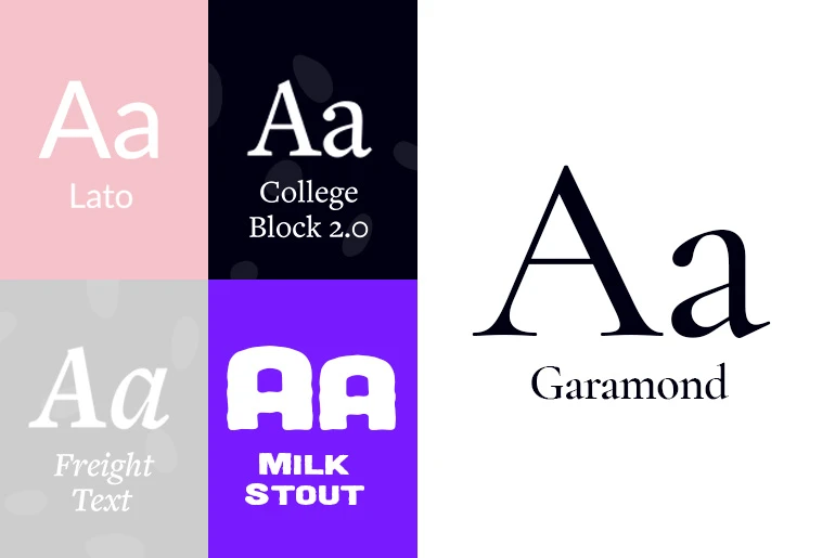
- Lato
Serif Typefaces
- Garamond
- Baskerville
- Tiempos Text
- Freight Text
Block Letter Typefaces
- College Block 2.0
- Milk Stout Font
Trendy Fonts of 2020
Take a look at the top ten trendy fonts of 2020. These trendy fonts are so in style, they might even spill over to 2021!
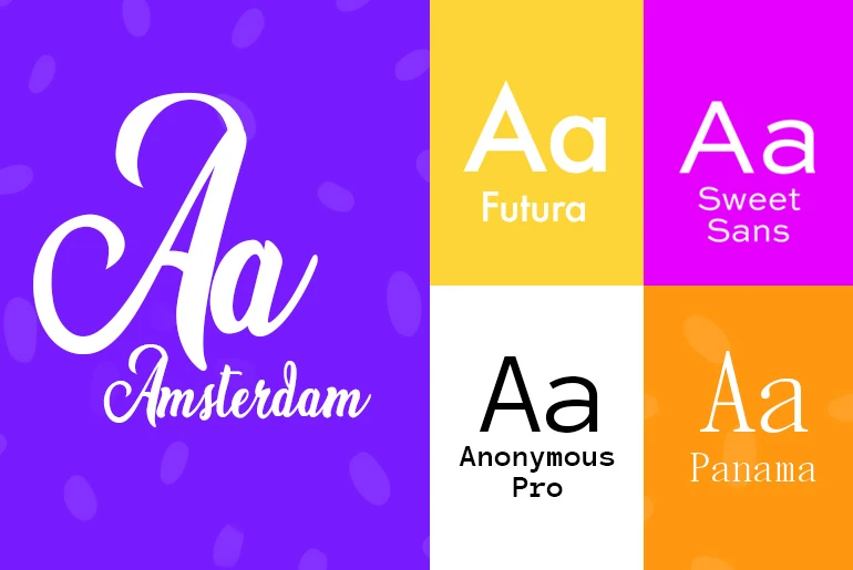
- Amsterdam
- Anonymous Pro
- Avenir Next Pro
- Sentinel
- Panama
- Futura PT
- Helvetica Now
- Ambit
- Sweet Sans
- Formula Condensed
Good Fonts for the Next Decade
If you’re looking for a clean and practical design in a font, one that will look good a decade from now, take note of these top ten fonts below.
- Akzidenz-Grotesk
- Clarendon
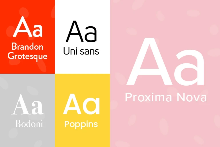
- Proxima Nova
- Uni Sans
- Poppins
- Bodoni
- Rockwell
- Bebas Neue
- Brandon Grotesque
- Verdana
Good Fonts Versus Bad Fonts
Not all fonts are created equal. There can be good and bad fonts, and you probably have come across both. There are certain characteristics that make a good font good and a bad font horrible. Let’s take a look at what these characteristics are that define the best and worst fonts.
Good Font Characteristics
- Even Kerning: Kerning is the spacing between two letters. A good font will have the perfect and even amount of space between each letter and across all letters or words. Too little kerning leaves the letters looking smushed together, and therefore unreadable. Too much kerning makes it hard to tell when one word ends and the other begins. An uneven amount of space from letter to letter is simply not aesthetically pleasing to the eye.
- Consistency: Consistency in the font design is important to providing a cohesive font look. All the font’s letters and numbers should have the same characteristics used in order to stay uniform in style. For example, if a font’s letter “A” is thick and bold all around, but the letter “B” does not share the same boldness, then the font letters are inconsistent.
- Balance: A balanced font refers to the details of each letter stroke. The letters should have a balanced blend of thick and thin strokes or heavy and light strokes. A well-balanced font will have the perfect variations of thin and thick strokes that look and read in a fluid fashion.
- Legibility: Arguably the most important factor, legibility is an essential characteristic of a good font. If you can’t read the font, then what’s the point? Font readability should be consistent throughout different font sizes, font weights, and words. For example, if you need to shrink down font size, then choose a font that is still legible when reduced to a smaller size.
Bad Font Characteristics
- Imbalanced: Balance = beauty. When a font’s weight is not distributed evenly among the letters, the font looks unnatural and, let’s face it, unattractive!
- Unreadable: If you come across a font that’s distracting and hard to read, and perhaps you’re even squinting to make out the words, you’ve got yourself a bad font! Unreadable fonts consist of uneven font weight and size, random fading of letters, extra lines, or overall bad design.
- Boring: Sometimes there isn’t necessarily a bad quality you can pinpoint in a font. Sometimes it’s just plain boring! These are fonts like Times New Roman or Arial, which you’ve seen time and time again. They are simply dull and don’t add anything extra to your brand or message.
- Overused: Similar to bland fonts, overused fonts also lose all appeal after being used so many times. Overused fonts become conventional and commonplace. It’s nice to spice things up with newer or lesser-used fonts.
- Imitation: Imitation isn’t always the best form of flattery. There are some bad fonts that are simply replicas or imitations that don’t do the original font justice. Other bad imitation fonts try to mimic elements associated with specific cultures. Papyrus and Bozai are good examples of bad fonts that try to mimic cultures.
How to Choose a Good Font
If you’re faced with the difficult decision to choose a good font, there are a few key things to keep in mind. Depending on your specific design project, remember these basic ideas, and you’ll find the right font in no time!
- Your font should be highly legible. Whether it’s the headline or the body text, you’ll want to make sure that your text is clear and readable.
- Your font should match your brand and industry. The font you choose will amplify your brand’s identity and content. Fun and playful? Consider adding a curved text effect.
- Make sure to use web-safe fonts. It is important that your text is accessible on all major browsers and platforms.
- Limit the total number of fonts to two or three. Should you want to use a combination of fonts, don’t go overboard. Stick to two or three fonts at the most.
- Your font should be aesthetically pleasing. Use your discretion and choose something that catches your eye. Stay away from boring and overused fonts.
Where to Find Good Fonts
We covered a lot of info about fonts: the good, the bad, and the ugly! You learned the basics of good and bad font characteristics, plus our top ten font choices for classic, trendy, and next decade font categories. So, where can you find some good fonts?
For smaller, personal projects, check out PicsArt’s mobile app for an impressive collection of unique fonts you won’t find elsewhere. PicsArt’s desktop editor also has free, user-friendly tools with tons of good fonts for more complex and commercial use.
Follow these step-by-step instructions on how to use the free online text editor.
- Open PicsArt’s Text Editor.
- Select any free image or upload or own using the top left Upload button.
- Click on Add a heading, Add a subheading, or Add a body text. Then type in your text and move the text box to the desired area on your image. You can also adjust the text box size by clicking and diagonally dragging the corners of the textbox.
- Click on Font above the image and you’ll see a dropdown of typefaces you can choose from. There are over sixty unique fonts to choose from!
- You can also adjust for size, letter spacing, line height, alignment, caps, and the options to make your text bold, italic, or underlined.
- Next to the Font option, you’ll find Color, Outline, and Shadow. Click into each of these editing tools and adjust your font accordingly.
- Looking to add more text to your project? Click on the Text icon on the left and choose another textbox (Heading, Subheading, or Body text). Tip: Here is where you can have fun with pairing different types of fonts!
- Once your project is complete, click Share to post on social media or Download at the top right.
Make Awesome
PicsArt all-in-one Photo and Video Editor, Collage, and Sticker Maker is the world’s largest creative platform with over 150 million monthly active creators and influencers. PicsArt has collaborated with major artists and brands like Taylor Swift, The Jonas Brothers, Gwen Stefani, Maroon 5, Lizzo, Meghan Trainor, One Direction, MONSTA X, Warner Bros. Entertainment, iHeartMedia, Condé Nast, and more. Download the app today to level-up your photos and videos with thousands of quick & easy editing tools, trendy filters, fun stickers, and brilliant backgrounds. Unleash your creativity with PicsArt and upgrade to Gold for awesome premium perks!


