
Seven seconds. That’s the average amount of time a recruiter spends looking at a resume.
It can be really hard to make your resume stand out from the crowd. With so many applicants for a single job, you want to do everything in your power to ensure that your resume catches the attention of the hiring manager.
One way to make your resume stand out is through the use of color.
In this article, we’ll discuss the best color for your resume to make it stand out and how you can incorporate it effectively.
Need help crafting the perfect resume? Read “How to make a resume that lands jobs in 2025”!
Should resumes have color?
You may be wondering whether your resume should have color in the first place. And the answer is…maybe.
It depends on the industry in which you’re trying to get a job.
If you’re applying for a creative role, such as graphic design or marketing, incorporating color into your resume may be a good idea to showcase your creativity and design skills. However, if you’re applying for a more traditional or corporate job, sticking with black and white may be the safer choice.
It’s also important to consider the company culture of the organization you’re applying to. If they have a more relaxed and modern culture, using color in your resume may help you stand out in a positive way. On the other hand, if their culture is more conservative and formal, using too much color could potentially come across as unprofessional.
Before you put color in your resume, do research on both the industry and culture of the organization to determine if it’s appropriate.
Color psychology when choosing a color
When choosing the best colors for your resume, it can be helpful to consider color psychology. Essentially, color psychology states that different colors evoke different feelings in people. Some colors and color combinations are more attractive than others and are better for use on your resume.
Here’s a quick breakdown of some major colors and the psychology behind them:
- Black: Elegant, sophisticated, powerful. Black may seem like a safe and neutral color, but when used correctly it can convey elegance and sophistication on your resume. However, too much black can come across as somber or cold.
- White: Clean, minimalistic, modern. White is a clean and simple color that can give your resume a modern look. It’s also associated with purity and perfection, making it a good choice for industries such as technology or finance.
- Gray: Professional, neutral, balanced. Gray is often seen as a professional and neutral color that conveys balance and stability. It’s a good choice for any resume but should be used in moderation to avoid appearing dull.
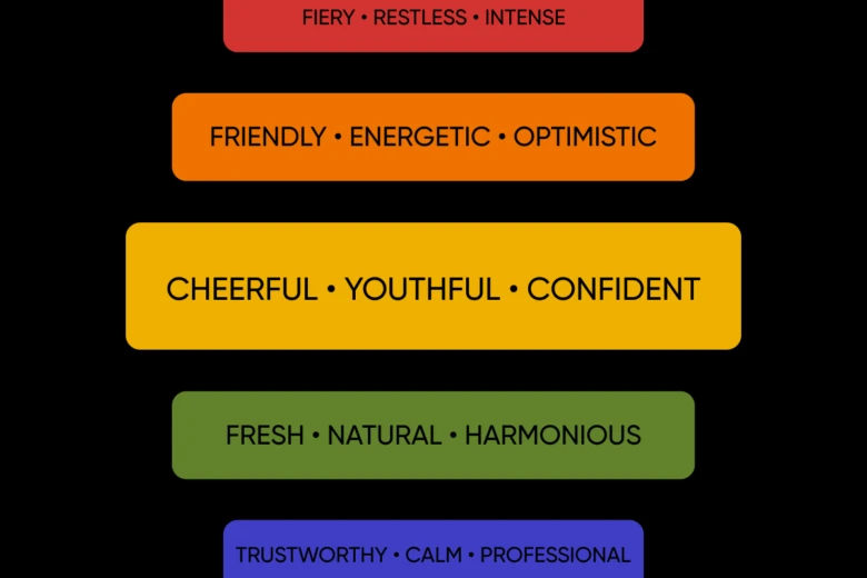
- Red: Fiery, restless, the most intense out of all the warm colors. Be very careful when using red because it can overwhelm other colors on your resume. It can also come across as aggressive and passionate, so it may not be the best choice for a corporate or traditional job.
- Orange: Friendly, energetic, optimistic. Orange is a great color to use if you want to convey enthusiasm and positivity on your resume. However, too much orange can be overwhelming, so use it sparingly.
- Yellow: Cheerful, youthful, confident. Yellow is a bright and attention-grabbing color that can add a pop of excitement to your resume. But like orange, too much yellow can be overpowering and should be used in moderation.
- Green: Fresh, natural, harmonious. Green is often associated with nature and growth, making it a great color for industries related to sustainability, health, and wellness. It can also represent balance and harmony, so it’s a safe choice for any resume.
- Blue: Trustworthy, calm, professional. Blue is often considered a safe and reliable color that can convey trust and dependability on your resume. It’s also the most universally liked color, making it a good choice for any industry or job.
- Purple: Creative, luxurious, royal. Purple has long been associated with royalty and wealth, but it can also represent creativity and imagination. This makes it a good choice for resumes in creative fields such as design or advertising.
- Pink: Playful, feminine, compassionate. Pink is often seen as a feminine color, but it can also evoke feelings of playfulness and compassion. It’s a good choice for industries that value empathy and creativity, such as healthcare or education.
- Brown: Earthy, dependable, trustworthy. Brown is often associated with the earth and can convey dependability and trustworthiness on your resume. It’s also a versatile color that can work well in many industries.
When creating your resume, think about the feelings you want it to evoke in the person who sees it. Do you want them to sense professionalism? Passion? Creativity? Carefully consider which colors are best suited to the company to which you’re applying and shape your resume accordingly.
Best resume color combinations for a professional look
So, given the above, what color combinations should you use in your resume to create a professional look? Here are some effective combinations to consider:
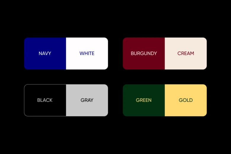
- Navy and white: The classic combination of navy and white can create a professional, clean look. Navy exudes professionalism while white adds a touch of sophistication.
- Black and gray: Another classic combination, black and gray can convey reliability and stability. This color scheme works well for traditional industries such as finance or law.
- Burgundy and cream: For a more unique option, consider using burgundy with cream accents. Burgundy is associated with elegance, while cream adds a touch of warmth to the overall look.
- Dark green and gold: Dark green symbolizes growth and success, while gold conveys luxury and prestige. This combination can work well for industries such as marketing or advertising.
- Charcoal and red: Charcoal is a modern twist on traditional black and gray, while red adds a bold pop of color. This combination can convey confidence and determination, making it a good choice for sales or management positions.
Remember, the key is to choose colors that complement each other and align with your personal branding. Avoid using too many colors or overly bright shades, as this can distract from the content of your resume.
Ultimately, the goal is to create a visually appealing resume that effectively showcases your skills and experience in a professional manner. So be intentional with your color choices and use them strategically to make your resume stand out from your competition.
Best resume colors based on industry

As we’ve discussed, there are certain colors that are better fitted for specific industries and some that shouldn’t be used at all. Let’s take a closer look at the best resume color choices according to different industries:
- Finance/accounting: Blue, navy, and gray
- Law: Black, dark blue, and white
- Marketing/advertising/PR: Red, orange, and yellow
- Technology: Green, purple, and gray
- Healthcare: Green, blue, and white
- Education: Blue, green, and white
- Hospitality: Gold, beige, and light blue
- Retail: Red, orange, and black
- Creative/design: Purple, pink, and turquoise
- Real estate: Green, brown, and gray
- Manufacturing: Gray, steel blue, and black
- Non-profit: Teal, purple, and white
- Sports/fitness: Red, black, and white
Of course, these are just general guidelines and you should always consider your personal branding when choosing colors for your resume. However, keeping in mind the industry you’re applying for can help you make a more strategic color choice.
How to use color correctly in a resume
When creating your resume, you shouldn’t just splash colors in random places, even if the colors go together. You need to use colors strategically. Here are some tips to help you use color correctly in your resume:
- Choose a color scheme: Select 2-3 colors that complement each other and use them consistently throughout your resume. This will create a cohesive and visually appealing design. If you’re not sure what colors go together well, check out our professionally-designed resume templates.
- Use color sparingly: Too much color can be distracting and take away from the important information on your resume. Stick to using color for headings, borders, and accents.
- Highlight important information: Use color to draw attention to key points or
achievements in your experience section. This will make them stand out more to hiring managers. - Use light backgrounds with dark text: Make sure your text is easily readable by using darker colors for text on a lighter background. This will ensure your resume is easy on the eyes and professional-looking.
- Stick to standard colors: While being creative with color can make your resume stand out, it’s important to stick to more traditional colors for a professional look. Stick to shades of blue, gray, black, and white.
- Consider the industry you’re applying for: As mentioned earlier, different industries may have certain color associations or preferences. Consider this when choosing your color scheme.
It’s also important to note that some companies or hiring managers may prefer a more minimalistic approach with no colors at all. In this case, it’s best to stick to a simple black-and-white design.
5 examples of great resumes
Picsart has dozens of beautiful resume templates, as well as a resume maker you can use to create your own gorgeous resume. Each of the templates can be customized, including the fonts, colors, and images. With our powerful online design tools, you can customize your resume until it perfectly aligns with your brand.
Here are five examples of resumes that use colors well:
Black, white, and grey
This black, white, and grey resume beautifully balances all three colors and creates a sleek and professional look. The design is simple but effective, with the use of bold font for headers and crisp dividing lines between each section. Ideal for a creative or tech industry job. Use this template.

Navy blue, yellow, and grey
With three distinct sections and a tasteful use of blue, yellow, and grey, this resume works well for a sales or marketing role. Use this template.

Yellow, white, and black
With a pop of bright yellow, this resume stands out while still maintaining a professional look. The use of white and black for a large part of the design keeps it clean and easy to read. Ideal for a creative or digital marketing position. Use this template.

Black, white, and blue
With just a splash of blue, this resume adds a touch of color without overpowering the overall design. The classic combination of black and white makes it suitable for any industry or position. Customize it to showcase your skills and experience. Use this template.

Warm burgundy and taupe
Featuring a warm burgundy and taupe color scheme, this resume template is perfect for those in creative fields or looking to make a bold statement. The combination of colors adds a sense of warmth and personality to the design, while still maintaining a professional look. Use this template.

Conclusion
Ultimately, the best color for your resume depends on your personal brand and the industry you are in. While traditional colors like black, white, and navy blue are often safe choices, don’t be afraid to incorporate a pop of color or try something unique if it aligns with your personal brand and helps you stand out from the competition.
Remember, your resume should make a strong first impression and showcase your skills and qualifications. So whether you choose a classic color scheme or opt for something more eye-catching, make sure it represents you accurately and effectively communicates your strengths to potential employers.
Experiment with different colors and combinations until you find the one that best reflects your personal style and professional goals. With the right color palette, your resume can become an impressive visual representation of who you are as a candidate.


