
In the dynamic realm of visual communication, posters remain powerful tools for capturing attention and conveying messages. At the core of every impactful poster lies a crucial element: typography. The right font can elevate a simple design into a compelling masterpiece, while an ill-suited choice may undermine even the most brilliant concept. Let’s explore the nuanced art and practical science of selecting the best fonts for your posters, examining both free and premium options that will enhance your designs.
The critical role of font selection in poster design
Choosing the right font goes beyond mere aesthetics; it’s a fundamental aspect of visual communication that can significantly influence your poster’s effectiveness. Consider these key factors:
- First impressions: Typography often forms the initial visual element viewers notice, setting the tone for your entire message.
- Readability: An appropriate font ensures your message remains clear and easily digestible, even from a distance.
- Brand identity: Fonts can reinforce your brand’s personality and values, contributing to a cohesive visual identity.
- Emotional impact: Different typefaces evoke varied emotions, helping you connect with your audience on a deeper level.
- Visual hierarchy: Thoughtful font selection and pairing guide the viewer’s eye through your content, emphasizing key information.
Top 10 cool fonts for poster designs
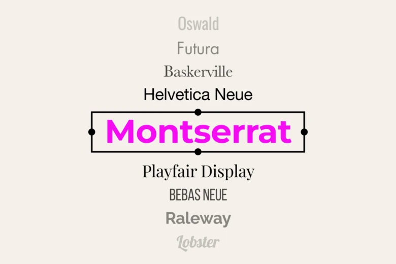
Based on extensive research and recommendations from design experts, here are ten fonts that consistently deliver outstanding results in poster design:
| Font name | Style | Best for |
| Bebas Neue | Sans-serif | Headlines, Titles |
| Montserrat | Sans-serif | Versatile, Body Text |
| Playfair Display | Serif | Elegant Headings |
| Oswald | Sans-serif | Bold Statements |
| Lora | Serif | Body Text, Readability |
| Futura | Sans-serif | Modern, Clean Designs |
| Baskerville | Serif | Classic, Timeless Look |
| Helvetica Neue | Sans-serif | Versatile, Professional |
| Lobster | Script | Casual, Fun Designs |
| Raleway | Sans-serif | Modern, Elegant |
Selecting the optimal font for your poster
Choosing the ideal font involves careful consideration of several factors:
1. Purpose and tone
Evaluate the message and emotion you aim to convey. A corporate event poster requires a different tone than one for a rock concert or charity fundraiser. Your font choice should align with and reinforce this intended tone.
2. Readability
Ensure your chosen font remains legible from a distance. For body text, sans-serif fonts often excel, while serif or decorative fonts can create impactful headlines and provide visual contrast.
3. Scalability
Test your font at various sizes. An effective poster font should maintain its integrity and impact whether used for a headline or smaller text elements.
4. Contrast
Create visual interest by pairing complementary fonts, such as a bold sans-serif for headlines with a readable serif for body text. This contrast helps guide the viewer’s eye and establishes a clear hierarchy of information.
5. Brand consistency
When designing for a specific brand, ensure your font choices align with established brand guidelines and personality. Consistency in typography across various marketing materials reinforces brand recognition.
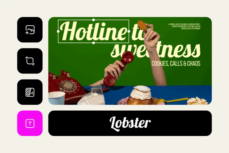
How to try out the best fonts for poster design for free in Picsart
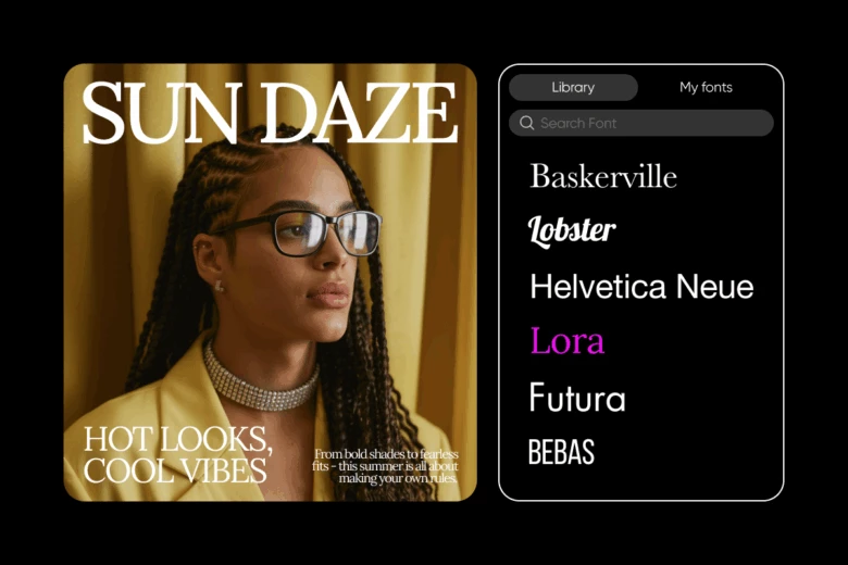
Need a way to put together a quick poster design and visualize how the fonts mentioned in this article will look on the final design? Tap into Picsart’s online poster maker and access all these fonts in one place. Here’s how to get started:
- Go to the poster templates page and pick a template to get started. If you want to start from scratch, just go directly to the Picsart Editor.
- Select the text element of the template to customize the content and font, or use the Text button on the left sidebar to add new text blocks.
- When you select a text box, the font dropdown menu appears on the top toolbar. Browse the initial selection or use the search bar to find a specific font, like the ones mentioned in this article.
While the best fonts for posters that we’ve mentioned above require a subscription to Picsart’s Plus and Pro plans, you can still preview them on your design for free. And once you’ve decided which font you want to use, you can consider getting a Picsart subscription and get access to over 2000 premium fonts in one place, as well as a plethora of expert-crafted poster templates, stickers, backgrounds, state-of-the-art AI tools, and so much more!
Alternatively, you can also try the AI font generator and experiment with 170 free fonts.
Conclusion
Selecting the right fonts for your poster is a critical step in creating a design that not only captures attention but also effectively communicates your message. By understanding the importance of typography and the intentionality of various font families, you can elevate your poster designs to new levels of creativity and impact.
Remember, the perfect font combination can transform a good poster into an exceptional one. Experiment with different pairings, consider your audience and message carefully, and don’t hesitate to think innovatively. With thoughtful typography, your posters will not just be seen—they’ll leave a lasting impression.


