Choosing the right color palette for your brand can be more important than you think. The way in which your brand is perceived by potential customers is crucial for attracting more clients. It has been found that up to 90% of an initial impression is based on color. So choosing the perfect palette for your brand is a major key to success. Let us explore just how you can use Picsart to work out the best color scheme for your brand identity.
The Color Wheel Whirl
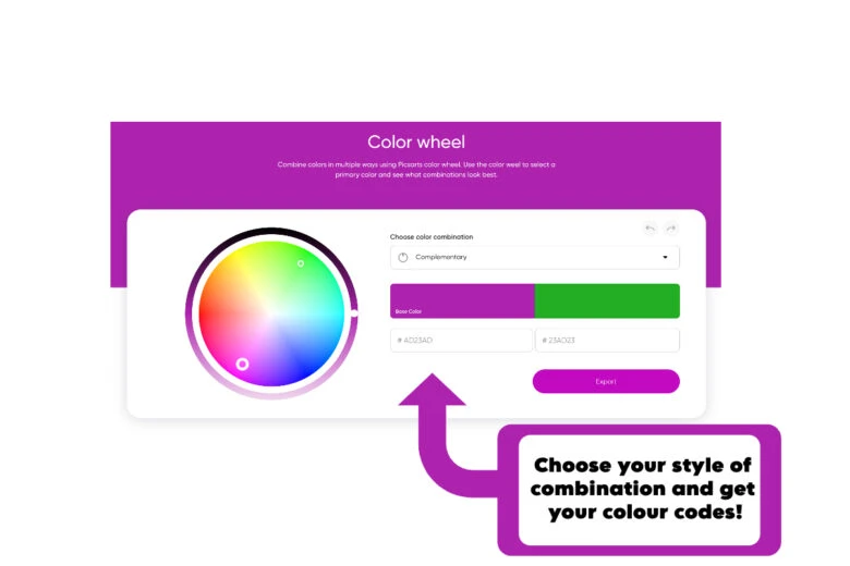
You may have come across color wheels in the past. They are a great way to visualize multiple colors at once, while seeing what compliments each other the best. Our Color Wheel tool allows you to select whatever color you like and be immediately shown its complementary partner! This is a super-quick way to instantly find the perfect pair. But that’s not all! If you want to see other types of color pairings from different parts of the wheel, you can simply click on a different combination style in the menu bar. Meaning you can compare different options and choose whatever is best for you.

Crafting Your Color Palette
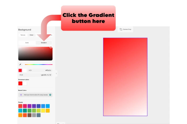
Through our many creative tools, you can create a captivating color palette that is perfect for your brand. Our Gradient Maker tool is a great way to work out what colors are good to use! Go to backgrounds, choose a color, and then tap the gradient button. You will be able to create an effect that showcases the different shades of whatever color you want. It’s a really helpful tool for exploring and saving different color combinations. If you see a shade you like, you can then use our Eyedrop tool to click on it and have it ready to use! Another great option is our Color Picker tool! If you choose any color in the grid provided, this will tell you important information about it (its CMYK code, RGB tone, etc.)This info is super helpful in searching for the exact tone of color that you want to use. Also, using our drawing tool to test different color swatches is a fast way to compare different options to each other.

Palette Perfection Examples
If you’re still questioning the importance of having a strong color palette, think about the many brands that have nailed their color branding. McDonald’s, one of the largest fast food companies in the world, is instantly recognizable with its iconic red and yellow color scheme. Fanta’s staple orange logo and branding, along with its most popular orange flavor, also jump out to consumers. Spotify’s green logo and overall color scheme throughout their product are also super helpful in cementing their consistent branding. These brands all have staple color palettes that immediately speak to customers and allow them to make connections between the company and the color. It’s also important to think about some of the ideas explored in Color Theory. Overall, warm colors (reds, yellows, oranges) evoke feelings of enthusiasm and excitement. They are seen as more inviting and are used by lots of food, entertainment, and retail brands. Whereas cold colors (blues, greens, purples) evoke more feelings of calm and relaxation. They are linked with emotions like trust and professionalism. This information is super helpful for working out what colors suit your brand the best. This will ultimately allow for the best choice to be made – leading to better engagement as a business overall.
Integrating Your Color Palette
Once you have chosen the perfect palette, it’s key to consistently use it across all of your brand’s various platforms and social media accounts. This type of branding is always the best for creating a strong image, as it shows professionalism. It’s also a lot easier for customers to create strong connections with your business if they can form a solid idea of what your brand is known for visually. Familiarity is always comforting for consumers. You can also use Picsart to implement your chosen palette into your content. If you create an Instagram Story from scratch, you can add the code of your color or simply locate it on our color grid! Even if you use one of our Templates, you can edit the colors in the same way!
Evolving Your Color Palette
Brand evolution is also important to consider in the long run. While a color palette may be working now, you should always be open to experimenting with and expanding the color schemes you use. This doesn’t necessarily mean completely changing it, but maybe expanding it to also include other complimentary colors. A great place to also get inspiration for different colors and pairings is in our Spaces! This is a super fun place to see and share any sort of creative work that can be a great inspiration for your own creations.
With all these helpful tools available and more, why wouldn’t you use Picsart for your color scheme planning? Finding the right palette may not be easy, but we’re here to guide you on this fun and exciting journey. So go on! Get colorful and creative today.
Empowering the Creator in Everyone
Picsart is the world’s largest digital creation platform. Its AI-powered tools give creators of all levels the ability to design, edit, draw and share photo and video content anywhere. It’s used by consumers, marketers and content creators for both personal and professional design, and is available to businesses via API partnerships and integrations. Picsart has collaborated with major artists and brands like Discord, PopSockets, Shopify, Taylor Swift and more. Download the app or visit picsart.com.


