
In the fast-paced world of digital marketing, your ad’s font choice might be a big contributing factor whether users scroll by or click through. Typography isn’t just about aesthetics; it’s a powerful tool that can significantly influence how your audience perceives and interacts with your brand. In this article, we’ll explore the best fonts for ads and discover how to make your ads not just seen but remembered and acted upon.
Why Fonts Matter in Advertising
Fonts serve as the visual voice of your brand, playing a crucial role in how your audience perceives and interacts with your message. Effective fonts for ads go beyond aesthetics, acting as a powerful tool that can significantly impact the effectiveness of your ads.
When you select an appropriate font for your advertising, you’re not just picking a style of letters. You’re choosing a way to communicate your brand’s personality and evoke specific emotions in your audience. Here’s why typography is so important in advertising:
- Visual branding: Fonts reinforce your brand identity and help with recognition
- Emotional impact: Typography can evoke specific feelings and set the tone
- Readability: Easy-to-read fonts ensure your message is quickly understood
- Differentiation: Unique typography helps your ads stand out in a crowded market
In essence, fonts are a fundamental element of your visual marketing strategy. They have the power to enhance brand recognition, improve message retention, and ultimately contribute to the overall success of your advertising campaigns. By giving careful consideration to your font choices, you can create ads that not only look appealing but also effectively communicate your message and drive engagement.
Top fonts for advertising
Now that we covered the impact font selection can have on your ads, let’s explore some of the best fonts for ads from the perspective of readability and timelessness.
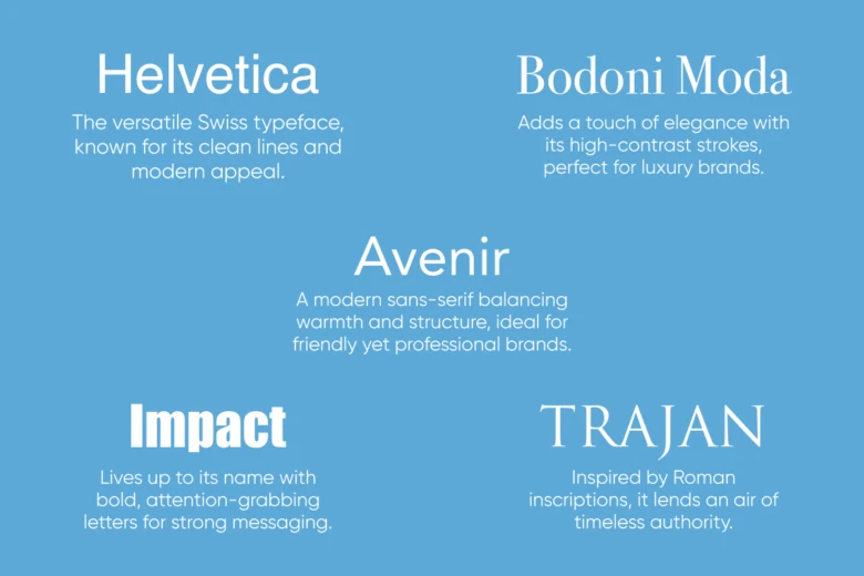
- Helvetica: The versatile Swiss typeface, known for its clean lines and modern appeal.
- Bodoni Moda: Adds a touch of elegance with its high-contrast strokes, perfect for luxury brands.
- Impact: Lives up to its name with bold, attention-grabbing letters for strong messaging.
- Trajan: Inspired by Roman inscriptions, it lends an air of timeless authority.
- Avenir: A modern sans-serif balancing warmth and structure, ideal for friendly yet professional brands.
Choosing free fonts without compromising quality
Budget constraints shouldn’t limit your typographic choices. There’s a wealth of free fonts available that can give your ads a professional edge. Here’s how to select the best free fonts for your campaigns:
- Prioritize legibility: Ensure your chosen font is clear and readable across different sizes and mediums.
- Maintain brand consistency: Select fonts that complement your existing brand identity.
- Seek versatility: Choose fonts with multiple weights and styles for design flexibility.
- Check licensing: Always verify that the font is free for commercial use.
For those looking to explore a wide array of font options, the Quicktools Font Generator offers an extensive collection of styles to enhance your ad typography. You can experiment with over 170 font styles and find the perfect match for your advertising needs.
The psychology of fonts in advertising
Understanding the emotional impact of fonts can give your ads an extra edge. Here’s a quick guide to font psychology:
| Font Style | Emotional Association | Best Used For |
| Serif | Traditional, Respectable, Reliable | Financial services, Academic institutions |
| Sans-serif | Modern, Clean, Straightforward | Tech companies, Healthcare |
| Script | Elegant, Creative, Personal | Fashion, Beauty products |
| Display | Unique, Expressive, Bold | Entertainment, Food industry |
By aligning your font choice with the desired emotional response, you can create ads that resonate more deeply with your target audience.
Optimizing fonts for different ad platforms

Different advertising platforms have unique requirements and best practices for typography. Here’s a guide to optimizing your font choices across various channels:
- Social media ads: Use bold fonts for headlines, but keep body text simple and legible. Sans-serif fonts often excel here.
- Print ads: You have more flexibility with print. Serif fonts can add sophistication, while larger display fonts for ads create impact.
- Video ads: Stick to clean, easily readable fonts, considering that viewers may be watching on small screens.
- Banner ads: Use a hierarchy of fonts to guide the eye. Your main message should be in a larger, bolder font.
Remember, consistency across platforms helps reinforce your brand identity. Choose a primary font family that works well in various contexts and sizes.
Conclusion
Fonts are more than just letters; they’re a crucial component of your brand’s visual identity and a powerful tool in your advertising arsenal. By carefully selecting fonts that align with your brand personality, resonate with your audience, and perform well across different platforms, you can create ads that not only look great but also drive results.


