The past year may have not been the easiest, but we’ve all learned our own ways of managing through the pandemic, and we’re hopeful. That being said, it’s more than normal to have to sit with the events of the last year before finding that hope within yourself. One of the ways you can get inspired about a better future ahead is to look at color trends. This year is the first ever for which The Pantone Institute has mixed up its own color, and this seems revolutionary. We’ve all lived through a lot and understand the kind of hope that a special hue can bring. These are unprecedented times, so why not pair them with an unprecedented hue? 2022 is all about moving forward, in whatever ways we can. Find out which trending colors can help you do just that over the course of this year.
What is the Pantone Color of the Year for 2022?
Each year, the Pantone Color Institute looks toward the future of design, drawing inspiration from fashion and interior design trends, new artists, technology, and current events. Their prediction? This year is all about courage, joy, creativity. Pantone’s pick for the color for 2022 is Very Peri (#17-3938), a periwinkle tone with high blue hues and a violet-red undertone.
This is the first time that Pantone has created a brand new color. The executive director cites the transformations taking place in society after the onset of the pandemic. The act of creating this hue is meant to acknowledge the ways in which we’ve come to connect with one another in complicated times, opening new paths to engagement and inventiveness.
Pantone also released some complimentary colors for their freshly-mixed Pantone 17-3938 hue. Below, we’ll explore a handful of these 27 harmonious combinations. The Pantone Color Institute has divided these tones into several categories, each with a different mood. We’ve chosen some favorites from their themed collections that represent balance, wellness, high style, and fun.
1. Muted Clay (#16-1330)
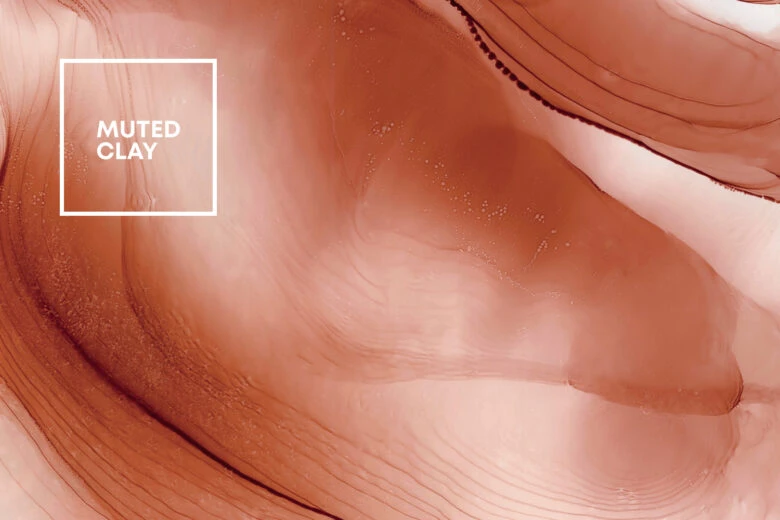
This earthen tone brings to mind clay pots and other raw ceramics. If you expanded your plant or dishware collection during the pandemic, this color may feel cozy and close to home. This color pairs especially well with periwinkle blue because the two colors respectively balance the warmth and coolness of one another. And, what more could we want this year than a bit of balance after uncertain times?
2. Foliage (#16-0237)
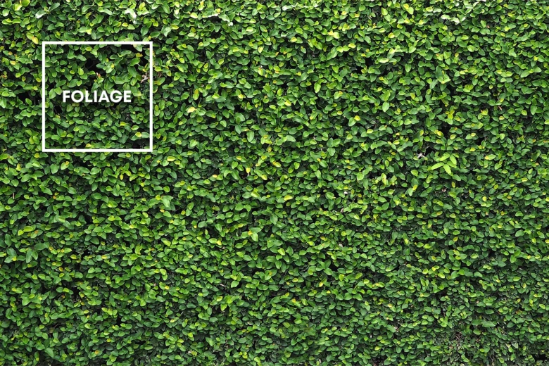
This grassy hue is part spring fever, part wellness culture. It is life-giving and a strong nature reference. It’s vibrance and intensity offsets the calming purple of Pantone’s color of the year. The institute describes the palette to which this color pertains as “nourishing”.
3. Cloud Dancer (#11-4201)
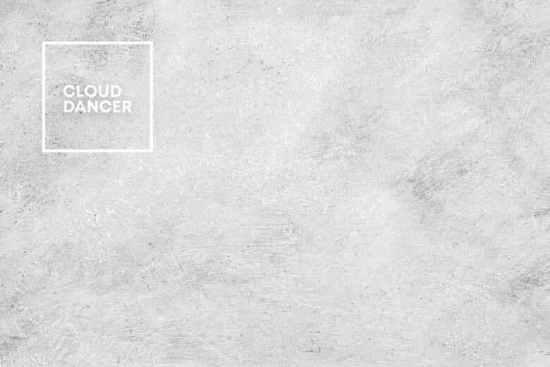
This color is your new neutral best friend. Balanced between beige and light gray, this creamy tone is perfect for the walls of your at-home sanctuary or that minimalist design project you’re working on. Peaceful and clean, this hue lines up nicely next to the bluish tone of the year, much as the perfect cloud might hang in an evening sky.
4. Fuchsia Pink (#15-2718)
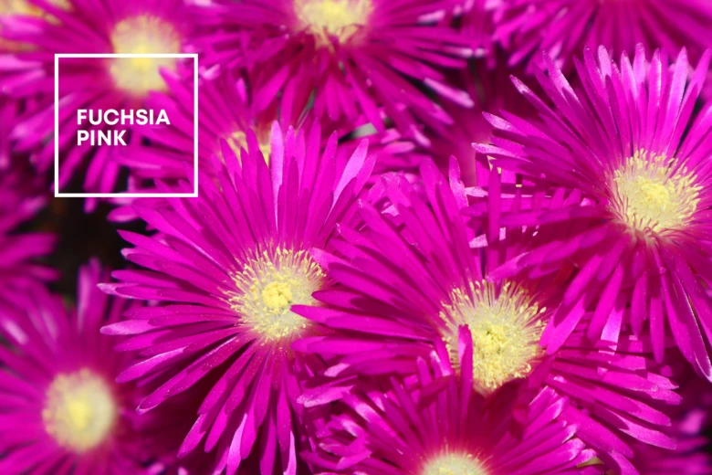
A tone that brings to mind Barbie and bubblegum, fuchsia is full of life and fun. This playful tone blends well with the color of the year because they reflect the joy and joie de vivre in one another. This color has already been on the runways so you may see it make a comeback in fashion this year. Is it time to break out that Y2K pink velour tracksuit? Time will tell.
5. Tourmaline (#16-4411)
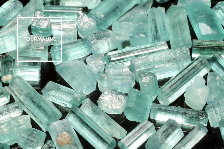
This muted teal earns its personality by getting dialed back with a grayish undertone. When placed beside the vibrant Pantone color of the year, this hue looks more playful, but it can be dressed down when paired with neutrals. The takeaway? This color is perfect for understated design projects and attention-grabbing ones alike.
What are the Trending Colors for 2022?
Pantone looks at a number of industries and trends before settling on their color of the year and complementary tones, so what are some of the trending colors that the design and fashion worlds will favor this year? Here’s a quick guide to some of the top hues for 2022. For more resources on colors and so much more, be sure to check out Picsart Quick Tools.
1. Muted Earth Tones and Comforting Neutrals
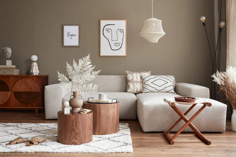
After the hard times of the last few years and in light of the hopeful ones to come, we all need a little calm. Plus, no matter what society is going through, we all need neutral hues for our wall paint, design projects, and wardrobes. Earth tones and neutrals like the clay, grass, and sky tones described above never go out of style, so don’t hold back. Whether you’re planning on renovating your wardrobe or your living room, count on neutrals and muted earth tones.
2. Vibrant Vibes
The last few years have been hard, and even if we will never go back to the reality that we knew before the pandemic, we’re all ready to experience more joy in our lives. The Pantone color this year represents this need, but so do the colors that complement it and have been seen on the runways. Bright greens, blues, and yellows are here to stay in 2022, so lean in to this vibrant trend.
3. The Blues
We all have the blues from time to time, and even the Pantone institute recognizes that. They created a color that would cover wherever our moods led us, from pensiveness to vibrance. This season, whatever kind of blues you have are in style, from dreamy cerulean tones to primary blue to the color of the year. If you are planning on designing with blue, follow your instincts. You’ll be in style.
4. Golden Warmth
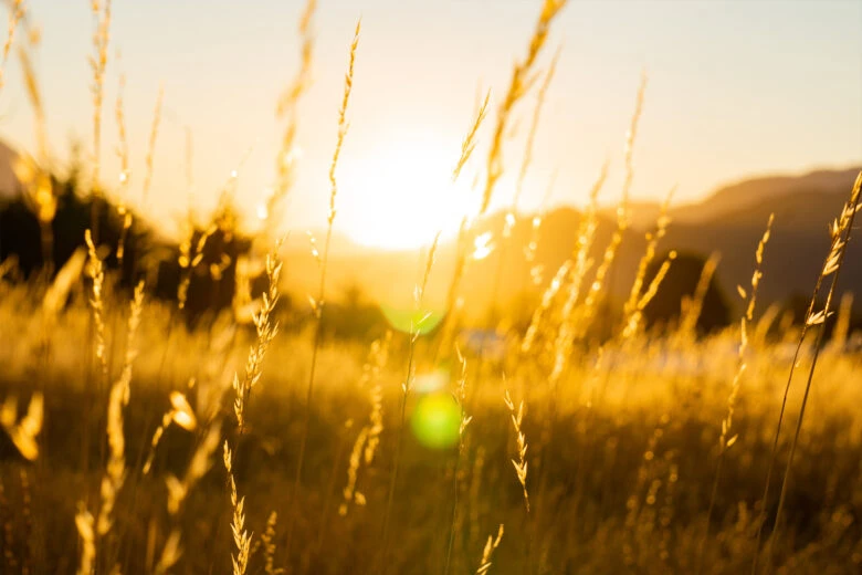
Who doesn’t need a touch of warmth in their lives right now? The fashion and design industries seem to recognize this because trending colors like canary, caramel, and bright yellow are everywhere. Infuse your space, wardrobe, and project with sunny tones.
5. In the Pink
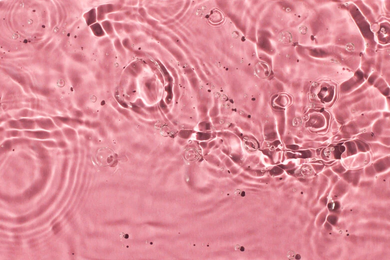
“In the pink” refers to optimal health and wellness, which is definitely a theme for this year, both in color and in general. That said, pinks are making a huge comeback. Arguably the most fun color on the spectrum, this hue is endlessly pairable, and the Pantone institute agrees. Their curated palates include several versions of pink, from creamy pastels to brighter tones.
The fashion industry is particularly into hot pink and bubblegum hues, so jump on the trend and stay up-to-date. And, if you need a new business card that screams 2022, this – or any of the other trending colors we’ve covered – might just be the way to go.
Create at the Speed of Culture
Picsart is a full ecosystem of free-to-use content, powerful tools, and creator inspiration. With a billion downloads and more than 150 million monthly active creators, Picsart is the world’s largest creative platform. Picsart has collaborated with major artists and brands like BLACKPINK, Taylor Swift, the Jonas Brothers, Lizzo, Ariana Grande, Jennifer Lopez, One Direction, Sanrio: Hello Kitty, Warner Bros. Entertainment, iHeartMedia, Condé Nast, and more. Download the app or start editing on web today to enhance your photos and videos with thousands of quick and easy editing tools, trendy filters, fun stickers, and brilliant backgrounds. Unleash your creativity and upgrade to Gold for premium perks!


