Contents
The below is a guest post from our friends at Monotype, they supply a lot of the really amazing fonts available on our platform.
————————–
Like in the world of fashion, trends in typography and graphic design move at lightning speed. The internet and social media, as well as growing access to design tools like Picsart, have enabled anyone to contribute to the vast ocean of design, with new snapshots of creativity being added to the cloud at an astounding rate. While curating this year’s type trends report at Monotype, we saw a return to playfulness with the Superhero trend. We also saw the continued expression of diversity and inclusion with the Match Maker trend and motion and 3D blurring the boundaries of graphic design.
“Type is a gateway to an entire conversation around technology and today’s trends,” said report curator and Monotype creative type director, Terrance Weinzierl, “This report is an educational collection of work that fascinates and excites us and, most importantly, represents a ripple coursing through the ocean of design.” The 2023 Monotype Type Trends report serves as an opportunity for reflection and projection, celebrating incredible global typography. In need of some inspiration for your next project? Let’s dive in.
10 type trends for 2023
1. Match Maker
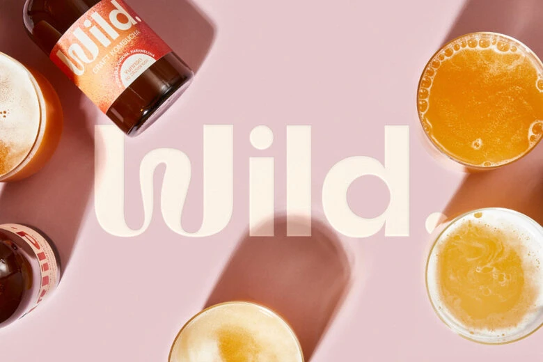
Match Maker is a trend about pairing different typefaces based on principles of diversity and inclusion, resulting in dynamic visual communication. This trend has various branches, including Mix-Up, Loopy, and Subtle, each with unique characteristics and applications. Match Maker reflects the values of this generation and encourages experimentation and creativity in typography.
2. Smart Grid
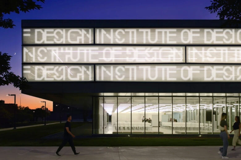
Smart Grid blends art and science, utilizing grid structures with quarter or half circles to disrupt the pattern. It follows the NASA “worm” logo tradition and unites art, science, and technology brands.
3. Superhero
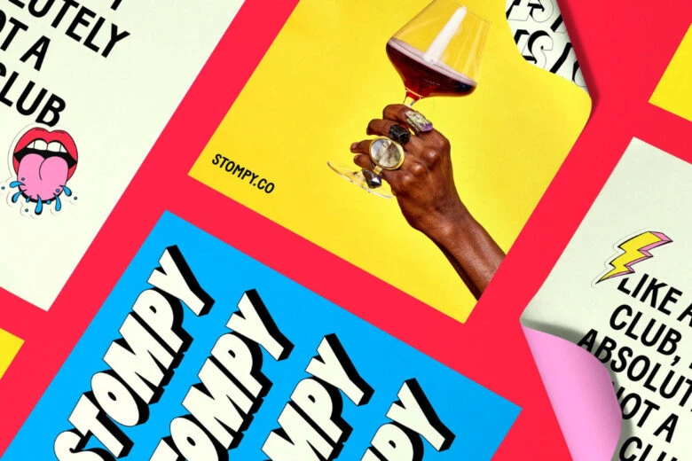
Superhero, one of our favorite trends this year, features outlined or shadowed forms that are often tilted, skewed, or curved into perspective. It has a playful comic book vibe and is explosive in form and color and may be inspired by the popularity of superhero movies today. Think big, bold, and fun, with lots of exclamation points. Two prime examples are the branding for Stompy wine subscription pictured here, and Forward Majority’s political action committee. We discuss both projects in our recent Type Trends podcast episode; listen to it here for more details.
4. Super Sober
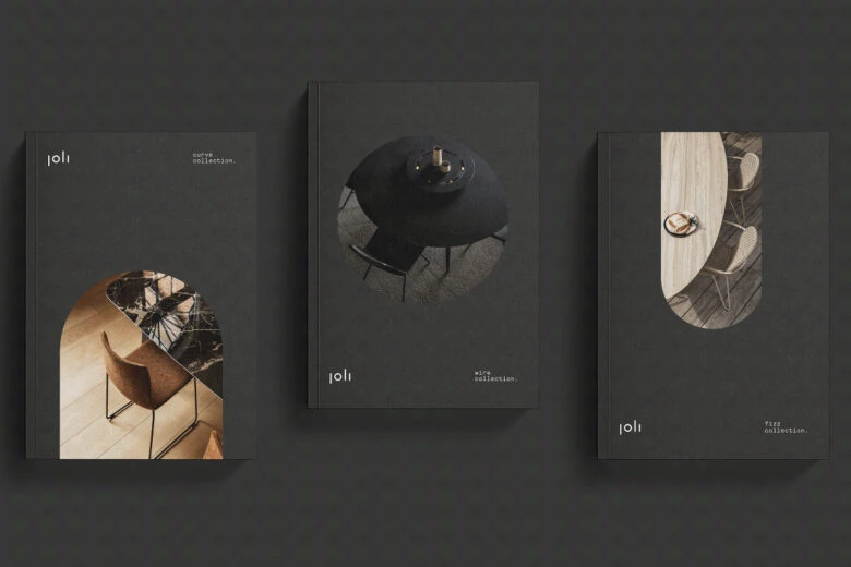
Super Sober is the opposite of Superhero, showing up with graphic austerity, simplicity, and centeredness, often featuring muted color palettes and generous white space. It provides a quiet and precise look, standing out in a noisy marketplace and creating a moment of peace. See the Joli furniture brand, which reflects precision and modernity with a calm and natural color palette.
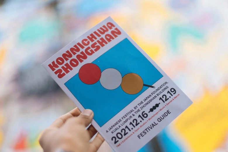
5. Making The Cut
Making The Cut involves cutting and removing pieces from letterforms to create sharp and edgy effects, often adding motion and visual interest. This trend includes a sub-trend highlighting use of decorative Ink Traps and a new trend called Hypertension, with sharp, flat, and diagonal forms that create visual tension. Examples include the logo for The Verge and type treatments for Konnichiwa Zhongshan (pictured above).
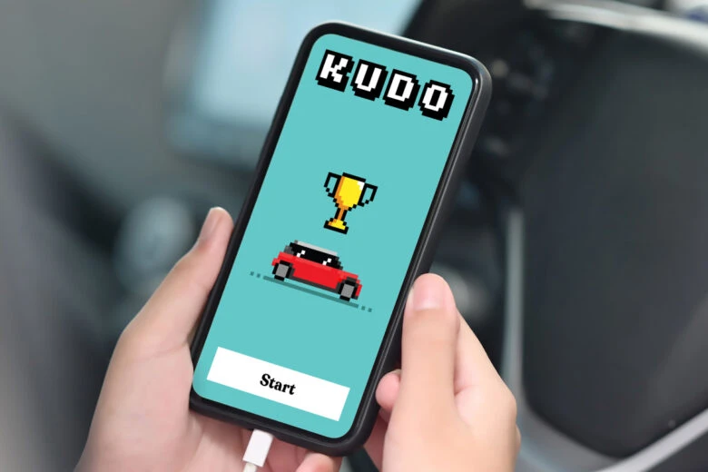
6. Pixel Play
Pixel Play is a trend that combines nostalgia with digital tools, using pixel forms to add interest and show authenticity or homage to early digital experiences. Marks can include vintage video game motifs and beautiful glitches, as seen in the branding for Kudo by NB Studio in the UK. The crude restriction of pixels can force creativity and increase sophistication.
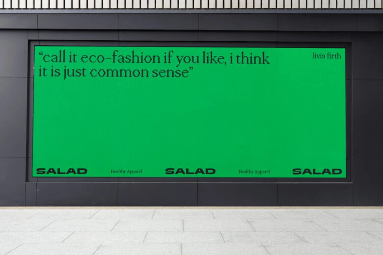
7. Flux
Flux focuses on movement in design, including animation and variable fonts. Screens allow and encourage movement, and today even static images can look like they’re in motion. This trend includes extended typefaces that convey a sense of movement and speed, often used for luxury brands. Examples include the Aerial typeface for drones and the elegant wordmark for Salad.
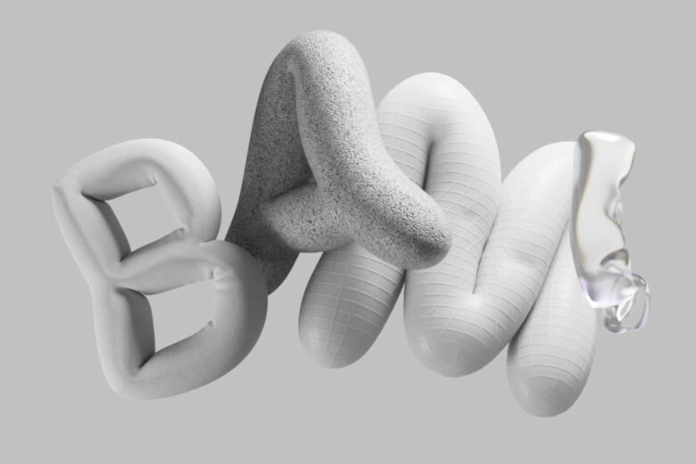
8. Volume Up
Volume Up is a trend that blurs the boundaries between graphic design, motion, and 3D modeling. It emphasizes motion and suggests movement using exuberant expressions of dynamic design, lavish textures, and lighting. Read the full report to learn about this trend’s different variations, including Illusion, Twisted, and Inflated, which have their own unique features and applications.
9. Liquify
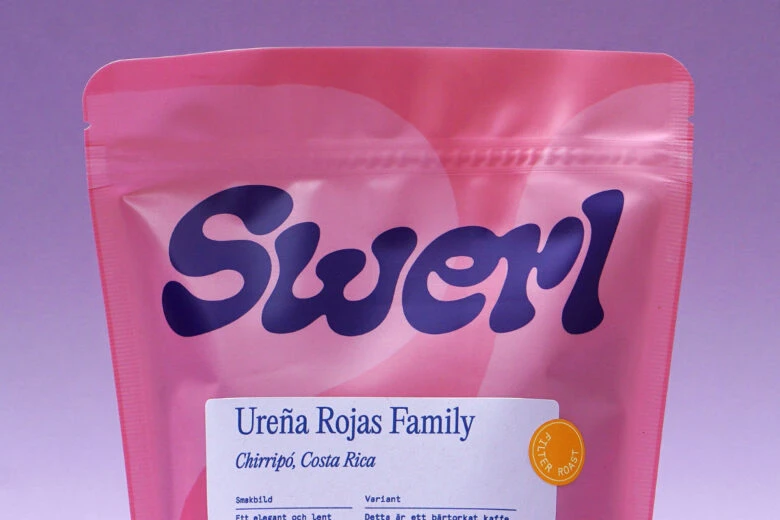
Liquify is all about organic and rounded forms, often showing up via custom lettering that looks like it’s melting or liquified. Legibility and readability are not a priority in this trend, and there is a move towards hand-finished designs using traditional art-making tools like paint and markers for authenticity and novelty. This trend can be seen in everything from food packaging to real estate branding.
10. AI Painting
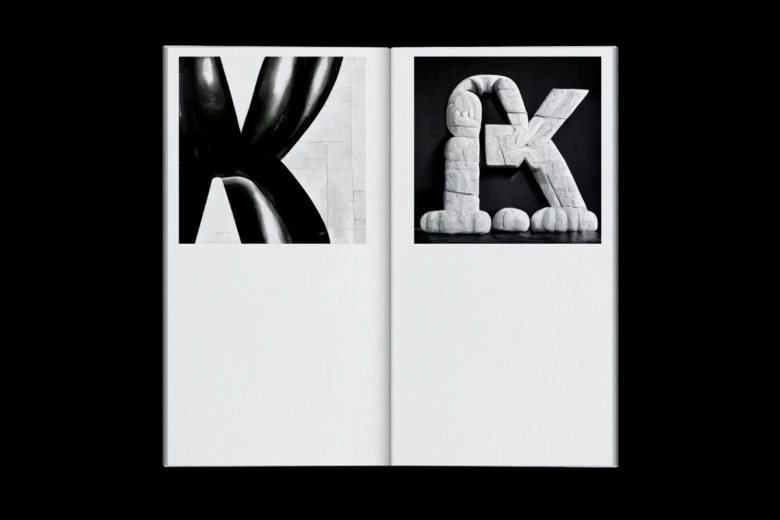
AI design tools are rapidly evolving and will change the art and design world. These fonts are a space to watch, with collaged and sometimes bizarre appearances. Andrea A. Trabucco-Campos and Martín Azambuja’s book Artificial Typography explores AI’s ability to imagine alphabets by famous artists, architects, and designers. However, the question remains, will AI provide us with more productivity and speed than we can handle?
As creatives, we can never take our finger off the pulse of our community. We trust our instincts and powers of observation to see what’s happening and what’s poised to be the next big thing. Through that lens, we can create unique and valuable work that tells a story and conveys a viewpoint, whether for a specific project, brand, or for ourselves. It’s through that work that trends appear and evolve in the first place – a long thread of creative thinkers experiencing and interpreting the world around them before making it their own.
Become a #TypeTrends2023 curator
We invite you to reach out to us where much of this report all started: on social media. Let us know what you think of this year’s report. Did we miss any significant trends? Is there a micro-trend in your city that you find interesting? Send it to us. Use the hashtag #TypeTrends2023 to tag us.


