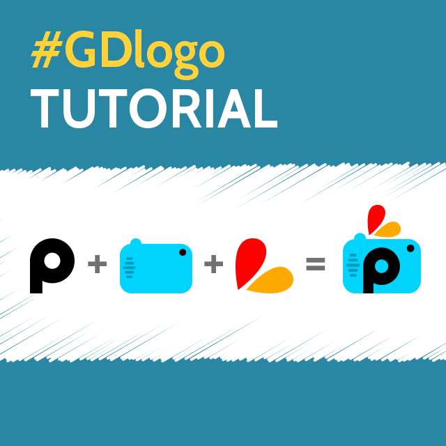
In light of this week’s Graphic Design Contest on logos, we have prepared a brief tutorial with some links to inform users on the creative process of logo design.
A logo by nature is simple, but the process of designing a good one can be a little more complicated. If you want your logo to really pop, follow our 4 easy steps to help you along the way.
Before you start you must understand the 5 principles of a great logo. A great logo should be:
- Simple: A simple logo is easily recognizable.
- Unique/Memorable: Whatever style you choose, your logo should stand out from the rest.
- Versatile: Your logo should be able to work in a diverse array of mediums. Good tests are if your logo retains its identity across very small or large sizes, or if it works in only one color.
- Appropriate: Your logo should suite its intended purpose.
- Timeless: Your logo should be as relevant today as it will be 30 years from now.
With this in mind, here are 4 easy steps to help you design your own sleek and professional logo.
Step 1: What is your logo for?
Are you a band of musicians, a law firm, a snack-food company, or a charity cause? This will help you decide what is or is not appropriate for your brand name and logo design. A law firm is a serious business that requires and equally serious logo to inspire confidence in clients, where as a band that plays music is more about being fun and unique.
Step 2: Choosing a Brand Name
A brand name should tell your audience who you are in as few words as possible. A simple name is easier to remember. Stay simple, memorable, and say something about who you are.
Step 3: Sketching Your Logo
Your logo should involve some sort of combination of images and letters. Sketch out a lot of samples until you find the look that’s just right for you.
Letters
For the brand name you can either draw your letters out by hand using PicsArt drawing tools, or choose from PicsArt’s extensive library of fonts. Open a blank page in drawing section of PicsArt and sketch your letters using various fonts until you find the perfect shape and letter type to fit your purpose. PicsArt’s text options allow you to rotate, stretch, and contort your text in any shape. Don’t be afraid to substitute letters with your own personal artwork or clipart.
Image
Whether or not your image is separate from or incorporated into your brand name, less is more. PicsArt offers a diverse toolbox of drawing tools. Choose between various useful shapes to keep the geometry of your logo clean and precise.
Whatever you do, keep your image simple and really take advantage of this opportunity to stand out and be unique. Be sure your image is appropriate to the purpose you chose in step one, and make sure that it matches your font in style, color, and in the message it conveys.
Step 4: Test Your Logo
Once you’ve chosen your logo, put it to the test and review how it holds up against the 5 principles of a great logo outlined above. If you are happy with the final product, tag it with #GDlogo and enter it into this week’s GD contest.


