The Trend Taking Over Reels and TikTok
If you’ve been on Instagram or TikTok recently, you’ve seen it: creators splitting themselves into multiple characters, each one representing a different creative pressure. Bold serif text across the screen. Cutout figures with dotted outlines. Styled color overlays giving each persona a distinct mood.
It’s called the “Creative Crises” trend, and it’s one of the hottest formats in content right now. Adobe’s version – a paid partnership with creator Julia Kong – pulled 17.7K likes in weeks. The reel shows Julia as multiple characters navigating the tension of using AI “to speed up” creative work, while admitting it “still feels intimidating.”
The format works because it’s honest. Creators aren’t defending AI or rejecting it. They’re showing the actual mess – the internal debate, the creative pressure, the question of where AI fits in their process.
And the visual style is just as strong as the message. Here’s how it breaks down.
What Makes the “Creative Crises” Format Work
The trend has three signature visual elements that make it instantly recognizable:
- Multiple versions of the same person. The creator plays several roles – the anxious one, the confident one, the one rushing to meet a deadline, the one questioning everything. Each character represents a different creative emotion or pressure. They appear together in the same frame, like different voices in one conversation.
- Cutout effects with visible selection outlines. Figures are cut out from their background with a dotted or dashed border – like you literally selected them in an editor and pasted them into the scene. The cutout look is deliberate. It’s part of the aesthetic.
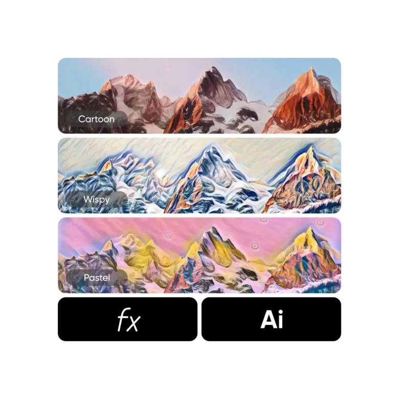
3. Bold text overlays. Short, punchy phrases layered directly on the image. Not in the caption – on the visual itself. Serif or display fonts, warm tones (coral, red, cream), positioned prominently. The text carries the emotional weight: “Creative Crises,” “to speed up,” “which still feels intimidating.”
How to Recreate the “Creative Crises” Look in Picsart
Step 1: Create Your Cutout Characters
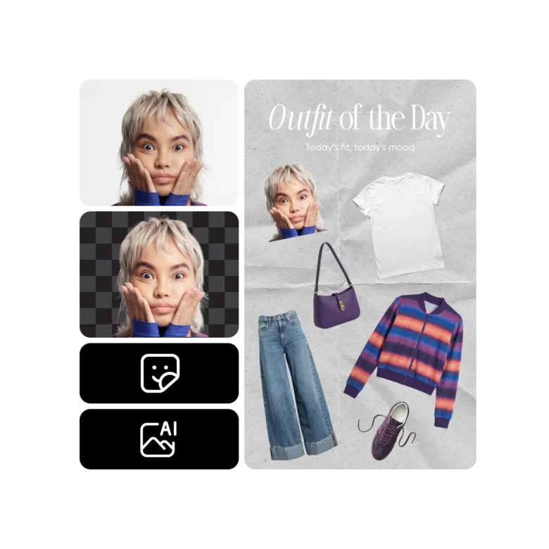
Take several photos of yourself in different poses, outfits, or expressions – each one representing a different creative mood. Upload each photo to Picsart and use the Background Remover to isolate yourself from the background. The AI handles edges, hair, and clothing automatically.
To get the signature dotted outline, add a stroke or border around your cutout in the editor. White or colored – your choice. This is what gives the “pasted-in” look.
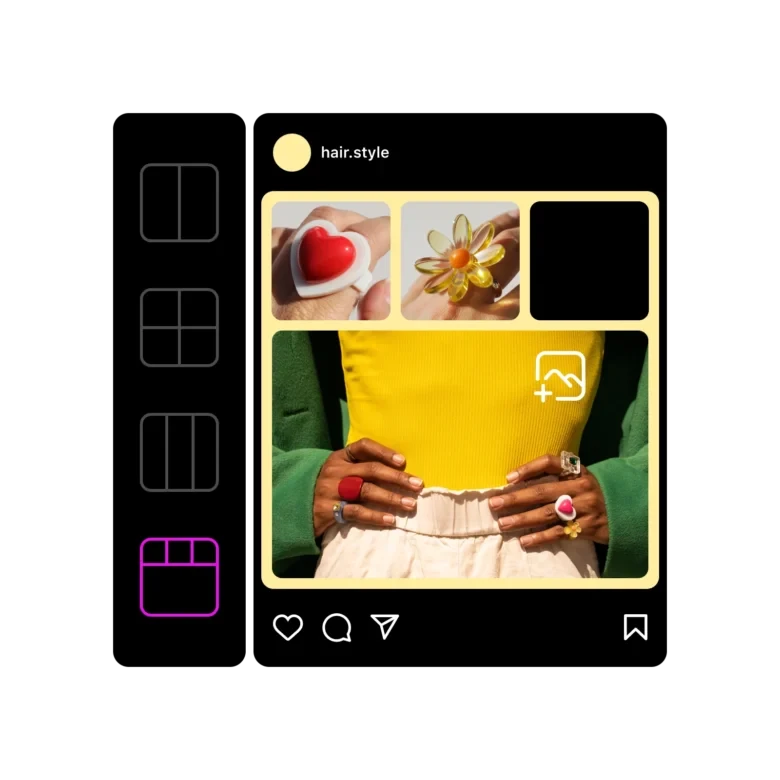
Step 2: Layer Multiple Personas in One Frame
Open a blank canvas in the Photo Editor and start layering your cutouts. Position each version of yourself in the frame – one on the left looking anxious, one in the center holding a script, one on the right looking confident. Resize and adjust until the composition feels like a scene, not just a collage.
Step 3: Apply Color Overlays for Each Persona
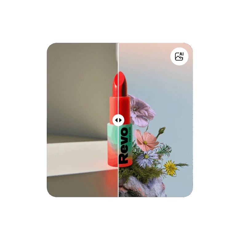
In the original trend, different characters have distinct color treatments – a red/orange wash on one, natural tones on another. This visual cue separates the personas even when they’re in the same frame.
Use Photo Effects to apply a color filter to individual cutouts before placing them. Warm red for tension, cool blue for calm, desaturated for doubt. Each persona gets its own mood.
Step 4: Add the Text
The text is what makes the trend hit. Use Add Text in the editor to place your phrases directly on the image. Choose a serif or display font for that editorial feel. Warm tones (coral, red, cream) work best against neutral or dark backgrounds.
Keep the phrases short. One to four words. The text should feel like a label on each persona, not a paragraph.
Step 5: Turn It into a Reel
The static scenes are the building blocks. Bring them into Picsart’s Video Editor to sequence them as a reel. Time your text reveals to the beat. Use Add Music to set the mood – something introspective, not upbeat. Export in 9:16 for Instagram and TikTok.
Why This Trend Matters Beyond the Aesthetic
The “Creative Crises” format isn’t just a visual trend. It’s a conversation – and it’s the conversation happening in every creative community right now.
Creators are openly working through the tension of AI entering their workflow. Not defensively. Not with hype. Just honestly. “I use AI to speed up – but it still feels intimidating.” That admission is what makes the content resonate. It’s relatable because it’s true.
The data backs this up. Adobe’s version with Julia Kong got strong engagement – 17.7K likes, solid reach. But Picsart’s “AI took the day off” reel – which celebrated human creativity – hit 5.9 million views. The audience is telling us something: they want honesty about AI, and they love content that puts human creativity first.
You’re Already Using AI. You Just Don’t Call It That.
Here’s the thing most people miss in the AI debate: the tools you already use are AI-powered. When you remove a background in one click – that’s AI. When your phone sharpens a portrait automatically – that’s AI. When an editor suggests a crop or upscales a low-resolution image – all AI.
These features arrived quietly. Nobody called the background remover controversial. Nobody said auto-enhance was “replacing” photographers. It was just a faster way to do something tedious.
The real question isn’t whether to use AI. It’s knowing where AI fits in your process and where it doesn’t.
Use AI for execution: removing backgrounds, enhancing quality, resizing for platforms, generating variations to choose from. These are production tasks.
Keep the creative decisions yours: the composition, the color choice, the mood, the message. The things that make your work yours. AI can’t taste. It can’t decide that breaking a rule makes the work better. That’s still you.