
Bold fonts pack a visual punch. They’re the heavyweight champions of typography, commanding attention and driving home key messages with unparalleled force. For designers and creatives alike, understanding how to harness the power of bold fonts can elevate projects from ordinary to extraordinary.
In this comprehensive guide, we’ll explore the world of bold typefaces, from free options to heavy and minimalist bold fonts and everything in between. We’ll uncover how to select the ideal bold typeface for various applications, examine the crucial factors influencing font choice, and provide concrete examples of standout bold fonts. Let’s dive into the art of mastering bold typography and unlock its potential for your designs.
The power and purpose of bold fonts in design
Bold fonts serve as visual anchors in design, acting as focal points that guide the viewer’s eye and emphasize crucial information. They’re not merely about increasing text thickness; they’re about creating contrast, establishing hierarchy, and infusing personality into your designs.
Consider the impact of a bold headline on a poster or how a bold product name stands out on the packaging. These are intentional design choices that leverage the psychological impact of bold typography. Research has shown that bold text can enhance reading speed and comprehension, making it an invaluable tool for conveying important messages efficiently and effectively.
Key factors in selecting the best bold fonts
Readability: The foundation of effective typography
Readability is paramount when choosing bold fonts. A bold typeface that sacrifices legibility for style ultimately defeats its purpose. When evaluating bold fonts, consider these factors:
- Character distinction: Ensure letters like ‘O’ and ‘Q’ or ‘I’ and ‘l’ are easily distinguishable.
- X-height: A generous x-height (the height of lowercase letters) often enhances readability in bold fonts.
- Counter spaces: Look for open counter spaces (the enclosed areas in letters like ‘e’ and ‘a’) to maintain clarity at smaller sizes.
For example, the bold version of Helvetica maintains excellent readability due to its clear letterforms and open counters, making it a perennial favorite among designers.
Visual appeal: Striking the right aesthetic chord
The visual appeal of a bold font extends beyond mere attractiveness; it’s about how well the font aligns with your design’s overall aesthetic and communicative goals. Consider these aspects:
- Style consistency: Ensure the bold font complements other design elements and typefaces in your project.
- Emotional resonance: Different bold fonts evoke different emotions. A serif bold might convey tradition, while a sans-serif bold could suggest modernity.
- Brand alignment: Choose bold fonts that reinforce your brand’s personality and values.
For instance, the bold variant of Futura exudes a sense of progress and efficiency, making it an excellent choice for tech-oriented or forward-thinking brands.
Versatility: Adapting across mediums and sizes
The best bold fonts maintain their impact and legibility across various applications and sizes. When selecting a bold font, test it in different contexts:
- Screen rendering: Ensure the font remains crisp on different screen resolutions and sizes.
- Print quality: Check how the font appears in print, especially in smaller sizes or on different paper types.
- Scaling: A truly versatile bold font should look good when scaled up for headlines and down for body text.
Roboto Bold, for example, performs admirably across digital and print mediums, making it a go-to choice for designers seeking versatility.
Bold fonts for various goals
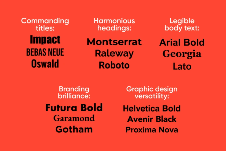
Commanding titles: Bold fonts that demand attention
When it comes to titles, you need bold fonts that can carry the weight of your message. Here are some top contenders:
- Impact: A classic choice, Impact’s condensed letterforms make it perfect for headlines that need to pack a punch in limited space.
- Bebas Neue: This free font offers a modern, minimalist take on Impact’s style, with clean lines and excellent readability.
- Oswald: A versatile sans-serif that works well for both digital and print titles, offering a range of weights for flexible design.
Pro tip: When using these fonts for titles, experiment with letter spacing (tracking) to fine-tune their impact and readability.
Harmonious headings: Bold fonts that create a clear hierarchy
Headings require a delicate balance between boldness and integration with body text. Consider these options:
- Montserrat Bold: Its geometric sans-serif design offers a modern look while maintaining excellent readability.
- Raleway Bold: With its unique ‘W’, Raleway adds character to headings without overwhelming the design.
- Roboto Bold: Google’s Roboto offers a neutral yet assertive presence, perfect for clear and professional headings.
Remember, consistency in heading styles across your design helps create a cohesive visual hierarchy.
Legible body text: Bold fonts that enhance without overwhelming
For body text, bold fonts should provide emphasis without disrupting the reading flow. These fonts excel in this role:
- Arial Bold: A web-safe font that offers clarity and simplicity, ideal for digital body text.
- Georgia Bold: This serif font maintains legibility in its bold form, adding a touch of sophistication to body text.
- Lato Bold: With its balanced letterforms, Lato Bold provides emphasis without overpowering surrounding text.
When using bold for body text, use it sparingly to maintain its effectiveness as a tool for emphasis.
Branding brilliance: Bold fonts that convey brand identity
Your choice of bold font can significantly influence brand perception. Consider these options for branding and marketing:
- Futura Bold: Its geometric forms convey modernity and efficiency, which is ideal for tech- or design-focused brands.
- Garamond Bold: This classic serif adds a touch of elegance and tradition, perfect for luxury or academic brands.
- Gotham Bold: Known for its use in Obama’s campaign, Gotham Bold conveys trustworthiness and approachability.
When choosing a bold font for branding, consider how it will appear across all brand touchpoints, from business cards to billboards.
Graphic design versatility: Bold fonts that adapt to any project
Graphic designers need bold fonts that can wear many hats. These fonts offer the flexibility required for diverse projects:
- Helvetica Bold: A true chameleon, Helvetica Bold works in almost any design context.
- Avenir Black: Offers a perfect blend of modernism and readability, suitable for both print and digital designs.
- Proxima Nova Bold: With its balanced geometric forms, it’s a favorite for web and app design.
These versatile fonts shine in various applications, from logo design to infographics and everything in between.
Exploring and implementing bold fonts in your designs
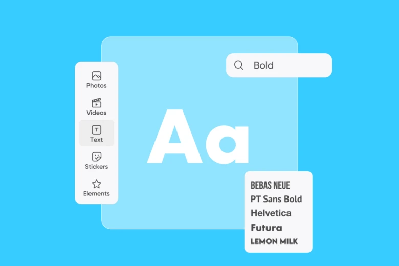
Now that we’ve covered the best bold fonts for different purposes, it’s time to put this knowledge into practice. Experimenting with different bold fonts is key to finding the perfect match for your project. Fortunately, Picsart’s all-in-one editor offers most of these bold fonts. To experiment with them and create visual content simultaneously, head to the Picsart Text Editor to get started.
- Use the Text button on the left sidebar to select a text box.
- Once you select a style, you’ll see a toolbar appear on the top with a font dropdown menu.
- Use the dropdown menu to search for the desired font.
Want a more detailed preview of how the font will look next to your product image?
- Use the Uploads button on the left sidebar to upload a photo.
- Drag the image around in the editor interface to find the right placement.
- Play around with the layers on the right side of the screen to bring either the text or the image forward.
Explore the rest of Picsart’s online toolset to create quick drafts of ads or flyers and get a better sense of how each font looks with your projects.
Alternatively, if you want something quick for a social media bio or post, make sure to try out the Quicktools Bold Text Generator which offers a vast array of bold fonts to explore.
Conclusion
Mastering the use of bold fonts can transform your design approach. From creating impactful headlines to enhancing readability and conveying brand personality, bold typography is a powerful tool in any designer’s arsenal. By considering factors like readability, visual appeal, and versatility, and by exploring the best bold fonts for different applications, you can elevate your designs to new heights.
Remember, the key to successful bold font usage lies in balance and purpose. Use bold fonts strategically to guide the viewer’s eye, emphasize important information, and create a clear visual hierarchy. With practice and experimentation, you’ll develop an intuitive sense for when and how to deploy bold fonts for maximum impact.
So go ahead and be bold in your typographic choices. Your designs—and your audience—will thank you for it.


