From impacting our mood to influencing how we think about an idea, color influences more than many of us realize. Research even shows that people form between 62 and 90% of their initial impression of a product based on colors alone.
By choosing the best color combinations, you can capture the attention and hearts of your audience. You could boost engagement, conversions, and even sales by creating a more cohesive and compelling image.
In this guide, we explore how you can find the best color combinations for websites, social media, and more! We also look at tools that help you save time and find better pairings.
Understanding color theory
Color theory involves looking at what happens to our emotions and perceptions when colors are paired together in different contexts.
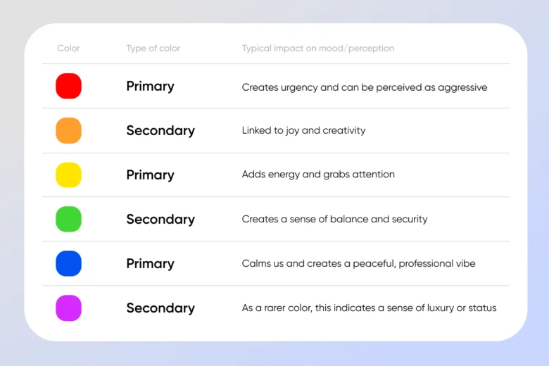
It begins by looking at the color wheel and understanding the impact that each color has on us. This includes the fundamental primary colors, secondary colors (which are created by mixing primary colors), and tertiary colors (which are created using a primary and secondary color).
Take a look at the table below to get an idea about how primary and secondary colors affect us. However, bear in mind that results can change slightly based on the context of where you use particular colors:

Color harmony looks at how these colors, plus tertiary colors, can be combined. There are a few main ways this can work:
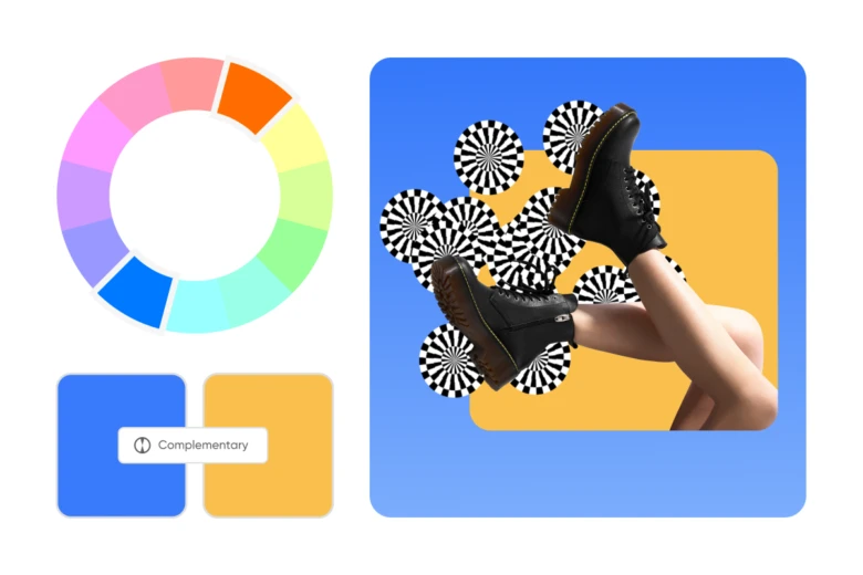
- Complementary combinations: Colors that sit opposite to each other on the color wheel — for example, blue and orange.
- Analogous combinations: Colors that sit next to each other on the color wheel — for example, blue and green.
- Monochromatic combinations. Varying shades of a single color — for example, turquoise, aqua, and teal.
- Triadic combinations: Three colors that are evenly spaced around the color wheel to form a triangle — for example, blue, yellow, and red.
- Tetradic combinations. Four colors that are evenly spaced around the color wheel to form a rectangle — for example, blue, orange, green, and red-violet.
- Warm and cool combinations: Pairing colors from the warm side of the spectrum (red, orange, and yellow) with the cool (blue, green, purple).
- Accented combinations: Introducing a single color that stands out against a pair of complementary colors.
3 best color combinations for different contexts in 2024
Here we look at how you can use different color combinations to influence mood and perception in different contexts.
Best color combinations for websites
The colors you use on your website have a powerful impact on user experience. But this goes beyond facilitating an enjoyable reading experience. Depending on how you make your audience feel, you can push them towards specific goals.
Here are some examples of how you can choose color combinations based on the type of website you have and its main goal:
- For an e-commerce site looking to make conversions: Aim to balance calming colors that convey a sense of professionalism (such as green or blue) with complementary colors that create urgency (such as red or orange).
- For a portfolio that aims to improve engagement: Choose a bright color that indicates creativity (such as yellow or orange) for accents that help your website stand out.
- For a brand-led site focusing on warming up leads: build trust with reassuring colors such as blue and green as well as using your brand colors (more on how to select these in the next section).
How to choose color combinations for your brand
When finding your brand colors, it’s important to reflect on your company’s values, personality, and mission and find color combinations that complement this. Consider which colors will resonate with your target audience and which colors your competitors use.

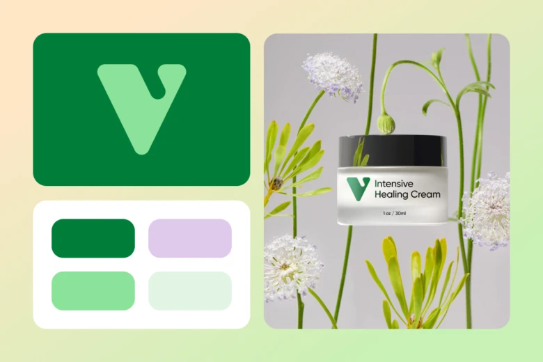
You’ll want to stand out, but there may be some standard colors that work well in your industry and with your website visitors. For example, one study found that pharmaceutical companies often use the color green to convey vitality and health.
Best color combinations for clothes
Clothes are a great example of how color can influence our impressions of a physical product. Different colors complement different skin tones and varying combinations of colors can create distinct aesthetics. For example, these classic and trending color combinations all create their own impression:
- Navy and white. You can use navy to act as an accent, adding richness and depth that exudes timeless sophistication.
- Burgundy and mustard. Using these recently trending complementary colors brings warmth and energy to an outfit.
- Peach and coral. Using two similar shades such as these creates an outfit that blends together seamlessly and appears youthful.
To create a balanced color palette in your wardrobe, you should select a few key complementary colors that match your skin tone. First, read about which colors suit different types of skin and then use a color wheel tool to find complementary colors based on one main, base color (more on this later).
Best color combinations for social media
When taking a look at your social media strategy, it’s a great idea to carefully consider which colors you are using. You should think about:
- Including your brand colors to create a cohesive experience across your website and profiles.
- Adding bright complementary color combinations when you want a post to stand out.
- Bringing in slightly different variations on your main colors to reflect different seasons. For example, if you typically use a bright yellow and blue color scheme, you might transition to pastel colors during spring.
What are the best color combinations?
Ready to discover which colors work well together in any context? Read on for the best two-color combinations and three-color combinations.

The best two-color combinations
Two-color combinations are a great way to simplify a design and create an impact on your audience. To select a two-color combination, pick a base color that sets the mood (you can use our table above for this) and then find a complementary or analogous color.
Complementary combinations such as red and green capture attention while analogous two-color combinations such as orange and yellow create a more harmonious look.
The best three-color combinations
Adding a third color into a color combination creates added visual interest and depth. A common way to do this is to use a dominant color, which sets the mood, alongside two accent colors.
For example, you might use a dominant color like navy blue, complemented by accent colors such as coral and gold. The navy provides a strong foundation and sets the overall tone, while the accent colors add pops of vibrancy.
You could also use triadic combinations where colors are evenly spaced around the color wheel to form a triangle. For example, orange, green, and purple work well to create a sense of warmth and creativity while still being grounded.
Tips and tools for choosing the best color combinations
To find the best color combinations, focus on:
- Considering accessibility. You should always make sure that the pairings you choose have sufficient contrast and are easy to read.
- Testing to optimize. Test your color combinations across various devices, channels, and lighting conditions to make sure they work well in different contexts.
- Staying on top of color trends. In 2024, for example, this includes using Pantone’s color of the year, Peach Fuzz, exploring neutral shades, and using deep blues and purples.
- Using an online color picker to find the perfect tone. Picsart allows you to find not only the right color for your project but exactly the right shade. You can then copy and paste the color code to use in the creator which sits inside the same platform.
- Using a color wheel to find complementary colors. Picsart makes it easy for you to choose pairings by allowing you to find complementary, monochromatic, analogous, triadic, and tetratic combinations in seconds.
That completes our guides to the best color combinations for a seamless design. We’d love to see your pairings… Tag us in your projects on social media and be sure to have fun as you experiment with our tools.


