Bright orange is a lively color that brings fun and vibrancy to any design. Below, you’ll find all the tips, tricks, and info you’ll ever need for making great things with it. Learn about complementary colors, the bright orange color code, and how to work with different orange shades and color palettes.
What is the Bright Orange Color Code?
Are you ready to brighten up your life? Try adding bright orange to your images and designs. It will not only make your images pop, but it might just make you feel happier, too.
Its HEX color code is #FFA500. In the RGB colorspace, bright orange is made of 100% red, 65% green, and 0% blue. If you’re working on a print project, then you will be working in the CMYK colorspace. For that, bright orange is 0% cyan, 35% magenta, 100% yellow, 0% black. On a technical level, it’s an orange color that hasn’t been shaded with black. It’s also a spectral color, meaning that it occurs as pure light. This is what makes it visible in a rainbow. Like all colors, bright orange has meaning beyond its technical characteristics, too.
Bright Orange Color Meaning
Bright orange is a bold and vibrant color that makes viewers think of happiness. That’s why it’s a high-energy color that represents warmth, excitement, and enthusiasm. Studies have also found that the color can trigger your appetite, so it’s a great one to use in designs and photography for restaurants, food blogs, and dinner party invitations.
Bright orange also represents confidence. It’s a color that is often associated with creativity, self-expression, emotional balance, and harmony. Due to orange’s position on the color wheel, you’ll find that it is an electric, energetic color, as it falls between red, which provides energy, and yellow, which provides joy.
Bright Orange Color Palette Ideas
If you’re just getting started with color theory and color pairing, then be sure to use the Color Wheel Tool to find color combinations. Below, we’ve pulled together some of our favorite bright orange color palette ideas to inspire you.
A monochromatic orange color palette is great for the fall.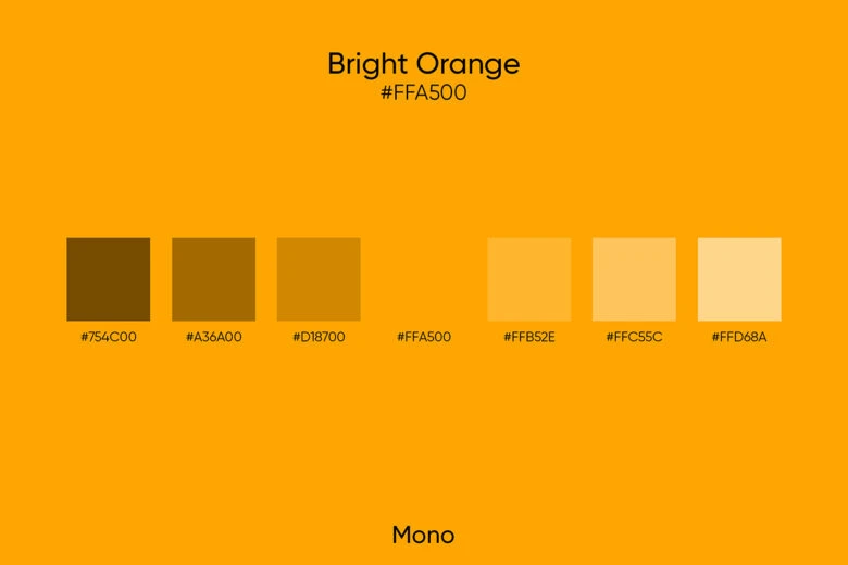
An analogous orange color palette might conjur images of a more tropical, bright setting.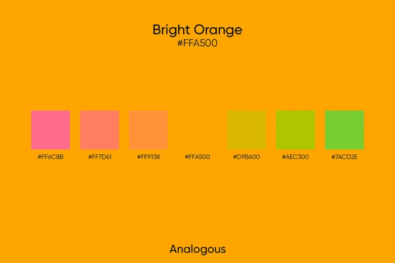
Bring in blues if you want to create a complementary orange color palette.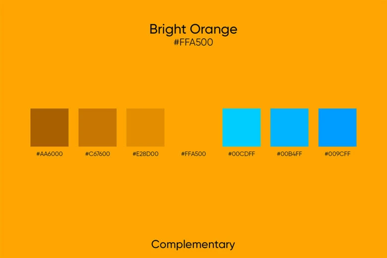
A triadic color palette is comprised of three colors evenly spaced on the color wheel.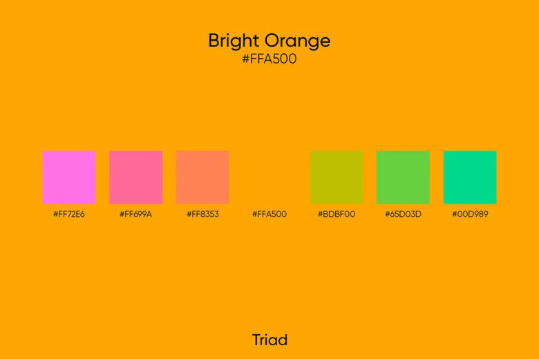
What Colors Work Well With Orange?
Because bright orange is such a strong color, it’s often used as an accent rather than the main attraction. But that doesn’t mean it can’t be. It’s so attention-grabbing, however, that using it as a focal point in your design can be overwhelming, depending on which shade you’re using. Here are some colors that you can incorporate to help complement it:
Complementary Colors
- Blue
- Navy
- Turquoise
- Azure
Similar Colors
- Dark Orange
- Amber
- Bright Yellow
- Tangerine
Analogous Colors
- Red
- Red-orange
- Orange
- Bright Orange-red
- Yellow
Accent Colors
- Brown
- White
- Purple
- Light Pink
- Lime Green
- Lilac
- Black
What Are the Different Shades of Orange?
We’re talking about a real show stopper here, but there are other shades of orange that can be the star, too. Let’s have a look at some of the best.
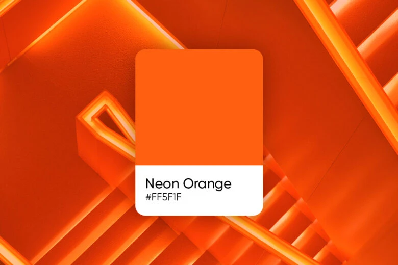
- Neon Orange (#FF5F1F)
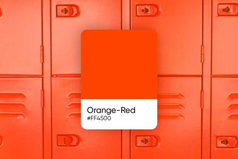
- Orange-red (#FF4500)
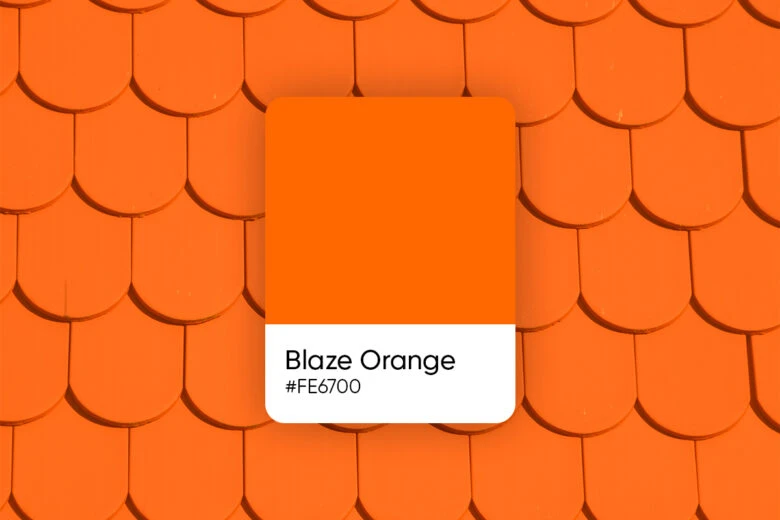
- Blaze Orange (#FE6700)
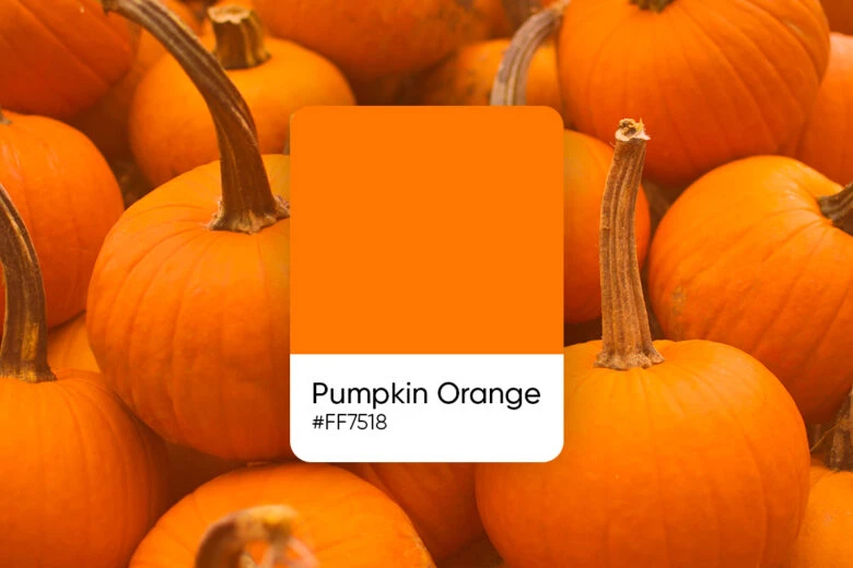
- Pumpkin Orange (#FF7518)
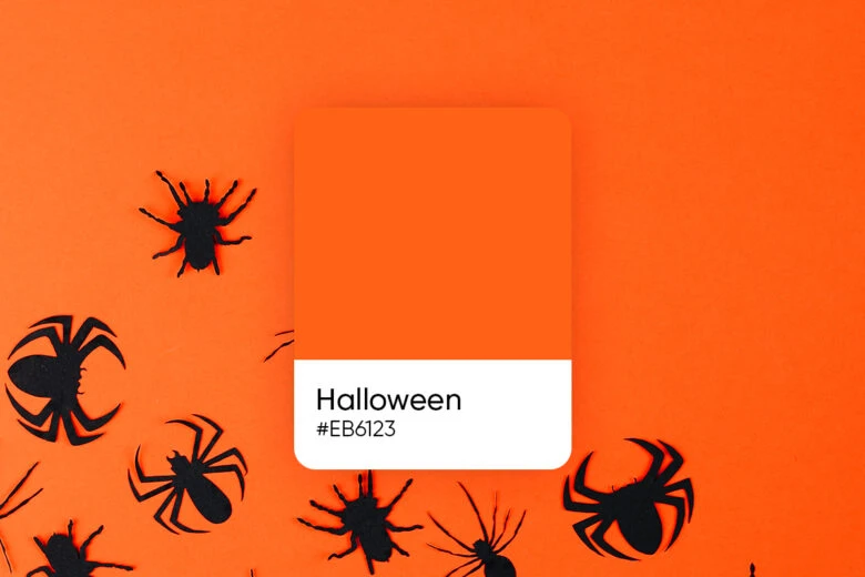
- Halloween Orange (#EB6123)
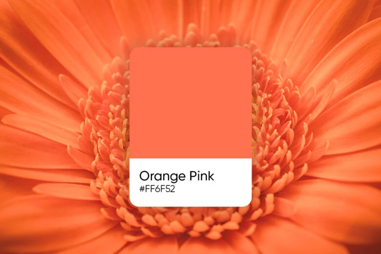
- Orange-pink (#FF6F52)
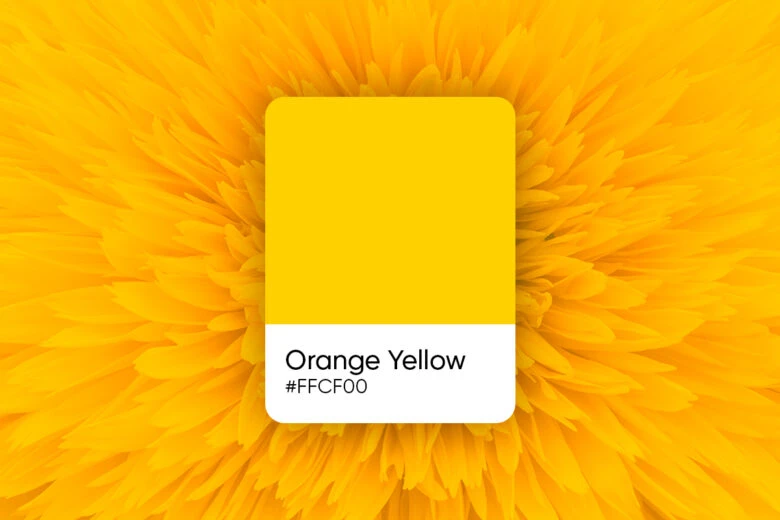
- Orange-yellow (#FFCF00)
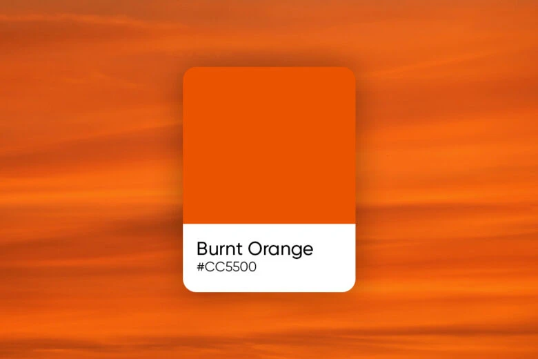
- Burnt Orange (#CC5500)
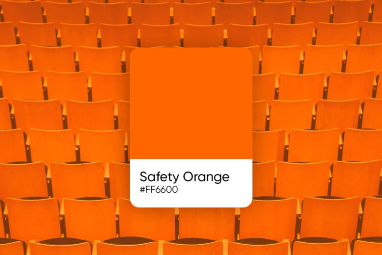
- Safety Orange (#FF6600)
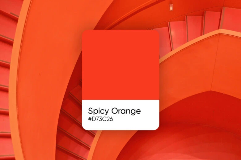
- Spicy Orange (#D73C26)
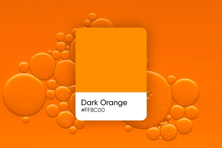
- Dark Orange (#FF8C00)
Create Fantastic Photos Using This Color
This is a fun color for artists and designers to incorporate into their work. It makes a bold statement, and you can easily add bright orange to your designs on Picsart by using the Color Picker tool in the editor. Just simply search for the color code, #FFA500 and you’ll be ready to start creating awesome designs and images.
Check out these incredible designs and images that incorporate bright orange, to get your creative juices flowing.
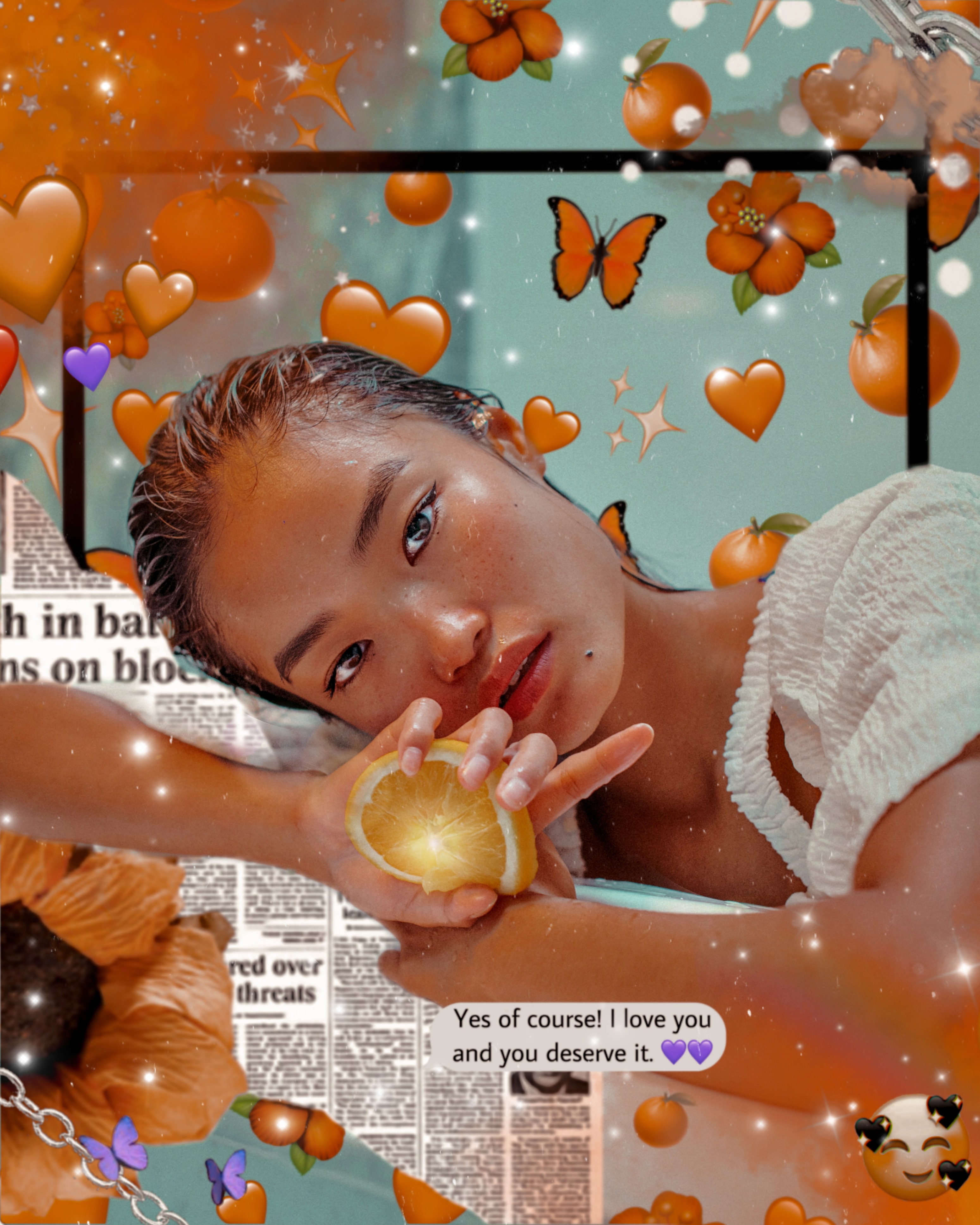
Start with a complimentary color like this cool blue for your background, and then layer in different orange elements using stickers and fonts.
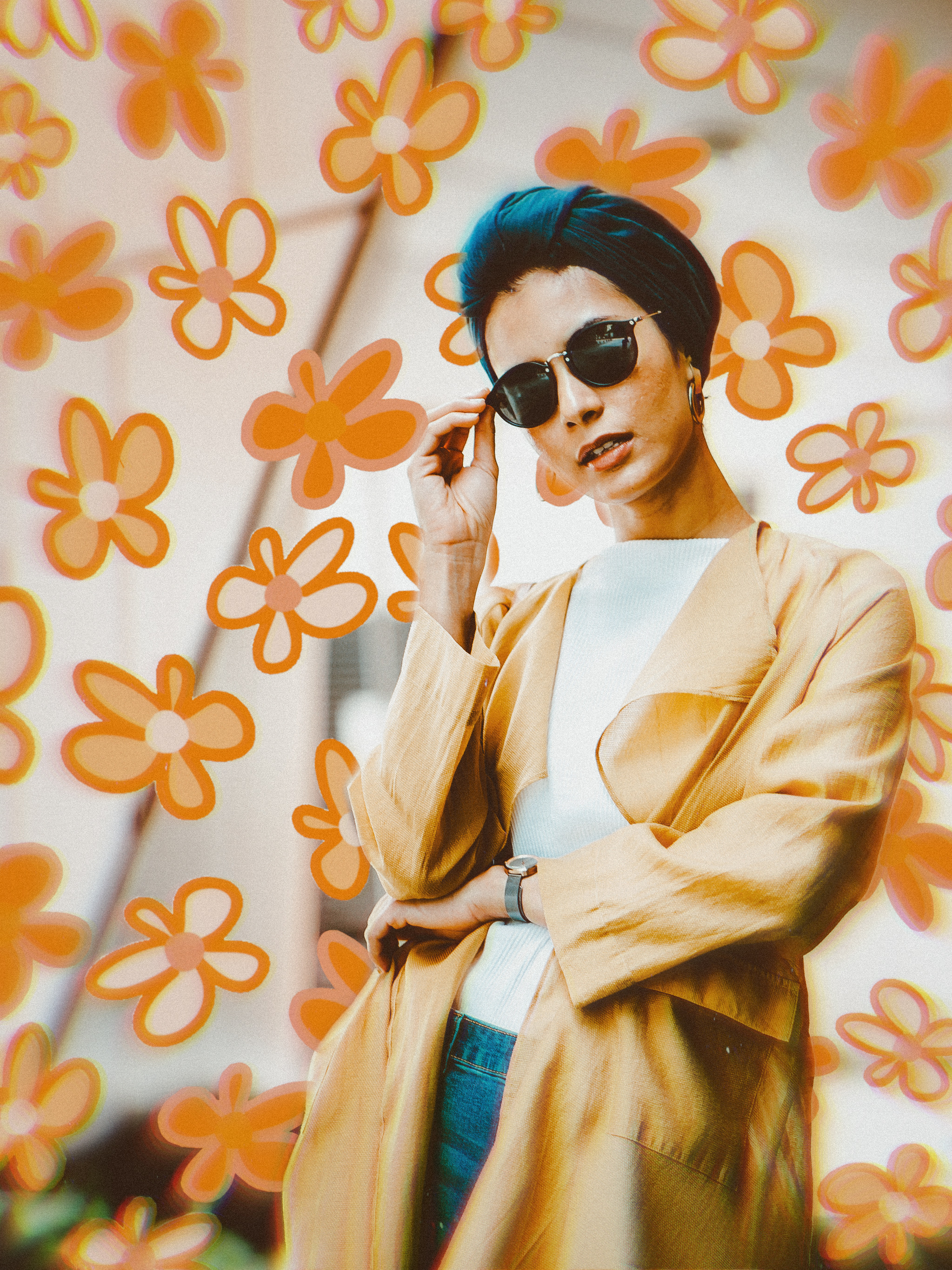
Since it’s such a bold color, orange works great in elements that are being layered over a photo. It helps the designs stick out among the background.
With the right filters, bright orange can take on a retro vibe giving your edits a cool 70s feel.
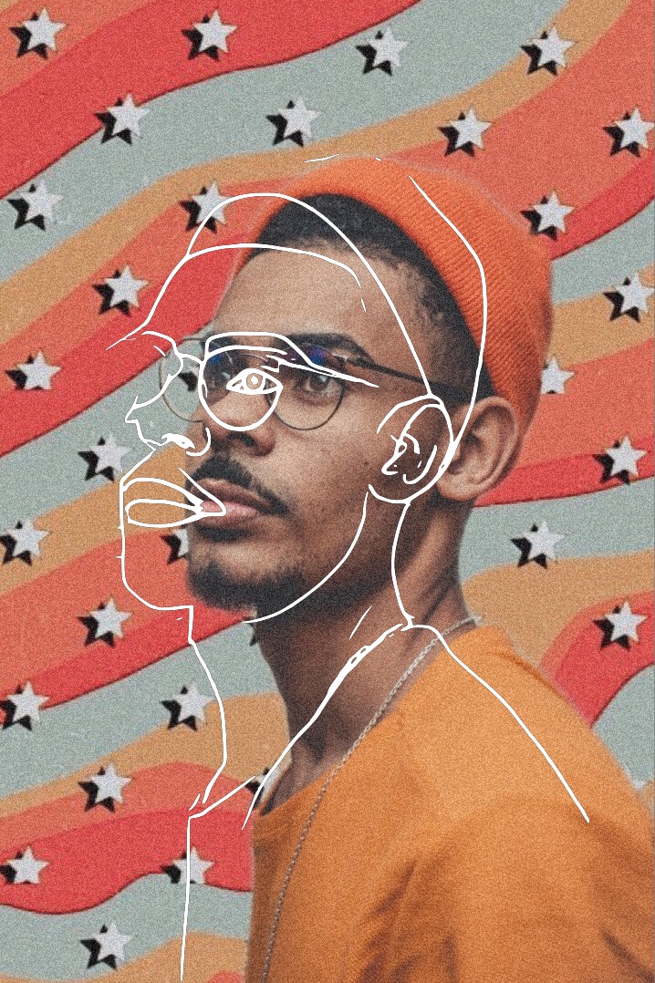
Nothing makes bright orange pop quite like a black and white background. Use a black and white filter on your images, or build in black and white stickers and fonts on an orange canvas to create a bold impact.
Playing up the bright orange shades and tones in your images (and adding in a few) will give your image a sun-kissed, golden hour look, any time of day.
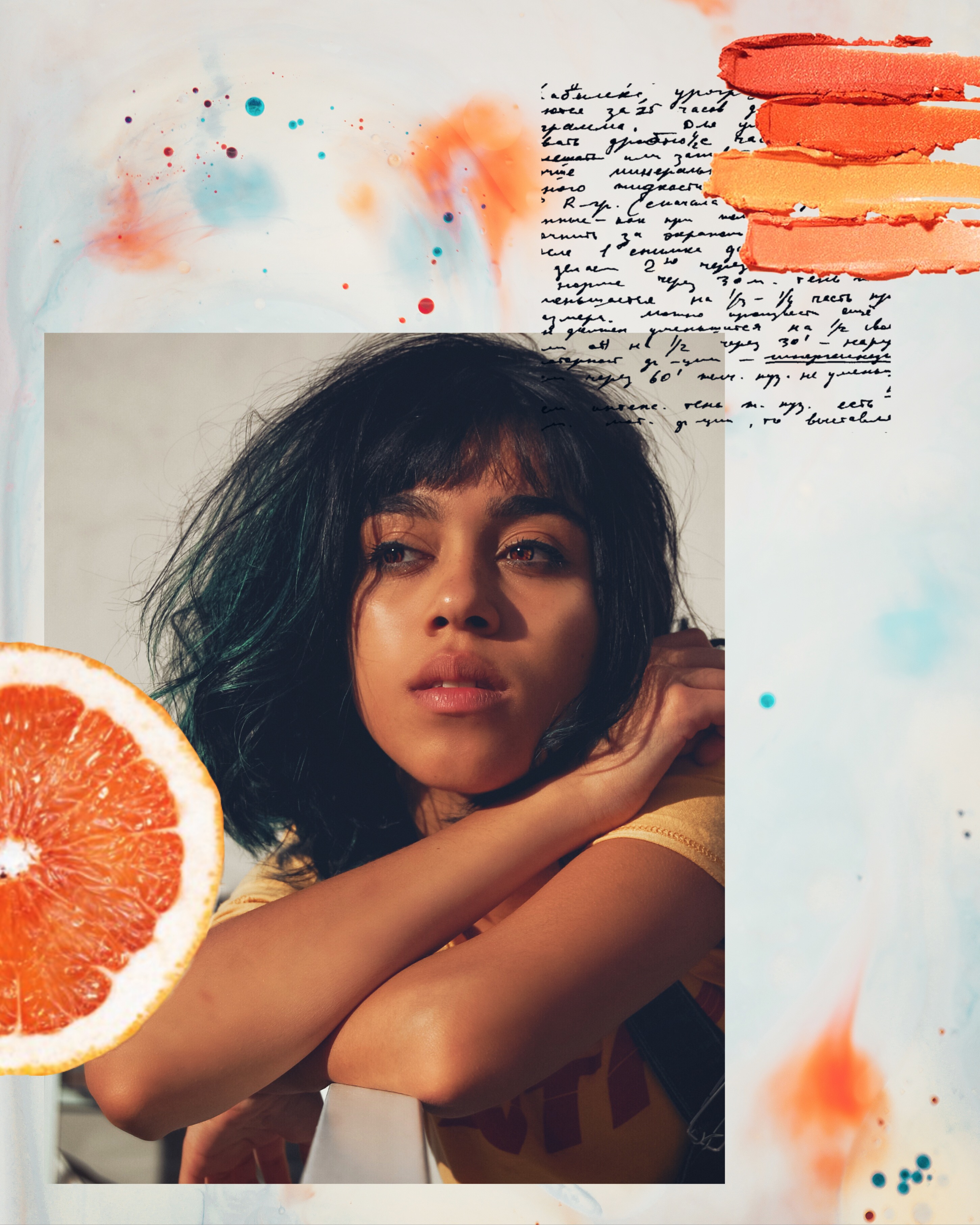
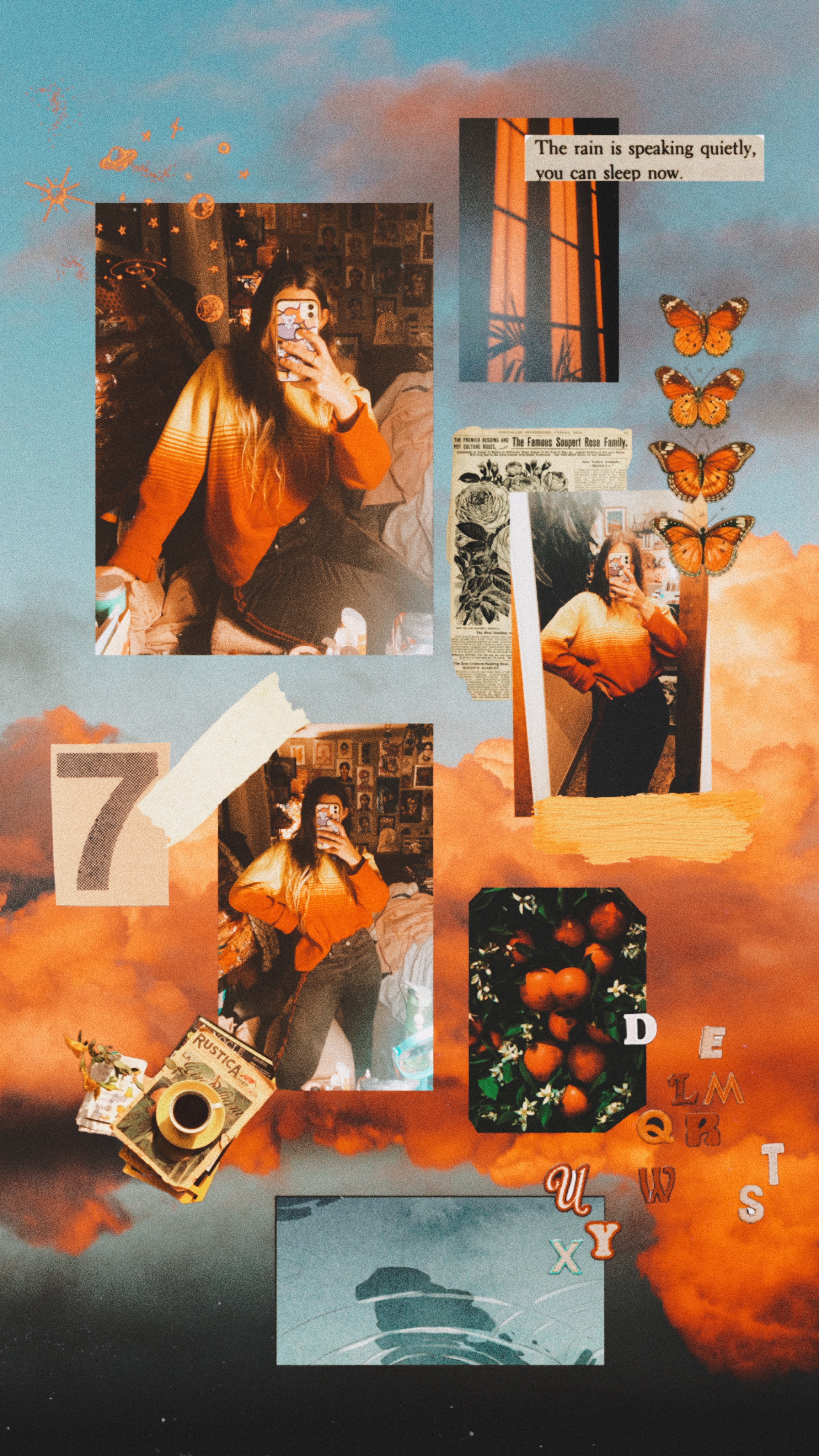
A collage with a bright, bold color palette like this one definitely makes an impression. It’s fun to create and it can serve as a mood board for future orange designs.
Channel autumn in your designs with fall-centric accents colors and leaf stickers.
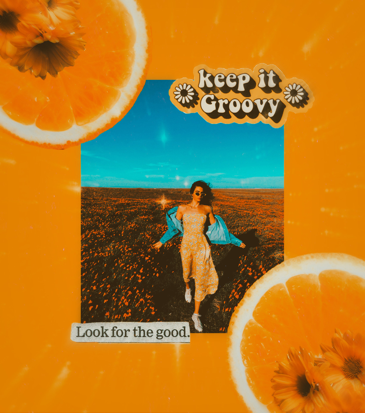
Orange is totally grooooooovy.
You can use orange as inspiration for creating the perfect Instagram aesthetic.
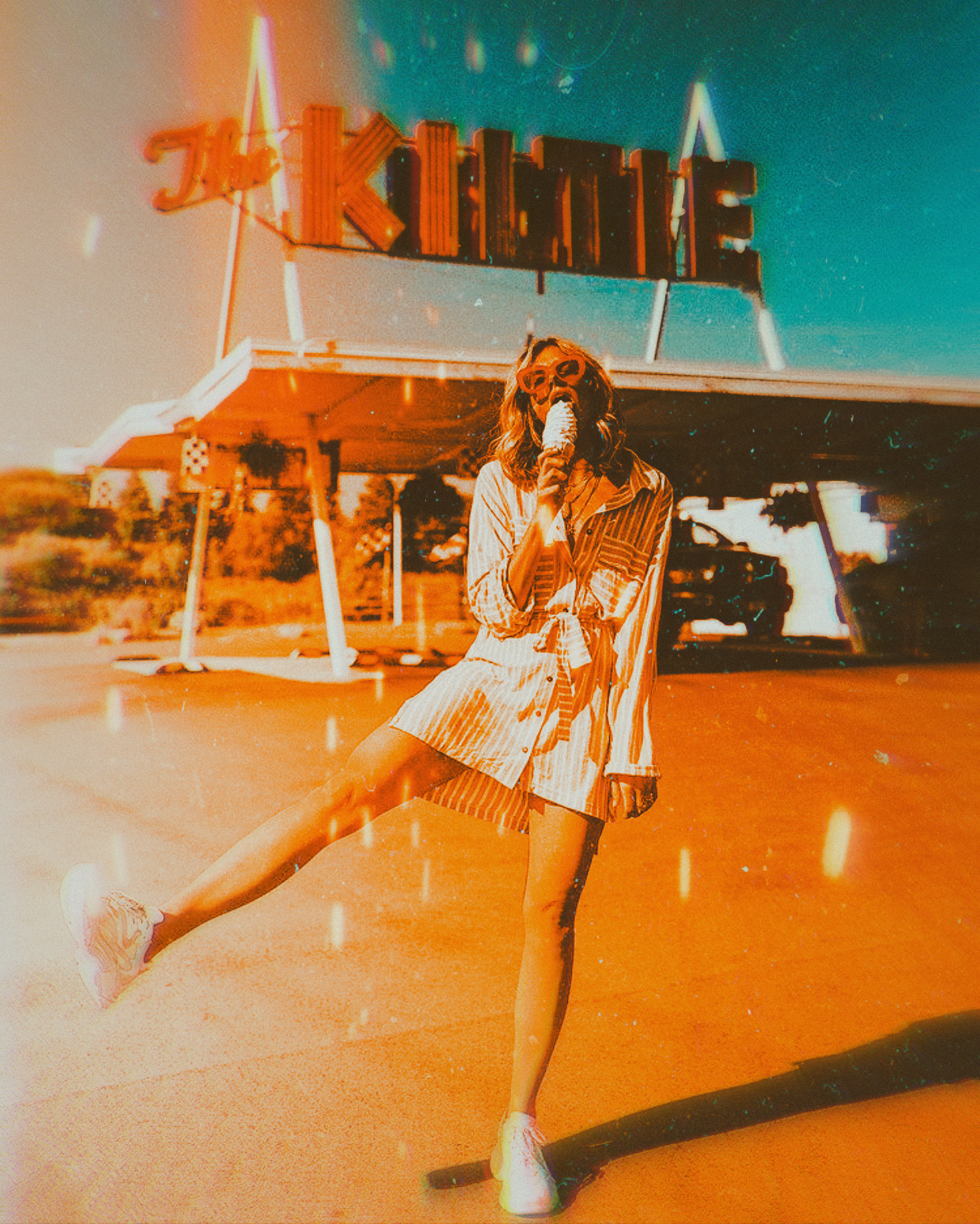
Use a bright orange overlay for a lens flare effect that will give your photos a vintage feel.
There you have it. Everything you’ll ever need to know about the color bright orange. Use it wisely, and don’t forget to share your edits and images to Picsart, to inspire other creators.
Create at the Speed of Culture
Picsart is a full ecosystem of free-to-use content, powerful tools, and creator inspiration. With a billion downloads and more than 150 million monthly active creators, Picsart is the world’s largest creative platform. Picsart has collaborated with major artists and brands like BLACKPINK, the Jonas Brothers, Lizzo, Sanrio: Hello Kitty, I am a Voter, Bebe Rexha, Maroon 5, One Direction, Warner Bros. Entertainment, iHeartMedia, Condé Nast, and more. Download the app or start editing on web today to enhance your photos and videos with thousands of quick and easy editing tools, trendy filters, fun stickers, and brilliant backgrounds. Unleash your creativity and upgrade to Gold for premium perks!

 via Picsart
 via Picsart
 via Picsart
 via Picsart
 via Picsart
 via Picsart
 via Picsart
 via Picsart
 via Picsart
 via Picsart


