Pastel colors have evolved from mere nursery staples to become a powerhouse in modern design. These soft, soothing hues are captivating designers, marketers, and consumers alike with their versatility and charm. In this comprehensive guide, we’ll explore what are pastel colors, delve into their nature and meanings, and the best pastel color combinations that will define 2025’s aesthetic landscape.
What are pastel colors
At their core, pastel colors are the result of a simple yet transformative process: adding white to any pure hue. This technique yields lighter, less saturated versions of the original colors, giving pastels their signature soft, muted appearance that soothes the eye and calms the mind.
Defining Traits of Pastel Colors:
Ethereal, airy visual quality
Reduced saturation levels
Inherently calming effect
Elevated lightness value
Subtle sophistication
Pastel color meanings: Understanding pastel psychology
Colors are silent communicators, and pastels speak volumes in hushed tones. Each pastel hue carries its own emotional signature and psychological impact. Grasping the underlying messages of these colors can significantly enhance your design decisions.
Pastel Hue
Symbolic Meaning
Emotional Resonance
Pastel Pink
Tenderness, romance
Nurturing, comforting
Pastel Green
Growth, harmony
Refreshing, balancing
Pastel Blue
Tranquility, trust
Calming, reassuring
Pastel Yellow
Optimism, clarity
Uplifting, energizing
Pastel Purple
Creativity, luxury
Inspiring, soothing
Where to use pastel colors
Pastel colors offer versatility across numerous applications, each bringing its unique advantages to different sectors:
Digital design
Websites: Pastel backgrounds reduce eye strain while maintaining readability, making them perfect for long-form content sites and blogs
Mobile apps: Soft pastel interfaces create a welcoming, user-friendly experience
Social media: Pastel templates and graphics help content stand out in crowded feeds without being visually aggressive
Branding and marketing
Logo design: Pastel variations of brand colors can create sophisticated secondary palettes
Packaging: Soft pastels on products communicate premium quality and gentleness
Marketing materials: Pastel accents can make promotional materials more approachable and inviting
Interior design
Commercial spaces: Pastel walls and furnishings create calming environments in offices and retail locations
Healthcare facilities: Gentle pastels help reduce anxiety in waiting rooms and treatment areas
Consumer electronics: Pastel-colored devices appeal to style-conscious consumers
Fashion accessories: Pastel elements add sophistication to clothing and accessories
Home goods: Pastel kitchenware and decorative items create a modern, fresh aesthetic
Print materials
Business cards: Pastel backgrounds make contact information more memorable
Brochures: Soft color schemes enhance readability and engagement
Packaging inserts: Pastel-colored documentation feels more premium and considered
Trending color pastel palettes for 2025
As we look towards 2025, pastel color schemes are poised to dominate design trends across various industries. Let’s explore some exquisite pastel combinations that are set to inspire your next project:
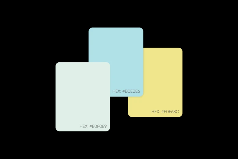
1. Serene Seaside
Hex Codes: #E0F0E9, #B0E0E6, #F0E68C
Application: Ideal for coastal-themed logos or wellness retreats, evoking tranquility and relaxation.
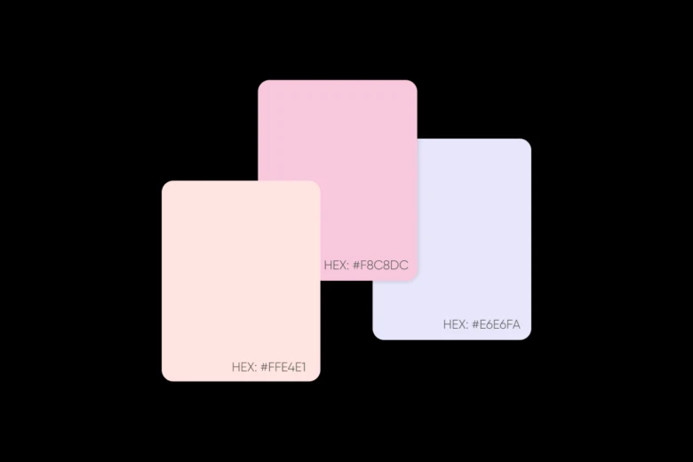
2. Blooming Blush
Hex Codes: #FFE4E1, #F8C8DC, #E6E6FA
Application: Perfect for beauty brands or wedding-related businesses, conveying softness and romance.
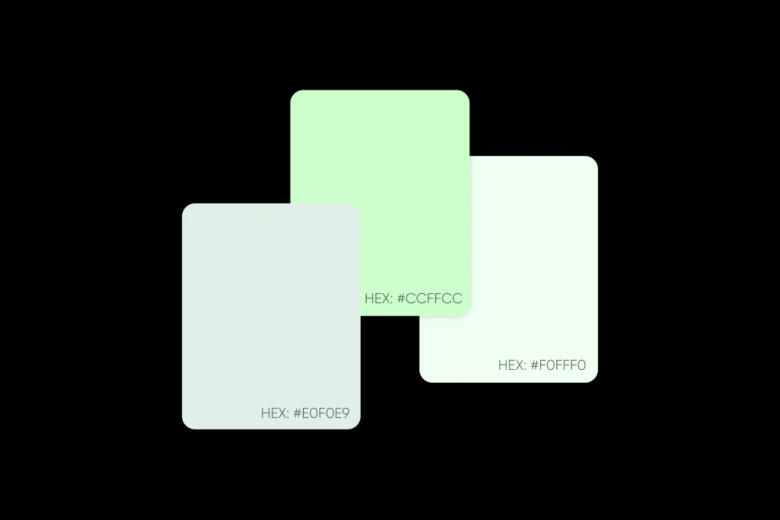
3. Minty Fresh
Hex Codes: #E0F0E9, #CCFFCC, #F0FFF0
Application: Suited for eco-friendly brands or health food companies, suggesting freshness and purity.
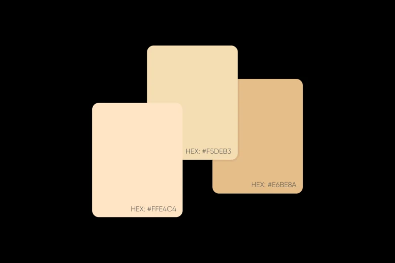
4. Desert Dawn
Hex Codes: #FFE4C4, #F5DEB3, #E6BE8A
Application: Perfect for bohemian lifestyle brands or natural cosmetics, conveying warmth and earthiness.
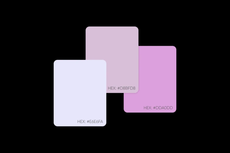
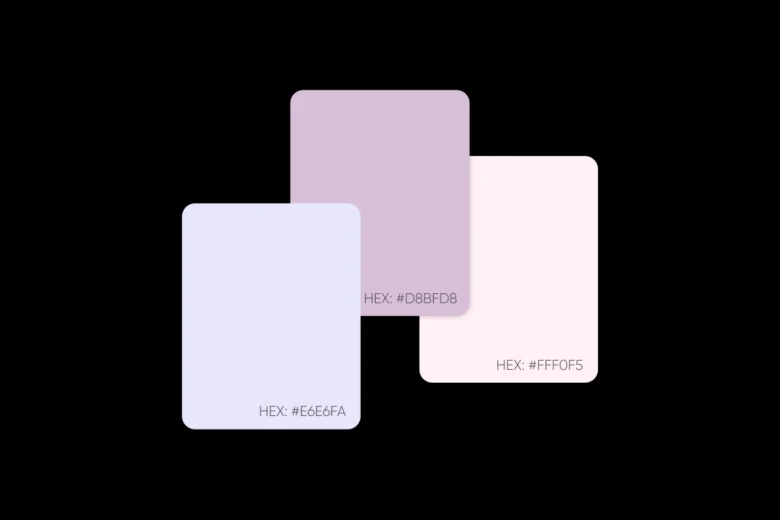
5. Lavender Dreams
Hex Codes: #E6E6FA, #D8BFD8, #DDA0DD
Application: Ideal for wellness apps or meditation spaces, promoting relaxation and mindfulness.
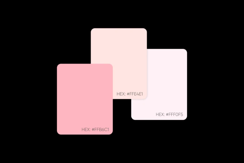
6. Cotton Candy
Hex Codes: #FFB6C1, #FFE4E1, #FFF0F5 Application: Great for children’s brands or dessert businesses, postcards, social media posts, expressing playfulness and joy.
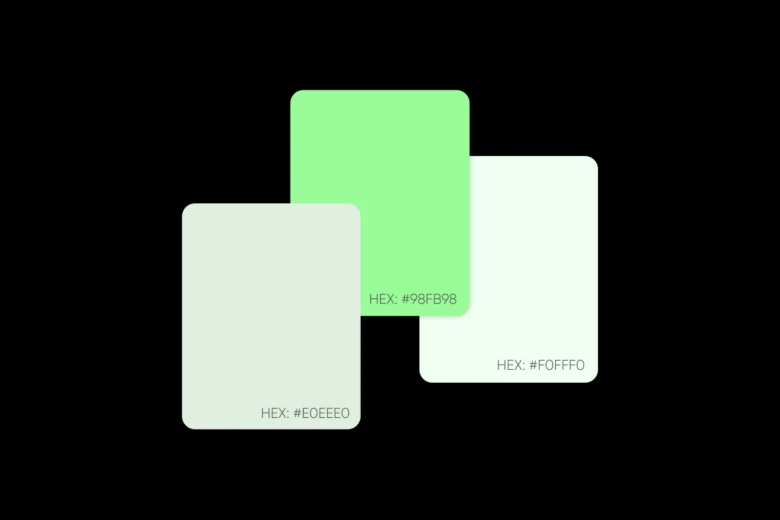
7. Spring Garden
Hex Codes: #E0EEE0, #98FB98, #F0FFF0
Application: Perfect for gardening brands or organic products, suggesting growth and vitality.
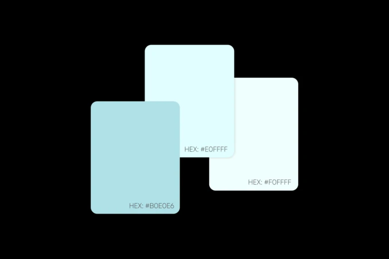
8. Ocean Mist
Hex Codes: #B0E0E6, #E0FFFF, #F0FFFF
Application: Suited for spa brands or water-related businesses, conveying freshness and clarity.
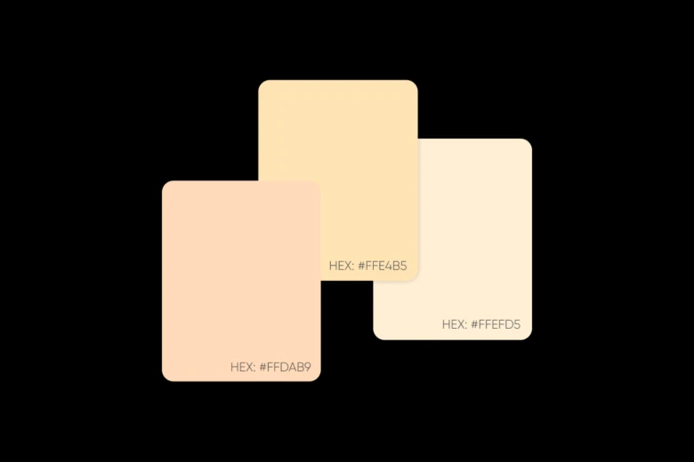
9. Peach Sorbet
Hex Codes: #FFDAB9, #FFE4B5, #FFEFD5 Application: Ideal for lifestyle blogs or fashion brands, posters, and ads, expressing sophistication and warmth.
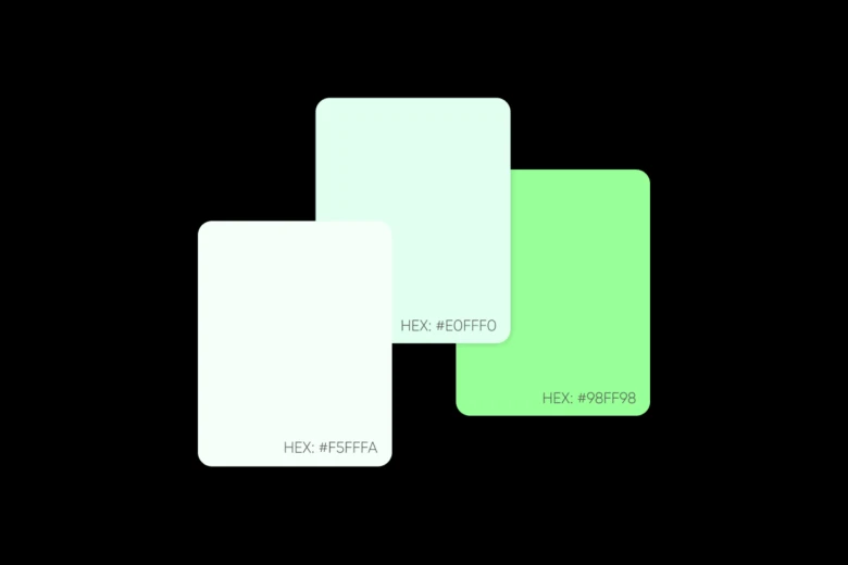
10. Mint Macaron
Hex Codes: #F5FFFA, #E0FFF0, #98FF98
Application: Perfect for pastry shops or beauty brands, suggesting freshness and indulgence.
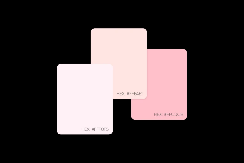
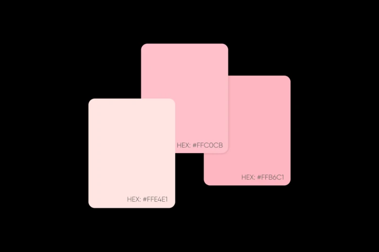
11. Ballet Slipper
Hex Codes: #FFF0F5, #FFE4E1, #FFC0CB
Application: Ideal for dance studios or feminine fashion brands, conveying grace and elegance.
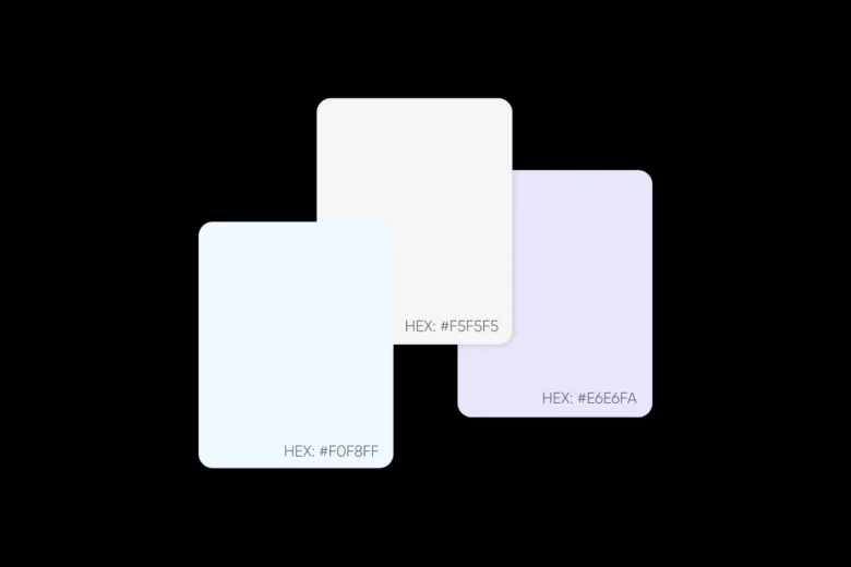
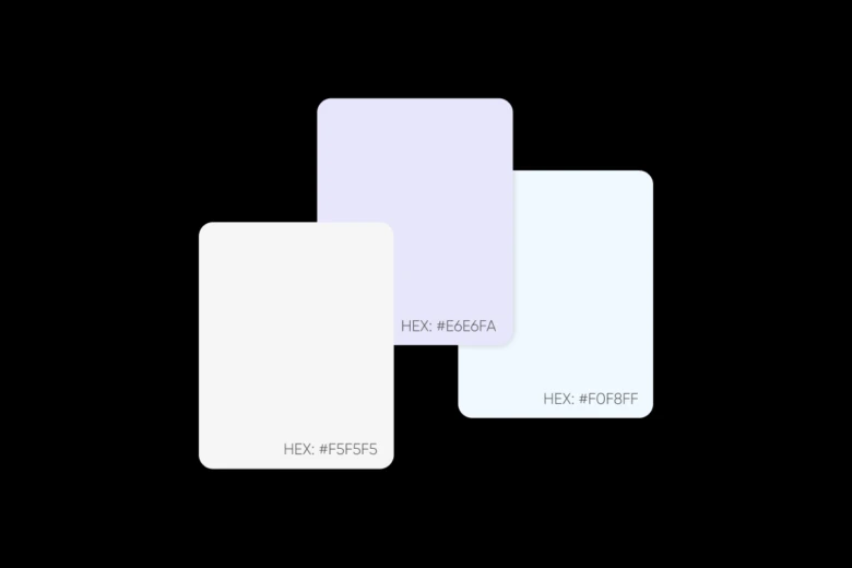
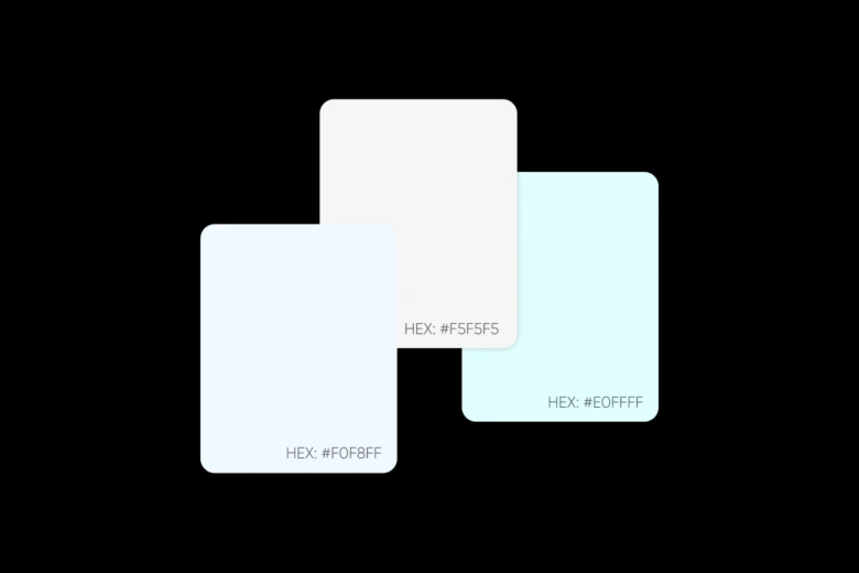
12. Cloud Nine
Hex Codes: #F0F8FF, #F5F5F5, #E6E6FA
Application: Suited for tech startups, mindfulness apps, or business cards suggesting innovation and serenity.
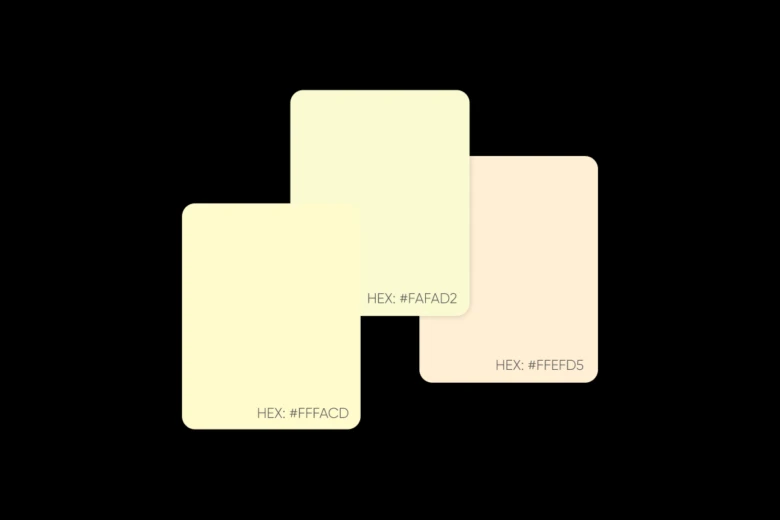
13. Lemon Chiffon
Hex Codes: #FFFACD, #FAFAD2, #FFEFD5
Application: Perfect for children’s educational products or summer fashion lines, expressing optimism.
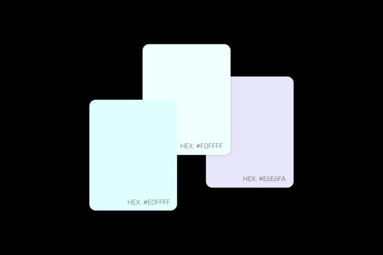
14. Arctic Aurora
Hex Codes: #E0FFFF, #F0FFFF, #E6E6FA
Application: Great for luxury skincare or winter fashion collections, conveying premium quality.
15. Rose Garden
Hex Codes: #FFE4E1, #FFF0F5, #FFB6C1
Application: Ideal for wedding planners or romantic lifestyle brands, expressing love and tenderness.
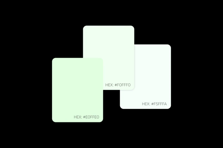
16. Pistachio Dream
Hex Codes: #E0FFE0, #F0FFF0, #F5FFFA
Application: Suited for vegan restaurants or sustainable fashion, suggesting health and eco-consciousness.
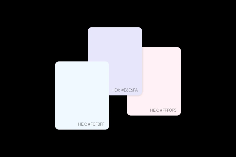
17. Summer Breeze
Hex Codes: #F0F8FF, #E6E6FA, #FFF0F5
Application: Perfect for resort wear or vacation rentals, conveying relaxation and escape.
18. Sweet Lilac
Hex Codes: #E6E6FA, #D8BFD8, #FFF0F5
Application: Ideal for aromatherapy products or spiritual wellness brands, promoting peace.
19. Coastal Fog
Hex Codes: #F5F5F5, #E6E6FA, #F0F8FF
Application: Great for minimalist fashion or modern home decor, expressing sophistication.
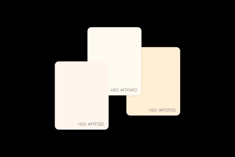
20. Vanilla Dream
Hex Codes: #FFF5EE, #FFFAF0, #FFEFD5
Application: Perfect for luxury hotels or premium stationery brands, suggesting elegance.
21. Cherry Blossom
Hex Codes: #FFE4E1, #FFC0CB, #FFB6C1
Application: Suited for Japanese-inspired brands or spring fashion Instagram ads, expressing delicacy.
22. Mountain Mist
Hex Codes: #F0F8FF, #F5F5F5, #E0FFFF
Application: Ideal for outdoor gear or adventure photography, conveying serenity and exploration.
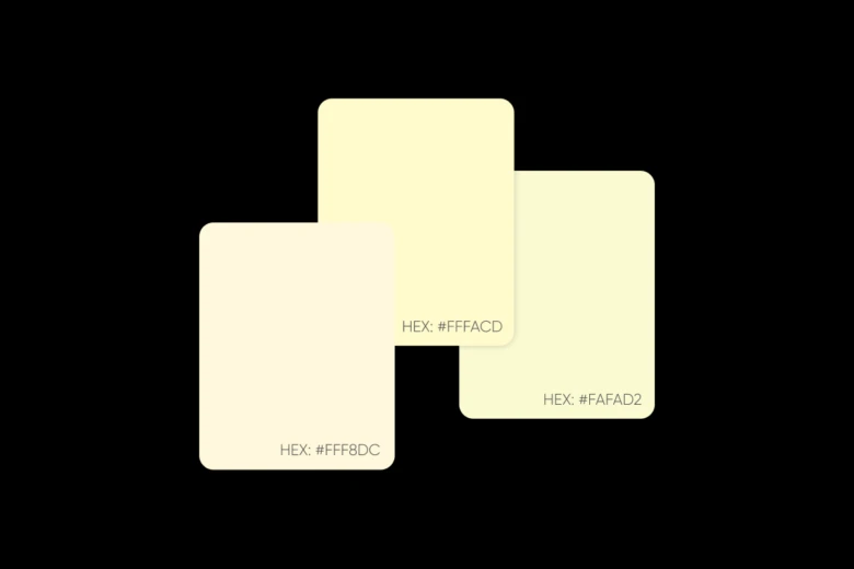
23. Buttercream
Hex Codes: #FFF8DC, #FFFACD, #FAFAD2
Application: Perfect for bakeries or craft supplies, suggesting creativity and warmth.
24. Powder Blue
Hex Codes: #B0E0E6, #E0FFFF, #F0F8FF
Application: Suited for baby brands or gentle skincare lines, expressing purity and care.
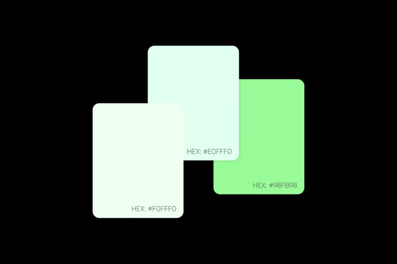
25. Sage Whisper
Hex Codes: #F0FFF0, #E0FFF0, #98FB98
Application: Ideal for natural healing practices or organic beauty products, conveying wisdom and nature.
How to craft your own signature pastel color palette
Creating harmonious pastel combinations doesn’t have to feel overwhelming. With Picsart’s color tools, you can craft the perfect palette in minutes whether you’re crafting brand colors or a website color scheme. Here’s how to develop balanced pastel combinations that work for your brand:
Step 1: Start with your base color
Check Picsart’s color meanings and select your foundational color. This should be the hue that best represents your brand’s personality. Use the color slider to find the exact tone you want, or input a specific color code if you already have one in mind.
Step 2: Transform it into a palette
Now switch to Picsart’s color wheel tool to find matching pastels for your foundational color. Pick a color combination and paste your base color HEX into the tool to start seeing suggestions.
Step 3: Build your palette
Each color combination will work differently to give you matching colors based on your foundational hue.
Monochromatic: Utilizes various shades, tints, and tones of a single hue for a sophisticated and elegant look.
Analogous: Features colors that sit next to each other on the color wheel, creating a sense of calmness and unity.
Triadic: The triadic color scheme employs three colors evenly spaced on the color wheel, offering a vibrant and dynamic feel.
Tetradic: Involves four colors forming a rectangle on the color wheel, resulting in a high-contrast and energetic scheme.
Complementary: Combines colors opposite each other on the wheel for maximum contrast.
Step 4: Test and refine
Once you’ve created your palette, copy the color codes in your preferred format (HEX, RGB, or HSL) using the copy button next to each code. Test these colors across different mediums and lighting conditions to ensure they maintain their pastel qualities.
Conclusion
As we’ve explored, pastel colors are more than just aesthetically pleasing hues – they’re powerful tools in design, branding, and communication. By understanding the psychology behind these soft shades and mastering the art of color pastel palettes, you’re well-equipped to create visuals that deeply resonate with your audience.
The world of pastels offers endless possibilities, whether you’re rebranding, designing a new website, or simply refreshing your creative palette. Remember, successful design lies in thoughtful experimentation while staying true to your brand’s core message.
Are you ready to embrace the pastel color revolution? Start exploring, creating, and transforming your designs with these gentle yet impactful hues. The future of design is soft, soothing, and undeniably pastel – and it’s time for you to make your mark.