Each color has a different, but immediate impact on our moods and perception of a concept or product. By selecting the right brand color palette, you can influence your audience to feel a certain way about your business or services.
When you learn how to choose brand colors, you can make your business instantly recognizable, and boost brand loyalty, engagement, and sales. Just think… We all know how it feels to see the bright yellow M of a McDonald’s and to instantly think of great, affordable food.
Read on to learn more about color psychology and how you can use this to build your brand color palette. We also look at the tools that will help you save time as you get inspiration.
Brand colors: Why are they important?
Your brand identity is the personality behind your business; it includes your values, how you communicate, and how your audience feels when they interact with you. Brand colors play a critical role in this, helping to convey the essence of your brand and evoke specific emotions.
Once you have established your brand colors and used them consistently, your audience will be able to identify you in seconds; this will help your business stand out. One study showed that almost 70% of people were able to recognize famous brands based on colors alone.
Understanding color psychology when picking branding colors
Before you can understand how to pick brand colors, you need to know the fundamentals of color psychology. This is the study of how colors affect human behavior, emotions, and perceptions.
Studies show that people most often have the same reactions to different colors. For example, research from the University of Mumbai shows that people consistently associate orange and yellow with playfulness and joy.
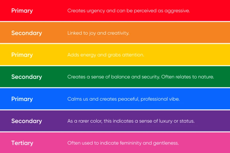
Take a look at the below table to understand which effects different colors typically have. However, bear in mind that these can change based on the context you use colors are used in and which color combinations you use them in.
These colors are categorized into primary colors (which don’t require any other colors to be made), and secondary colors (made by mixing two primary colors).
Remember that you can also find various shades of each color (for example, pink is a shade of red) and tertiary colors (made by mixing secondary and primary colors). An easy way to pinpoint your perfect shades is to use a color picker tool like Picsart.

Choosing the right brand colors
Ready to help your company stand out? Here we explore how to choose brand colors in three easy steps…
1. Defining your brand identity
Start by asking a few key questions to build out your brand identity. This will help you find colors that match up to its personality and vibe. Consider:
- What are your core values?
- If your brand was a person, how would you describe them?
- How do you want your target audience to talk about your brand?
- How do you want your target audience to feel when interacting with your brand?
- Are there any cultural or symbolic meanings associated with certain colors that should be considered?

2. Building your brand color palette
After you’ve selected a primary (main) color that you associate with your brand identity, you can start to find the best color combinations. It’s a good idea to stick to between 2 and 4 colors in your branding color scheme as this allows you to create a clean image and have maximal impact on your audience.
As well as a primary color, your brand color palette could include:
- A secondary color that complements the primary color.
- Accent colors that stand out and provide visual interest.
- Neutral colors such as black, white, or gray which add balance and work well as backgrounds.
You can easily find colors that go well together by using Picsart’s Color Wheel. When you select a primary color, it automatically shows you which shades will create a beautiful contrast or well-blended brand image.
3. Testing and finalizing brand colors
It’s important to test how your chosen colors look across various devices, channels, and lighting conditions. This allows you to make sure they’re easy to read and likely to create a great impression on your audience.
You can also ensure that your designs are accessible by ensuring sure there’s enough contrast between the text and background color. Learn more about this by reading The Web Content Accessibility Guidelines.
After optimizing your color choices, make sure to write the color codes (alphanumerical representations of the colors) down in brand guidelines. This will allow you to stay consistent in the future to create a consistent brand image. You can use RGB, HEX, HSL, or CYMK code formats or convert between them in our easy tool.
Finding examples of strong brand color palettes
It’s important to research your competitors’ brand color palettes. This allows you to differentiate yourself while still remaining aware of colors that are typically used in your industry due to their particular associations.

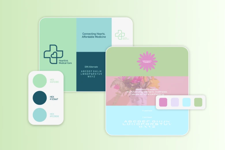
For example, medical companies often use the color green to convey vitality and stability. If you were operating in that field, you’d likely want to avoid looking like everyone else, but you might use a color with similar associations, such as blue.
Our tools make it quick and easy to find inspiration. To make the process of finding your competitors’ colors easier, you can extract the colors from an image of their site. Alternatively, you can use our color palette generator to randomly generate a palette or create a beautiful collection of colors based on a primary color of your choice.
If you’re ready to play around and find the colors that make you (and your audience) feel something about your brand, head to our suite of tools. You’ll have a sparkling new visual identity in no time!


