Humans are very visually oriented. We often can’t help “judging a book by its cover” and drawing conclusions about people, places, and things based entirely on their appearances. Because of this, people will make assumptions about your brand, whether consciously or subconsciously, based on the colors and design of your website.
Think about your favorite brands — what colors do they conjure up in your mind’s eye? Now, if you go to any of those brands’ websites, you’ll likely see those colors prominently featured. Your website design is your chance to decide which colors people picture when they think of your brand.
In this post, we’ll go into why you should care about website color schemes, what they can say about you and your brand, and how to pick the right color palette for your website.
What Is a Website Color Scheme?
Website color schemes are a collection of all the colors you use on your brand’s website. This includes every design element — such as the text, backgrounds, images, shapes — no matter how big or small. If it’s on your webpage, it’s part of your website color scheme.
However, a color scheme is more than just a list of colors used on a webpage. It’s also the different weights that you assign to each color. For example, if you’re using bright red on your website, you’ll need to decide how big of a presence you want that shade of red to have in the overall look of your website.
For your website color scheme, you’ll choose one color to be your dominant color. This is the hue that will have the most weight on your webpage. Then you’ll pick one or two secondary colors to complement the dominant color. Lastly, you’ll select one or two accent colors. You’ll use these the least, so they’ll make the most impact.
Pro tip: The colors in all website color schemes should include the colors used in the logo design. Both your website and your logo are representations of your brand, and using a consistent color palette can help increase brand awareness and recognition.
Things to Consider When Choosing a Website Color Scheme
Setting up a website for your business or personal brand is an exciting step. Not only are you committing to yourself and investing in your future success, but you’re also making a statement by creating a public space for your brand. Once your website is up, it will be the place where people go to learn more about your business, form an opinion about your brand, and decide if they want to spend money on your products or services.
A little research in color theory and color psychology can go a long way in helping you choose the right color palette for your website. Yes, you want to get your site up and running as soon as possible, but there are a few things you should consider before you hit Publish:
- Who Is Your Target Audience?
While your webpage should absolutely showcase your brand colors, it should also the preferences of your target audience. So before you decide on website color schemes, you should do some research into which colors are most popular among the people you’re trying to connect with. For example, if your target audience is men over 50, you’re probably going to choose sleek blue and gray tones over bright pinks and yellows.
- Which Colors Are Your Competitors Using?
Your color choices will partly depend on what kind of brand you have. Certain industries tend to gravitate towards specific colors. For example, wellness brands tend to use a lot of neutral, earthy tones, and children’s brands typically use pastels or bright, playful colors. Yes, you want to stand out from your competitors, but you don’t want your color choices to confuse or alienate your target audience.
- Which Colors Look Best Together?
Your website will look more professional if you choose colors that go well together. When creating your color scheme, you should either choose complementary colors that are opposite each other on the color wheel or analogous colors that are similar shades. If you’re unsure where to start, find an online color palette generator to see which types of color combinations resonate the most with you. Do you like contrasting colors more? Or colors that all have the same tone? Once you’ve figured out which type of color scheme you prefer, you can apply that to the colors you want to use on your website.
- How Will This Color Scheme Look Across Different Mediums?
A consistent color scheme can help increase brand recognition, so make sure your website color palette is something you’re willing to stick with. For branding purposes, you should use this color scheme across every medium, including your business cards, social media profiles, and advertisements.
How to Choose a Professional Website Color Palette?
After you’ve given some thought to how you want to design your website, the next step is to choose the actual colors that you’ll use. The following steps can help guide you as you consider website color schemes:
- Do Your Research
The colors you use in your web design will affect how people perceive your brand, whether they realize it or not. As we discussed above, your first step in choosing your website color palette should be researching color theory and color psychology to learn how different colors are related to different emotions.
- Decide Which Colors Go Best With Your Brand
Once you’ve learned how different colors can evoke specific feelings, you can choose a color scheme based on the emotions you want to be associated with your brand. You can either go off the colors in your logo, create a color palette from an image, use an online color scheme generator, or design a color palette from scratch.
- Pick Your Dominant and Accent Colors
Your job isn’t over once you’ve chosen your color scheme. Your next task is to decide how much weight you want each color to have. There’s a ratio used in fashion and interior design that may help — try assigning 60% of the page to your dominant color, 30% to your secondary color, and 10% to your accent color. If you’re using more than three colors, you can still follow this ratio by splitting your colors into three categories: dominant, secondary, and accent.
- Assign Your Colors to Different Elements on the Page
Think about all of the different components that make up the homepage of your website. There’s header text, backgrounds, images, body text, links, pop-ups, buttons, links, and the list goes on. A big part of website design is choosing how all of these different elements will follow your color scheme. You’ll probably need to play around with this a little bit to get the perfect balance of colors.
- Test Out Your Finished Product
When you’re finished designing your website, you’ll need to test it out to see how it will look when it goes live. Pay special attention to how your font colors look against your website background colors. Are the words on your website easy to read? (Pro tip: Using contrasting colors — light on dark and vice versa, or colors from opposite sides of the color wheel — is a great way to make sure your text shows up against your background.)
During this step, you may want to send a preview of your website to a few trusted family members or friends to get their opinion. Do they find your website easy to understand and navigate? Choose people that are in your target audience, if possible, to give you the most relevant feedback.
15 Examples of the Best Color Schemes for Websites
Unless you’re used to putting together different color combinations, it may be difficult to know where to start when it comes to picking out your website color palette. To help you out, we’ve put together a list of 15 example website color schemes that will help spark your imagination. If one of them resonates with you, feel free to adapt it to your own website design.
1. Dark and Modern
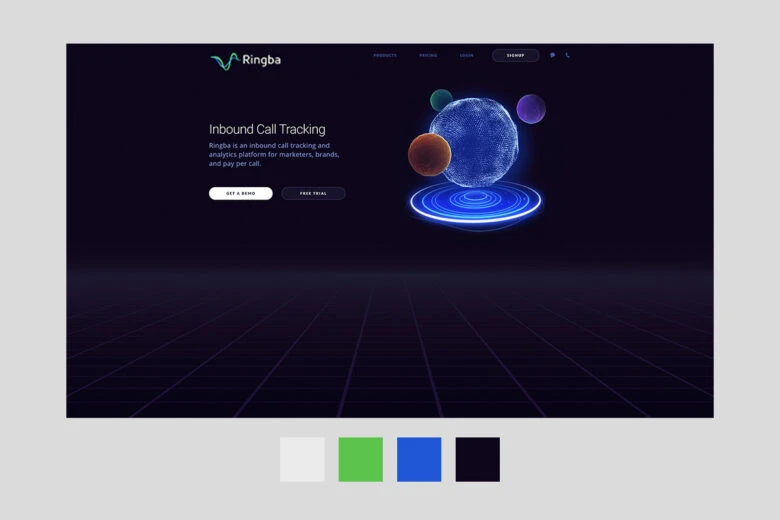
You can achieve a futuristic look by pairing vibrant colors, such as bright green, blue, or hot pink, against a black background. This look can be great for app-makers, technology companies, and software as a service (SaaS) brands.
2. Contemporary Art
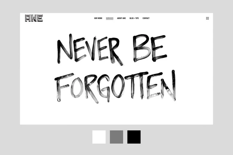
For a more creative, youthful approach, try using thick black accents against a white background. Think of your website as a piece of contemporary art. This style gives off an air of artistry and innovation.
3. Sepia Nostalgia
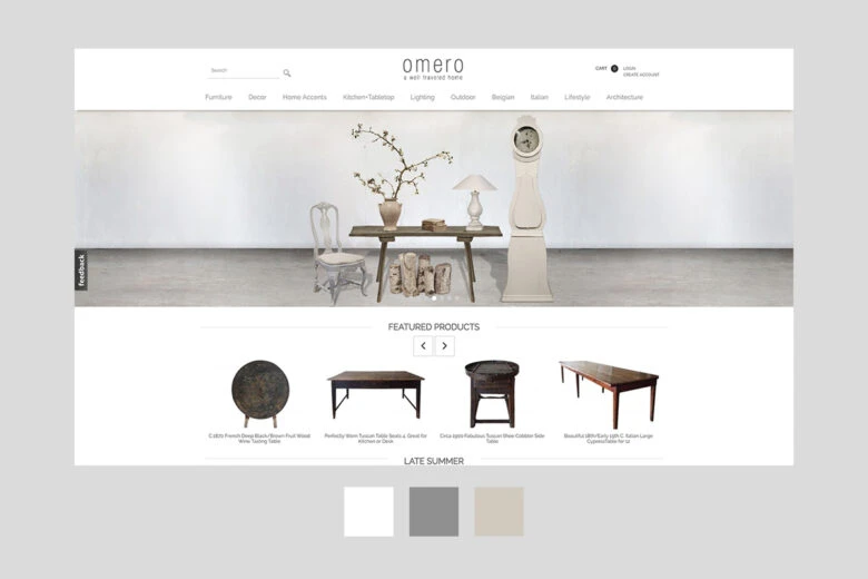
If your brand calls for a more classic look, you can use a monochromatic color scheme inspired by old photographs. With various brown tones paired with black and white accents, your website can make people reminisce about the “good old days.”
4. Peaceful and Fresh
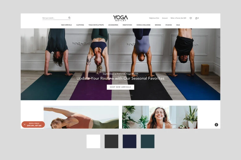
By combining a dark forest green, white, and a lighter, muted green color, you can make your website feel like a fresh day. This kind of color combination is a good choice for athletic or wellness brands.
5. Earthy Pastels
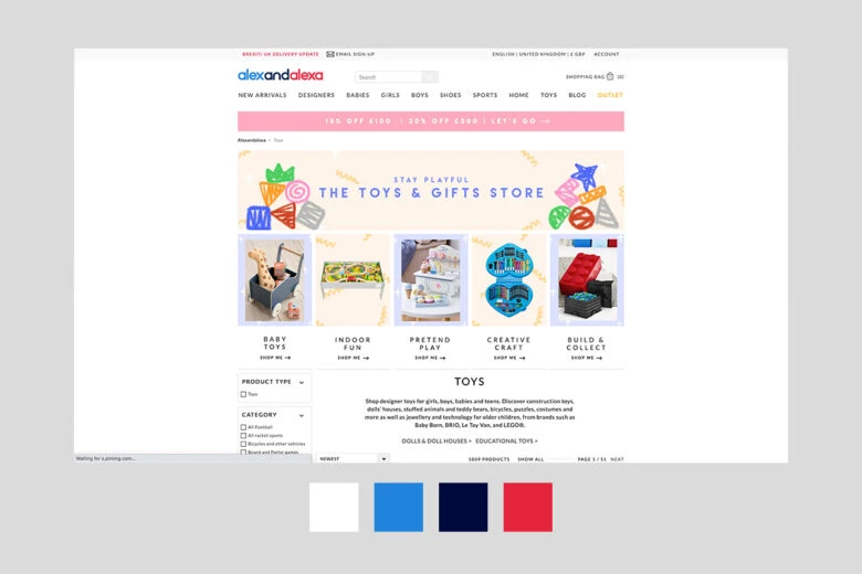
Modern children’s brands are steering clear of pastel pink and baby blue. Instead, popular mommy influencers, children’s clothing brands, and toy companies are opting for light natural tones. You can achieve this simple color scheme by combining light greens and browns with a cream or white color background.
6. Retro Accents
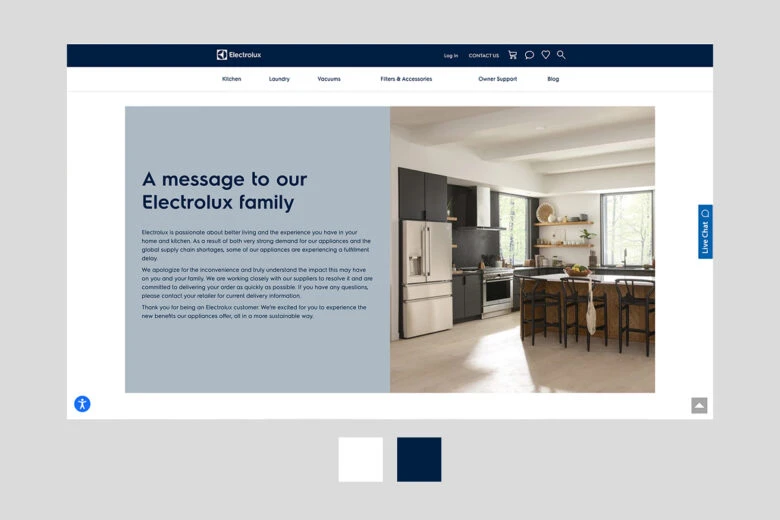
By using bright colors like yellow, seafoam green, and peach with black accents, you can give your website a playful, retro feel. This color scheme is often used for appliances and music industry brands.
7. Sleek Performance
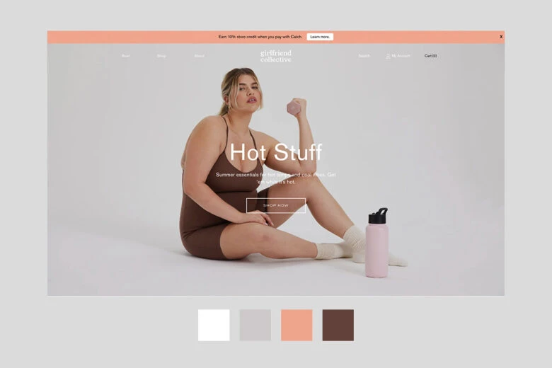
Performance-oriented athletic brands may skip the earthy tones and go for a more intense color palette. Try using eye-catching neon yellow against a black background color. Then, pair it with different shades of darker yellow to intensify the look.
8. Monochromatic Blue

For a more buttoned-up, professional aesthetic, try a color scheme completely made up of different shades of blue. By using bright blue, dark blue, and light blue together with white accents, you can make your business website look authoritative and trustworthy.
9. Friendly Foods
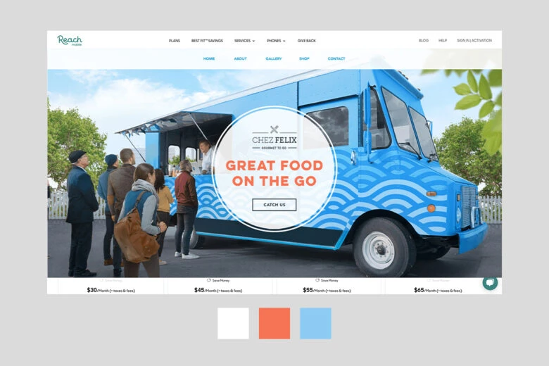
Bright reds and yellows are often associated with food brands. However, modern independent restaurants often opt for a more simple palette. If that sounds like your brand, the right color scheme for you may be colors like light aqua, muted maroon, butter yellow, and warm coral.
10. Dreamy Sunset
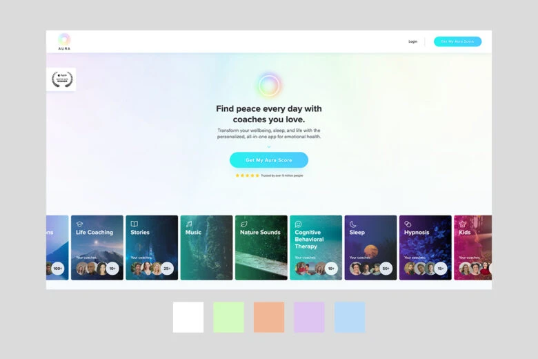
A popular color scheme right now is a combination of lavender and coral with black and white accents. This trendy color scheme can be used for any brand that wants to seem modern, artsy, and ethereal.
11. Professional Pop of Color
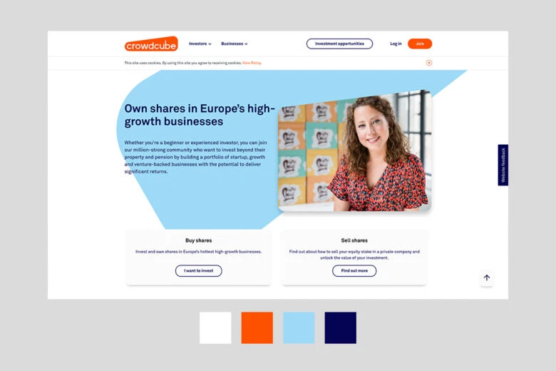
If you want a professional look, but aren’t interested in a monochromatic color scheme, try pairing a dark slate gray with white, black, and a rich accent color, such as eggplant or marigold.
12. Quaint Storybook
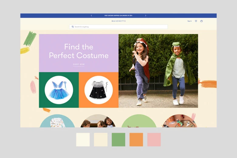
Some brands may call for a more whimsical approach to web design. Whether you’re a fantasy author, jewelry maker, or children’s brand, there are many reasons you may want your website to feel like a page from an illustrated book. To achieve this look, use cream backgrounds instead of white to mimic the color of an old page from a book. Then, add in different shades of purple to give it that touch of magic.
13. Colorful Party
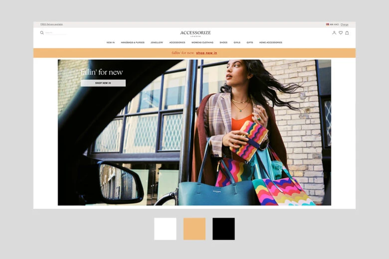
Combining fun colors like teal, lime green, hot pink, and bright yellow can have an exciting effect on a webpage. This can be a good choice for some restaurants, clothing, and accessories brands. Make sure to ground these bold colors with lots of white space so you don’t overwhelm your audience’s eyes.
14. Luxe and High-End
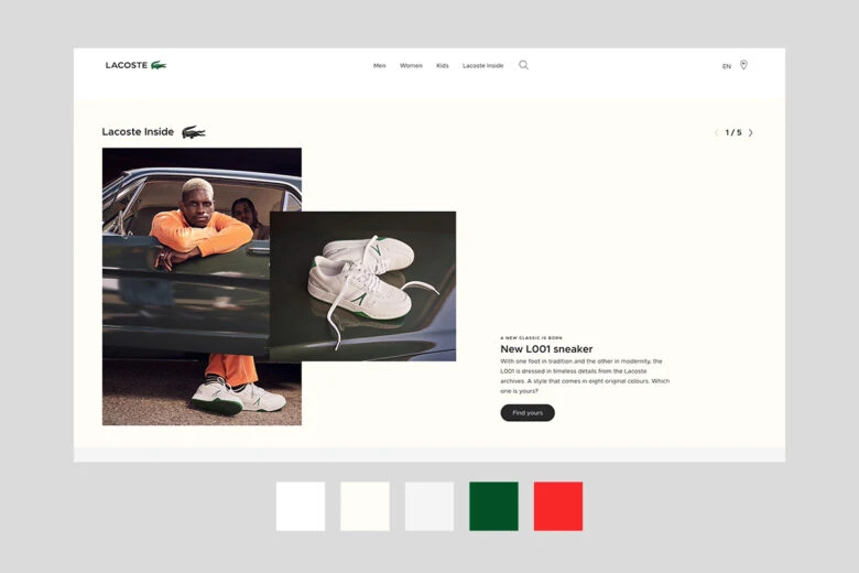
For a luxury e-commerce experience, you may want to stick to a black and white color scheme for your webpage. When combined, strong blocky blacks and stark whites can work together to create a modern, high-end aesthetic for your website.
15. Modern Elegance
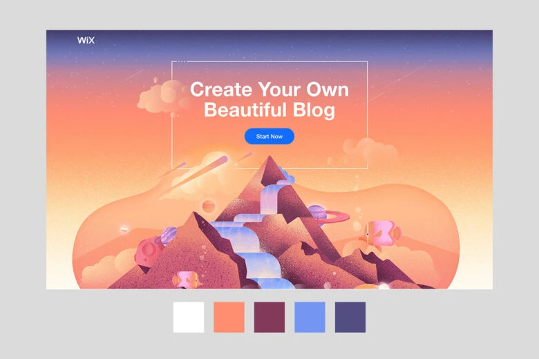
Luxe black-and-white color schemes aren’t the only way to give your website an elegant feel. If you want a more contemporary look, but still want to retain that high-end feel, consider opting for a muted cool color scheme. By using pale eggplant, sage, taupe, and gray, you can give your website all the sophistication it deserves.
Create at the Speed of Culture
Picsart is a full ecosystem of free-to-use content, powerful tools, and creator inspiration. With a billion downloads and more than 150 million monthly active creators, Picsart is the world’s largest creative platform. Picsart has collaborated with major artists and brands like BLACKPINK, the Jonas Brothers, Lizzo, Sanrio: Hello Kitty, I am a Voter, Bebe Rexha, Maroon 5, One Direction, Warner Bros. Entertainment, iHeartMedia, Condé Nast, and more. Download the app or start editing on web today to enhance your photos and videos with thousands of quick and easy editing tools, trendy filters, fun stickers, and brilliant backgrounds. Unleash your creativity and upgrade to Gold for premium perks!


