Hot pink color (hex code #FF69B4) is the blazing bright pink that many associate with the neon fashion of the early 1980s and its resurgence in the 2000s. But it was on the scene long before then. In 1940, an advertisement in a newspaper in San Antonio, Texas described 21 brand new shades, including hot pink, a new color success for Spring. But what’s hot to some is not to others. The first documentation of hot pink’s existence was a description from Bentley’s Miscellany, a British literary magazine popular in the 1840s.
Fast forward to today and Gen Z is bringing it back (again). Softer shades of the color are known as Millennial pink, but lately, it’s all about the joyful highlighter hues of the early ’00s.
What does hot pink stand for?
Color can affect our moods and behaviors. Traditionally, people immediately associate pink with femininity, girlhood, and softness. Pink often also brings to mind romance and Valentine’s Day. Some love it, some hate it. But it always demands attention. Because it’s often associated with femininity, companies that cater to women often use the hot pink color in their branding and logos.
According to architect Annmarie Adams, pink didn’t always have a feminine connotation. Pink only became the default feminine color after World War II. Before then, it was common for girls to wear blue, while mothers would dress their baby boys in pink. According to Adams, a cultural shift came after Nazi Germany forced gay men to wear pink triangles on their sleeves. The LGBT community has since reclaimed the pink triangle as a symbol of pride.
As to hot pink’s role in fashion and art, its history doesn’t disappoint. The color was introduced in the 1950s as a symbol of post-war optimism, it soon became associated with youth culture and empowerment, thanks to designers like Elsa Schiaparelli. The ’60s and ’70s amplified its presence amidst counterculture and disco, representing experimental and avant-garde fashion. ‘80s neon trend further solidified hot pink as a statement of rebellion and glamour, a favorite in punk and underground scenes.
Then came many many iconic cultural moments that involved the eye-catching color. In the ‘50s and ‘60s the Pop Art movement leveraged hot pink to blend high art with popular culture, challenging norms and perceptions. In cinema, it has defined iconic visual narratives in films like “Legally Blonde” and most recently “Barbie” which started a pink fashion trend that took over the world.
It’s no surprise artists, filmmakers, and pop stars all have an obsession with the color and its eye-catching nature. So keep on reading to see how you too can also effectively implement this color in your creative process.
How to match colors with hot pink
Looking for some hot pink color combinations? Here are a few pro ideas that you can try:
Similar colors
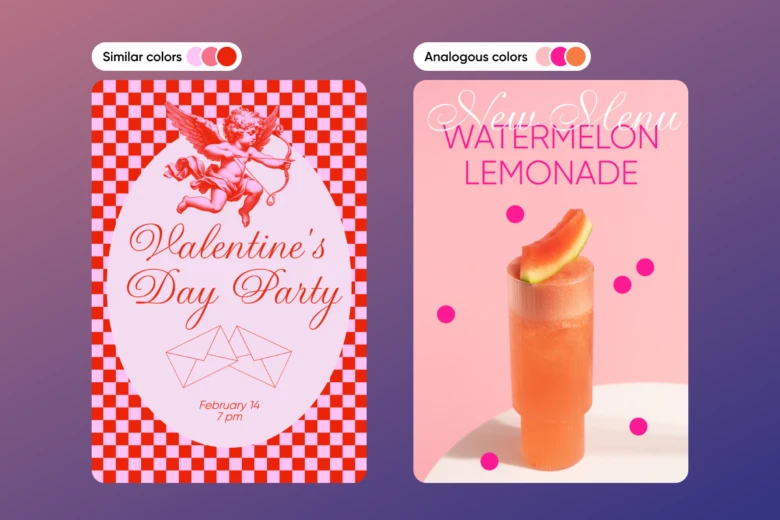
Hot pink with a range of related pinks creates a romantic edge. Pairing similar colors with hot pink can be helpful when designing Valentine’s Day greeting cards. Using color theory can help to improve your design. If you want to take things up a level, try using analogous or triadic colors.
Analogous colors
Analogous colors are three colors next to each other on the color wheel. To find an analogous color, take a close look at the color wheel. Then, pick the three colors to the left or right from it. Those four colors are analogous. The colors analogous to hot pink (color picker code: #ff69b4) are bright orange (#ff6969) and bright purple (#ff69ff).
Triadic colors
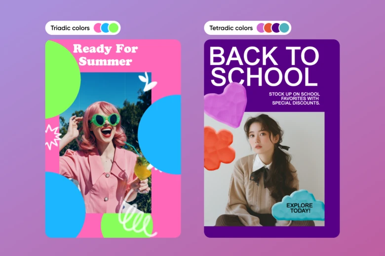
Triadic colors are easily identified using the color wheel. A triadic color scheme uses three colors evenly spaced around the color wheel. For example, the three primary colors form a triadic color scheme: red, yellow, and blue. Hot pink’s triadic colors are bright green (#b4ff69) and bright blue (#69b4ff). These three combine to make a fun, summery vibe.
Tetradic colors
Tetradic color schemes are also known as rectangular schemes. Imagine drawing a rectangle on the wheel. The four corners represent your color palette. For example, pink, red-orange, blue-green, and indigo.
Colors that go with hot pink
Hot pink stands alone as a striking and impactful color. However, when hot pink is combined with other color schemes, it really comes to life.
Hot pink and blue
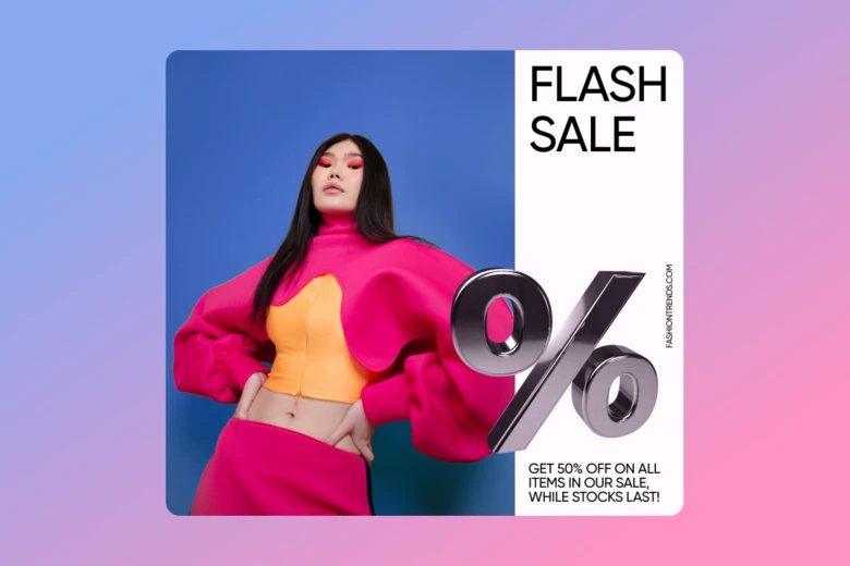
Even though pink and blue don’t exactly complement each other, (although if you add yellow, they form a triad), culturally, they’re paired as opposites. Because it’s modern tradition to think that pink is for girls and blue is for boys, putting them side-by-side inspires a kind of color harmony.
Neon green and hot pink
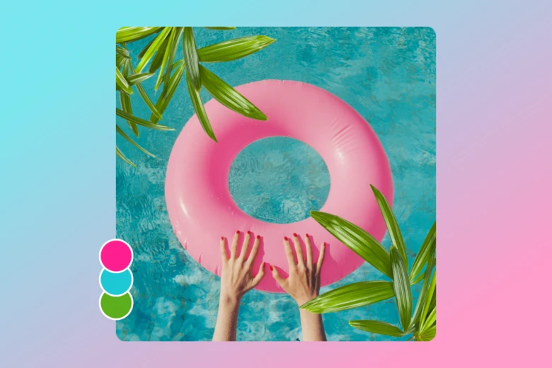
One thing that’s wonderful about this complementary color combo is how often it occurs in nature (and um, swimming pools). Every spring, you’re sure to see pink blossoms blooming out of green leaves and stems. Pink and green go together like black and white.
Black and hot pink
This vintage color combination throws it back to the era of poodle skirts and Parisian shopping bags. This high-contrast color combination, from bright to dark, can be a lot of fun to play around with.
Get creative using the hot pink color
Feeling daring and want to incorporate hot pink into your graphic design? Here are some ideas on how to effectively incorporate the hot pink color into your work.
Pop Art
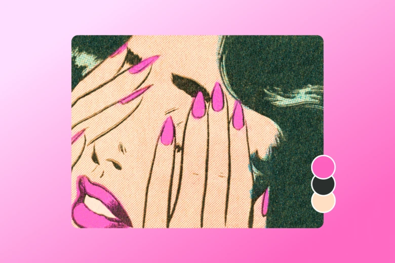
Pop art is more than an art movement. For the genre’s fans, it’s a lifestyle. Pop art emerged in the 1950s and 1960s when plastics and consumer goods were taking over the world. The term “pop” refers to what’s popular and fashionable, young, bold, and fun. Pop artists used everyday consumer objects to reflect the changing desires of culture. To catch the eye, pop artists frequently use bright and vibrant shades and colors.
Experimenting with Vaporwave
Vaporwave is kind of like the pop art of the 21st century. It’s a musical genre and visual art style that emerged from Internet culture in the late 2000s. The style gained a lot of popularity for its aesthetic and pleasing visuals that are derived from the 1980s and 1990s subcultures. As an aesthetic movement, vaporwave has been described as a tongue-in-cheek commentary on modern consumerism and technology.
Valentine’s Day

Want to impress that special someone? On Valentine’s Day, you don’t need a reason to share love. A Valentine’s Day card is a great way to put all you’ve learned about hot pink into practice. Simply combine your favorite Valentine’s Day images with a quote or words about the recipient.
Create hot pink color edits using Picsart
Now it’s time to put that hot pink color knowledge to work. Ready? These easy tutorials will show you just how easy it is to get started.
On the web
- Open Picsart’s Web Editor and use the New Project button to start creating.
- Select a canvas size to adjust the edit resolution based on the content type or social media platform.
- And then fill that canvas with the hot pink color by inputting the hex code #FF69B4.
- Use the Stickers button on the left sidebar to search for hot-pink-themed stickers, images, shapes, and more. Add effects and filters if required by using the fx button on the top toolbar. This part is entirely your call. Go wild with your hot pink color inspiration to create fully customized edits.And when you’re done editing use the Export button to download your work.
- And when you’re done editing use the Export button to download your work.
On mobile
- Open the Picsart app, tap on the + at the bottom of the screen, and select a blank canvas.
- Find Drawings on the toolbar at the bottom of your screen. Don’t worry, you won’t have to draw anything.
- Tap on the Color tool and use the Adjust button on the top left of the pop-up menu.
- Select RGB and adjust the sliders so the numbers are R: 255, G: 105, and B: 180. Confirm then select Fill and tap on the canvas to add the hot pink color as your background. Use the Apply button to save.
- Now use various Picsart tools to search for hot-pink-themed stickers, images, shapes, and more.
- Use the download button on top to save your new, pinktastic edit.


