We love color and are obsessed with images and profiles that have a unique, eye-catching aesthetic. If you’re not sure where to start with making a custom color palette, we have a cool creative hack for you. The easiest way to create a cohesive aesthetic across all of your photos is to create a color palette from an image you like.
Want to create a color palette for yourself? In this article, we’re sharing how to pick colors from an image to create a custom color palette.
How Do You Create a Color Palette From an Image?
You can easily create a color palette that pulls from the primary or secondary colors in your image using Picsart. Creating a color palette from an image is a cool and easy way to ensure a consistent look and feel for your online brand presence, social media accounts, moodboards, and so much more! Ready to create your custom color palette? Let’s do it!
Step 1) Open the Picsart app and tap the + sign at the bottom to upload the image you want to use to generate a color swatch from in the Editor.
Step 2) Scroll across the bottom toolbar and tap on the Draw icon. While in the Draw Tool, tap on the Shape icon in the bottom toolbar (it looks like an overlapping square and circle). Select the square shape (or any shape you like!) and the Fill option, then tap the checkmark to continue.
Step 3) Tap on the rainbow Color Chooser in the bottom left corner of the toolbar. Tap on the Eyedropper icon and drag the cursor over the part of your image that has the color you want to highlight, then let go.
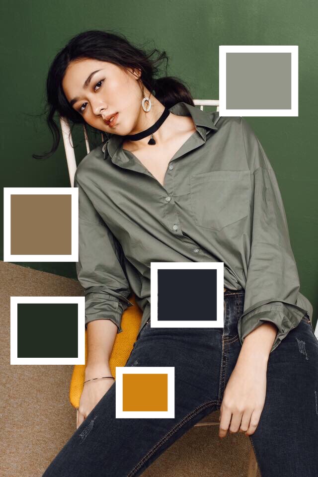
Step 4) Now use your finger to draw a shape in that color over any part of the photo. You’ll see the shape and color you selected popular. Drag to position and size it as you like. Repeat this step in other areas of your photo until it has as many colored shapes as you need for your custom color palette.
Step 5) Want to get a little fancy? Tap on the Shape Tool again, select the Stroke option, and slide to adjust the thickness of the outline. Tap on the color chooser and select the color white. Use this step to create an outline around all of your different colored shapes to help them stand out.
Step 7) Tap on Apply when you’re done, then tap Next in the top right corner to save your edit and share it on Picsart or download it to your phone to share online!
More of a visual learner? Check out this tutorial to learn how to make your own color palette from a picture in the Picsart app.
What Is the Color Wheel?
Fun fact for your next trivia night! Isaac Newton invented the color wheel in 1666 bringing together art and science to help guide which colors work together and why. The color wheel is exactly what it sounds like. It’s the color spectrum mapped out in a circle.
There are two types of color wheels and both serve a different purpose. The RYB or red, yellow, blue color wheel is typically used by artists. It’s useful when you are combining colors for painting. The second color wheel is the RGB, or red, green, and blue color wheel. The RGB color wheel is designed for online use, as it takes light into account when it comes to computer or TV screens.
How Does a Color Wheel Work?
Color wheels can help you find color harmonies by using the rules of color combinations. Colors are arranged on a color wheel according to their chromatic relationship to each other. The main aspects of the color wheel are primary colors. Primary colors are positioned an equal distance from each other on the color wheel. In between them, the wheel is filled in with secondary colors and tertiary colors.
Primary colors are the basic colors that cannot be created by mixing other colors. Secondary colors are made by mixing two primary colors. Tertiary colors are made by mixing primary colors and secondary colors. Now that you’ve got the color basics down, you can explore all sorts of types of colors and consider how to combine them when you go to create a color palette.
Complementary colors are two colors that are opposite on the color wheel. They make a high impact, high contrast color combination. Common examples of complementary color palettes are yellow and purple, or red and green. You often see these complementary colors used together in school and sports logos or for holiday color palettes because they work well together. Next to each other, complementary colors will appear brighter and bolder!
Monochromatic colors are the three shades, tones, and tints of one primary color. Monochromatic colors create a harmonious, subtle look that works great for design and branding.
Analogous colors are three colors that are side by side on the color wheel. Think of color blocking for this one. It’s a strong look with one base color and the others used as accents. Use an analogous color scheme when you really want to make a statement!
Triadic colors are three colors that are evenly spaced out on the color wheel. Consider selecting one of the three shades as a dominant color and using the other two as accents.
Tetradic colors are just like triadic colors, but rather than three swatches, there are four. The more colors you have in your palette, the more you can get creative! Just make sure you are still maintaining a balance. We recommend choosing one dominant color and using the other three as accents in your color palette design.
Where Can You Find a Color Palette Generator?
Quicktools by Picsart offers a free color palette generator that’s fast and fun to use. Simply type in the RGB color code and it’ll generate a unique color palette with additional colors that pair well with the shade you added in. Alternatively, you can use it to create a random palette that will kickstart your creative work.
What Are Some Color Palette Ideas?
There are endless possibilities when it comes to creating custom color palettes and creating your own color combinations. So how do you choose? You can start by picking colors from an image that you love, drawing inspiration from nature, looking at your social feed to see what color patterns catch your eye. Check out the below color palette ideas to kickstart your editing.
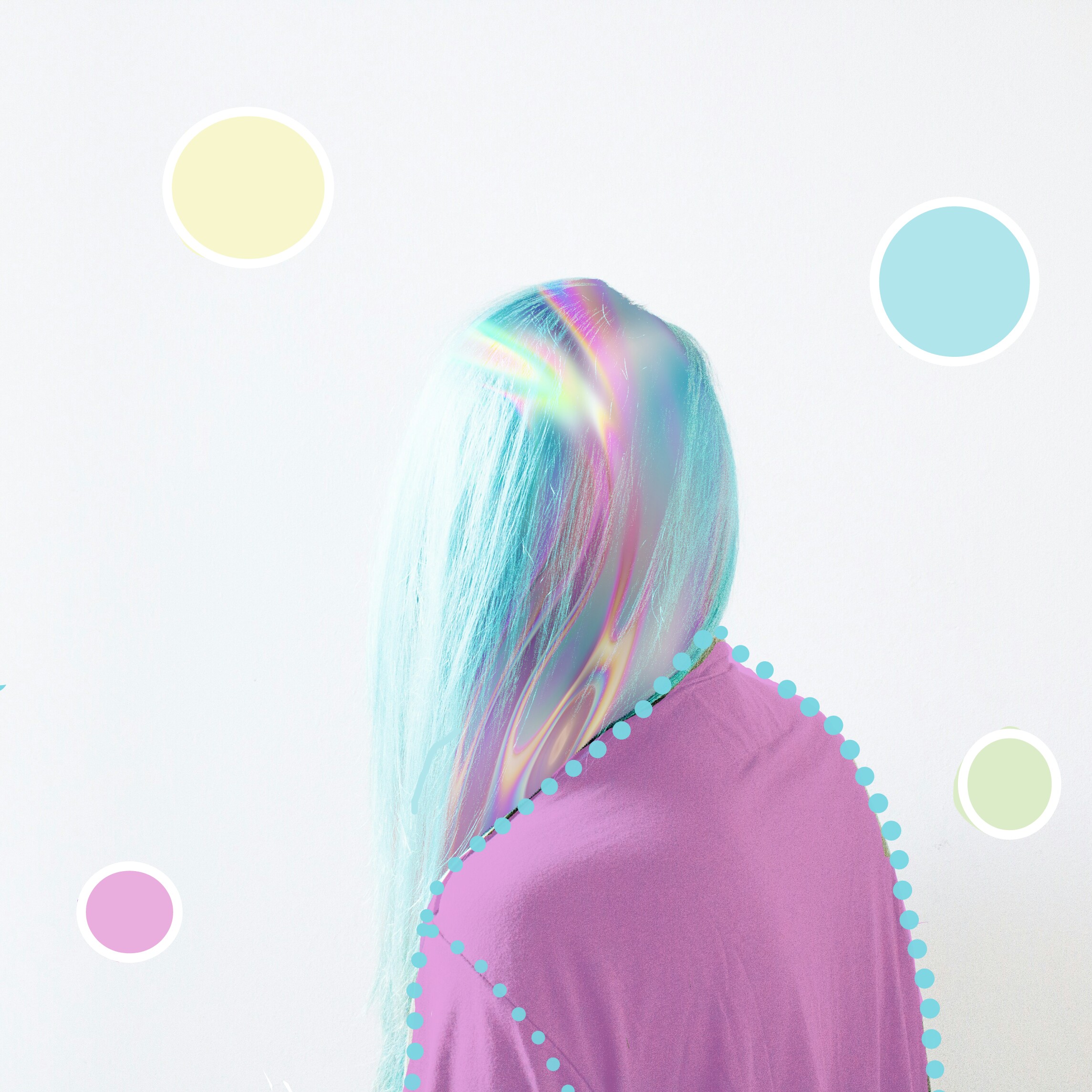
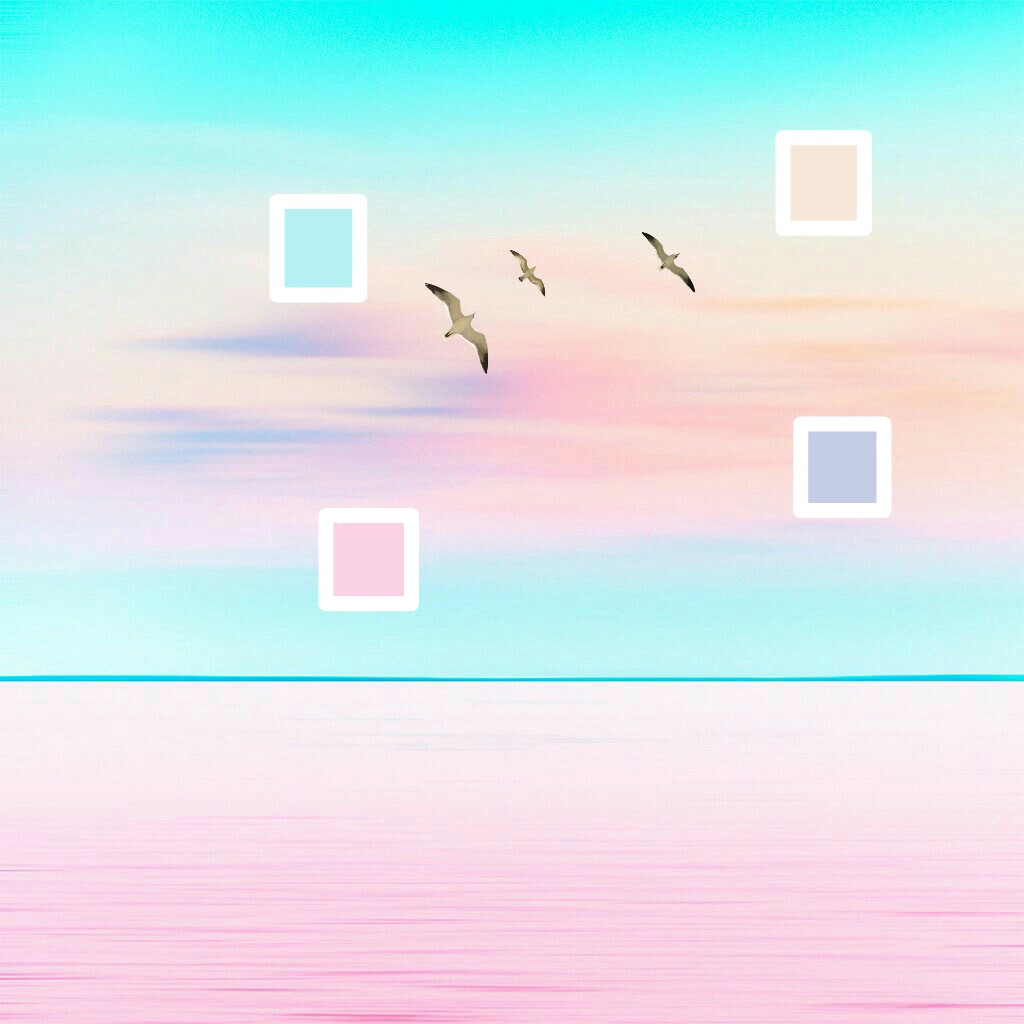
Pastels: We like a combination of #FFAEBC, #A0E7E5, #B4F8C8, and #FBE7C6.
 via PicsArt
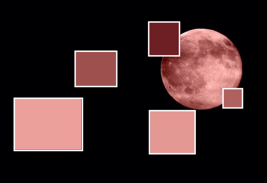
Everything’s Coming Up Roses: Consider using varying shades of red and pink like #EBA09B, #9F514F, and #701E25.
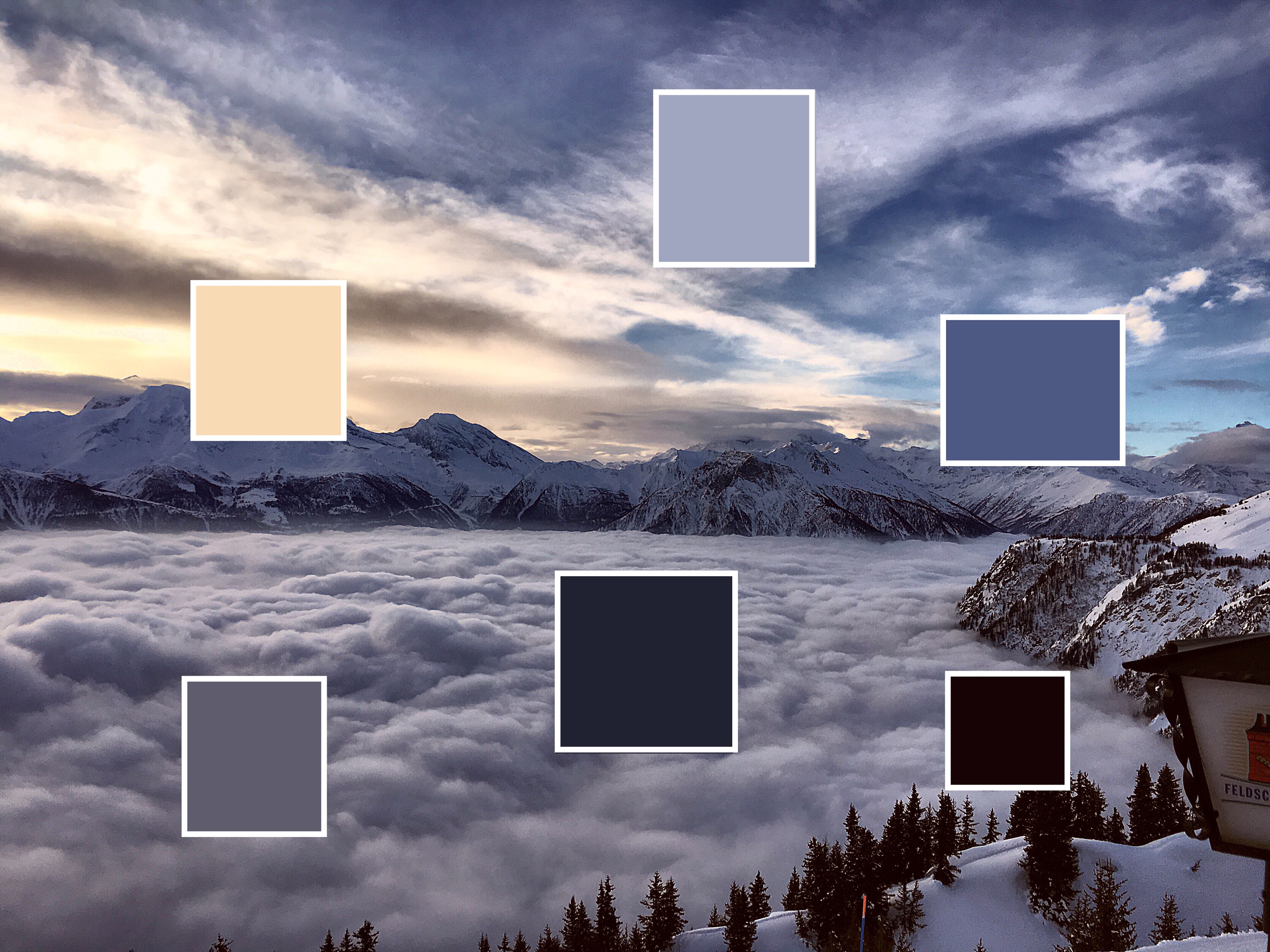
Deep Sea: Who doesn’t love picking colors from an image of nature. Here we were inspired by shades of blue like: #7EC8E3, #0000FF, #000C66, and #050A30.
 via PicsArt
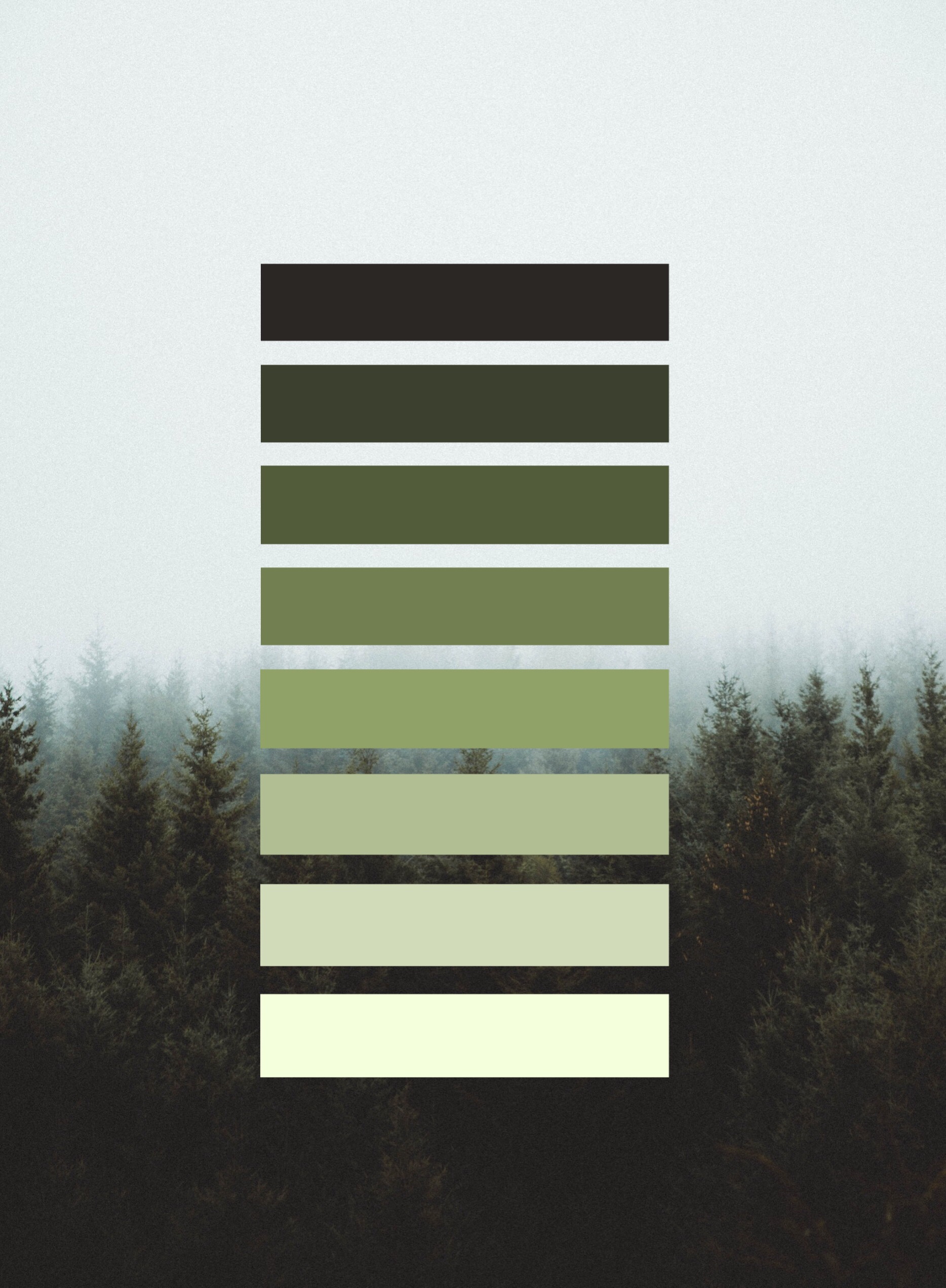
Green Pastures: Mother nature is an endless source of inspiration for green shades like #B2D2A4, #1A4314, #2C5E1A, and #32CD30.
 via PicsArt
Pop Star: Bubble gum pink, yellow, and blue serve up some real ’80s and 2000s pop star vibes. Consider picking colors from a pastel image like #F52EC0, #22CAE0, #FFFF00, and #FFC5D0.
Looking for more inspiration? Consider turning to the seasons for color palette ideas. Make your own fall-inspired color palette or turn up the heat with some hot summer shades. We can’t wait to see your custom color palette!
Create at the Speed of Culture
Picsart is a photo and video editing platform and creative community. A top 20 most downloaded app worldwide with over 150 million monthly active users, its AI-powered tools enable creators of all levels to design, edit, draw, and share content anywhere. The platform has amassed one of the largest open-source content collections in the world, including photos, stickers, backgrounds, templates, and more. Used by consumers, marketers, content creators and businesses, Picsart tools fulfill both personal and professional design needs. Picsart has collaborated with major artists and brands like BLACKPINK, Taylor Swift, Lizzo, Ariana Grande, Warner Bros. Entertainment, iHeartMedia, Condé Nast, and more. Download the app or start editing on web today, and upgrade to Gold for premium perks!

 via PicsArt
 via PicsArt
 via PicsArt


