
15 Beautiful Fonts for Your Creative & Design Projects
Fonts aren’t just letters; they’re symbols. They’re pop culture. Helvetica is the punchline of jokes for being a little too cool for school, and Comic Sans is synonymous with the 90s. Because fonts say so much all by themselves, you’ll need to choose the one that best aligns with your message.
Before we get to the fun stuff, here’s an express class on terminology. Fonts come in a few main varieties, and today we’ll be looking at serif, sans serif, script, and display. Serif fonts have tiny lines on the ends of each letter; sans serif fonts do not. Script flows, each italicized letter rolling into the next. Display fonts are intentionally eccentric and made to be seen; they look good big, so they’re common in print. Once you learn about each category and what mood it gives off, you’ll have all the knowledge you need to pick the right font for your project.
Serif Fonts: A Classic
Serif fonts take themselves pretty seriously, so they’re a strong bet if you’re preparing a document for work or penning a novel. This type of font brings a literary or academic aesthetic to a design. Not surprisingly, serif fonts are common on book covers and university websites. This said, don’t write them off as outdated. You can bring serif font into the 21st century with bold colors and wide kerning (spacing between letters). You can also play around with pairing serif and san serif fonts in the same design.
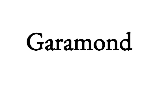
- Do you remember your first font love? I remember mine: Garamond. This font is rounder and squatter than some of its popular counterparts like Times New Roman. Garamond is great for an event announcement or a personal website.
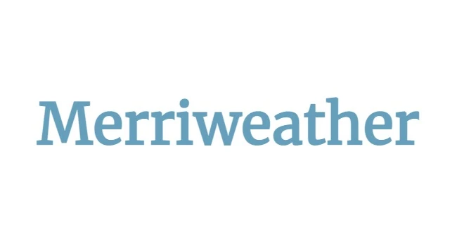
- Merriweather isn’t afraid to take up space. Its bold letters make an impression, so when you need to do the same, consider using this font. It’s right for your business card or the headlines on that travel blog you just started.
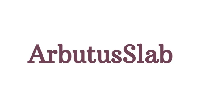
- Opening up a rare books store? A wine bar? Arbutus Slab has notes of timeless class and the inside of books. The elaborate flourishes on the end of each letter bring elegance to a design. It’s a font that pays as much attention to detail as you do.
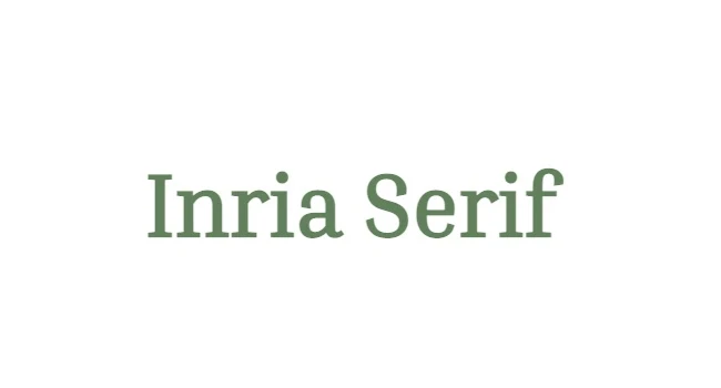
- This one’s for all the foodies or yoga lovers out there. Whether you’re creating the perfect graphic for your studio or compiling the family recipes, this laid-back serif font is as calming and cozy as child’s pose or your mom’s chicken soup.
San Serif Fonts: Smooth Operators
San serif fonts are no-frills, get-the-job-done types of fonts, beloved by modernists and minimalists. They are hip, smart, and never stuffy. You’ll find them on the spines of art books or heading up the menu at the hottest restaurant in town. Almost everywhere sans serif fonts go, heavy kerning goes with them. Part of getting that sleek look is making sure your letters aren’t too close together.
5. Gallery opening, anyone? Bebas Neue is a narrow font that is all-caps meets Bauhaus. Use this font in an interior design presentation or on an announcement for an art show. 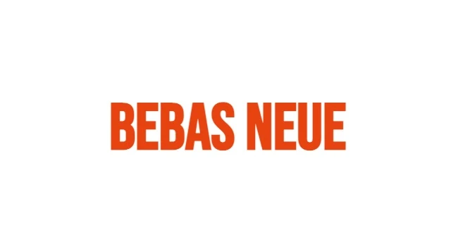
6. Geek out with Source Code Pro. Surprisingly, these early-tech fonts don’t always show up where you’d expect. Instead of being techy, they’re arty–often found in avant-garde designs. So, while Source Code Pro might be perfect for your tech startup, it’s also great for that underground art ‘zine you run on the side. 
7. “Hi, I’m Heebo.” You can practically hear the friendly tone of this font. As such, it’s great for making people feel welcome and making your business look approachable. Use this in the logo for a vacation-rental business or that new app you’re designing. 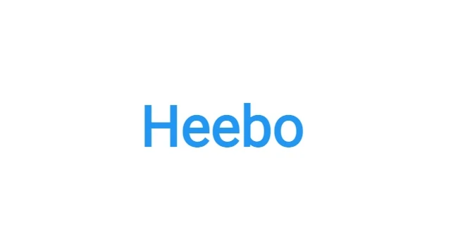
Script: Sheer Elegance
Script is more than that writing style many of us never use but had to learn in grade school. Script is one of the most exciting font varieties, with enough range to go from a formal save-the-date to an album cover. Contemporary scripts are also social media favorites; they give your weekend-outing posts a touch of effortless chic.
8. Bad Script: this is the font that skipped those cursive classes back at school. It looks like a cleaned-up, consistent version of bad handwriting, and the effect is simply cool. It’s awesome for the title credits of your short film or a local plant-based food truck. 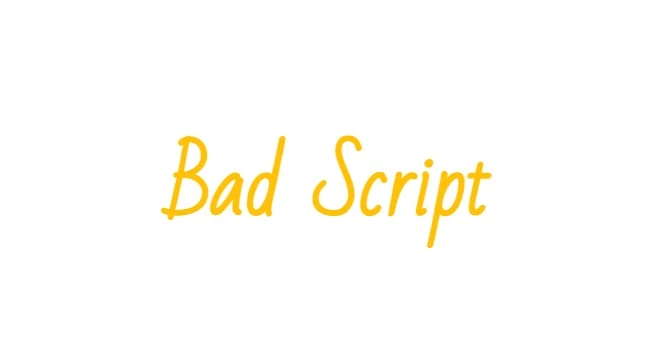
9. Great Vibes is an instant classic. Part traditional and part retro, it’s perfect for posting about, say, your journey to restore an old Airstream camper. Make your design feel nostalgic with this font; it’s the equivalent of putting on a record instead of the Bluetooth speakers. 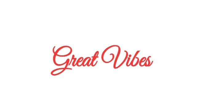
10. The aptly-named Parisienne font is synonymous with the timeless luxury of the French capital. Whether you’re documenting your trip to the city of lights, designing a logo for a boutique, or creating a design for your bakery, you’ll get that perfect je ne sais quoi with this font.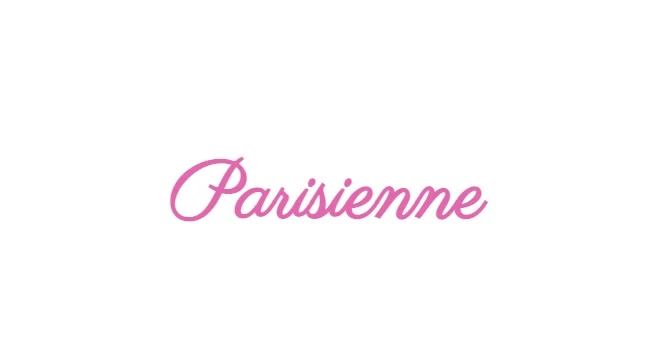
11. League Script, with its stretched, easy-flowing letters, has that laid-back vibe that’s perfect for a modern invitation. This font invites you to kick off your shoes and relax, so use it to invite your friends to a summer gathering. Stick with it for decorations, too. It looks great on name cards. 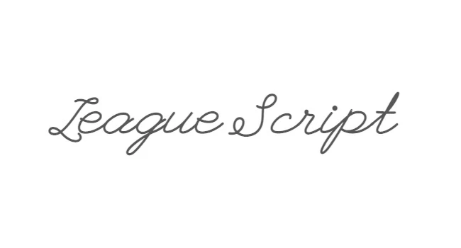
Display: Rock N’ Roll
Display fonts live up to their name. You’ll find this kind of lettering on signs, newspapers, and concert posters. The letters look best large so that viewers can appreciate all their intricate details. The rockstars of the font world, display fonts like to be front and center.
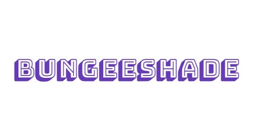
12. Maybe it’s the name, but Bungeeshade brings extreme sports to mind. You could just imagine this lettering on an advertisement for–the obvious answer–bungee adventures or a surf school. This funky text would look right at home on a band tee as well.
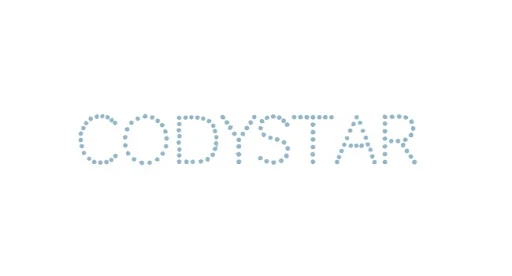
13. Want to see your name in lights? Codystar is a great option for your premiere. Fully comprised of little dots, these letters are meant to be appreciated. So, when you create with this font, give it the space it deserves, and remember to maintain strong contrast with the background of your design so that the letters stand out.
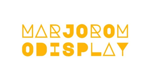
14. Marjoromo Display: is it a font or a ready-made work of art? This complex font uses color blocking and alternating letter weights to create structure worthy of a modern sculpture garden. What’s more, it’s versatile: you can change its appearance by switching the case. While the letters will always render in uppercase, making the font “lowercase” results in more pared-down lettering.
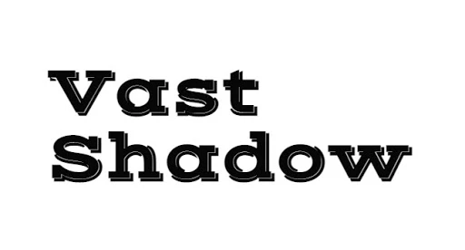
15. Vast Shadow is a 3-D font that looks as if it were stamped on the page. Use it to announce a concert series, and recreate the print age in digital. It’s also a fun choice for book covers, calendars, and other designs that were traditionally made on letterpresses.
Make Awesome
PicsArt all-in-one Photo and Video Editor, Collage, and Sticker Maker is the world’s largest creative platform with over 150 million monthly active creators and influencers. PicsArt has collaborated with major artists and brands like Taylor Swift, The Jonas Brothers, Gwen Stefani, Maroon 5, Lizzo, Meghan Trainor, One Direction, MONSTA X, Warner Bros. Entertainment, iHeartMedia, Condé Nast, and more. Download the app today to level-up your photos and videos with thousands of quick & easy editing tools, trendy filters, fun stickers, and brilliant backgrounds. Unleash your creativity with PicsArt and upgrade to Gold for awesome premium perks!


