When working in the visual arts, you’re working with colors which have the unique quality of drawing all attention to themselves. Color theory is important for understanding not only how photo colors behave, but how the human mind perceives them and what affect they have on our overall impression of an image.
Depending on what kind of photography you’re shooting, you may not have the option to alter the colors in your scene. In these cases, your understanding might tell you to reframe the picture, use PicsArt’s color splash effect, or maybe just turn it monochrome altogether.


RGB or CMYK: It’s All Addition and Subtraction
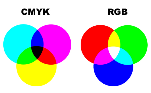
Color can be created in two ways, depending on what medium you’re using. If you remember elementary school art class, you’ll know the primary colors as Blue, Red, and Yellow (or Cyan, Magenta, and Yellow, as are used in inkjet printing). These are the subtractive primaries, which apply to paintings, inks, and other things that are viewed under reflected ambient light. They are known as subtractive because color must be removed to achieve white; all the colors added together would become black (or, in our imperfect world, a muddy dark brown).

In photography, however, we use additive color; because we are dealing with light and not pigment, all the colors blended together will create white, and the absence of color is the absence of light, which is black. When images are illuminated, as on a computer screen, they use the additive primary colors Red, Green, and Blue.
These make up the two main color wheels in use today. CMY is ideal for printing, but for digital photo editing, RGB is the key for our purposes, so let’s look at it a little closer.
Color is Light, and Vice Versa
The RGB spectrum blends a little differently than the paints we used in art class. On this color wheel, Red and Green combine to make Yellow, Green and Blue make Cyan, and Blue and Red make Magenta. All colors together become white, so to darken the shade, color must be removed instead. The ratio of R:G:B determines the hue – whether it’s orange, blue, violet, or whatever. The intensity of those RGB levels determines the tint or shade – how bright or dark (respectively) the photo color appears.


What Does it All Mean?
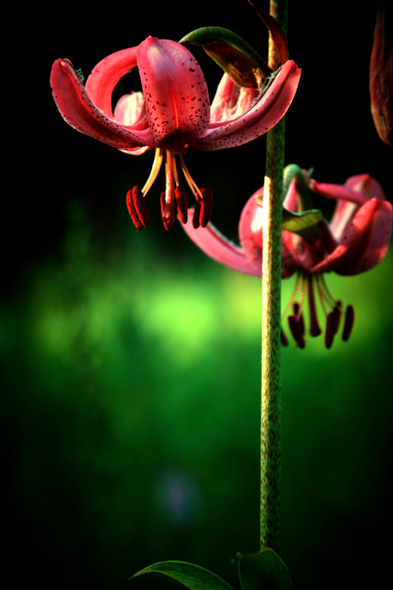
Now that you understand a little bit about light, color, and their intimate relations, you can start to learn how these different values fit together. The first thing to know is about complementary colors; these sit opposite each other on the color wheel, and you know what they say about opposites attracting. These colors – such as Red and Cyan, Green and Magenta, and Yellow and Blue – bring out the brightest in each other, counteracting in our brains to make both appear more brilliant. Using a complementary color scheme will make poppy, arresting images, but be careful not to put the opposites too close together or it can cause a dissonant sensory overload.


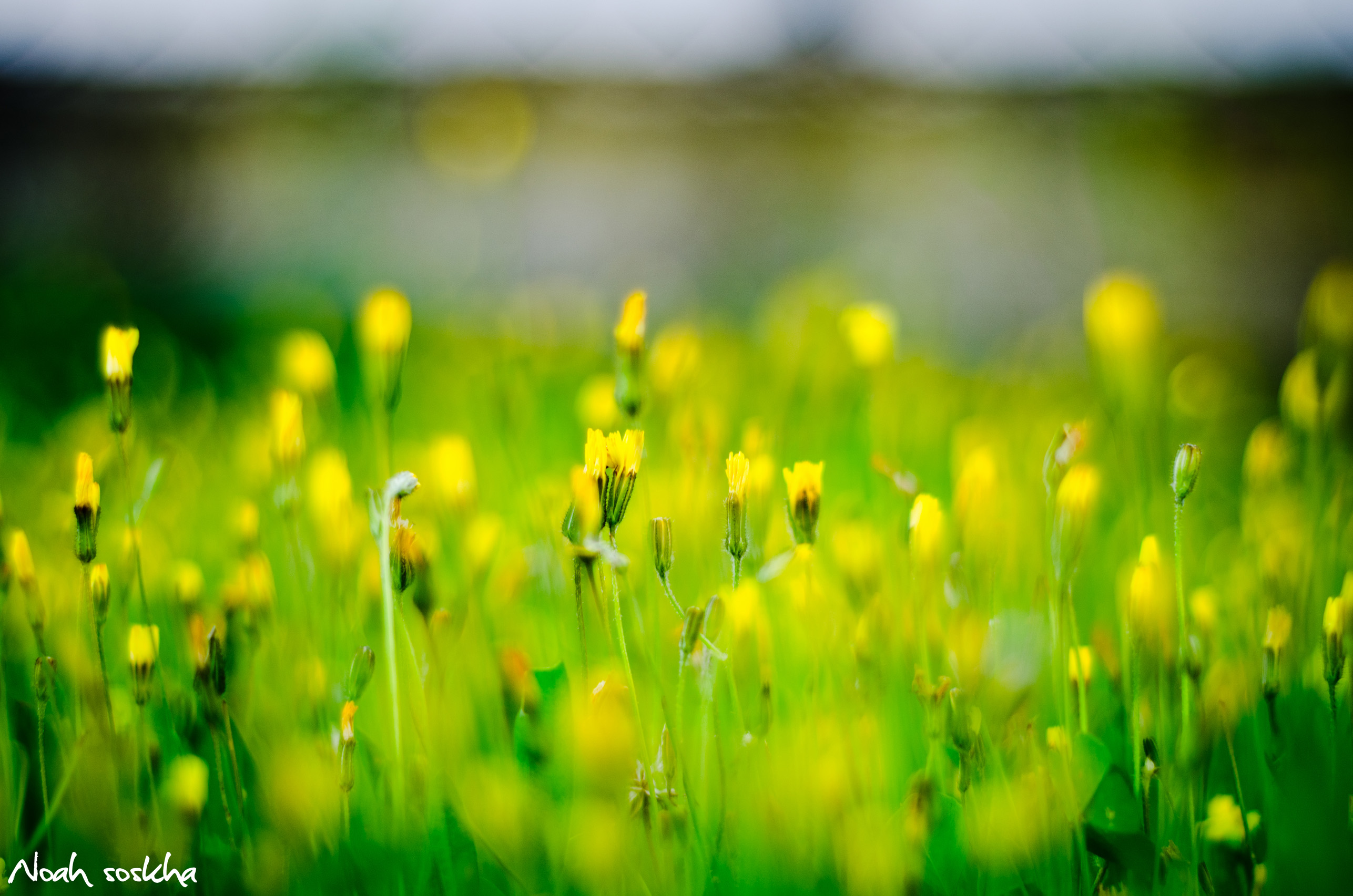
On the other side of the attention-grabbing spectrum are the analogous colors. These sit next to each other on the color wheel and would all be considered to be of the same palette. This could mean a sunset of orange-red,red, and red-purple, or some green, green-yellow, and yellow foliage. This type of color scheme is very pleasant and unchallenging for our brains to absorb, giving a feeling of relaxation and comfort.
Once you understand the principles of color theory, you can begin to look for pleasing tones throughout your photography. With practice and honed skills, this understanding can become one of the most powerful visual storytelling tools in the photographer’s repertoire.


