
Walk into any design studio or marketing meeting, and you’ll quickly realize that choosing logo colors is anything but a random process. It’s a strategic decision that can make or break a brand’s visual identity. Those seemingly simple logo color combinations you see in iconic brands – like the bold red of Coca-Cola or the calming blue of IBM – are the result of careful psychological and design considerations.
Colors do more than just look good. They communicate. They evoke emotions. They tell a story before a single word is read. A well-chosen color scheme for a logo can make a startup feel like an industry leader, transform a local business into a memorable brand, or create an instant connection with your target audience.
In this guide, we’ll dive deep into the art and science of logo color combinations. We’ll explore how colors work, why certain combinations become legendary, and how you can craft a color strategy that speaks directly to your brand’s unique personality.
The psychology of color in logo design
Color is far more than just a visual element – it’s a powerful communication tool that can make or break your brand’s first impression. Every shade carries emotional weight, subconsciously influencing how potential customers perceive your business. Understanding these subtle psychological triggers can transform a good logo into an unforgettable brand identity.
Here’s a breakdown of how different colors translate into emotional and brand signals:
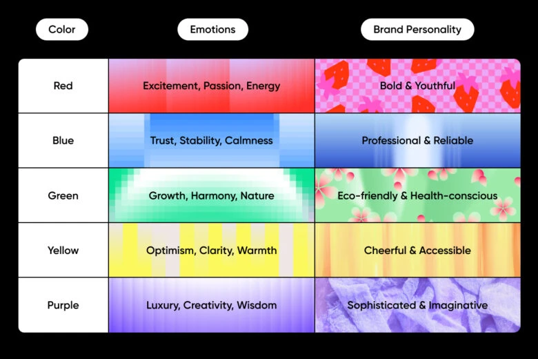
For more color information make sure to check Picsart’s Color Meanings guide to get in-depth information like psychological and symbolic meanings, technical information, appropriate codes, and even logo templates in that color.
Best logo color combinations of two or more colors
Here are some tried-and-true color pairings that have proven their worth across industries:
Classic blue and white
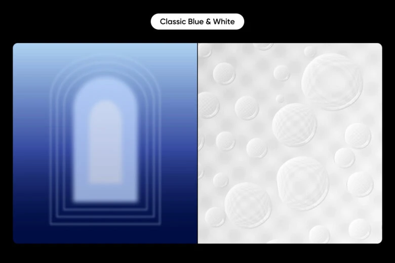
This isn’t just a safe choice – it’s a strategic powerhouse. Blue communicates reliability and professionalism, while white provides clarity and cleanliness. Tech giants like Facebook and professional services like Ford have leveraged this combination to build trust instantly.
Vibrant red and yellow
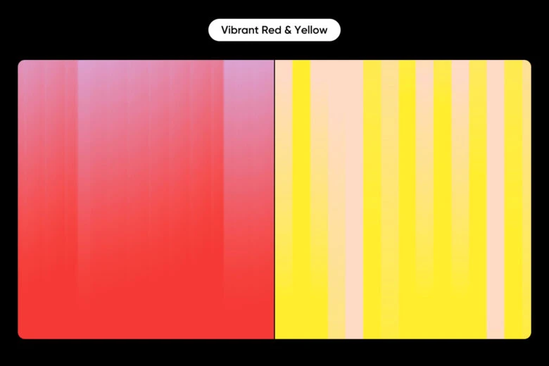
Want to grab attention? This combination screams energy and urgency. Fast food brands like McDonald’s and energy companies like Shell use these colors to create an immediate, visceral response. It’s the color equivalent of a marketing megaphone.
Earthy green and brown
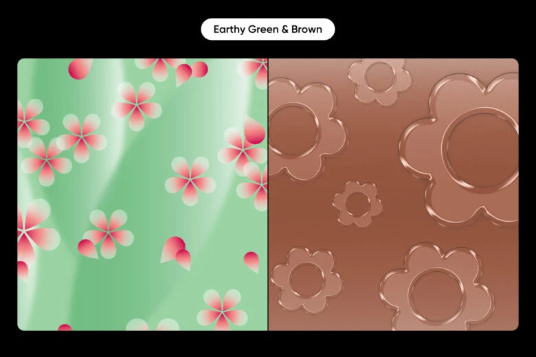
For brands focusing on sustainability, natural products, or wellness, this combination speaks volumes. It communicates groundedness, authenticity, and a connection to the natural world without feeling cliché.
Sophisticated black and gold
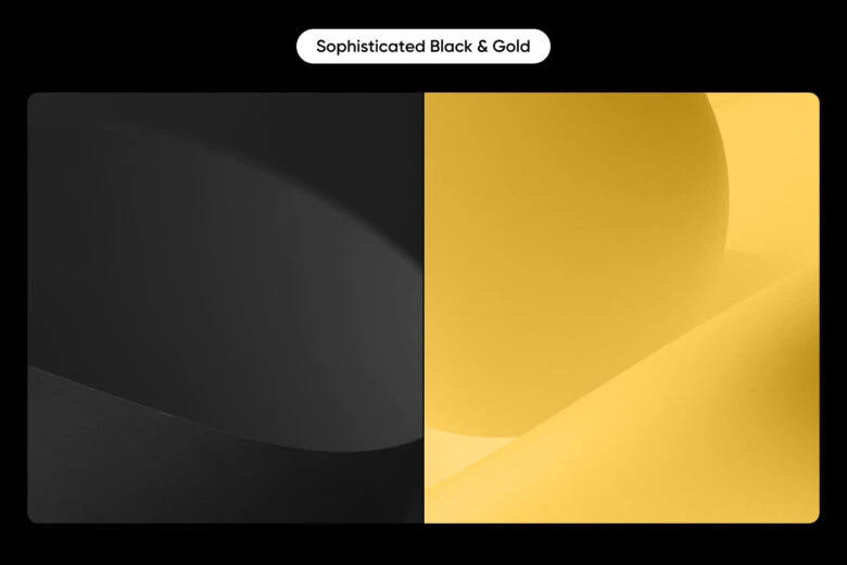
Luxury isn’t just a look – it’s a feeling. Black and gold together whisper exclusivity, premium quality, and timeless elegance. High-end fashion and technology brands frequently use this palette to signal top-tier status.
Energetic teal, coral, and white
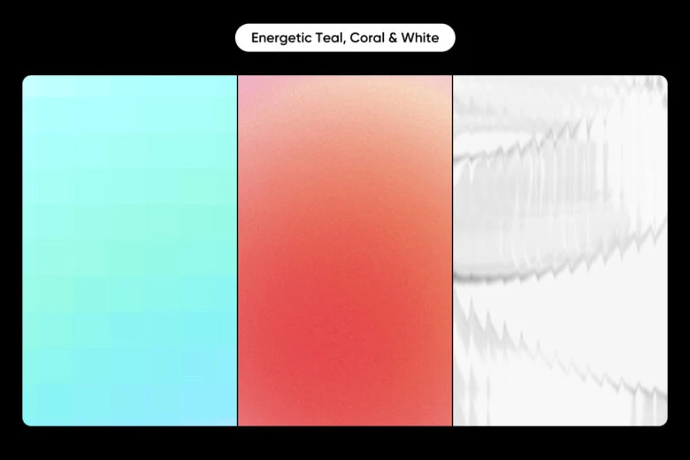
A more modern approach that breaks traditional color boundaries. Teal brings a sense of creativity and communication, coral adds warmth and approachability, while white keeps the design clean and fresh. This combination works brilliantly for innovative tech startups, creative agencies, and lifestyle brands that want to appear both professional and exciting.
Purple, gray, and mint green
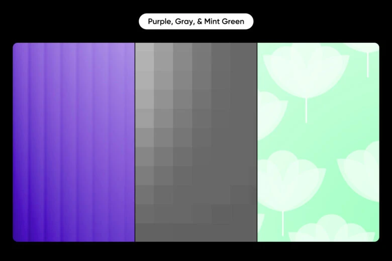
An unexpected combination that speaks to sophistication and innovation. Purple brings creativity and wisdom, gray adds professionalism and neutrality, and mint green introduces a fresh, modern touch. This palette is perfect for brands in technology, design, wellness, and forward-thinking industries that want to appear both cutting-edge and approachable.
Navy blue, orange, and white
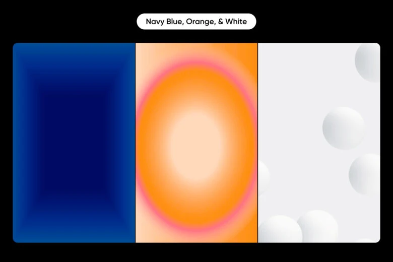
A bold combination that balances professionalism with energy. Navy blue provides trust and stability, orange brings excitement and creativity, and white ensures clarity and simplicity. This color scheme works exceptionally well for sports brands, educational platforms, and companies that want to appear both reliable and dynamic.
Sage green, terracotta, and cream
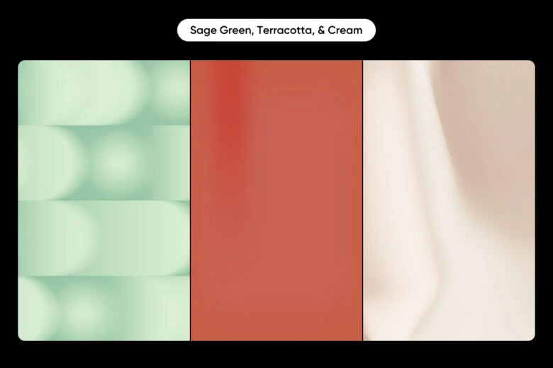
A warm, organic palette that communicates authenticity and groundedness. Sage green represents growth and harmony, terracotta adds an earthy, natural feel, and cream provides softness and warmth. Ideal for organic food brands, sustainable fashion, wellness services, and businesses that want to emphasize their connection to nature and holistic living.
Creating your own color palette for logos
Developing a unique color palette isn’t about picking colors you personally like – it’s about strategic brand positioning. Here’s a step-by-step process to develop your own color scheme:
- Define your brand personality: Determine whether your brand is playful or serious, luxurious or accessible. Your colors should reflect these traits.
- Choose a base color: Select a primary color that best represents your brand’s core values.
- Use color theory: Utilize complementary, analogous, or triadic color schemes to find harmonious combinations.
- Consider the context: Think about where your logo will appear most often and how your colors will look in those environments.
- Test and refine: Use tools like the Picsart AI logo generator to visualize your color combinations in various logo designs.
If you need help finding the matching colors make sure to give Picsart’s Color Wheel tool a try. It can help you create combinations of 2 or more colors by using complementary, monochromatic, analogous, triadic, and tetradic combination logic.
Testing your logo color combinations
Once you’ve selected a color palette for your logo, it’s crucial to test it in various contexts. Consider the following:
- How does it look in black and white?
- Is it readable on both light and dark backgrounds?
- How does it appear on different devices and screen sizes?
- Does it maintain its impact when scaled down for social media profiles?
Tapping into logo templates for inspiration
![]()
Most people who need a logo aren’t designers. They’re entrepreneurs, small business owners, and creatives who just want a visual representation of their brand – without spending weeks agonizing over every pixel.
The blank canvas can be paralyzing. You know your brand needs a logo, but the thought of starting from scratch feels overwhelming. Not everyone has the time or skills to create something from nothing.
Picsart’s logo templates offer a practical alternative. They’re not about taking shortcuts, but about giving you a solid starting point. Think of them like a rough sketch that helps you visualize possibilities. You get to see professional design principles in action, understand layout options, and quickly experiment with different looks.
The real value is in removing the initial creative barrier. Instead of staring at an empty screen, you have a foundation to build on. You can focus on the fun part – making the design uniquely yours by adjusting colors, tweaking elements, and infusing your brand’s personality.
Final thoughts
Choosing the right logo color combinations is a critical step in building a memorable brand identity. By understanding color psychology, exploring proven combinations, and leveraging tools like the Picsart color suite, you can create a logo that not only looks great but also effectively communicates your brand’s values.
Remember, the great color combinations for logos resonate with your target audience and stand the test of time. Don’t hesitate to experiment, but always keep your brand’s core message at the heart of your design decisions.


