We’ve all heard the saying “Less is more.” But as technology continues to open up new possibilities in graphic design, we find ourselves with less “less” and more “more.” It’s one of the consequences of having limitless options at our fingertips. The temptation to add a flourish here, a touch there is too tantalizing to resist. The search for less has become frustratingly elusive.
As a result, minimalist graphic design, which uses only the sparsest elements, has become a striking alternative and a valuable strategy for companies hoping to make their brands and projects stand out amidst crowded visual fields.
In this article, we’re going to talk about the history and main principles behind minimalism, showcase examples to inspire you, and then show you how to get started with a minimalist design in the PicsArt app!
A Summary of the History of Minimalist Graphic Design
Minimalist design trends came about in the 1950s and 1960s. Unsurprisingly, as artistic movements are often born out of some form of rebellion, it was an aesthetic response to an increasingly noisy, consumeristic, busy, and technologically-advancing society.
Whereas most of human history had been characterized by scarcity and people often went to great lengths to fill their empty space with stuff, the post-war period saw people enjoying abundance for the first time. Suddenly, spaces filled up with stuff without much effort, and simplicity took on new meaning. For the first time, it wasn’t just the result of scarcity, but of curated, educated intention. This manifested in graphic design circles through the use of clean lines, minimalist fonts (like Helvetica), and lots and lots of white space. Some of the first designers to utilize minimalistic principles were Buckminster Fuller in the field of architecture, the Bauhaus School in Germany in the field of industrial design.
Why Is Minimalist Design So Popular?
By the 1980s and 1990s, clutter was back in style, and mainstream art was defined by a grungy and collage-driven aesthetic. But by 2010, minimalism made another comeback, and it’s continued to have its moment since then — especially as mobile devices have users scrolling endlessly through content. Instagram is flooded with ads featuring clean and modernist photography. Website design is characterized by neutral color schemes, tight layouts, and bookish fonts. And in the world of fashion, minimalism dominates through brands like American Apparel, which shocked the industry by offering only basics and succeeding at it.
The Principles of Minimalist Graphic Design
Minimalist design is simple only at first glance. It is clean, crisp, and timeless; but it doesn’t just appear in a vacuum. There are principles involved and lots of discipline on the part of the designer.
Pay Attention To Detail: The cardinal rule when talking about minimalism is to consider each and every element very thoroughly. There are many parameters on which designers need to weigh their compositions, everything from copy to photography. Elements should be sparse, but striking; simple, but still extremely user-friendly (and ideally, even more so, as using fewer elements can help lead the way for a more guided experience, particularly in website design). Only the absolutely necessary is included to get the message across.
Never Underestimate the Power of White Space: One of the pillars of minimalist web design is negative space, or white space, which are the areas in between elements in a design composition. Sometimes, when designers talk about white space, clients mistakenly picture endless fields of white, but it’s much more than that. It’s less about having blankets of uninterrupted emptiness, and more about creating balance and harmony between elements of your project, which is a great tactic to direct the user’s attention to where you want it to go. The benefits of white space include increased readability, a reduced cognitive load for your audience, and a better sense of flow.
Use Color Deliberately: Neutral colors are definitely trending in minimalist web designs, but don’t be afraid to toy with a more bold color palette in your graphic design projects. That may sound counterintuitive, but it is possible to utilize color while being strategic about your white space. In minimalist designs, the key is not to avoid color but to not overdo it. Today’s designers will usually stick to only one or two colors at a time within a single composition. Across a larger work, like a website or an application, you might see multiple gradients.
Get To Know Your Fonts: While Helvetica has been overused in the last 60 years to the point of cringe, its legacy in typography and relationship to minimalism is potent. Sans serif fonts emerged when the trend towards minimalism reached typographers, so will always be a popular choice within minimalist design circles. But lately, more minimalist brands are gravitating towards using serif typefaces (in larger applications), to convey a more bookish vibe. The key with minimalism is keeping your fonts legible and your copy to a minimum.
Rethink Your Navigation: Removing every excess is the creed of minimalist design. But it’s also important not to go overboard, especially when designing something as functional as your website’s or application’s navigation menu. While it does make sense to remove rarely used elements, make sure that you aren’t hiding links and instruments that are important to your users. And if you’re selling something, it is essential to keep the “Shop Now” button in perpetual view. Create a hierarchy for your navigation — what is most important? Organize your content accordingly to create a more efficient path across the website, but never sacrifice usability or functionality for aesthetics.
Best Minimalist Graphic Design Inspiration
Logo design
Perhaps one of the areas of branding and graphic design where minimalism has been most widely employed is in logo design. The reason for this is because simplicity is a much more crucial element in logos than in something like website design, mainly because you have very little space to work with. A logo is your brand distilled into its very essence, which goes hand in hand with minimalism. Think about the Nike or Adidas symbol, or the logos for news outlets like CNN or ABC. Logos are about efficiency, and the less cluttered this tiny space is, the better.
Web and App Design
Ever been on a website and felt overwhelmed by the endless content? Unsure how to navigate the design? It’s a common mistake website designers make, to put too much content on a site or a mobile application as opposed to too little. And the stakes are high: It can literally be the difference between a user deciding to spend money on your platform or not. The average person uses 30 apps a month and an average of nine per day, so you’re going to want to make sure your design follows a simple, logical flow, and minimalist principles help you do just that. That’s why minimalism is the new gold standard in both apps and websites: boosting the white space, limiting both the color palette and fonts and hiding UI clutter like navigation bars and buttons.
Book and Magazine Design
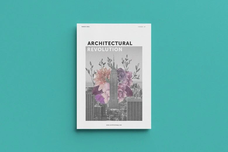
Publishers have long recognized the importance of decluttering their publications, be they magazines or book covers. With the rise in online book sales, it’s important to make sure covers are easily translatable as a thumbnail image, so cutting down on content is key. For magazine publishers, it can be a challenge to distill pages to the bare essentials, but it’s happening more and more. While classic magazines like Cosmopolitan and Reader’s Digest still employ traditional principles, newer magazines on the market, like Jacobin or Philosophy, rely on using line-based illustrations and bolded fonts to create a more modern reading experience.
How To Design a Minimalist Website
Since it doesn’t appear our tendency towards content overload is going away anytime soon, it seems likely this trend will continue to remain popular for quite some time. The question then becomes: How will it evolve? Hopefully, with creative input from you! Here are some quick tips to edit your photos using PicsArt so they’ll be picture perfect for your minimalist website!
Make Awesome
PicsArt all-in-one Photo and Video Editor, Collage, and Sticker Maker is the world’s largest creative platform with over 150 million monthly active creators and influencers. PicsArt has collaborated with major artists and brands like Taylor Swift, The Jonas Brothers, Gwen Stefani, Maroon 5, Lizzo, Meghan Trainor, One Direction, MONSTA X, Warner Bros. Entertainment, iHeartMedia, Condé Nast, and more. Download the app today to level-up your photos and videos with thousands of quick & easy editing tools, trendy filters, fun stickers, and brilliant backgrounds. Unleash your creativity with PicsArt and upgrade to Gold for awesome premium perks.


