
Searching for creative ways to promote your brand? Look no further than typography-style logos. No matter what industry you’re in, typography logo designs are an amazing way to differentiate your brand and leave a lasting impression on your audience.
Simply put, a typography-inspired logo is designed entirely with text. It can be as simple as your company name or as complex as incorporating different fonts, typefaces, sizes, and colors. Here’s how to create effective typography logos to make an impact on your brand.
The importance of typography logo design
When it comes to logo design, typography is an incredibly effective way to stand out in a sea of competitors. A thoughtfully designed logo with the right typography can convey your brand’s personality, values, and messaging in a visually appealing and recognizable way.
For example, a modern typography logo can show that your brand is innovative and forward-thinking, while a more traditional font might be used to express a sense of reliability and trustworthiness.
Key typography terms to know
Before we dive into typography, let’s take a step back and outline some common typography terms. From typefaces to fonts, here’s everything you need to know to design an amazing brand logo.
- Case-sensitive: The position of the punctuation marks (hyphens, brackets, and slashes) of lowercase letters. Fonts with case-sensitive punctuation typically have slightly raised alternatives of these characters, which are centered on the height of the capital letter.
- Dingbats: Decorative symbols and characters that generally aren’t included in a font, such as boxes, arrows, bullets, and other symbols.
- Font: A set of letters, numbers, punctuation, and other symbols used to create text. Although ‘typeface’ and ‘font’ are often used interchangeably, font describes the physical embodiment of text, while typeface refers to the way it looks.
- Leading: The vertical space between lines of text from baseline to baseline.
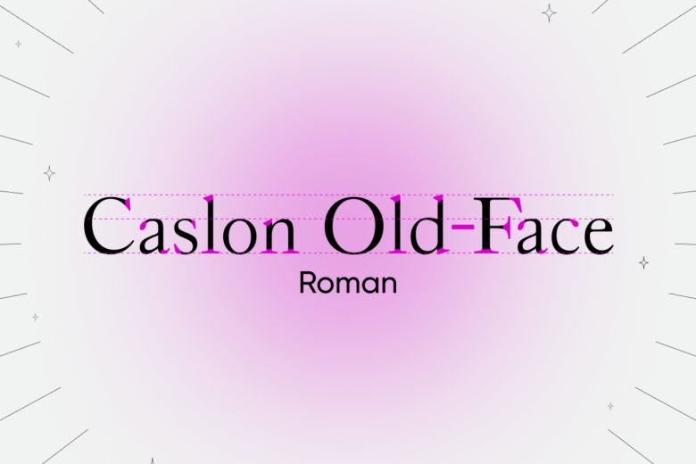
- Roman: The standard upright type style. This term can also be used to describe characters with a regular weight.
- Serif: A short line or stroke that crosses from stems or strokes in a character. Serifs can have multiple shapes, from brackets to wedges. Fonts without serifs are known as “sans-serif.”
- Spacing: The distribution of horizontal space on both sides of a character. Spacing is used to achieve balance in typography design.
- Stroke: A single linear element in a character.
- Typeface: The design of alphanumeric symbols. A typeface can include letters, numerals, punctuation, symbols, and more. Typefaces are usually grouped in families containing individual fonts.
- Weight: The heaviness of strokes in a typeface.
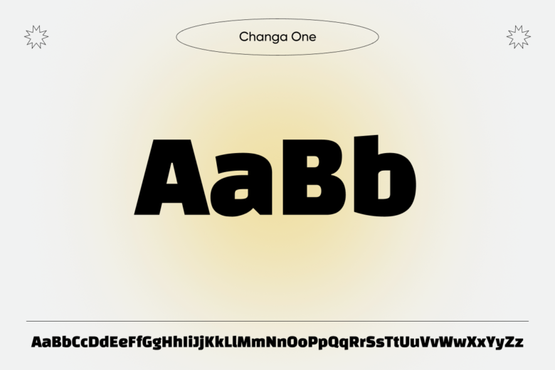
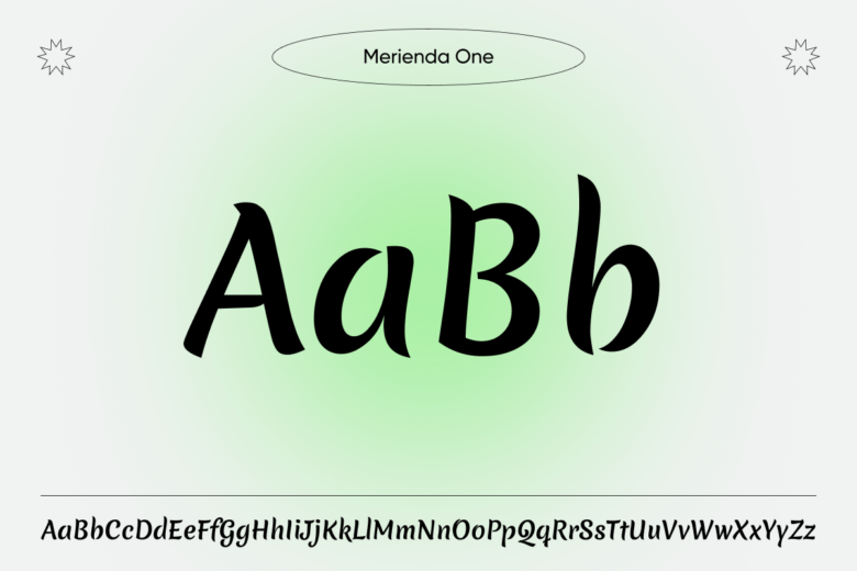
Top 5 font types for typography logos
Now that you’re an expert on logo design, it’s time to explore some popular font options. When you’re designing a typography-style logo, there are several font families to choose from — each with different versatility, legibility, and aesthetic appeal. Here are some fonts to help bring your typography logo ideas to life.
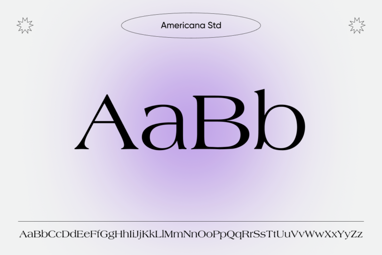
Serif fonts
Compared to other font families, serif fonts feature a more traditional, classic look that can convey a sense of elegance, sophistication, and trustworthiness. They’re often used by luxury brands, financial companies, and other businesses that want to establish a sense of authority and credibility.
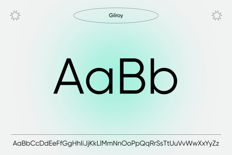
Sans-serif fonts
One of the most popular font families for typography logos is the sans-serif family. Sans-serif fonts have a clean, modern look that works for a wide range of brands and industries. They’re easy to read and can be easily scaled up or down without losing legibility, making them a great choice for logos that will be used across multiple platforms.
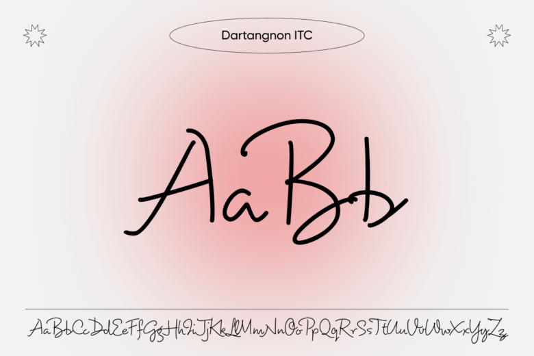
Script fonts
Script fonts are also a great option for typography logos, especially for brands that want to convey a sense of creativity, elegance, or femininity. Script fonts typically mimic cursive handwriting and can add a personal touch to your brand’s visual identity.
Display fonts
Display fonts are often used for modern typography style logos that want to make a bold statement. Because display fonts are highly decorative, they can be used to create eye-catching logos that stand out from the crowd.
Decorative fonts
Decorative fonts are an effective way to infuse your design with personality and flair. They’re often highly stylized and can range from elegant and ornate to whimsical and playful. Decorative fonts can be used to create logos for a wide range of businesses, from fashion to food to beauty.
Eye-catching typeface styles for logos
Looking for some more inspiration for your new logo design? Here’s a quick guide to popular typeface styles for logos to help you make the best choice for your brand.
- Traditional typeface styles: Traditional styles, like serif typography, are characterized by small lines or flourishes at the end of letter strokes. They’re often associated with tradition, elegance, and sophistication. This typography style can be used to create logos for brands that want to convey a classic, established, and trustworthy image.
- Modern typeface styles: Modern typography styles, such as sans-serif typography, have a clean and simple look without the small flourishes of serif fonts. This style is often associated with modernity, simplicity, and clarity. It can be used to create logos for brands that want to convey a contemporary, innovative, and minimalist image.
- Retro typeface styles: Retro typography has become popular in recent years, especially when it comes to logo design. This style is characterized by its vintage, old-school look, featuring bold, blocky letters with unique serifs. By evoking a sense of nostalgia, these logos can tap into people’s emotions and create feelings of comfort.
- Handwritten typeface styles: Handwritten typography styles are often associated with creativity, allowing brands to convey a sense of authenticity and personalization. A handwritten logo can create a warm and inviting feeling, making a brand appear more trustworthy to its target audience.
How to create an effective typography logo design
Ready to start designing your logo? From conveying your brand’s unique personality to selecting the perfect font, here are some tips for designing a scroll-stopping brand logo.
Consider your brand identity
First things first: Your brand identity is essentially the personality of your brand. It encompasses your values, mission, and aesthetic. When designing a logo, it’s essential to ensure that it accurately represents your brand identity. After all, your logo is often the first impression that potential customers have of your brand.
When it comes to logo design, typography can make or break the overall look and feel of your logo. Different fonts and design elements have different personalities, and it’s important to choose a font and overall design that aligns with your brand identity.
Choose the right font
Once you’ve defined your brand identity, it’s time to choose fonts that align with your personality. If you’re using an AI-powered typography logo maker like Picsart, you can experiment with different font choices until you find the right match for your brand.
For example, if your brand is fun and playful, a script font might be the best choice. On the other hand, if your brand is more serious and professional, a sans-serif font might be a better fit. Remember: It’s all about finding a font that accurately represents your brand.
Create a visual hierarchy
In logo design, visual hierarchy refers to the arrangement of different elements in order of their importance. For typography logo design, visual hierarchy is especially important because it helps your audience understand the message you’re trying to convey.
So, how can you create a visual hierarchy in your logo? Try using font size and weight to emphasize certain words or letters. Alternatively, you can use color to draw attention to specific design elements. In addition, the arrangement of the words and letters in your design can also play an important role in your visual hierarchy.
Balance legibility and creativity
Typography is about more than just picking an attention-grabbing font. It’s also about effectively communicating your brand’s message. With that said, there’s a fine line between being creative and being legible — and balancing these two elements is essential to creating a successful logo.
Ultimately, your font choice, size, spacing, and color all play a role in the legibility and creativity of your logo design. If you’re designing a logo with AI, try creating multiple variations of your brand logo to strike the right balance.
Select a fitting color palette
Even in typography designs, choosing the right color palette is paramount. Because color has a powerful impact on emotions, it can influence how potential customers perceive your brand.
Different colors evoke different emotions, so it’s important to choose colors that align with the values and personality of your brand. For example, blue is often associated with trust and professionalism, while green is associated with growth and nature.
Incorporate iconography or symbols
Want to send the right message to your target audience? When simple text isn’t enough, symbols and icons can help convey the values of your brand in a simple and memorable way. For example, a tree icon might represent nature and sustainability, while a heart symbol represents love and care.
By incorporating symbols into your logo, you can communicate your brand’s message and values at a glance — all while leaving a long-lasting impression on your audience.
5 examples of successful typography logos
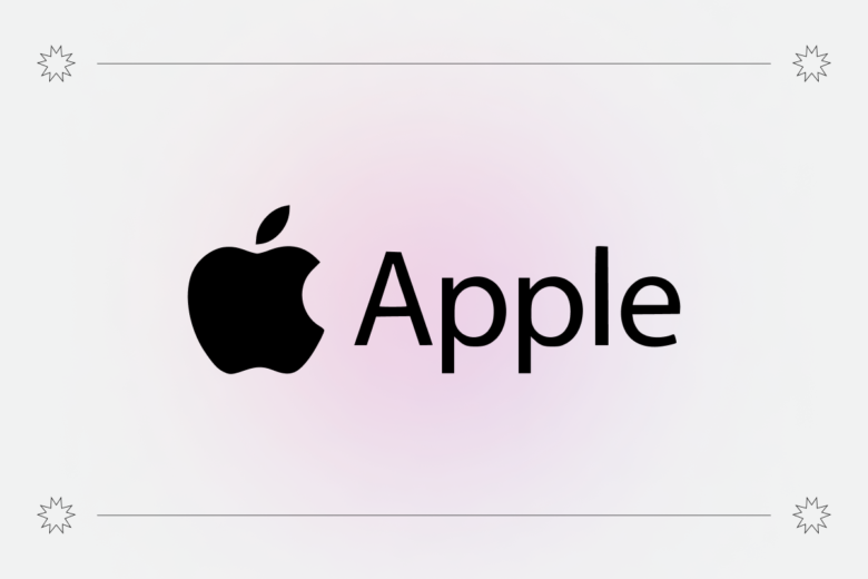
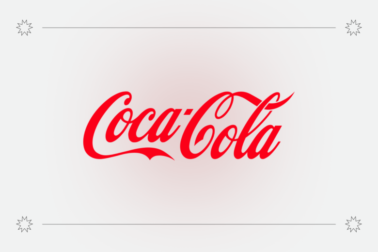
Chances are, you’ve already seen examples of successful typography designs in use. From FedEx to Nike, here are some of the most recognizable brands with typography designs.
Apple Inc.: The Apple logo is a perfect example of minimalist typography. The logo features a sleek, silver apple with a bite taken out of it. The font is clean and perfectly complements the simplicity of the logo.
Coca-Cola: The Coca-Cola logo has undergone several redesigns over the years, but one thing has remained consistent: the typography. The logo features a distinctive cursive script that is instantly recognizable. The font is a custom design called “Spencerian script” that was created specifically for Coca-Cola.
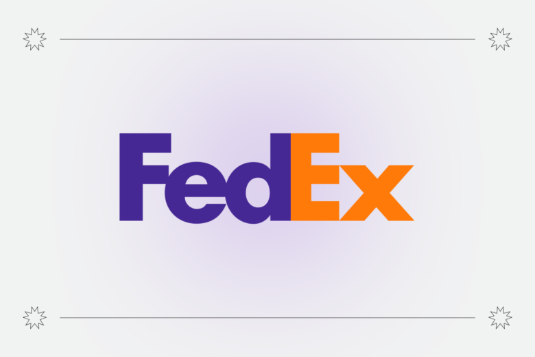
FedEx: The FedEx logo is a great example of how typography can be used to convey a message. The typography is a custom font called “FedEx Sans.” The font is clean and modern, and the use of different colors creates a sense of movement and speed, which is perfect for a company that specializes in shipping and logistics.
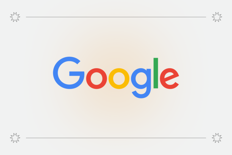
Google: Google uses bright, primary colors and a clean, simple sans-serif font that makes the logo easy to read and visually appealing. They’ve made small adjustments to the logo over the years, such as changing the shade of the colors or the spacing between letters, which keeps it looking fresh and modern.
Nike: Nike’s iconic “swoosh” shows a simple yet memorable logo can be created with typography. The font used for the word “Nike” is a bold and confident sans-serif, which complements the simple yet powerful swoosh.

Revamp your brand with a typography logo maker
Want to take your brand to the next level? Whether you’re brainstorming typography logo ideas for a tech startup or marketing your Etsy business, we’ve got you covered. With Picsart, it only takes a few clicks to create a stunning brand logo — even if you don’t have any design experience.
When you tap into our AI logo maker, you can instantly create visually appealing logos for your brand. From there, you can refine your logo design using our AI editing tools to design the perfect image for your brand. Get started today!


