
Have you ever looked at a design or painting and thought, Why does that look so good?
You know the design is good. You can feel that it’s good. But you can’t put your finger on exactly what makes the design so eye-catching.
What you’re seeing is one or more of the principles of design at work. These principles are guidelines that help designers create aesthetically pleasing designs.
In this article, we’ll go over 12 core design principles that you can use in your next project.
What are principles of design and how important are they?
The principles of design are basic rules that are used to structure and organize the elements of design. They are generally agreed-upon rules regarding what makes a good design.
Design principles guide designers in creating visually appealing and effective designs. They’re important because they help designers make intentional decisions when creating a design, whether it is for a website, logo, or product packaging. Instead of just putting an element here or a splash of color there, designers can operate specifically according to these design principles.
12 core design principles to know
There is not a definitive list of principles that are maintained by a governing body or anything like that. Depending on who you ask and the context, you’ll get anywhere from 7 – 12 principles of design.
So, here are 12 principles to be aware of the next time you start a design project:
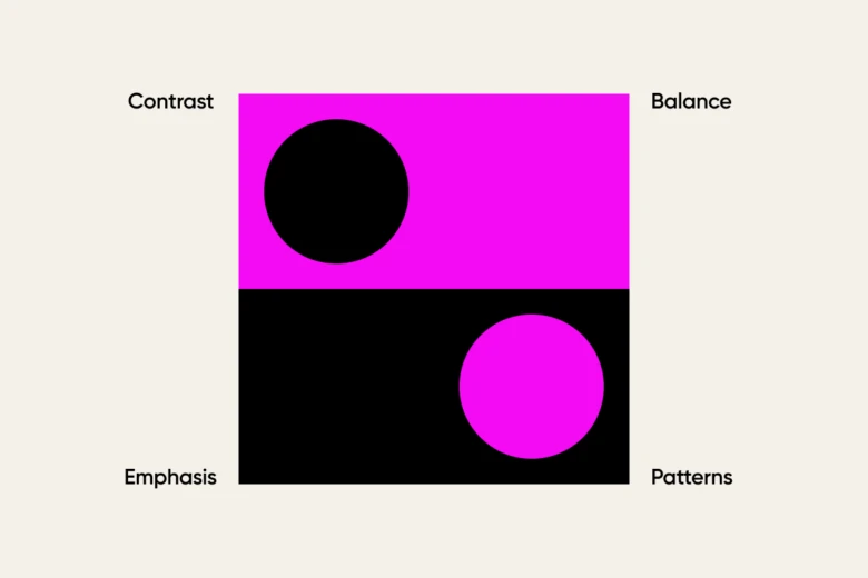
Contrast
Contrast is the difference in visual elements that makes an object distinguishable from other objects and the background. In other words, contrast is how you differentiate elements from one another and make certain elements “pop”.
Contrast is really important when it comes to text designs. Insufficient contrast between a font and a background can make the text tough to read, especially for those with visual impairments. Too much contrast can cause strain on the eyes. Contrast is also important in creating a hierarchy and emphasizing important elements in a design.
How to use contrast:
- Light vs. dark
- Big vs. small
- Bold vs. thin
Emphasis
Emphasis is when certain elements or aspects of a design are made to stand out more as compared to others. It creates visual interest and draws attention to specific parts of the design. Emphasis can be achieved through various techniques such as size, color, shape, position, and style.
Emphasis can also be used to reduce the impact of a certain element. For example, using fine print at the bottom of an image to reduce its impact compared to the main text or image.
How to use emphasis:
- Use contrasting colors
- Make elements larger or bolder
- Change the position or alignment of elements
Balance
Balance is a principle of design that refers to the distribution of visual weight in a design. Some elements are big, blocky, and heavy. Others are light and wispy. You achieve balance when elements are arranged so that no one element overpowers another.
There are three types of balance: symmetrical, asymmetrical, and radial.
Symmetrical balance is when elements are evenly distributed on either side of an imaginary line. Asymmetrical balance occurs when elements are not evenly distributed but still create an equilibrium in the design. Radial balance is achieved by having elements radiating out from a central point.
How to use balance:
- Create symmetry to build a sense of equality in a design
- Use asymmetry to draw the eye to a particular spot
- Utilize radial balance for circular designs
Proportion/Scale
Proportion/scale refers to the relative size and scale of objects within a design. It’s the size of elements in relation to each other. Larger elements tend to stand out more and create a focal point, while smaller elements can add detail and texture. A good proportion/scale creates harmony and helps guide the viewer’s eye through the design.
How to use proportion/scale:
- Use larger elements to create a focal point
- Arrange smaller elements around the larger ones to add balance
- Employ negative space to create proportion/scale and draw attention to certain elements
Repetition
Repetition is the use of similar or identical elements throughout a design. It helps to create consistency and unity within a design. You can repeat colors, typefaces, shapes, or any other element to create a cohesive and visually appealing design. Repetition also helps guide the viewer’s eye and creates a sense of rhythm within the design.
How to use repetition:
- Use repetition to give a sense of stability and consistency to your design
- Experiment with different types of repetition, such as pattern or rhythm
- Utilize repetition to highlight important elements and create a hierarchy within the design
Hierarchy
Hierarchy means that the elements that are important in a design should seem important in the design. So, for example, on a page, the title should be large so that people know that it’s important. The headings and subheadings should be appropriately sized to convey their importance in relation to the title. This visual hierarchy helps guide the viewer’s eye and makes it easier for them to navigate through the design.
Rhythm
Rhythm refers to the space between elements and the flow that the space creates. There are different types of rhythm:
- Regular
- Alternating
- Random
- Flowing
- Progressive
Each type of rhythm evokes a different feeling. A regular rhythm conveys stability, while a random rhythm conveys a sense of chaos.
How to use rhythm:
- Use rhythm to create a sense of movement and flow within your design
- Vary the spacing between elements to create different types of rhythms
- Combine multiple types of rhythm for a more dynamic and interesting design
Patterns
You probably are well-versed in this one. A pattern is simply a set of repeating elements in a design. Think wallpaper.
A pattern can be a motif, texture, color, or any other repeating element. Patterns can add interest and visual appeal to a design while also creating rhythm and unity.
How to use patterns:
- Use patterns to add texture and depth to a design
- Consider the scale of the pattern in relation to other elements in the design
- Break up large areas of negative space by using patterns
White Space
White space, or “negative space”, is the empty space between design elements. It may seem like wasted space, but it actually serves a purpose in design. White space helps create balance in a design and allows the viewer’s eye to rest and focus on important elements. It also helps with readability and organization. White space allows a design to breathe, in a sense, and not feel overly cluttered.
How to use whitespace:
- Use whitespace to create balance and allow important elements to stand out
- Create a clean and organized design through the strategic use of whitespace
- Avoid overfilling a design with too many elements
Movement
Movement is the way elements are arranged to create a sense of motion or direction in a design. You can achieve motion through various techniques such as diagonal lines, repetition, or visual flow. Movement helps guide the viewer’s eye and creates a dynamic and engaging design. It can lead the viewer from the most important element to the next most important and so on.
How to use movement:
- Use movement to create a sense of energy and flow in a design
- Arrange elements in a way that leads the viewer’s eye through the design
- Create variation and interest by incorporating different types of movement
Unity
Unity is a principle of design that describes how well the different elements of a design work together. In most designs, you want each element to have a specific relationship with other elements in the design. Unity creates a cohesive and harmonious composition. It helps the viewer understand the design as a whole rather than individual elements.
How to use unity:
- Use a consistent color palette and typography to create unity
- Space elements in a way that creates harmony and balance
- Avoid using conflicting styles or elements that do not fit together
Variety
Variety is the use of different elements to create interest and contrast in a design. By using various colors, sizes, shapes, textures, etc., you can add variety to your design and make it more visually appealing. Variety also helps prevent boredom and keeps the viewer engaged with the design.
How to use variety:
- Incorporate different visual elements such as color, shape, and texture
- Use varying font sizes or styles to create contrast
- Create emphasis by using different-sized or styled elements
Using Picsart to implement the principles of design
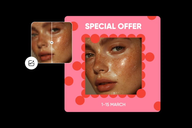
Picsart is the perfect design tool for implementing the principles of design. If you’re not sure where to begin, we have thousands of professionally designed templates for every occasion. These designs feature all the principles mentioned above and can help you design an image that looks absolutely stunning.
Or maybe you have an existing image you want to customize. If that’s the case then you’re going to want to check out Picsart’s powerful image editing tools.
And if you want to turn your ideas into amazingly realistic images, then you’re not going to want to miss out on our AI design tools.
Basically, Picsart is your all-in-one image design and editing tool that can do, well, just about everything! It’s a collection of the best AI design tools, custom templates, and image editing tools out there.
Conclusion
Using the principles of design doesn’t automatically guarantee that a particular project will turn out well. However, by incorporating these principles into your designs and using tools like Picsart to make them even better, you can significantly increase the chances of creating an eye-catching image. So don’t wait any longer. Start designing!


