Paraphrasing, someone once wrote, “There are seven seas, seven deadly sins, seven chakras, seven days of the week, Seven Wonders of the World…and then there are sevencolors.”
red, orange, yellow, green, blue, indigo, violet
I like red. Always have. But everything I know about color I learned from that box of crayons I was given as a kid. The sum total is what was written on the Crayola paper wrapper: green, violet, and burnt sienna. Unfortunately that is all most of us know about the subject. People take color for granted.
What exactly is color?
Newton, Einstein, Rembrandt and Freud, frequencies, particles, pigments and foibles, each has a different answer to that question.

BLUE
Originally the color pigment was manufactured from indigo and woad. One of the most popular colors for many people. Most preferred by men. It is attributed with feelings of calm or serenity. One of the most prevalent in nature because of the sky and the seas. Cold.
Colors can be combined to complement or cancel each other. But in practical terms, none of the science matters. We do not need to know its speed or wavelength or theory to make it work.
PRIMARY COLORS
red, green, blue
SECONDARY COLORS
orange, green, violet
CMYK
cyan, magenta, yellow, black
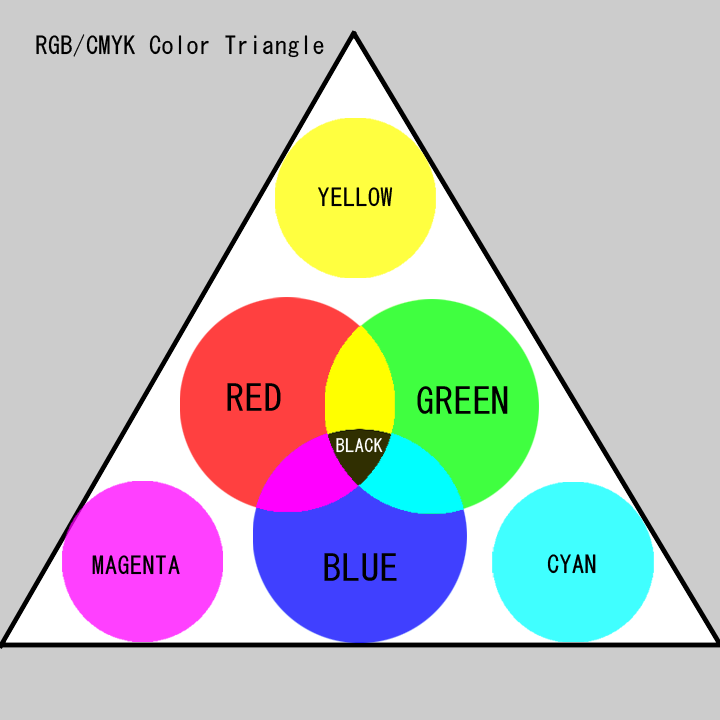
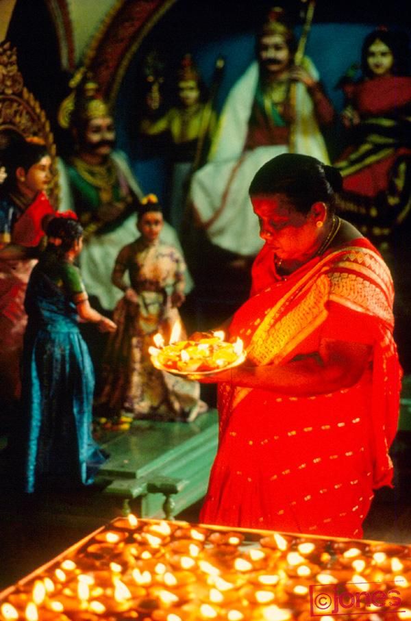
For photographers, color is a tool. To make our pictures better we need to be aware of how colors affect our audience, not necessarily why. Because of how our eyes receive light waves, warm colors tend to stand out from the background while cool colors recede. Or more obviously, bright colors attract attention whereas dark colors are largely ignored.
YELLOW
This is the brightest and most visible of colors. A person surrounded by yellow feels optimistic. In the West, yellow is often associated with cowardice and treachery but in China yellow is a noble color. Indicates the sun. Light. Air. Royalty.
Armed with the right light and right colors, you can do almost anything in photography. You can create your own reality or fantasy. You can highlight what you see or hide what you don’t want others to see.
Colors have psychological effects on people so we can draw their attention in the direction we want them to look or dramatically affect their mood. They have cultural attachments also. Therefore what a color means in one country can induce entirely different behaviors in another.
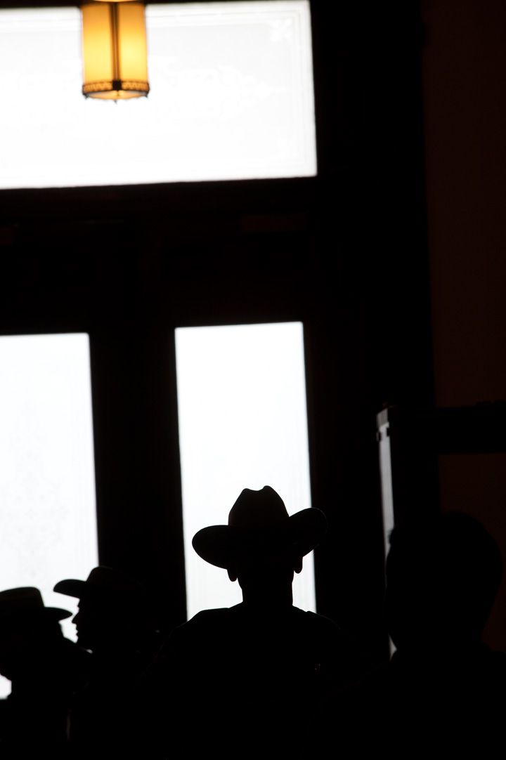
Using many colors can be distracting. Because there are so many colors it can be a balancing act to use them effectively and judiciously in a good photograph. On the other hand, being monochromatic can be clever or abstract. Color choices are so subjective and personal. “The science of color must be regarded as essentially a mental science.”

RED
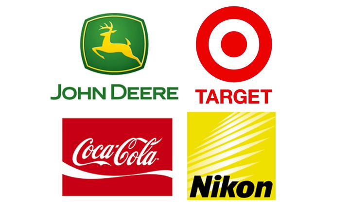
Blood. Fire. Emotion. Anger. If you want to draw attention, use red. Red has long been associated with love, warmth and comfort. Worn by brides in China. It has the longest wavelength of visible light.
Little empirical data has been collected on its influence but color is a wonderful means of nonverbal communication. It is a hot topic in marketing, art and design. We use and abuse colors. Photography is the perfect outlet for experimentation and exploitation of colors.
GREEN
Green is a cool color that symbolizes nature. It is also associated with fertility. Growth. Supports harmony. Used on money.
Light illuminates everything we see democratically. Everything receives its share. But color differentiates. It is discriminating. Color makes choices. Light does not. Light goes in and reveals while color comes out to inform.
WHITE
White is the compression of all the colors of the spectrum. It represents purity or innocence. Sterility. Wisdom. In certain cultures it connotes death.

___________________
Photos and Text by Lou Jones


