
Do you ever wonder why some text just ‘works’ while others fall flat on their face? It’s all about typography, the art and science of arranging text. Choosing a font just won’t cut it, you need to arrange your text in a way that boosts its readability, adds to the aesthetics and gives your brand a unique identity.
But what does typography mean, and why does it matter so much in design? Let’s break it down, explore typography design principles, and share actionable typography tips to elevate your projects.
Typography for the layman
What is typography? To put it simply, typography is a combination of style, arrangement, and the overall appearance of the text. This could involve selecting from a variety of typefaces, tweaking the spaces and then structuring the layout to improve your messaging.
The tell-tale sign of typography that does its job is text that is not just readable but pleasing to the eyes. But wait- there’s more. Even though you might not notice it, Typography can often give you cues about what to do next.
Ever landed on a site and instantly knew where to focus? That’s typography guiding you. With tricks as simple as bold text, italics, or color; typography creates a hierarchy so you put your attention where it’s needed the most.
Why is design incomplete without typography?
It’s a shame to have an amazing design suffer because the typography just doesn’t hit the mark. Typography can make or break the impact you would like your designs to have. When you get typography right, you’ll see:
- Improved readability and user experience
- A stronger brand identity
- Better control of the reader’s attention
- The right emotions and tone coming across
- A more professional and polished finished product.
Typography can change the way people engage with your messaging. Play around with the typography and you can influence your brand perception however you want, just make sure you understand the principles of design for a fruitful outcome.
Typography lingo you need to know
To master typography, you must know what it is and how to use it. We’ve made it easier for you with our typography lingo cheat sheet, let’s take a look:
Typeface – Think of this as the “style” of the text. It can set the mood for your message and add personality to the text. For example, if you use a fancy typeface like Baskerville, it feels classy and formal, which is perfect for invitations. On the other hand, a fun typeface like Comic Sans is great for a kid’s book.
Font – The font is just a variation of the typeface. It can influence the weight, style, and the size of your text. Such as a bold font will make your text stand out, and if you want to give a softer look, you can use a light font, maybe even italics.
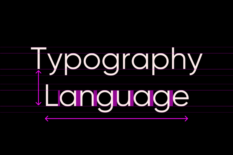
Leading – Every text looks best if it’s evenly spaced out and the space in between the lines is called the leading. Too little, and everything looks crammed together. Too much, and the text feels too spread out.
Kerning – Kerning is the space between the individual letters. If you’re not too careful, the letters can look awkward. So it is best to go for good kerning which makes the words easy to read and visually appealing.
Tracking – This controls the spacing across a whole word or sentence. Widening it makes text feel more open and airy, while tightening it gives a more compact look.
Typography principles- A checklist
When deciding on a typographical design, you might miss out on a lot of key components, which is why you MUST keep all the typography principles in mind before you start and after you finish. We have made a checklist that can help you:
✔ Readability – Use fonts and spacing that are easy to read.
✔ Contrast – Combine different font sizes and styles for visual interest.
✔ Alignment – Keep text consistently aligned (left, right, centered, or justified).
✔ Hierarchy – Guide readers using font weight, size, and color.
✔ Spacing – Adjust kerning, leading, and tracking for better clarity and flow.
For tools that simplify typography design, explore Picsart’s Design Tools.
Typography elements don’ts
Making mistakes is super common when it comes to typographical elements. Here are some Don’ts that you should avoid at all costs:
✖ Mix too many typefaces – Too many styles create inconsistency.
✖ Use tiny or oversized text – Both can make reading difficult.
✖ Ignore color contrast – Low contrast reduces readability.
✖ Overcrowd text – Too little white space makes designs look messy.
✖ Make lines too long or too short – Poor line length disrupts reading flow.
How to choose the right typeface
Do you face difficulty choosing the right types? There are so many to choose from! Here’s a step-by-step guide that helps you choose the right typeface every time:
- Step 1
Brainstorm, think about whether your brand is playful or uber professional? Determining this will help you choose a typeface that reflects this identity. - Step 2
We all know how tempting it is to choose overly decorative fonts for body text, but they can be hard to read in long-form content. - Step 3
Compatibility is not just important in relationships. You need to pair your fonts in a way that they complement, not clash with each other. - Step 4
User experience is paramount so you need to check how your typeface looks on different screens (desktop, tablet, and mobile) to make sure they are readable everywhere. - Step 5
Two’s a pair and three’s a crowd. Stick to one or two fonts max to keep your design polished and professional.
Browse a variety of fonts and experiment with styles using Picsart’s Font Library.
Conclusion
Typography is the backbone of great design. It balances art and science, turning words into visuals that capture attention, set the mood, and make content effortlessly readable.
By now, you’ve learned the essentials:
✔ Hierarchy, spacing, and contrast aren’t just jargon—they’re your tools for guiding the reader’s eye.
✔ Mistakes matter—overcrowded text, clashing fonts, or poor readability can ruin even the best designs.
✔ Readability is non-negotiable—if your audience has to squint, they’ll scroll away.
Ready to level up? Use this typography guide and experiment fearlessly with Picsart’s design tools. Tweak your fonts, adjust spacing, and create text that doesn’t just look good—it works.


