
Contents
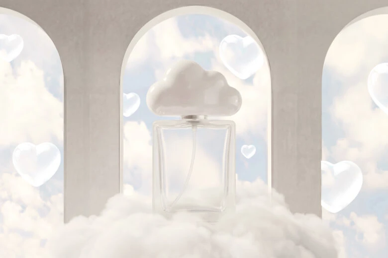
The Pantone Color of the Year 2026 is Pantone 11-4201 Cloud Dancer. It’s a soft, quiet off-white designed to create space rather than fill it.
Cloud Dancer doesn’t behave like a typical “trend color.” It doesn’t shout, sparkle, or try to dominate a palette. Instead, it sits back. It lets other elements breathe. That restraint is the point, and it says a lot about where visual culture is heading in 2026.
If past Colors of the Year leaned expressive or emotional, Cloud Dancer leans deliberate. This guide looks at what that means, where the color is already showing up, and how creators can actually use it without everything blending into beige.
Why the Pantone color of the year matters
Every year, the Pantone Color of the Year acts like a visual temperature check. It reflects how people are feeling and what they’re craving from design right now.
In 2026, that craving is clarity. Less clutter. Fewer competing signals. Cloud Dancer fits into that shift naturally. It works as a reset color – something that calms visual noise instead of adding to it.
For creators, the Color of the Year isn’t a rule. It’s more like a reference point. You don’t copy it verbatim. You respond to it.
Why Pantone chose Cloud Dancer for 2026 and what it means
Pantone describes color of the year 2026 Cloud Dancer as “a whisper of tranquility and peace in a noisy world.” That phrasing feels intentional because the color itself behaves that way.
Cloud Dancer lives just off pure white. It has warmth, but barely. Enough to feel human. Not enough to feel decorative. Psychologically, it creates a sense of pause. Visually, it gives other colors permission to exist without competing.
Pantone’s selection process always pulls from culture, not trends alone. For 2026, the signal is clear: designers are moving toward softness, spaciousness, and environments that feel lighter – mentally and visually.
This isn’t minimalism for the sake of minimalism. It’s design as relief.
Where you’ll see the Pantone color of the year 2026
Cloud Dancer doesn’t show up as a centerpiece. It shows up as a setting.
In interiors, it’s used on walls, textiles, and sculptural forms where light matters more than contrast. In fashion, it acts as a neutral base that lets silhouette and texture do the work.
Branding leans on Cloud Dancer as a background color – especially for packaging, editorial layouts, and product storytelling. In digital design, it’s already common in UI surfaces, social templates, and calm, editorial-style feeds.
You don’t always notice it immediately. You notice how everything feels easier to look at.
Cloud Dancer works best when it supports the design instead of leading it. Think foundation, not feature.
Using Cloud Dancer in design
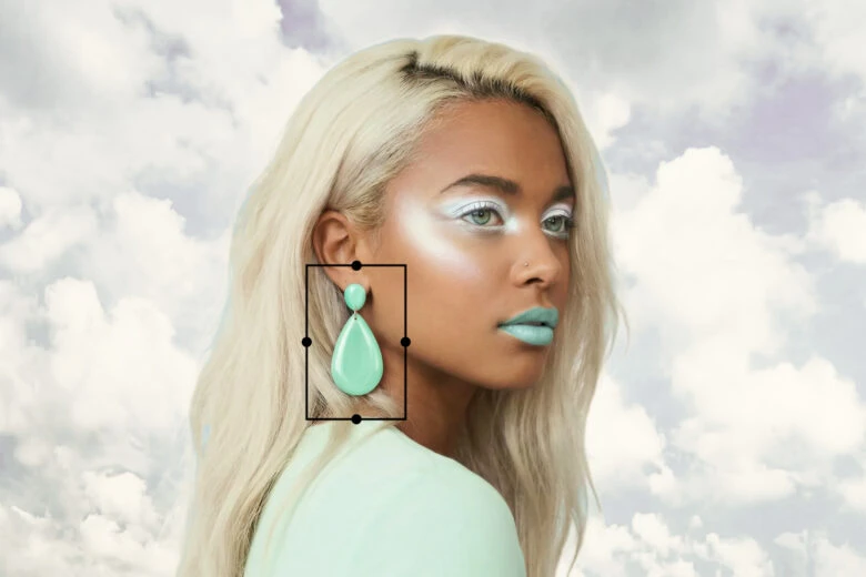
As a primary color, Cloud Dancer creates openness. It works especially well in layouts that rely on spacing, light, and structure rather than bold color contrast. As an accent, it softens edges and keeps stronger hues from feeling heavy.
Pairing is where things get interesting. Powdery pastels, warm neutrals, muted blues, and softened greens all sit comfortably next to Cloud Dancer. Loud, saturated colors can work too but only when used sparingly.
With Picsart Colors, creators can explore subtle variations around Cloud Dancer to find tones that feel intentional rather than flat.
Using Cloud Dancer in digital content and social media
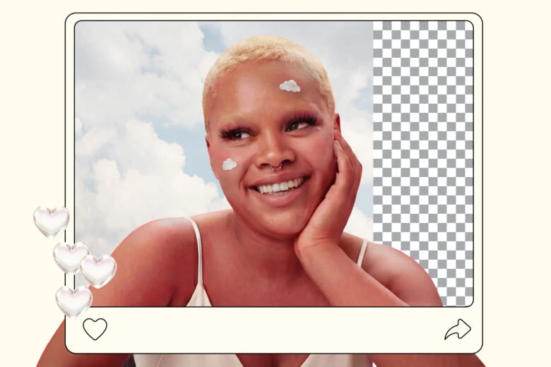
On social platforms, Cloud Dancer is a pacing tool. It slows things down visually.
Used as a background or framing color, it gives content room to breathe. It works well for stories, thumbnails, and editorial-style posts where clarity matters more than impact.
Rather than replacing an existing brand palette, Cloud Dancer fits best when it softens it. A little goes a long way.
The Color Wheel helps build palettes that stay cohesive without becoming dull, especially when working with low-contrast schemes.
For creators starting from mood boards or reference images, the Color Picker makes it easy to pull supporting tones that naturally align with Cloud Dancer’s softness.
FAQs about the Pantone color of the year 2026
What is the Pantone Color of the Year 2026?
Pantone 11-4201 Cloud Dancer.
What does Cloud Dancer represent?
It represents calm, clarity, and visual lightness in response to overstimulated design environments.
Why did Pantone choose such a subtle color for 2026?
Because restraint and balance are becoming more valuable than boldness in visual communication.
Do brands need to use Cloud Dancer?
No. It’s a reference, not a requirement.
How can I find colors that pair well with Cloud Dancer?
Palette tools and color wheels help reveal combinations that stay soft without losing contrast.
Can I experiment with Cloud Dancer using Picsart for free?
Yes. Picsart’s color tools make it easy to test palettes before committing.
Final thoughts
Cloud Dancer isn’t meant to impress at first glance. It’s meant to last.
Pantone 11-4201 Cloud Dancer sets a tone for 2026 that favors intention over intensity. When used thoughtfully, it gives designs space to breathe and content room to speak.
For creators, the value isn’t in copying the color exactly. It’s in understanding what it allows and then deciding how quietly or boldly to use it.


