We’ve all heard the saying “don’t judge a book by its cover.”
While this adage about not jumping to conclusions might be good life advice, when it comes to a literal book, the cover should actually help us come to a few conclusions.
A great book cover cues us into the genre, style, and tone of the work.
In recent years, book covers have gone from great to excellent, with many novels looking like Instagram-ready, coffee-table books. Bold colors, modern fonts, and perfectly edited images have come together to make books that look so good they’re practically accessories.
The best part? The cover is just the start. It’s the perfect invitation to cozy up with the great story that unfolds in the pages.
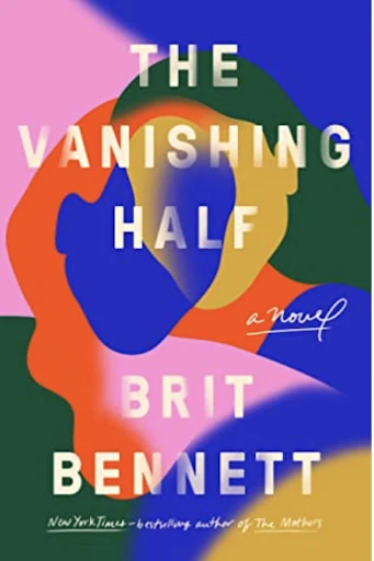
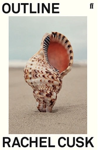
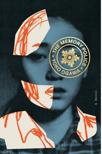
Screenshots of covers sourced from Goodreads
When you set out to create your own book cover — or any kind of cover for that matter — start with a solid plan and remember that less is more. Complexity doesn’t come from adding a ton of elements; it comes from layering the right elements in the right way.
Set the Tone
There are two important questions to ask yourself when starting a book cover design. What is this book about? How does this book make me feel? Your responses will guide your creativity. The goal is to make a cover that represents the text.
Your responses don’t have to be complicated. Your book cover just needs to give the viewer an idea of the setting and style. Start with the basics. Fiction covers — no matter the time period or content of the text — are usually eye-catching and aesthetically pleasing, while non-fiction titles can look more serious or academic.


Screenshots of covers sourced from Goodreads
Then, get a bit more specific. Historical romances, for example, often have covers containing heavy scripts and dreamy images of landscapes. Meanwhile, modern romance covers tend to stick to the essentials: a hip graphic, contrasting colors, and a laid-black font.
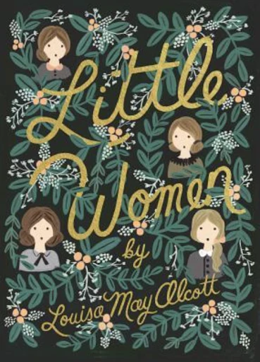
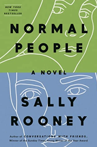
Screenshots of covers sourced from Goodreads
Whatever you decide, do it with feeling. Even within the same genre, content and tone can be very different. Take poetry, for example. A lyrical love poem might leave you feeling pensive, while a powerful contemporary one is likely to make you feel energized. Try to give your book cover that same vibe.
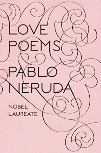

Screenshots of covers sourced from Goodreads
Graphic or Photo: That is The Question
There are two kinds of book covers in this world: those that contain photos and those that do not. If you don’t know where else to start, deciding on this point will set you on the right track. There are no rules, so go with your gut. Both serious and lighthearted texts use photographs on the cover, and we’ve seen plenty of styles of books in the aforementioned examples that have purely graphic covers: font, color, shapes, and nothing else.
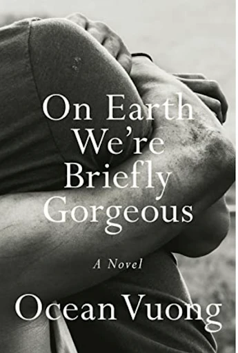
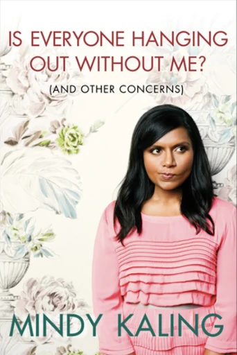
Screenshots of covers sourced from Goodreads
Whether you’re using a photographic or abstract background, think about the seven principles of design as you dream up your book cover. Most importantly, think about balance, contrast, and proportion. Fill the space well and make sure your text is easy to read but doesn’t overwhelm your background picture or shapes. Like we said, less is more. If using an image, limit yourself to one big photo or a tasteful collage. If using shapes, bigger is usually better, but if you want to use an intricate pattern like those of the gold-embossed books of old, just make sure your text is well-balanced and easy to read.
Text is Everything
You’d be hard-pressed to find a book cover that does not contain text. After all, text is essential. It tells us what the book is called, who wrote it, and what kind of content it is.
While romantic scripts and historical-leaning letterpress fonts might make us feel a certain way, the “feel” of a text is not the most important consideration for book covers. Legibility is. You’ll find big modern fonts on updated versions of literary classics and even the most elaborate scripts are displayed in large letters for visibility’s sake.
Remember, contrast is key. Since the background of book covers runs right to the edge, this means that you’ll inevitably be putting your text on top of something else, whether a photo, a pattern, or a solid color. Choose a font color that stands out well against the background one. Opposite hues on the color wheel do this well, as do two colors that vary in intensity — meaning, one that’s very saturated and another that is not. White and black are also solid choices; white looks good on complex, colorful backgrounds, and black complements neutrals and grayscale.

Screenshot of covers sourced from Goodreads
Hit the Books
It’s time to get designing. Head over to our web app, as it’s the perfect place to make a format as specific as this one.
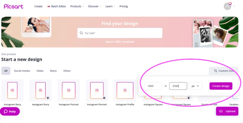
- Once you have our web application open, set your canvas size. Generally speaking, 1,600 x 2,560 pixels is a good rule of thumb for a book cover, and it’s very easy to make a canvas exactly this size. Simply click on “Custom Size” on the new design screen and enter the pixel quantities. Then, select “Create design.”
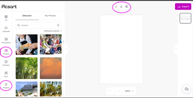
2. Start your background. You have three options: a photo, a color fill, or shapes. Let’s locate the tools that correspond to these three options. Above your canvas, you can find the toolbar with the option for a color, gradient, or texture fill. If you’re thinking about going with a graphic pattern, we highly recommend checking out the texture fill options as there are some cool ready-made graphics there. In the lateral toolbar to the left of your canvas, you’ll find both the photo and shape options.
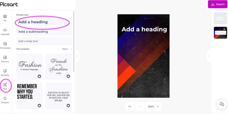
3. Click on the “Text” icon and then on “Add a heading” to incorporate the title into your design. Even though our heading font setting is big, you’ll probably have to increase it even more to fill the space. Aim for the 100 pt. size range. Add subsequent texts using the same function or the subheading one for something smaller. Don’t forget that you can always change your font style as well as the spacing between letters using the tools that appear when you click on your text box.
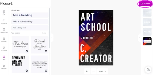
4. When you’re finished, download your creation by clicking “Export” in the upper right-hand corner. Now, you’re the expert, so transfer these skills to other designs, too, like the cover image for your podcast or ‘zine.
Create at the Speed of Culture
Picsart is a full ecosystem of free-to-use content, powerful tools, and creator inspiration. With a billion downloads and more than 150 million monthly active creators, Picsart isn’t just the world’s largest creative platform; we’re also the fastest growing. Picsart has collaborated with major artists and brands like BLACKPINK, the Jonas Brothers, Lizzo, Sanrio: Hello Kitty, I am a Voter, Bebe Rexha, Maroon 5, One Direction, Warner Bros. Entertainment, iHeartMedia, Condé Nast, and more. Download the app or start editing on web today to enhance your photos and videos with thousands of quick and easy editing tools, trendy filters, fun stickers, and brilliant backgrounds. Unleash your creativity and upgrade to Gold for premium perks!


