Layout and text design are two hugely important consideration for creating content, especially when it comes to your business or brand. Let’s start with layout design, which refers to the way in which we arrange the elements on a page that make up design content. The aim of layout is both to convey the message correctly and to present information in a logical, coherent way to ensure the key elements stand out.
Let’s take newspaper layout as just one classic example. We take for granted how much the conventions of newspaper design appeal to our senses of hierarchy and order, all of which is achieved by layout. Text is organized in columns, punctuated by striking imagery, and sectioned by authoritative headlines. All of this helps the reader navigate the information on the page in the most logical manner.
But you don’t have to be a newspaper designer to create effective layouts. That’s why in today’s post, we are going to consolidate the main principles of text and layout design.
What Is Text Design?
We often think words are the copywriter’s job, but they have a massive part to play in any designer’s job too. Text layout has some overlaps with typography (the art of arranging and creating type) but while typography is focused more on the detailed shapes of letters and words, text design focuses on higher level arrangement, such as how to place large groups of text in a way that will make reading easy, interesting, and visually engaging.
Why Text and Layout Design Matters
You’ve just spent the last few months putting together all the written content for your brand and it’s everything you dreamt it would be. Your next battle is making sure it gets read. The good news is, educating yourself on text and layout design will ensure that happens.
5 Principles of Good Layout Design
- Always follow the grid. Grids are the backbone of all layouts, be they newspapers, infographics, or iPhone applications. When you’re designing in a photo editing app, for example, you are using grids without even realising. Apps contain built-in sensing capabilities that helps you align elements of your composition in relation to one another. But what makes a few grid lines in your work so important? In short, because they help keep your elements aligned and ordered, and your page design clean and neat. Grids greatly speed up and improve design time, as they can act as a guide that signals where to best place, position, or scale elements.
- Choose a focal point. Following a grid structure will allow you to create a sense of balance in your designs, which you can use intelligently to direct the reader’s attention on the page. Creating a focal point is a great way to do that. A great headline in an eye-catching font or a striking image can be very effective ways to draw in your reader.
- Adhere to the rule of thirds. There are designers that live and die by the rule of thirds, which says that if you divide your page into thirds (a three-by-three grid), the intersection points make for natural focal points in a composition. By aligning your key elements to these four points, you’ll achieve a more pleasing composition than if you, for example, perfectly center elements on your page. By itself, the rule of thirds won’t magically provide your layout with balance, but by extending the principle, it’s easy to use this tendency towards a natural focal point to help inform the balance of your layout.
- Don’t fear white space. It’s tempting to fill your page but creating clutter isn’t necessarily the most effective way to go. The best layout design contains everything you need and nothing you don’t. One way to utilize negative space is to make your margins and gutters larger, creating the sense that your content is floating in space. Sometimes less is more.
- Utilize hierarchy. Hierarchical thinking, which organizes the elements of your layouts in order of importance, is one of the keys to successful design. You can achieve hierarchy in design by using a grid or going at it freestyle. A great example of hierarchy is an online magazine or blog, which features articles in different sizes. Also, creating headlines in different font sizes can further give your text a sense of hierarchy, which you use to draw attention to certain elements over others. In an e-commerce website, it might be the CTA button, for example.
The Different Types of Grids in Text and Layout Design
- Manuscript Grid. This is the most basic type of grid. It’s the one you don’t even realize you’re using when you open up a Word document, which is basically a rectangle on the page on which you insert your content (usually text). The way content appears is typically like a block, surrounded by margins, header and footer (which are usually invisible). Think of it like the page of a book. Within this type of layout, there are ways you can center the text to make it either fill out the edges of the rectangle or justify it to the left to give it a more casual, grouped feel.
- Column Grid. Column grids are just what they sound like. They utilize columns to arrange your content into pillars of equal width and length on the page. They are often employed by magazines. This tendency started initially because, when printers were working with linotypes, it was far easier to set text in shorter line lengths. From there it became a convention, and there are those who argue it gives way to readability. It definitely creates a sense of proportion and order on the page. A page can have as few as two columns or as many as six or more (though that’s really pushing it). The spacing between columns is called gutters, and these should be consistent throughout the entire project.
- Modular Grid. Take your column grid, add rows, and you’ll have a modular grid. This type of grid is useful when you have a lot of different types of content to work with on the page, and need to rely on more focal points for the reader. Newspapers use this type of grid frequently.
Incorporate Text and Layout Principles Into Your Designs
Using the Picsart app, follow these easy instructions:
1) Open the app and tap the plus icon at the bottom of the screen to start a new project.
2) Scroll down to the Collages category and click the Grid icon.
3) Select images that you want to make up the grid from your phone. Selecting multiple images will create multiple options to choose from.
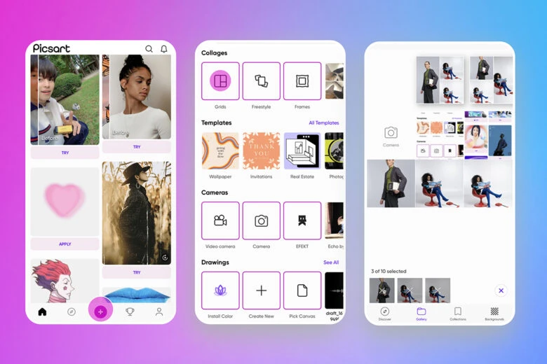
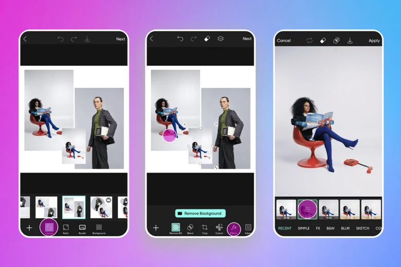
4) Select the grid layout that looks best to you.
5) In the image editor, click on each image to change its features. You can change their size, placement, remove backgrounds, and adjust properties such as the contrast and saturation.
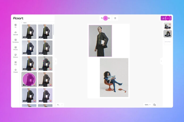
6) Add any effects and filters to images, tapping on FX and selecting your preferred finish.
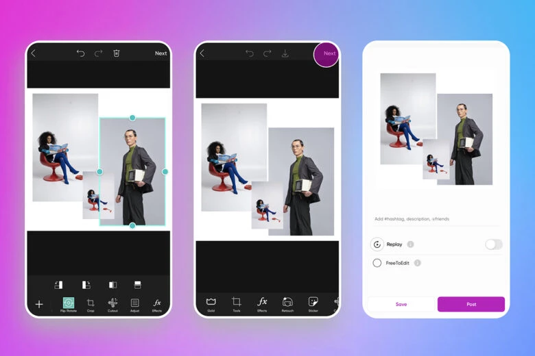
7) Adjust the size and placement of your images.
8) Tap on Next when satisfied with your edit and select whether to save or post it.
Working on desktop? The good news is you don’t need to switch to mobile, as the Picsart web editor can help your text and layout design too.
1) Click on Products and See All to get started.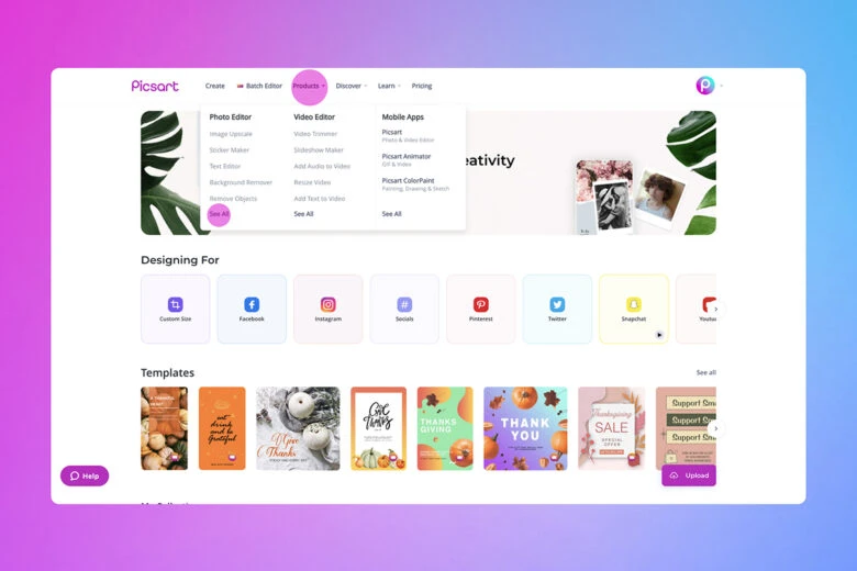
2) Select the Collage Maker tool and click on the Create A Collage button.
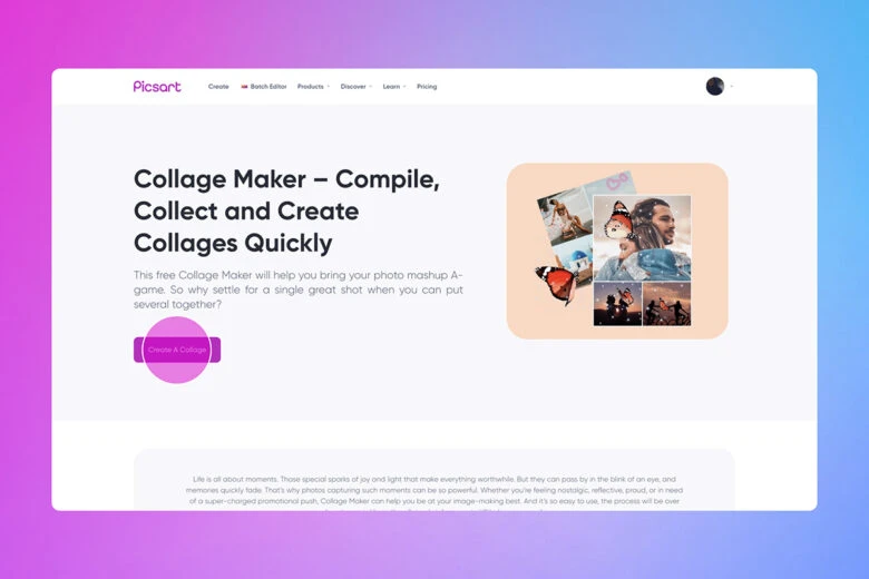
3) Click on Templates, search for ‘collages’ and select the one that works best for your project.
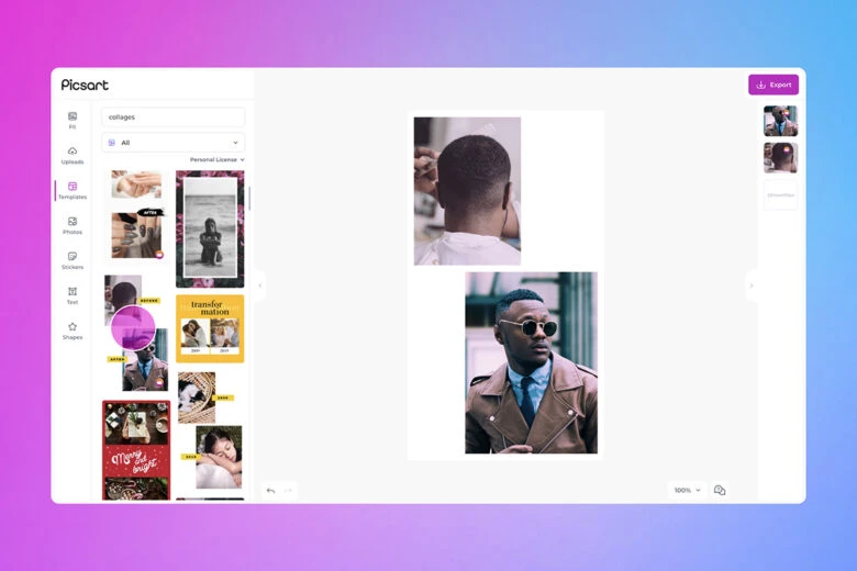
4) Upload the images you want to add to your grid.
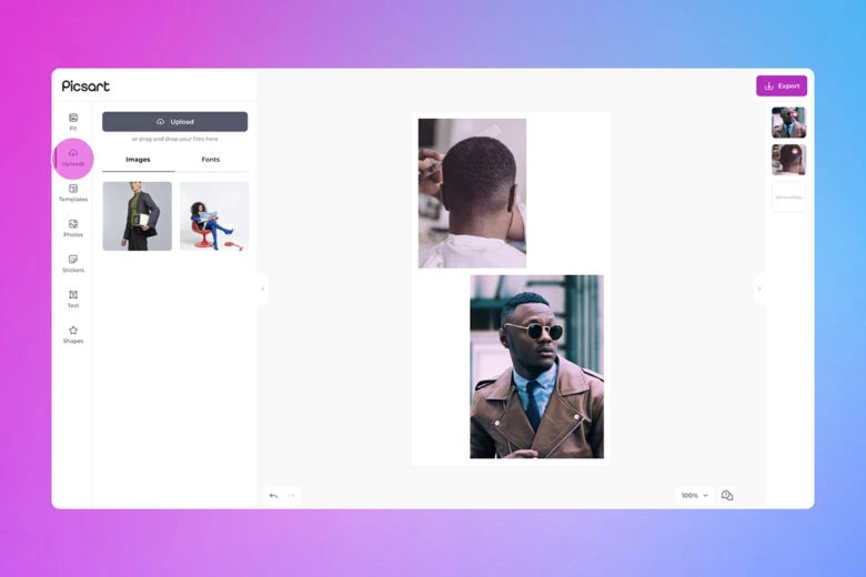
5) Adjust the images to your specifications, following the same principles outlined in the in-app steps 5 and 6.
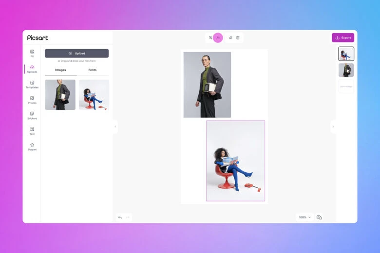
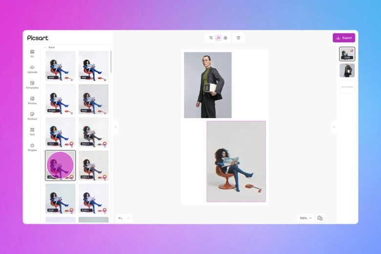
6) When you’re finished adding custom touches to your images and grid, click on Export to save or post your design.
Create at the Speed of Culture
Picsart is a full ecosystem of free-to-use content, powerful tools, and creator inspiration. With a billion downloads and more than 150 million monthly active creators, Picsart is the world’s largest creative platform. Picsart has collaborated with major artists and brands like BLACKPINK, the Jonas Brothers, Lizzo, Sanrio: Hello Kitty, I am a Voter, Bebe Rexha, Maroon 5, One Direction, Warner Bros. Entertainment, iHeartMedia, Condé Nast, and more. Download the app or start editing on web today to enhance your photos and videos with thousands of quick and easy editing tools, trendy filters, fun stickers, and brilliant backgrounds. Unleash your creativity and upgrade to Gold for premium perks!


