
In the world of creativity, color combinations wield immense power. Whether you’re developing a new brand identity, creating marketing materials, or designing a post for social media, mastering two color combinations can transform your work from ordinary to extraordinary. This guide delves into the art and science of pairing colors and seeks to equip you with the knowledge to create designs that truly resonate.
A two-color combination design can form the backbone of an impactful creation. Colors evoke emotions, boost brand recognition, and can guide viewers’ attention. By understanding color theory and applying proven pairings, you can craft a design that catches the eye and sends a message.
How color theory helps create effective two-color combinations
Establishing a solid understanding of color theory isn’t just knowing how colors work together visually. Colors elicit emotions, and knowing the best pairings to bring those feelings out can inform your decisions and help you create harmonious designs that speak volumes.
The color wheel is your compass for harmony
The color wheel is so much more than a circle of colors. It is your trusty guide in a sea of colorful relationships neatly organized into three main categories:
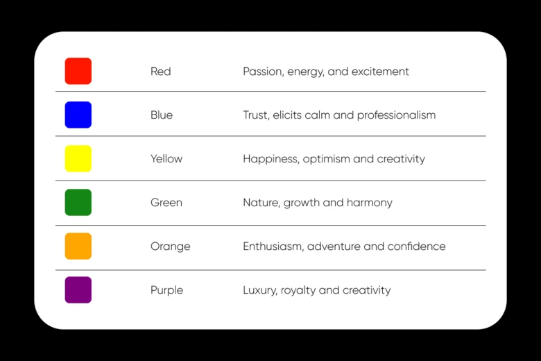
- Primary colors – The building blocks – Red, blue, and yellow
- Secondary colors – The next generation (born from mixing primaries) – Green, orange, and purple
- Tertiary colors – The nuanced palette (the offspring of primary and secondary colors) – Yellow-green, blue-green, blue-violet, red-violet, red-orange, and yellow-orange
Think of the color wheel as a map of complementary, analogous, and triadic color schemes. You can play with different colors and see how they blend together with Picsart’s Colors tool. This is your first step toward mastering color theory.
The psychology behind the emotional connection to a color palette
In addition to being visual elements, colors are emotional triggers. Although not every color induces the same emotion from person to person, some colors have a common effect on the mainstream. Here are a few examples of color associations and the feelings they represent:
For a deeper exploration of color meanings and their impact on design, check out this comprehensive guide on Color Meanings by Picsart.
Best two-color combination design ideas for impactful visuals
Now that we’ve laid the groundwork, let’s explore some of the most effective two-color combinations you can use to elevate your creative projects:
1. Classic blue and white
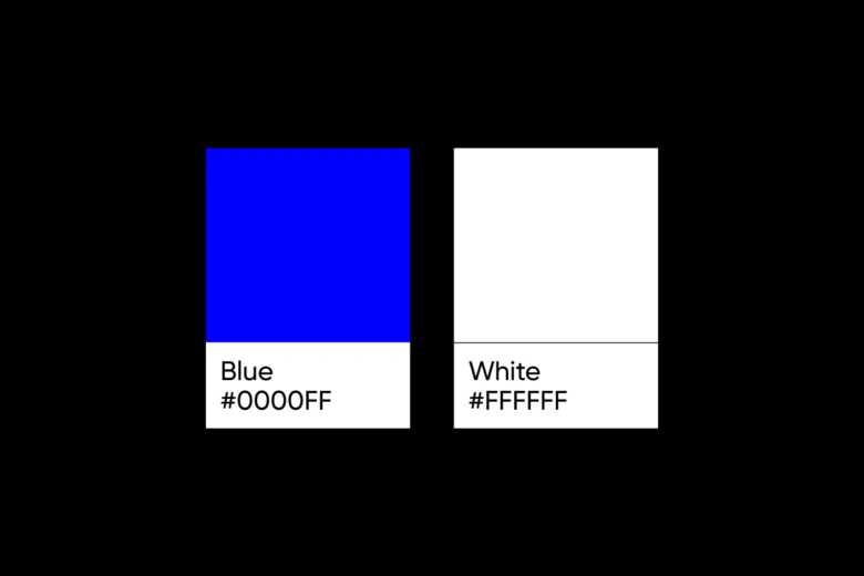
Hex codes – #0000FF (Blue) and #FFFFFF (White)
Ideal for – Corporate branding, websites, and professional documents
Why it shines – This timeless duo exudes trust and professionalism. Blue suggests stability and reliability, while white adds a touch of purity and simplicity.
2. Black and yellow
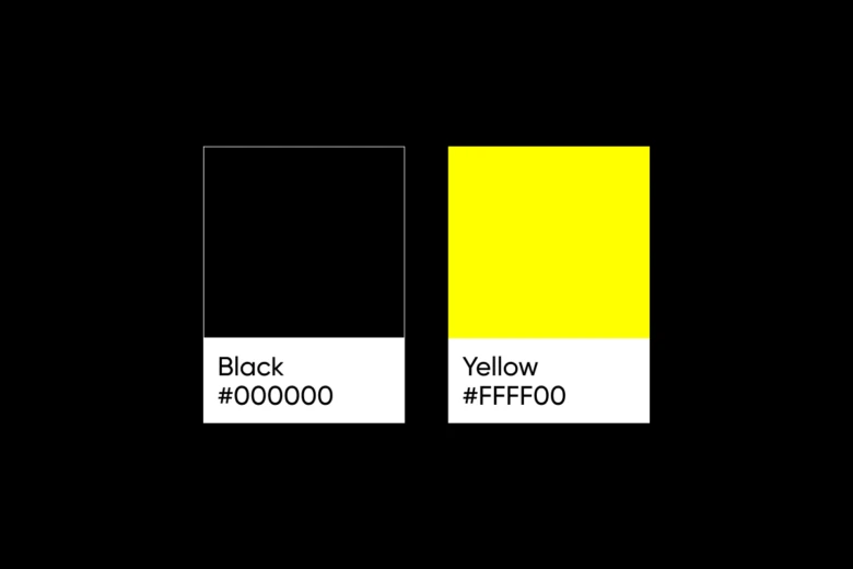
Hex codes – #000000 (Black) and #FFFF00 (Yellow)
Ideal for – Warning signs, construction branding, and high-visibility designs
Why it shines – This high-contrast pair demands attention. Black lends power and sophistication, while yellow injects energy and optimism.
3. Green and purple
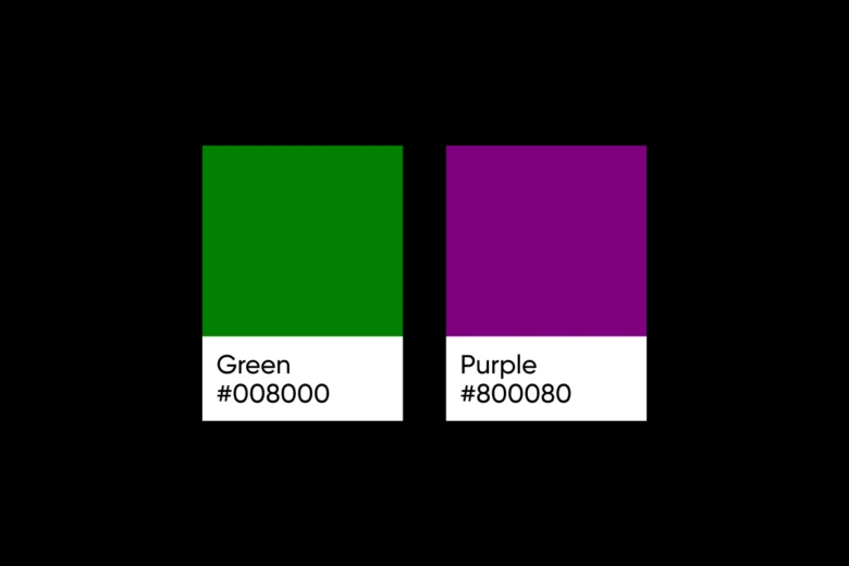
Hex codes – #008000 (Green) and #800080 (Purple)
Ideal for – Creative industries, beauty products, and nature-inspired designs
Why it shines – This complementary scheme balances the natural, growth-oriented aspects of green with the luxury and creativity associated with purple.
4. Orange and blue
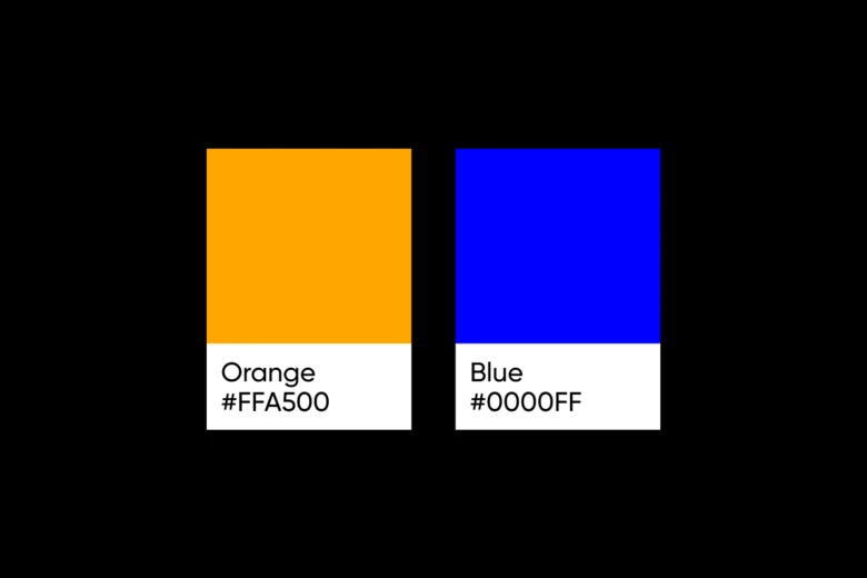
Hex codes – #FFA500 (Orange) and #0000FF (Blue)
Ideal for – Sports teams, entertainment brands, and energetic designs
Why it shines – This vibrant pair creates a dynamic contrast as orange brings warmth and enthusiasm, while blue adds depth and stability.
5. Red and gray
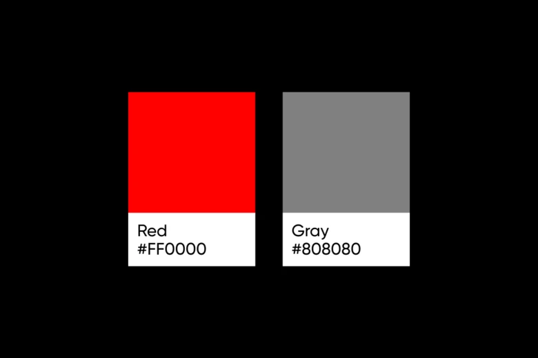
Hex codes – #FF0000 (Red) and #808080 (Gray)
Ideal for – Technology brands, modern app interfaces, and cutting-edge designs
Why it shines – Red symbolizes passion and energy, while gray provides a sleek, neutral backdrop that enhances sophistication and professionalism.
6. Teal and coral
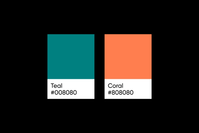
Hex codes – #008080 (Teal) and #FF7F50 (Coral)
Ideal for – Wellness brands, summer-themed designs, and creative portfolios
Why it shines – Teal represents tranquility and renewal, while coral adds a vibrant, warm touch that evokes excitement and creativity.
7. Burgundy and cream
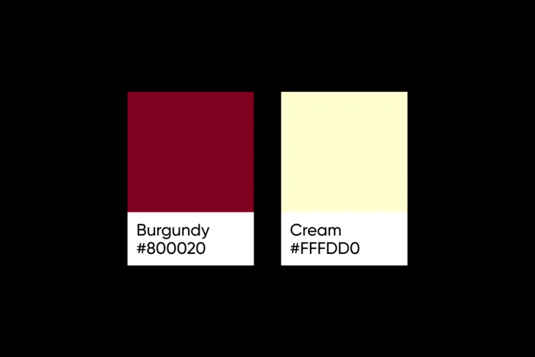
Hex codes – #800020 (Burgundy) and #FFFDD0 (Cream)
Ideal for – Luxury branding, wine labels, and elegant print materials
Why it shines – Burgundy exudes sophistication and depth, while cream provides a soft, refined background that complements the rich color.
8. Mint green and lavender
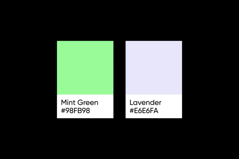
Hex codes – #98FB98 (Mint Green) and #E6E6FA (Lavender)
Ideal for – Wellness apps, spa branding, and soft, calming designs
Why it shines – Mint green represents freshness and growth, while lavender adds a soothing, dreamy quality that promotes relaxation.
9. Navy and gold

Hex codes – #000080 (Navy) and #FFD700 (Gold)
Ideal for – Luxury fashion, high-end jewelry, and premium product packaging
Why it shines – Navy provides a deep, authoritative base, while gold introduces elements of opulence, prestige, and timeless elegance.
10. Charcoal and salmon

Hex codes – #36454F (Charcoal) and #FA8072 (Salmon)
Ideal for – Modern interior design, contemporary art, and innovative branding
Why it shines – Charcoal offers a strong, grounding presence, while salmon introduces a soft, warm accent that adds visual interest and energy.
How to properly implement two color combinations in your designs
Knowing great color combinations is just the beginning. Implementing them effectively requires skill and consideration. Let’s explore some strategies to help you make the best decisions when choosing your pair of colors:
- Apply the 60-30-10 rule – Use your dominant color for 60% of the space, the secondary color for 30%, and an accent color (if needed) for 10%.
- Mind the contrast – Ensure sufficient contrast between your two colors for readability and visual interest.
- Consider context – Remember that colors can appear differently on screens than in print. Always test in the intended environment.
- Experiment – Play with different shades and tones to figure out what works within your chosen scheme.
- Maintain consistency – Once you’ve settled on a color combination, use it consistently across your brand materials to boost recognition.
How to craft a custom color pairing
If you are looking to create unique and personalized color combinations, here are a few advanced approaches you should try:
1. Monochromatic variations
Select a single color and build a palette using various shades, tones, and tints. This technique creates a cohesive and sophisticated look.
2. Analogous colors with a twist
Choose two colors adjacent to each other on the color wheel, then add a unique spin by adjusting the saturation or brightness of one color.
3. Split-complementary approach
Instead of direct complementary colors, select one color and then two colors that are adjacent to its complementary color on the color wheel. This creates a more nuanced and harmonious palette.
Tools for crafting effective color combos
Getting the perfect combination can be difficult. Many of us like to stick to the colors we know or are comfortable with and rarely like to branch into uncharted colorscapes. If this describes you, don’t worry. Picsart has you covered.
Here are a few must-have tools you can add to your arsenal to get the best possible two color combinations for your project:
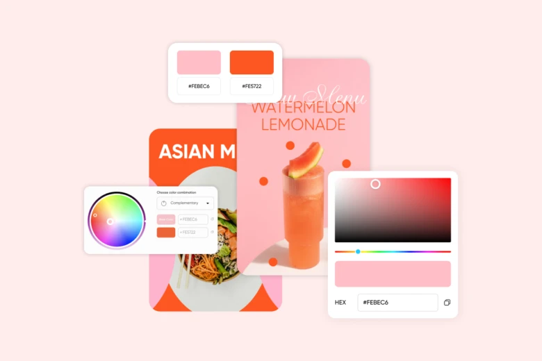
Picsart Color Wheel
Use color theory to explore color relationships and discover harmonious combinations with the Picart color wheel. Follow these simple steps to combine the colors you want:
- Navigate to Picsart’s Color Wheel tool
- Use the cursor inside the wheel to choose your base color or type in the base color code
- Slide the cursor along the outline of the wheel to change the brightness
- Use the dropdown to the right of the wheel to choose your combination scheme (i.e., analogous, triadic, etc.)
- Select each color to adjust its saturation or hue
- Use the “Export” button to download your two-color combination information to a PDF
Picsart Color Picker
Select your color tones with precision by using the Picsart Color Picker. It allows you to conveniently find the exact color codes you are looking for. Follow these easy steps to pick the best color tones for your designs:
- Navigate to Picsart’s Color Picker tool
- Pick a color by using the slider under the color box or enter the color code in any format (i.e., HEX, RGB, HSL, or CMYK)
- Use the slider to change the shade of the color to your preference.
- Once you have the color you want, use the copy button beside the format you want to use to copy the code
Conclusion
Dipping your toes in color theory can help you create complementary designs of all kinds. By exploring proven combinations, and experimenting with your own palettes, you’ll create works that not only look stunning but can also effectively communicate your message and kindle the desired emotions in your audience.
The perfect color combination should align with your brand identity, resonate with your target audience, and achieve your overall design objectives. Don’t hesitate to step out of your comfort zone and experiment. Iterate until you find the perfect pair of colors that brings your vision to life.
Keep exploring and refining your color choices. As you gain more knowledge and experience using color theory, you’ll develop an intuitive sense of what color combinations work best for different projects and audiences. Leverage resources like the Picsart Colors suite to continually expand your color theory knowledge and experiment with new combinations.


