If you’ve only ever encountered fonts in Google Docs or Microsoft Word, you might not have even heard of typefaces, and that’s okay. But typeface enthusiasts and old school designers consider the typeface vs font distinction pretty important. Many are vehemently against the conflation of the two terms. Unsure where you stand in the typeface vs font debate? We’re here to help.
In this article, we’ll define both fonts and typefaces, discuss their differences, list some examples of both, and finally show you how to use typefaces and fonts in your designs. You’ll find out more about the history of the printed word, make your own judgments about the differences between font and typeface, and learn easy typography techniques.
Ready to get to the bottom of the typeface vs font saga? Let’s jump right in.
What is a Typeface?
So, is Helvetica a font or a typeface? According to classic definitions, it’s a typeface. But what is a typeface? A typeface is the design of the text, sometimes also known as a family of fonts. The main stylistic choices in typography – for example, the concepts it reflects and the purposes it serves – all concern the typeface, not the font. By this definition, Helvetica is a typeface.
Why do we call Helvetica or Arial or Times New Roman a font then? The conflation of the terms started with the digital age, with Microsoft Word having just fonts, no typefaces. That’s also in part because mass digitization made the distinction less crucial: Why bother with particularities when typeface, font size, bolding or italicization is done with a few clicks?
What is a Font?
If Helvetica is actually a typeface, then what is a font? A font is a subset of a typeface, with width, weights, size, and other details specified.
For example, Helvetica Bold 16 point is a font. And it is different from Helvetica Neue UltraLight 12 point. The word font (‘fount’ originally) is tied to the old process of printing words using metal blocks, from the Old French verb fondre, meaning ‘to pour out, melt, smelt’. Back then you needed a different set of metal blocks for each font: Helvetica Bold 16 pt was indeed vastly different from Helvetica Ultra Light 12 pt.
Differences Between Fonts and Typefaces
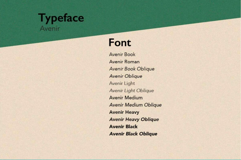
So, what is the difference between a font and a typeface? The former is just the subset of the latter. A typeface is a collection of different related fonts. Those fonts can be different in a number of ways:
- Weights (Bold, Black, Light, Thin, etc.)
- Widths (Compressed, Condensed, Narrow, Normal, etc.)
- Styles (Roman, Italic, Cursive, etc.)
- Sizes (Caption, Text, Subhead, etc.)
- Grades (1-4)
- Effects (Inline, Outline, Shadow, etc.)
And yet they all share a typeface, a font family: a design philosophy, an overarching style, a concept.
Does it matter if you use the right term or not? In most cases, you can use font to mean typeface and get away with it, but if you’re a professional designer, making the distinction and using the right words can make life easier for others in the industry to understand you. Besides, learning the difference wasn’t that difficult, was it?
Beautiful Fonts and Typefaces
Now that we’ve made the typeface vs font distinction, let’s go over some stunning typefaces and fonts that’ll inspire you to get creative with your designs.
Merriweather
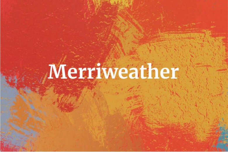
The first thing to note about Merriweather is that it’s super pleasant to look at. Elegant and balanced, this open-source medium-contrast semi-condensed serif typeface was designed for digital. Because it’s so readable, you can freely use it on chunks of text. It’s especially well-suited for designs related to literary arts: library booklets, literary festival invitations, quoted reviews, etc. This typeface really has a sturdy, studious look to it. Merriweather comes in eight styles, varying from Light to Bold. It is often paired with Roboto, Montserrat, and Source Sans Pro.
Bebas Neue
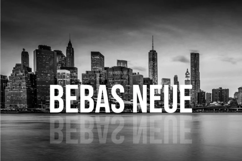
Created by architect and designer Ryoichi Tsunekawa, Bebas Neue is a modern popular uppercase-only sans serif font family. The wide commercial use of this Grotesque font comes as no surprise: The font is as minimalistic as it is attention-grabbing, which makes it perfect for branding and packaging. Thanks to its clean lines, Bebas Neue is equally suitable for digital and print. It comes in five different weights, from thin to bold, and can be harmoniously paired with Open Sans and Lato.
Amatic SC
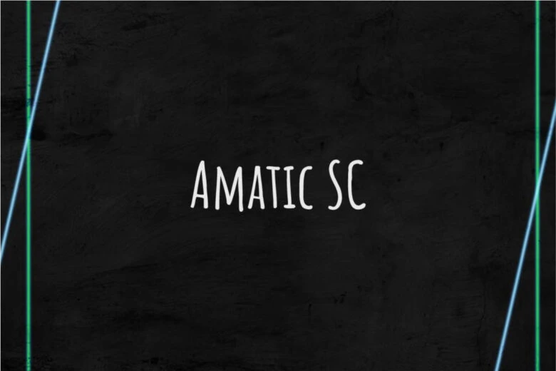
The spindly handwritten look of Amatic SC is immediately familiar. That’s because this style is super trendy recently, and you’ve probably seen it a lot in the digital sphere. The uneven messy look of Amatic SC is best suited for bohemian, artsy designs. The typeface comes in two font weights, regular and bold. Amatic SC pairs well with Josefin Slab, Oswald, and Pacifico.
Bungee Shade
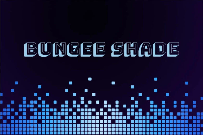
Designed by typographer David Jonathan Ross, Bungee Shade is described as a font family that ‘celebrates urban signage’. You can use it in website design to communicate the mood of a bustling city. It also looks really good in magazines and on the covers of books. The typeface comes in five different variations: Bungee, Bungee Hairline, Bungee Inline, Bungee Outline, and Bungee Shade. Pair with Monoton to go all out or with Roboto to tone the typeface down a bit.
Bangers
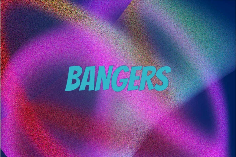
Ever feel nostalgic for the old comics aesthetic? You’re not the only one. The internet is full of people reinventing or deconstructing the vintage comic book look. And Bangers is just the typeface for that. This definitely detracts from its versatility but makes it so fun to experiment with. Pairing perfectly with Open Sans and Monserrat, Bangers will infuse any boring-looking text with a breeze of an adventure. It’s better used as a headline or short text though: The eye gets tired of the typeface when it’s a longread.
Lora
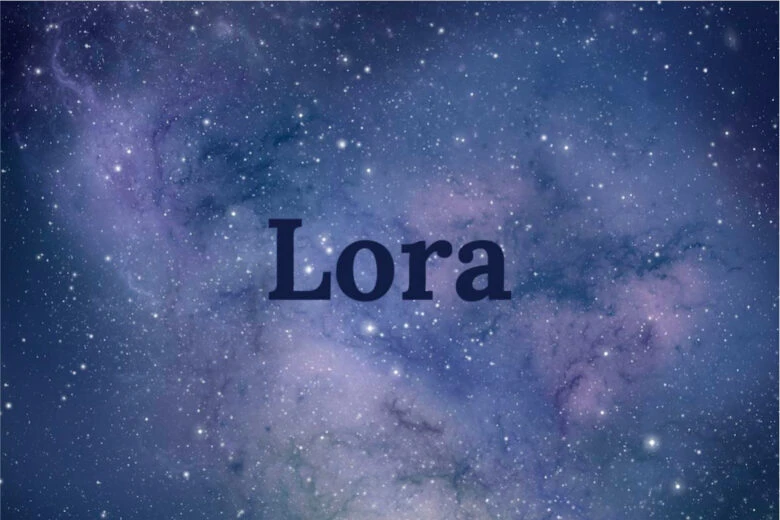
Lora is a versatile, classical-looking serif typeface that works just as well in print as it does on screen. Taking inspiration from the great tradition of calligraphy, the font family is well-suited for usage in body text in all its variations. Its neutral contemporary look makes it easy to pair with almost any other font family.
Great Vibes

In equal parts ornate and official, Great Vibes looks like it belongs on a wedding or debutante ball invitation. The cursive typeface is feminine and curvy, and the letters effortlessly connect to each other. Try pairing it with Roboto or Raleway to balance it out.
Leckerli One
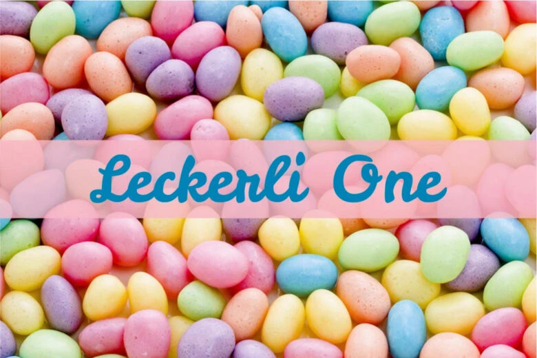
Everything about Leckerli One screams delicious. It’s a fat, bold, handwritten typeface that brings to mind cottages, coziness, and pies. This typeface is best used in short texts and digital design, such as online games or greeting cards.
Codystar
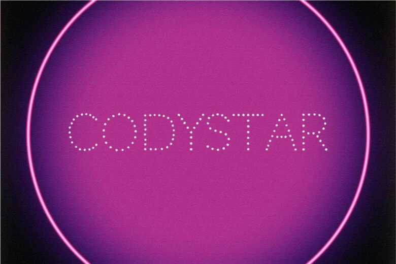
Codystar is a dotted typeface inspired by the razzle-dazzle of Manhattan and Broadway. The typeface comes in two variations: regular and light. It works best as a headline, or, because it’s so attention-grabbing, as a part of a digital marketing item, an online banner or advertisemenr. If you have to pair it with another typeface, go for something neutral, such as Open Sans or Roboto, to balance the showiness out. Alternatively, you can pair it with Pacifico to accentuate its extravagance.
How to Use Typefaces and Fonts
Whether you’re creating designs on PC or making a quick edit on your smartphone, there’s no better tool than Picsart.
Here’s how you can experiment with a great variety of options to make your typography shine:
1) Open Picsart Photo Editor and pick a size or set a ratio if you want to start designing from scratch. Note that even if you choose to start with a template, the typefaces and fonts will be in the same menu section.
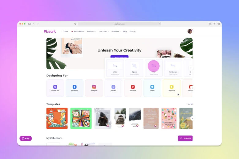
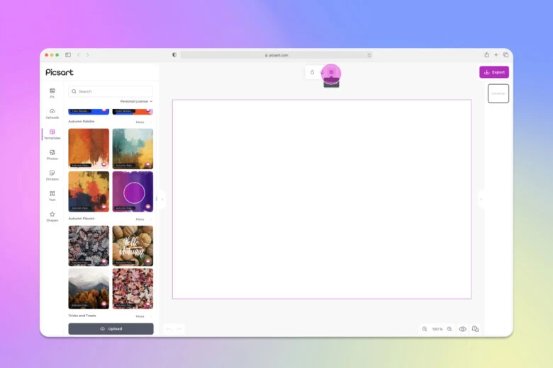
2) Click Text from the left-side menu and then Add a heading or Add a body text depending on your intentions. Type in the text you want to add to the design. 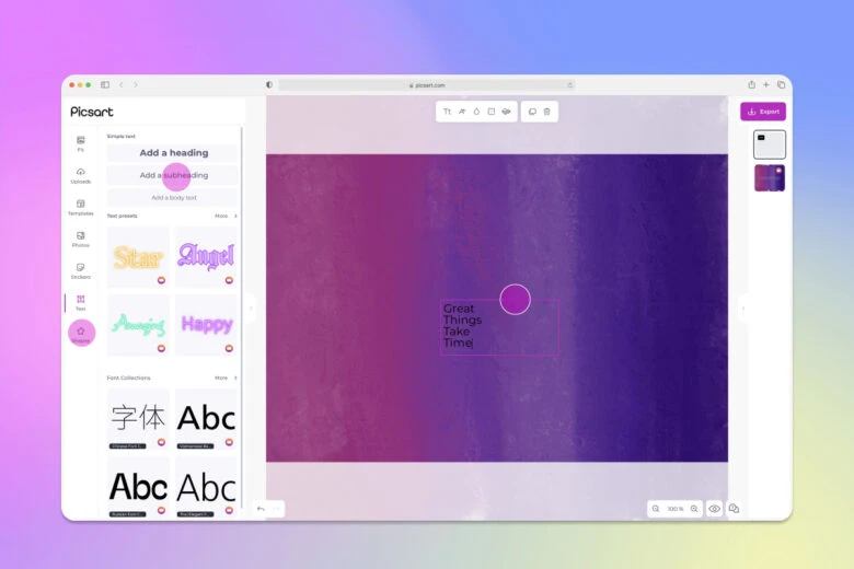
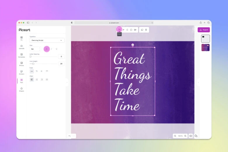
3) To choose a font, click on the left button on top, Tt. From the left, you can choose the typeface, the size, the letter spacing, and the line height. Note the typeface vs font distinction there. 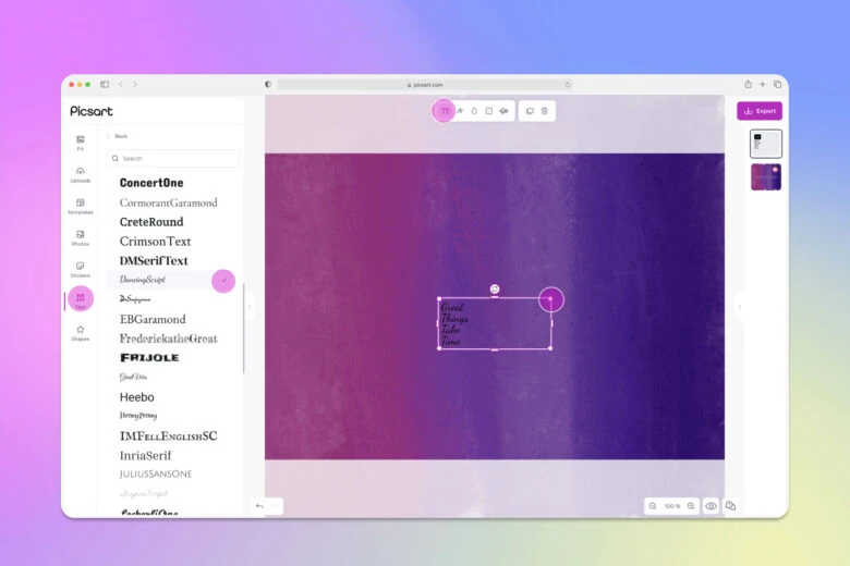
4) Adjust the settings on the left to choose the right typeface and specify the font. The adjustments will, of course, depend on the purpose and style of the design you’re working on. 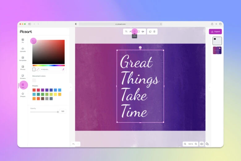
5) When you’re done with your design, click on Export to save or post it.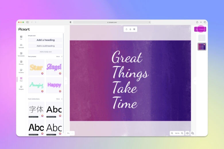
If you’re editing on mobile, the process is similar. Here’s how you do it:
1) Open the Picsart app and tap on the purple plus sign.
2) Upload an image or choose one from the stock options.
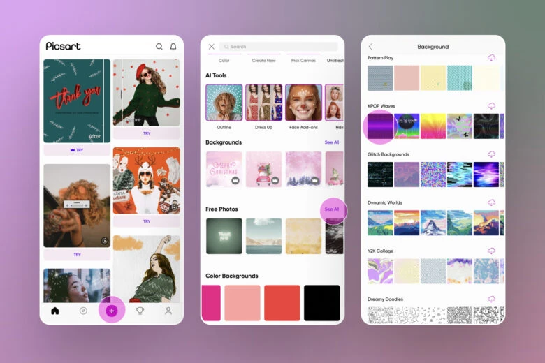
3) Tap on the Text tool.
4) Input your copy.
5) Stylize the message with a font.
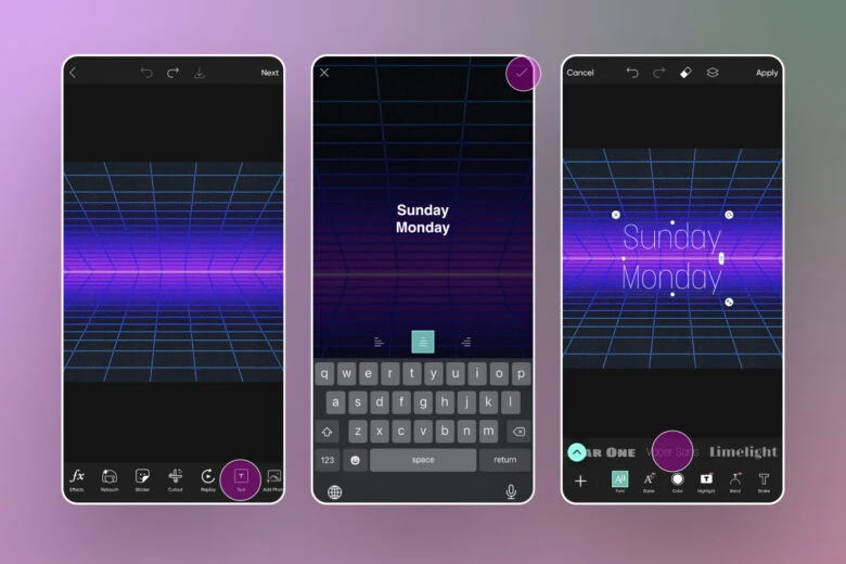
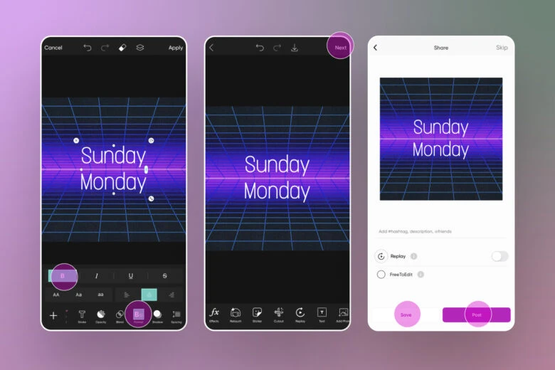
6) Adjust appearance of the text, changing things like size, placement and style.
7) Tap on the Next button when you’re happy with the design.
8) Save or Post your work.
Hope you’ve enjoyed this discussion on the typeface vs font issue. Be sure to check out the Picsart font generator to explore even further.
Create at the Speed of Culture
Picsart is a full ecosystem of free-to-use content, powerful tools, and creator inspiration. With a billion downloads and more than 150 million monthly active creators, Picsart is the world’s largest creative platform. Picsart has collaborated with major artists and brands like BLACKPINK, Taylor Swift, the Jonas Brothers, Lizzo, Ariana Grande, Jennifer Lopez, One Direction, Sanrio: Hello Kitty, Warner Bros. Entertainment, iHeartMedia, Condé Nast, and more. Download the app or start editing on web today to enhance your photos and videos with thousands of quick and easy editing tools, trendy filters, fun stickers, and brilliant backgrounds. Unleash your creativity and upgrade to Gold for premium perks!


