
Contents
Ever wondered why some color combinations just click while others clash? That’s where color theory basics come in. Whether you’re designing your first logo or spicing up your Instagram feed, understanding what color theory is can transform the way you work with colors. Let’s break down this fascinating world of hues, tints, and shades into bite-sized color theory 101 pieces you can actually use.
What is color theory?
Color theory is the science and art of using color effectively. It delves into how humans perceive color, how colors interact with each other, and the messages they convey. This framework is essential for designers, artists, and marketers to create visually compelling and impactful work.
Color theory 101: Color wheel basics
Think of the color wheel as your color theory basics cheat sheet. It’s a practical tool that shows how different colors relate to each other, making it easier to create combinations that work. The color wheel isn’t just a pretty circle – it’s your roadmap to creating visually stunning designs.
Primary, Secondary, and Tertiary Colors
The color wheel is typically divided into three categories:
- Primary Colors: Red, Blue, and Yellow
- Secondary Colors: Green, Orange, and Purple (created by mixing primary colors)
- Tertiary Colors: Yellow-green, Blue-green, Blue-purple, Red-purple, Red-orange, and Yellow-orange (created by mixing primary and secondary colors)
How to use the color wheel
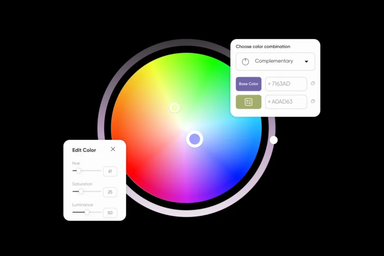
To get started, head to Picsart’s color wheel and follow these steps:
Step 1: Pick a base color
Use the cursor in the color wheel above to select a base color. Play around with the outer wheel to adjust the brightness of the hue.
Step 2: Choose a color combination
Use the drop-down on the right to switch to monochromatic, analogous, triadic, and tetradic schemes.
Step 3: Adjust colors
Select each color to adjust its hue, saturation, and brightness.
Step 4: Export
Use the export button to download a PDF file with all selected color information.
Color harmony
Colors are like the guests at a party – some instantly hit it off, others create dynamic tension, and a few just clash. Understanding these relationships helps you play matchmaker with colors to create designs that not only look good but serve their purpose. The secret lies in knowing which combinations create the vibe you’re after, whether that’s bold and energetic or calm and collected.
| Harmony Type | Description | Example |
| Complementary | Colors opposite each other on the wheel | Red and Green |
| Analogous | Colors adjacent to each other | Blue, Blue-Green, Green |
| Triadic | Three colors equally spaced on the wheel | Red, Yellow, Blue |
| Split-complementary | A base color and two colors adjacent to its complement | Blue, Yellow-Orange, Red-Orange |
Complementary colors sit opposite each other on the wheel (think blue and orange or red and green). These power couples create maximum contrast and vibrance – perfect for making something stand out. You’ll see this combo everywhere, from movie posters to sports team logos. Pro tip: try using one color as your main player and its complement as an accent to avoid overwhelming your audience.
Analogous colors are the friendly neighbors on the wheel. Picture autumn leaves changing from yellow to orange to red – that’s analogous harmony in nature. Using these close-knit colors (like yellow, yellow-green, and green) creates a sense of unity and flow that’s easy on the eyes. This scheme works wonders for creating depth without jarring contrasts, making it perfect for backgrounds, illustrations, or any design where you want things to feel connected.
Triadic colors form an equal triangle on the wheel (like red, yellow, and blue). Think of them as a well-balanced trio – each one brings something unique while maintaining harmony. This combination gives you high contrast while keeping things balanced and vibrant. It’s the sweet spot between complementary’s boldness and analogous’s harmony. Perfect for designs that need to pop while staying professional, like educational materials or creative portfolios.
Split-complementary takes the drama of complementary colors but dials it back a notch. Instead of using direct opposites, you pick one color and use the two colors adjacent to its complement. For example, instead of blue and orange, you might use blue with yellow-orange and red-orange. This creates high-impact designs that are a bit more sophisticated and easier to balance.
Understanding how colors affect emotions
Colors shape how we feel about something before we even realize it. Walk into a room painted in warm reds and oranges, and you’ll feel different than in a space washed in cool blues and greens. It’s no accident that fast-food chains use red and yellow to stimulate appetite and energy, while spas choose soft blues and greens to help you relax. This invisible influence of color on our emotions is why brands spend so much time picking the perfect shade for their message.
Here’s your guide to color psychology:
Red is the rockstar of the color world – it demands attention and gets hearts racing. It symbolizes passion, excitement, and urgency. That’s why you’ll spot it on Valentine’s Day cards and clearance sale signs alike. Use it for:
- Call-to-action buttons that need immediate attention
- Food-related designs (it actually stimulates appetite)
- Sports and energy drink branding
- Warning signs and error messages
Blue is the trusted professional in a well-tailored suit. It’s the color of calm seas and clear skies, bringing a sense of stability and reliability. No wonder tech giants and financial institutions can’t get enough of it. Perfect for:
- Corporate websites and business applications
- Healthcare services and medical brands
- Security and privacy-focused features
- Productivity tools and professional networks
Green sits at the intersection of nature and nurture. It’s the color of fresh starts and healthy choices, making people feel balanced and hopeful. Use it for:
- Wellness and sustainability brands
- Financial services (think money and growth)
- Educational platforms
- Food and nutrition products
Yellow is the optimistic morning person of colors – energetic and cheerful, but a little goes a long way. It grabs attention while creating a sense of warmth and clarity. Great for:
- Highlight important information
- Creative and children’s products
- Budget-friendly brands
- Warning signs when red feels too aggressive
Purple has historically been the color of royalty, and it still carries that air of luxury and mystery. It bridges the excitement of red with the trustworthiness of blue. Perfect for:
- Beauty and anti-aging products
- Creative tools and artistic brands
- Premium or luxury items
- Spiritual or mindfulness applications
Orange combines the energy of red with the cheerfulness of yellow, creating a friendly, confident vibe. It’s the color of adventure and affordability. Use it for:
- Youth-oriented products
- Travel and entertainment
- Food and beverage brands
- Confident, friendly call-to-actions
Pink, depending on its shade, can range from playful to sophisticated. Light pink feels gentle and romantic, while hot pink bursts with energy and confidence. Great for:
- Beauty and fashion brands
- Dating apps
- Products targeting younger audiences
- Brands wanting to appear fresh and modern
Brown brings warmth and reliability – think coffee shops and chocolate. It’s the color of earth and wood, making it perfect for:
- Organic and natural products
- Coffee shops and restaurants
- Craft and artisanal brands
- Outdoor and adventure gear
Remember: context is everything. A color that works perfectly for one brand might send the wrong message for another. Test your color choices with your target audience and don’t be afraid to break these “rules” if it serves your design’s purpose better.
Master digital color models
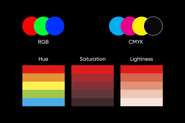
Let’s demystify the technical side of color theory 101 in the digital world:
RGB (Red, Green, Blue) is all about screens. Your phone, computer, and tablet mix these three colors of light to create every color you see digitally. Each color uses values from 0 to 255:
- Pure red: rgb(255, 0, 0)
- Deep purple: rgb(128, 0, 128)
- Sky blue: rgb(135, 206, 235)
CMYK (Cyan, Magenta, Yellow, Key/Black) is print’s best friend. This model uses percentages of each ink color:
- Vibrant orange: C:0% M:60% Y:100% K:0%
- Forest green: C:75% M:0% Y:75% K:30%
- Rich black: C:60% M:40% Y:40% K:100%
HSL (Hue, Saturation, Lightness) makes color adjustment intuitive:
- Hue: Choose your base color (0-360 degrees)
- Saturation: Control color intensity (0-100%)
- Lightness: Adjust brightness (0-100%)
Put color theory into action
- Web design: Create interfaces that guide users naturally through your site. Use contrasting colors for calls-to-action and complementary colors for balanced layouts.
- Branding: Build recognition with consistent colors across all platforms. Pick colors that reflect your brand personality and resonate with your audience.
- Social media: Make your posts pop with color schemes that catch attention while scrolling. Use color psychology to drive engagement.
- Art and illustration: Express mood and depth in your artwork through strategic color choices. Layer analogous colors for dimension and complementary colors for impact.
What is color theory 201
Once you’ve got the color theory basics down, it’s time to explore the nuances that make color theory truly powerful. These intermediate concepts will help you create more sophisticated and intentional color combinations.
Temperature changes everything in color theory. Each color has warm and cool variations that can dramatically shift its impact. A warm blue (with hints of red) feels more welcoming than a cool blue (with hints of green). This subtle temperature shift can make the difference between a design that feels inviting and one that feels clinical.
Value and saturation create depth and hierarchy in your designs. Value refers to how light or dark a color is, while saturation describes its intensity. Try creating monochromatic schemes using different values of the same color – they’re perfect for creating depth without introducing new hues. For example, a deep navy blue paired with lighter sky blues can create sophisticated, layered designs.
Color context shows how colors behave differently depending on their surroundings. A medium gray looks darker against white but lighter against black. This optical illusion, called simultaneous contrast, means your colors need to be tested in their final context. What looks perfect in isolation might need adjusting when placed in your actual design.
Color proportion follows the 60-30-10 rule: use your dominant color for 60% of the design, your secondary color for 30%, and an accent color for 10%. This creates visual balance while maintaining interest. Think of it like a well-tailored suit – the main color is the suit itself, the secondary color might be the shirt, and the accent color could be the tie.
Neutral colors deserve attention too. Beige isn’t boring when you know how to use it. Neutrals like white, black, gray, and brown act as sophisticated supporting players that can make your other colors sing. They can also stand alone – just look at high-end fashion brands that build entire identities around black and white.
Tools for color theory mastery
Take all that color theory basics knowledge and put it into practice with Picsart’s powerful color tools. Whether you’re editing photos, creating designs, or building a brand identity, these tools make working with color simple and fun:
- Color picker: Grab exact colors you are looking for and find color numbers using HEX, RGB, HSL, and CMYK color picker formats.
- Color meanings guide: Discover everything about colors, the psychology and symbolism behind different hues. Perfect for choosing colors that convey the right message and evoke the emotions you want in your designs.
- Color wheel: Find harmonious color combinations instantly. Just select your base color, and get complementary, analogous, and triadic matches that work.
Conclusion
Mastering color theory opens up a world of creative possibilities. It empowers you to make informed decisions about color usage, enhancing the impact and effectiveness of your visual communications. Whether you’re designing a website, creating art, or planning a marketing campaign, a solid understanding of color theory will elevate your work to new heights.
Remember, while color theory basics provide a scientific foundation, they also leave room for artistic intuition. As you apply these principles, don’t be afraid to experiment and trust your creative instincts. The more you practice and observe, the more nuanced your understanding of color will become.
Ready to put your color theory knowledge into practice? Explore the powerful tools at Picsart Colors and start creating stunning, color-rich designs today!


