
Contents
Design in 2026 feels different right away. It’s softer, more textured, and a lot less interested in looking perfect. The biggest design trends of 2026 lean into paper-like surfaces, washed-out Polaroid effects, sculpted 3D elements, expressive typography, and layered, slightly messy compositions that feel made by hand.
After years of ultra-clean layouts and flat visuals, creators are moving in the opposite direction. There’s a clear pull toward things that feel physical – like you could reach out and touch them. That shift shows up everywhere, from Instagram graphics and branding to packaging and editorial design.
For designers, social media managers, and creators, this opens up a lot of room to experiment. You don’t need everything to look polished anymore. In fact, a bit of imperfection is the point. Below, you’ll find the design trends for 2026 that are shaping visual culture right now – and practical ways to start using them.
Blue texture backgrounds
Blue is having a quiet moment in 2026, but not in a flat, predictable way. Instead, it shows up as layered textures – soft gradients, cloudy washes, denim-like grains, even cyanotype-style effects.
What makes this trend work is how subtle it feels. Blue backgrounds add depth without stealing attention, which is why they’re everywhere right now, from website headers to social posts. They give designs breathing room.
This also ties into broader color trends for 2026. After years of loud, saturated palettes, designers are leaning toward calmer tones. Blue sits right in that sweet spot.
Try using textured blue backgrounds for quote posts, mood boards, or landing pages. Pair them with clean white text, and you’ve got something that feels modern but not cold.

Paper texture backgrounds
Flat color backgrounds are starting to feel a bit lifeless. Paper textures are stepping in to replace them.
Think torn notebook pages, soft cardstock grain, or slightly wrinkled surfaces. Even subtle paper overlays can make a design feel more grounded and intentional.
There’s something about paper that instantly adds warmth. It suggests care – like the design wasn’t just generated, but actually put together.
This is one of those design trends for 2026 that works across almost everything: presentations, social carousels, packaging mockups, and even portfolios.
If you want a quick starting point, explore ready-made paper-style layouts.

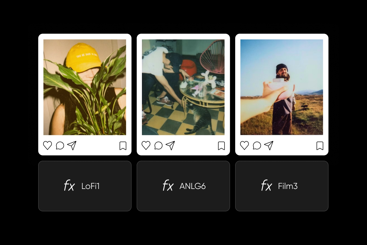
Old Polaroid effect backgrounds
The Polaroid look isn’t new, but it’s evolving. In 2026, it’s less about obvious retro filters and more about subtle imperfections – faded edges, light leaks, soft grain.
It feels casual and real, which is exactly why it works. In a feed full of overly edited images, something slightly imperfect stands out.
Designers are using this style for storytelling – event recaps, behind-the-scenes content, and lifestyle branding. It adds mood without needing extra elements.
You can recreate the effect with gentle color fading and texture overlays using tools like Vintage Filters.
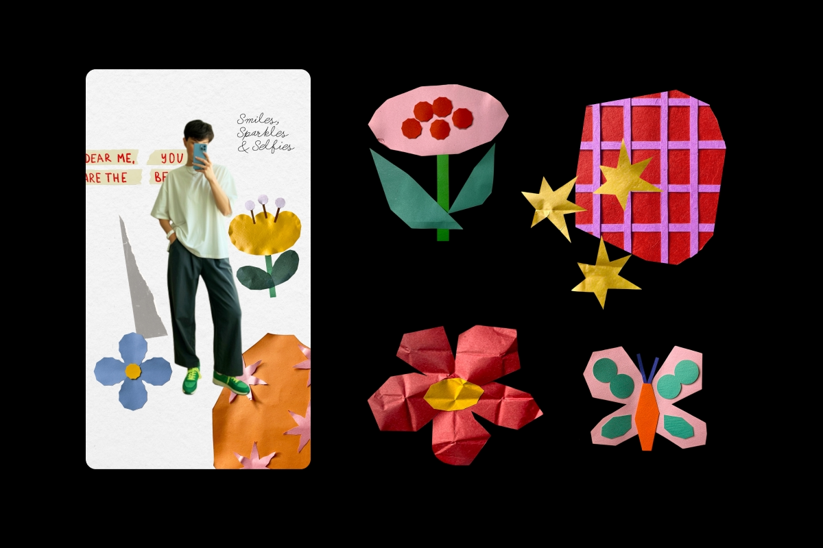
Papers and photo stickers
This trend feels like flipping through someone’s scrapbook. Photos overlap, edges are torn, elements don’t quite line up, and that’s what makes it work.
Collage-style layouts are everywhere in graphic design trends 2026. They feel layered and personal, like each piece was placed intentionally, even when it looks spontaneous.
It’s a flexible style too. You can go minimal with just a few elements or build something dense and editorial.
This approach works especially well for lookbooks, posters, and social content where you want to show multiple ideas at once without feeling rigid.
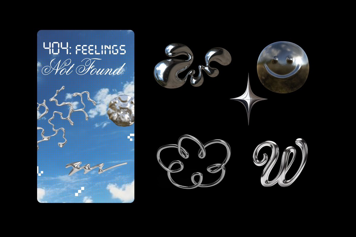
3D metal style stickers
Metallic 3D elements are popping up in unexpected places. Chrome lettering, embossed badges, and shiny ornamental shapes are giving designs a more tactile edge.
They feel a bit nostalgic – almost like wax seals or engraved details – but with a modern finish.
This trend leans more premium. You’ll see it in branding, packaging, and anything that wants to feel elevated without being overly formal.
The key is contrast. Pair metallic elements with softer textures or darker tones so they really stand out.
Art Nouveau frames and stickers
Art Nouveau is back, and it fits surprisingly well with today’s design direction.
Its flowing lines, botanical shapes, and decorative details bring a sense of movement that contrasts nicely with more structured layouts.
Designers are using it for frames, borders, and accents – especially in beauty, food, and lifestyle content. It adds personality without overwhelming the main design.
It’s one of those trends of 2026 that feels both nostalgic and new at the same time.

Quotes with expressive typography
Typography is doing a lot more heavy lifting in 2026. Instead of playing it safe with one font, designers are mixing styles – big, small, clean, messy – all in one layout.
It’s less about rules and more about feeling.
This shows up a lot in quote graphics and social posts. The text becomes the visual, not just something you read. If you want to experiment, browse different font styles at Picsart. Don’t worry about perfection. The more personality the type has, the better it fits this trend.
X-ray and halftone style food and flowers
This is one of the more unexpected aesthetic trends of 2026. Everyday subjects – like fruit or flowers – are being transformed with halftone dots and high-contrast color treatments.
It gives them a graphic, almost poster-like quality.
You’ll see this style in packaging, editorial design, and bold social content. It grabs attention quickly, which makes it perfect for fast-scrolling platforms.
Stick to strong, limited color palettes to keep the effect sharp.

Large-scale cutouts with hand-drawn elements
This trend blends two very different things: clean photography and rough, hand-drawn details.
You might see a full-body cutout layered over scribbles, paint strokes, or geometric shapes. The contrast is what makes it interesting.
It feels creative without trying too hard. That’s why it’s showing up in fashion campaigns and editorial work.
It’s also one of the easiest ways to make content feel more original without starting from scratch.
Elegant serifs with bejeweled details
Decorative typography is getting more playful and a bit more glamorous.
Serif fonts are being styled with dotted, jeweled, or pearl-like details. It sounds niche, but it’s showing up more and more, especially in beauty and event design.
It adds texture directly into the text, which makes even simple layouts feel richer.
Pair it with soft colors or dark backgrounds so the details don’t get lost.

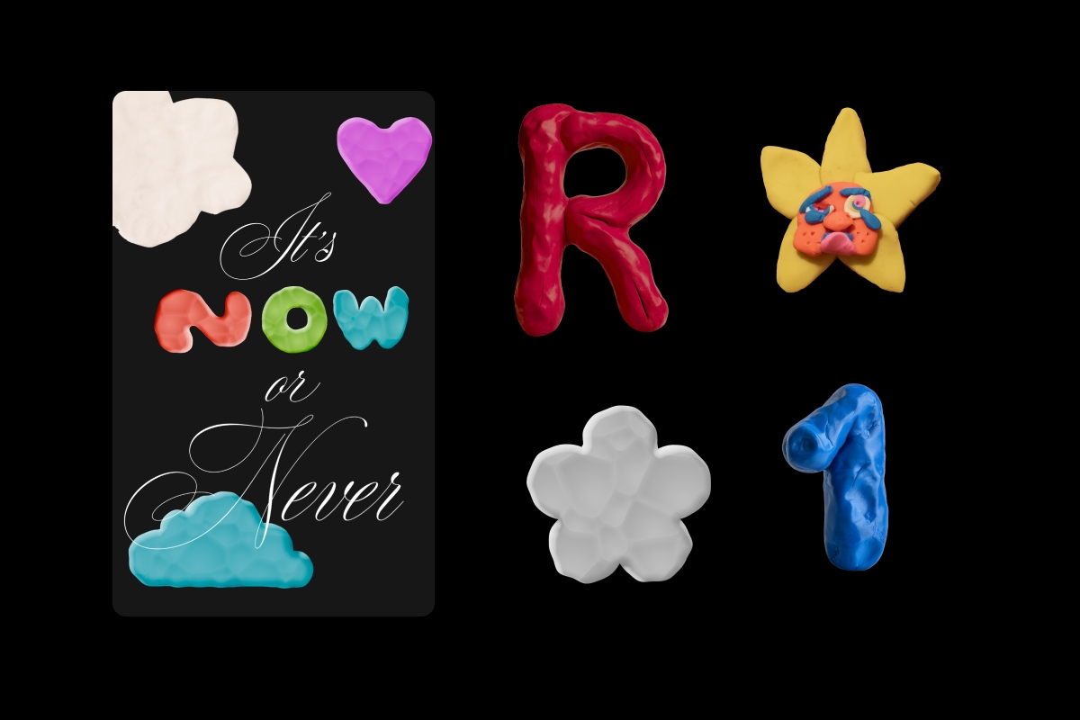
Hand-molded 3D plasticine
This might be the most fun trend of the year.
Plasticine-style 3D elements look like they were shaped by hand – slightly uneven, brightly colored, and full of personality.
They bring a sense of play that’s hard to get with cleaner styles. That’s why they’re popular for posters, social graphics, and anything aimed at younger audiences.
It’s also a clear reaction to overly perfect visuals. This trend embraces flaws instead of hiding them.
Color trends 2026: what palettes are designers using?
Color trends in 2026 feel softer overall. There’s less contrast, less intensity, and more balance.
Cloud Dancer, Pantone’s color of the year, is a warm off-white that works almost anywhere. It pairs easily with other tones without dominating.
Alongside that, you’ll see earthy shades – terracotta, sage, warm browns – as well as deeper jewel tones like burgundy and emerald.
These palettes support the broader shift toward texture and tactility. They don’t fight for attention – they support the design.
How to create 2026 design trends with Picsart
You don’t need to master every trend to start experimenting. In most cases, picking two or three that fit your style is enough.
For backgrounds whether it’s paper textures or soft gradients, you can generate custom visuals using the AI Background tool.
If you’re working with layered designs or collage-style layouts, the Collage Maker makes that process much easier.
Sticker-based designs are also a big part of 2026 trends. You can create and customize your own elements with Sticker Maker.
And for more stylized edits – like halftone or vintage effects – the Photo Effects tool covers a lot of ground.
The best approach is to mix styles. Combine something textured with something clean. Pair a playful element with a more structured layout. That contrast is what makes designs feel current.
Conclusion
Design trends 2026 are all about bringing feeling back into visuals. Texture, imperfection, and personality are leading the way.
You don’t need to follow every trend. Just find a few that fit your style and build from there.
Start creating with Picsart and explore these trends yourself.


