
Think of your favorite app. What does it look like? Chances are you don’t visualize the interface of the homepage, but you do think of the app icon design. App icons are essentially the app logo. True, an app logo is not the same as an app’s icon, but they do need to complement each other and maintain a sense of recognition.
What is an App Icon?
An app icon is your first chance to make a positive impression on someone. You want it to stand out among competitors in the app store and on the home screen. It should embody the essence of your app and evoke the same type of feeling users could expect to have when using it.
Every app needs an icon, and that icon design can affect whether or not an app will make it in the digital world.
Reasons to Have a Good App Icon
There are thousands and thousands of apps out there, and you want yours to stand out. Having a good app icon design that is memorable and unique can help.
Having a well designed, consistent app icon will increase your chances of going viral, product satisfaction and user retention. If potential users don’t understand your app icon, chances are they will think they won’t understand the user interface either.
App Icon vs. Logo
App icons are often confused with logos, but they are not strictly the same. Yes, they are both different pieces of branding (which is why they are often confused with each other), but they are designed with different restrictions in mind for different end goals. One of the key differences between the two is the shape.
App icons should be able to fit into a square canvas. The app icon size can range from 16 x 16 to 512 x 512, and so on. Ideally, your app design will fit to a range of square sizes all the way up to 1024 x 1024 so that you can be sure that the design is versatile and practical. Keep in mind that different app stores have different requirements, so having a range in sizes assures that you’re optimizing your app icon design to various needs.
Unlike an app icon, logos do not have shape and size restrictions. Logos are scalable vector files designed with diversity in application in mind. They can be used on billboards, websites and T-shirts without having to stay within a square box. This allows for a little more creativity and variety in designs while app icon design literally needs to stay within a box.
Benefits of Using App Icon
There are a handful of options you can use when it comes time to designing your logos and apps. You could work with a designer, but that can cost a lot of money. If you have a vision already, then your best bet is to use a logo design app to create your own. Here’s why:
- Convenience: Apps themselves are all about mobility. When inspiration strikes, you want to be able to get your ideas down, and it’s much easier to do so on a mobile design app than if you’re tethered to a desktop.
- Easy to use: Logo design apps are user-friendly and intuitive. You don’t have to be a professional graphic designer to create a cool, memorable app icon. Oftentimes they even have templates you can work from.
- Modern designs: Logo design apps tend to work better for modern designs. Sure this can range from one app to the other, but there tends to be sleeker tools and templates.
- Good for B2C: The type of app icon you’ll design in these apps tend to have more consumer-friendly aspects than if you were to use a professional editing suite on a desktop. If your business needs to connect with everyday people, then you’ll benefit from the wide variety of colors and styles.
- Customizable: Many apps have templates to get your design started, but once you have the groundwork laid, there is a whole suite of editing tools you can use to create a unique app icon design.
- Affordable: If you’re looking to create your own app icon design, chances are you’re still in the early stages of your app which means you probably don’t have a lot of cash to spend on design. Well, the good news is you can download Picsart for free. It offers tons of templates, tools and customization options.
What Makes a Good App Icon?
There are many ways you can go about designing your app icon, but there are five things to consider if you want it to create effective app icon designs.
- Scalability
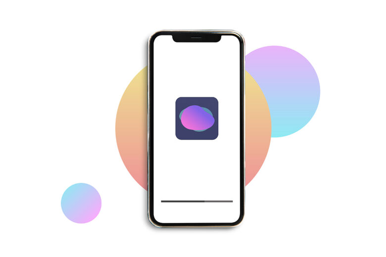
Your app icon is going to show up in a variety of places, whether that be across different operating systems and within the app. Each use case will require a different app icon size. Each one will begin with a square app icon file, and across all of them, you want to be sure your design maintains its legibility and quality. - Recognition
You want people to recognise your app icon immediately. That requires something creative, yet practical and memorable. You can have a highly detailed design or something simplistic, but your app icon needs to stand out among the other of hundreds of app icons it will be up against. Finding the balance between connecting with users on a functional and emotional level is essential.
- Consistency
Consistency is key when it comes to app icon design. You wouldn’t want your icon to look different in the Apple iOS store than it does in the Google Play store, for example. Keep the same design and color scheme everywhere your icon appears. - Uniqueness
A no-brainer, right? But app icon design can be trickier than it seems. Take a look at what other app icons in your category look like. Are there similarities among them that signify what their function and purpose is? Look at those details and brainstorm ways you can convey the same message while standing out. This can be done through color palettes, shapes within your canvas, gradients, and more. - No Text
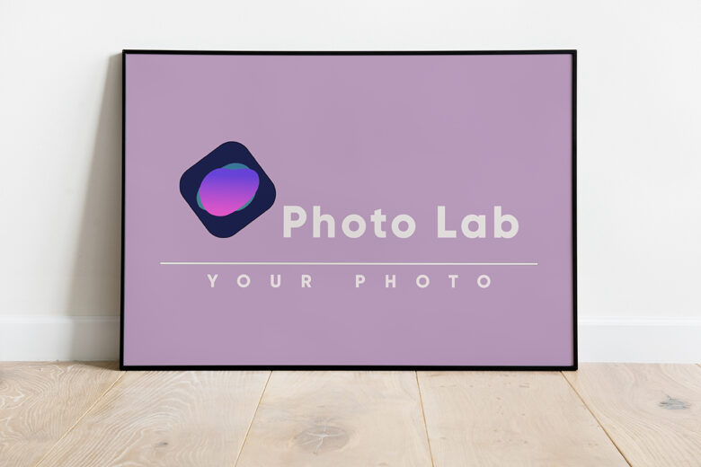
When it comes to design, leave the text and words for the logos. Symbols and icons make much more sense for your app than trying to spell out exactly who it is or what it does. A fun alternative to using the full name of an app is to take just the first letter of the name and then have fun getting creative around its presentation. Take the Picsart ‘P’, for example.
How to Make an App Icon
You’ll want to make sure that the design fits in with your brand identity. For iOS, design on a larger scale square canvas (1024 x 1024), bearing in mind that it is always easier to reduce the size of your design than it is to increase it. The same goes for when you are creating an app icon for Android. With both, you’ll want to create a grid within the canvas to keep your design to, and this is where the differences come in.
The grid will keep the integrity of your icon design, and you’ll want to keep the main focus of the design within a centered circle, or safe zone. The safe zone on an iOS app icon is larger than it is on an Android app icon design. This is why scalability for your design is important. While the integrity of the design will be the same, the designs will look slightly different from the app store to the Google Play store.
Once you’ve got the scale of your canvas down, it’s time to get designing. Here’s how to do it in Picsart.
1) Open the Picsart app and tap on the purple plus sign at the bottom of your screen to open a blank, square canvas.
2) Scroll down and choose a Color Background.
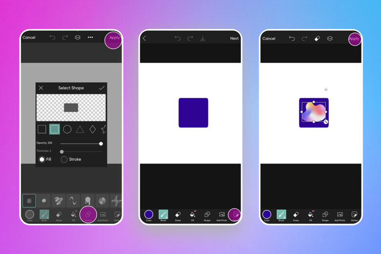
3) Select the Draw tool.
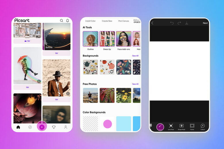
4) Tap on Shape and select the rounded circle option. Choose your color with the color picker tool.
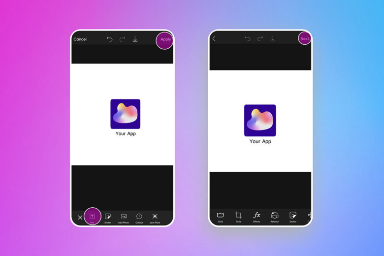
5) Add a Sticker of your logo and tap on Apply.
6) If you want to add your app name, tap on the Text tool and type it in, styling and finessing as required and tapping on Next when you’re done.
If you’re more comfortable designing on a desktop, you can also use Picsart to get the job done. Let’s show you how.
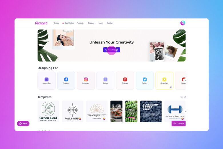
1) Open the Picsart Web Editor and click on New Project to get started.
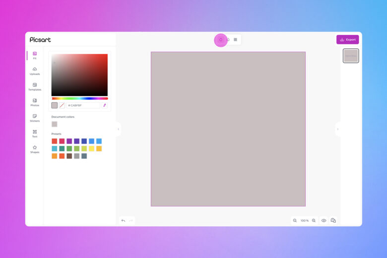
2) Choose your canvas size and select a color from the color picker.
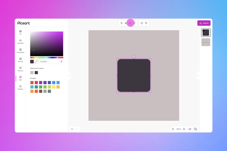
3) Click on Shapes and seleect the rounded circle.
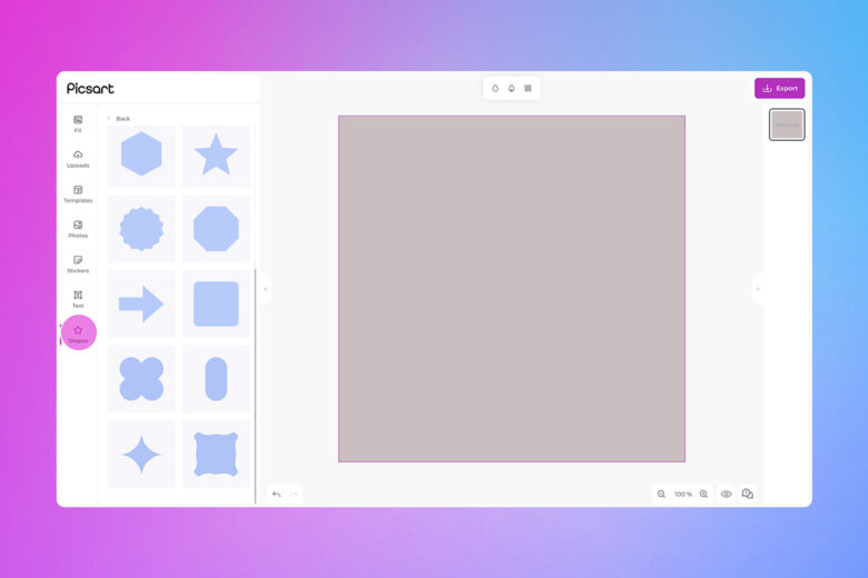
4) Fill your app icon canvas with your background color or gradient.
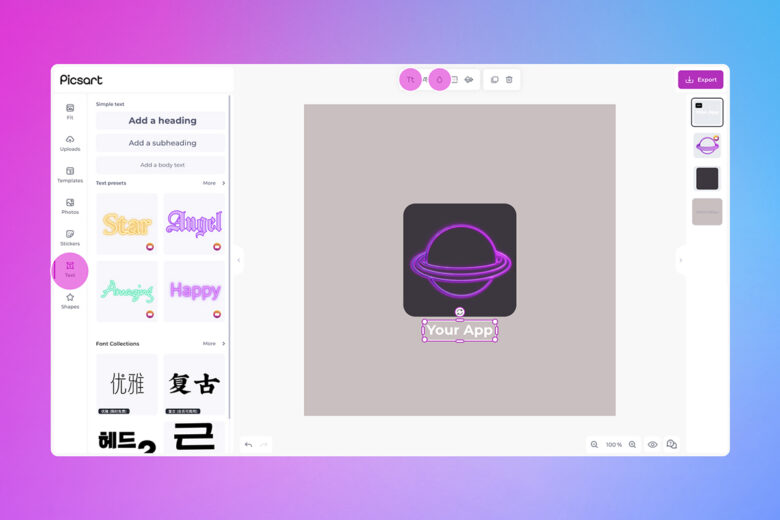
5) Insert your logo from your Stickers collection. If you need to add your app name, click on Text and type it in.
6) When you’re finished designing, click on Export.
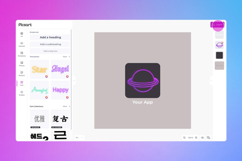
And with that, you’re ready to show off your new app icon to the world.
Create at the Speed of Culture
Picsart is a full ecosystem of free-to-use content, powerful tools, and creator inspiration. With a billion downloads and more than 150 million monthly active creators, Picsart is the world’s largest creative platform. Picsart has collaborated with major artists and brands like BLACKPINK, the Jonas Brothers, Lizzo, Sanrio: Hello Kitty, I am a Voter, Bebe Rexha, Maroon 5, One Direction, Warner Bros. Entertainment, iHeartMedia, Condé Nast, and more. Download the app or start editing on web today to enhance your photos and videos with thousands of quick and easy editing tools, trendy filters, fun stickers, and brilliant backgrounds. Unleash your creativity and upgrade to Gold for premium perks!


