
Look at any image and ask yourself where your eye goes first. This focal point is likely the positive space of that image. Negative and positive space can’t be measured or delineated. We can’t simply define these two spaces as foreground and back.
So what exactly is positive space and negative space?
Positive space is the main subject of an image – that is, where a viewer’s eye goes first. In turn, negative space is the rest of the composition.
One might argue that positive space is more important because it contains the key material of an image. In a portrait, the subject rendered is the positive space. In a photograph of a cityscape, the positive space is that monument or building of interest. However, the space outside these focal elements is just as important, even if playing a supporting role. The negative space gives us context.
Just try to capture the Eiffel Tower without the grassy park in front of it or the buildings around it. The image wouldn’t look natural or well-composed.
In a portrait, negative space can tell us just as much as the facial expression or posture of the person. Perhaps the negative space of the portrait features items that are important to the subject, or maybe this space serves artistic purposes, like providing balance or contrast. That said, it’s just as important to know how to use negative space in photography as it is positive.

Photo by Il Vagabiondo on Unsplash
To take better photos, we should think about positive and negative space and how to create it. Identify these two types of space, decide on your subject and surrounding material, and create balance and contrast. Knowing how to use negative space in photography is a foolproof recipe for more professional-looking shots. What’s more, when you consider these compositional elements of your work, you become a better creator: more informed, thoughtful, and intentional.
Subject Matters
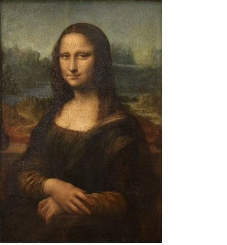
In certain images, you can easily identify the subject and, therefore, the positive space. In images that don’t have a lot going on, you can quickly determine the subject by asking what the image shows. For Leonardo da Vinci’s Mona Lisa, the answer is that the image features a woman sitting for a portrait. For Van Gogh’s Starry Night, the response might be a bit more unclear. Perhaps your eye goes first to the astral wisps in the background of the painting, while someone else’s eye might focus on the dark bush in the foreground. The painting’s title cues us into what Van Gogh likely thought. Either way, the painting provides a unique learning moment. As mentioned above, positive and negative don’t necessarily mean foreground and background. The stars in the background of Van Gogh’s painting grab your attention, and the spindly vegetation in the foreground almost fades away, like a dark, carved relief.
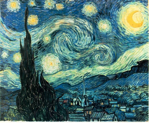
Starry Night via Wikimedia Commons
How should we use positive and negative space in practical application? We can start by determining our subject and deciding where to place it. If you want to take a modern-day picture a-la-Mona Lisa, have the individual you’re photographing sit in front of an idyllic landscape. Many of us are already great at this type of composition as we commonly snap travel pictures in this style. Whatever you choose for your negative space, remember that it should tell the viewer something. If your subject is a person, use the negative space to give context about place and time. If the subject is a landscape feature, use the surrounding area in the composition to create scale.
Balance
Once you’ve determined your subject, it’s time to get artful. Balance is essential to any piece, and you can achieve it by making sure no one part of the photo draws too much attention. Balance does not necessarily mean symmetry – think: the asymmetrical Starry Night – but it does imply a complete, well-thought composition. Think of it like a scale tipping one way or another depending on the weight on either side. In achieving the correct balance in a photograph, you don’t want the image to lean to one side, so to speak. Avoid this by having visual interest everywhere, both in your positive and negative space, without either overwhelming the other. In the photo below, both the castle, which is the subject, and the negative space around it hold our visual interest. What’s more, while the composition invites our eye to travel around the image – up the path and even into the hills and sky – we never feel distracted by just one part of the composition.
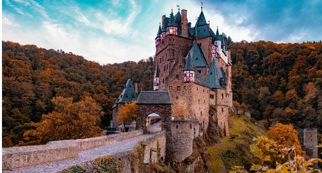
Photo by ERROR420 on Unsplash
In some pieces, positive space and negative space are so balanced that it can be hard to tell them apart. This effect, popular in graphic design, is one that you can replicate in abstract photos. Where are the positive space and negative space in the image below? Your guess is as good as ours. In this case, not knowing is just fine. The funky dimensions and mind-bending shadows of the composition allow us to have an abstract experience.

Photo by Shapelined on Unsplash
Contrast
In photography, there is no such thing as good or bad contrast. Sometimes the artist’s vision is to create a dreamy background into which the subject fades. Other times, a creator goes for stark divides.
Whatever you decide, be sure to consider this element of composition. Try using color to delineate positive and negative space. For high-contrast photos, make sure that the colors in your subject, such as the bright red-orange jacket in the image below, stand out against the background. If this same subject had been photographed in a fall forest full of reddish leaves, the result would have been a low-contrast image. Neither option is right or wrong, just a decision you, the photographer, get to make.

Photo by Nick Sheerbart on Unsplash
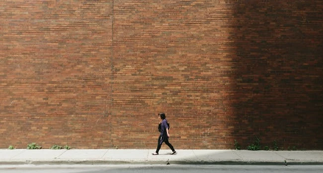
Another way to create contrast is through the use of opposing shapes. While the walking figure in the image below is far smaller than the large brick wall in the background, we can still easily identify the woman as the photo’s subject. In fact, we can even do so despite the image’s generally dark, flat color scheme. The reason is that the long horizontal lines in the negative space of the photo contrast with the stark vertical line of the walker’s body.
Applying What You Know
Sometimes, you’re able to set up the perfect shot, but other times, you need to capture an important moment while it’s happening, and you aren’t able to tweak the setting. Whatever the case, the better you become at identifying negative and positive space and how to balance and contrast them, the more professional snaps you’ll take. Don’t be shy about asking your subjects to move a little bit to the right, for example, to balance them out against the photo’s background. When you do have time, go one step further. Frame your shot and shift your lens until your overall composition is harmonious and eye-catching, from border to border, corner to corner.
Create at the Speed of Culture
Picsart is a full ecosystem of free-to-use content, powerful tools, and creator inspiration. With a billion downloads and more than 150 million monthly active creators, Picsart isn’t just the world’s largest creative platform; we’re also the fastest growing. Picsart has collaborated with major artists and brands like BLACKPINK, the Jonas Brothers, Lizzo, Sanrio: Hello Kitty, I am a Voter, Bebe Rexha, Maroon 5, One Direction, Warner Bros. Entertainment, iHeartMedia, Condé Nast, and more. Download the app or start editing on web today to enhance your photos and videos with thousands of quick and easy editing tools, trendy filters, fun stickers, and brilliant backgrounds. Unleash your creativity and upgrade to Gold for premium perks!


