
If you’ve never heard the word “histogram” before or you’re unsure how it relates to photography, don’t worry. You’re about to learn how the histogram tool on your camera can help you take even better photos.
Light is everything to a photo. Even when taking shots of some of the most beautiful places on earth, the proper lighting is essential for capturing the scene. To avoid photos that look shadowy, washed out, or uneven, photographers usually take the time to learn the ropes of their cameras, getting familiar with settings like aperture, shutter speed, and ISO. The histogram function might not be quite as popular on the blogs or in tutorials, but it’s there to help us as we frame our perfect shot, so we may as well take advantage of our cameras’ mind-boggling mathematical prowess.
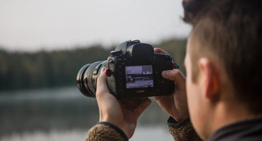
Photo by Maxim Medvedev via Unsplash
What is a Histogram?
A histogram is essentially a bar graph. Perhaps you saw these back in math class, and you may be wondering what they have to do with the visual arts. If math isn’t your strong suit and photography is, then fear not. You won’t be running any calculations; your digital camera will. Cameras are quite good at doing so, and you might not yet be taking advantage of all this work yours is doing behind the scenes.
Digital cameras can display up to four types of histograms, one for luminosity and another three for color. Essentially, these graphs plot the light or color in your shot and help you better understand how your photo will be exposed and saturated.
What Does a Histogram Show Us?
Let’s start with the luminosity histogram as a jumping-off point. This graph shows what sort of lighting your photo has. The horizontal X-axis shows the range of light in a photo, spanning the darkest to lightest tones. The vertical Y-axis shows you how much of any given kind of light there is in relation to others in the photo. That means that histograms with sharp peaks and deep valleys have a high concentration of specific tones. Reading from left to right, the first third of the graph shows your darker tones, the middle shows the mid-range tones, and the final third shows the highlights.
So, how can you read this data quickly and efficiently before snapping off the perfect picture? First, look for which way the histogram leans. If there is a big swell on the left, you know the photo contains a high concentration of dark tones. Conversely, a large swell on the right implies intense highlights. Take this data with a grain of salt. If you’re outside on a bright day, you’re naturally going to have more highlights than you would, let’s say, while taking photos at a dimly-lit restaurant. That said, a spike on the left coupled with little data elsewhere could tip you off to an underexposed photo and vice versa.
Now that you understand how the light histogram works, the color ones should be a breeze. The logic is the same: they show distribution, this time of hues in an image. These histograms present the range of blue, green, and red tones and then the tonalities together under the tool’s “all” heading. How can you use this quickly in the field? These color graphs will show you any “clipping,” which refers to a part of your photo where the camera is not capturing all the visual data it could. For example, if there’s a big spike on a color histogram, it can mean a specific area of the photo has lost the intensity of a particular color. As you may have imagined, luminosity clipping implies a similar effect not to color but rather to light. Because we’re talking about lost data here, this means that clipping can cause your image to lose detail.

Getting it Right: What Does a Good Histogram Look Like?
In photography, there is no right or wrong, just a wealth of artistic opportunities. Sometimes, underexposed photos can look extra moody, while overexposed ones turn out hip and nostalgic. If you are trying to expose your photos correctly, the histogram tool can help you get there without lots of trial and error.
Correctly exposed photos – and again, there is some room for error and creativity – generally have a balanced histogram reading. That means no sharp, high spikes nor graphs that lean hard toward one side. Shoot for the middle on both axes of the graph: readings that aren’t too vertically high or low or too horizontally concentrated in one place. Keep in mind that there will always be a bit of sway and areas of higher concentration on the graph. The environments we photograph in aren’t even perfectly lit, so we can’t expect the camera to capture them as such. For example, if there are dark shadows on the side of a building or an intense ray of light in your photo – both of which likely look interesting from a creative standpoint – the histogram will reflect these saturated light and dark spots. When you see them on the graph, don’t be surprised. It likely means that the camera is capturing the scene as you’d like: close to reality and full of depth.
Should You Be Exposing to the Right?
Exposing to the right is a technique that employs the histogram to determine the lighting of a photo quickly, albeit perhaps not perfectly, but well enough. Essentially, it relies on the logic that if your luminosity histogram leans to the right – that is, toward the light – your photo will be, at worst, overexposed yet well-lit. The theory is that you can later fix any washed-out regions in editing. Experts cite some key downfalls associated with this trick, like excess noise, which implies an overall loss in quality.
What’s our take? If you have the time to set your photo up well, rely on all that impressive math your camera does and use the histogram to get into the median range that generally ensures a well-exposed photo. Also, use your instincts. If you are purposely going for a specific light effect, run with it, and if you’re trying to take a perfectly-lit shot, combine the power of your camera’s histogram with that of your own eye. Check the graph and the previews of your pictures on the camera’s screen as you progress through a photoshoot, and you’ll surely be set for the perfect shot.
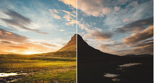
Intentionally Underexposed Photo Example. Image by Ali Bakhtiari via Unsplash.
Intentionally Underexposed Photo Example. Image by Brandon Hoogenboom via Unsplash.
Create at the Speed of Culture
Picsart is a full ecosystem of free-to-use content, powerful tools, and creator inspiration. With a billion downloads and more than 150 million monthly active creators, Picsart is the world’s largest creative platform. Picsart has collaborated with major artists and brands like BLACKPINK, the Jonas Brothers, Lizzo, Sanrio: Hello Kitty, I am a Voter, Bebe Rexha, Maroon 5, One Direction, Warner Bros. Entertainment, iHeartMedia, Condé Nast, and more. Download the app or start editing on web today to enhance your photos and videos with thousands of quick and easy editing tools, trendy filters, fun stickers, and brilliant backgrounds. Unleash your creativity and upgrade to Gold for premium perks!


