The pastel green color is a pale shade of green with high value and low saturation. The name pastel comes from the art media that originated in Italy in the 16th century. Pastel colors became a dominant color trend in 2014, while pastel green has been an internet favorite color since 2020 due to its soothing effect. Scroll down to learn all you need to know about it and how to incorporate this soft shade into your design. From pastel green accents to extravagant color schemes, this powdery hue will help you make a real style statement.
Ready for the technical stuff? Pastel green’s color code is #77dd77. In a RGB color space, that’s composed of 46.7% red, 86.7% green and 46.7% blue. Whereas in a CMYK color space, it’s 46.2% cyan, 0% magenta, 46.2% yellow and 13.3% black. It has a hue angle of 120 degrees, a saturation of 60% and a lightness of 66.7%. It also has RGB values of R:119, G:221, B:119 and CMYK values of C:0.46, M:0, Y:0.46, K:0.13. Its decimal value is 7855479.
How Do You Make Pastel Green?
Green lies between yellow and blue on the color wheel. To get a vibrant green, you’ll need to mix one part of yellow with one part of blue. Pro tip: You’ll need to mix blue and yellow paints with a greenish tint to them, i.e. Phthalo blue or Manganese blue and Cadmium Yellow light. Mix them until you get a uniform color. To lighten your vivid green, keep adding a paintbrush of white until you get the perfect pastel green color.
What Does Pastel Green Represent?
Pastel shades are peaceful, romantic, harmonious, soft, and tender. Green is the color of balance and nature. Therefore, pastel green is inspired by nature and evokes feelings of freshness, new beginning, and lightness. It’s a positive color and has a soothing, vitalizing effect. It’s used to represent equilibrium, tranquility, and optimism. It also represents safety, growth, harmony, freshness, and fertility.
What Colors Go with Pastel Green?
To find out which colors go with pastel green, let’s take a look at the color wheel. If you’re new to designing, basing your color choices on the color schemes provided below will help get you started. For more resources on the color wheel, palettes, and much more, be sure to check out Picsart Quick Tools.
Complementary Colors
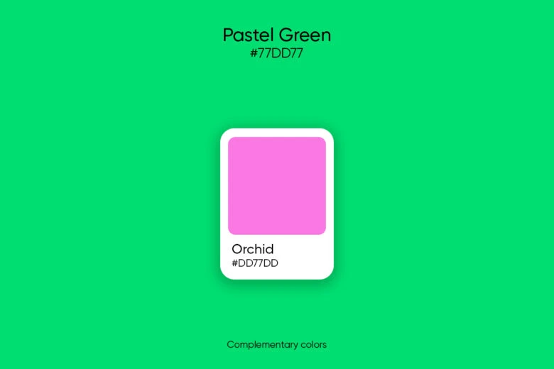
A complementary color scheme is a vibrant combination made up of two colors opposite one another in the color spectrum. Here, pastel green is the base, and creates a tension while combined with Orchid (#dd77dd), its complementary color.
Split Complementary Colors
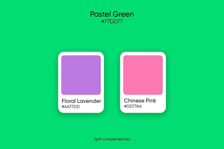
A split complementary color scheme is based on avoiding the direct opposition of complementary colors. For a split complementary palette, combine pastel green with the two colors on either side of the complement color (#dd77dd) which are: Floral Lavender (#aa77dd) and Chinese Pink (#dd77aa).
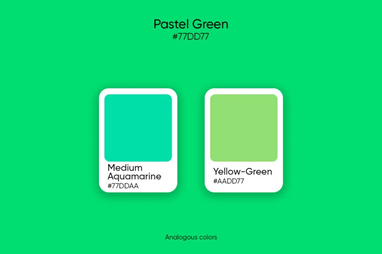
Analogous colors
An analogous color scheme is made up of three colors next to one another on the color wheel. This harmonious palette is made with the two secondary colors adjacent to pastel green: Medium Aquamarine (#77ddaa) and Yellow-Green (#aadd77).
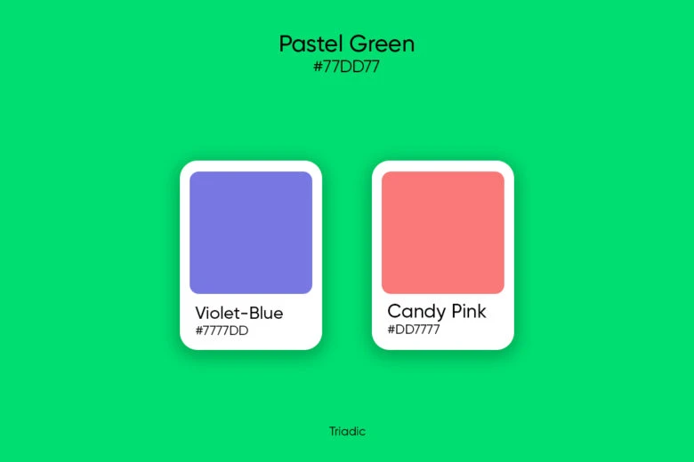
Triadic colors
The triadic color harmony combines three colors that are spaced evenly (120°) apart and form a triangle when visualized on the color wheel. These colors will look amazing as accents and highlights of pastel green. The two colors paired with pastel green are: Violet-Blue (#7777dd) and Candy Pink (#dd7777).
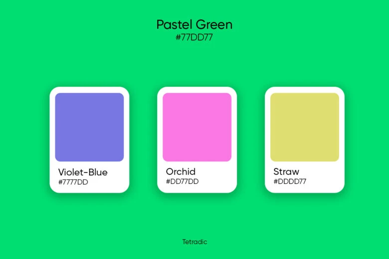
Tetradic colors
A tetradic color scheme is made up of two complementary pairs or four colors spaced evenly (90°) apart on the color wheel. This vibrant and versatile scheme works best with one dominant color. Here, the colors paired with pastel green are: Violet-Blue (#7777dd), Orchid (#dd77dd), and Straw (#dddd77).
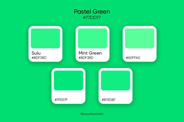
Monochromatic colors
Monochromatic schemes are derived from a single base hue and extended using its shades, tones, and tints. To create a Monochromatic color palette, pair pastel green with: Sulu (#8df38d), Mint Green (#96fc96) & (#a0ffa0), and Pastel Green shades with hex codes #7fe57f & #87ed87.
Similar colors
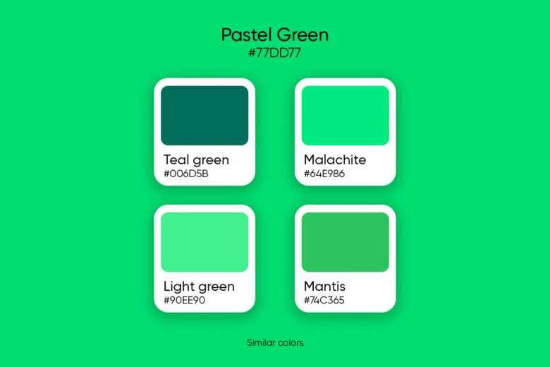
Looking for an alternative to pastel green? Consider Teal green, Light Malachite Green (#64e986), Light Green (#90ee90), and Mantis (#74c365).
Pastel Green Color Palette Ideas
Need some more inspo? Try these pastel green color palette ideas on for size.
Eternal Spring
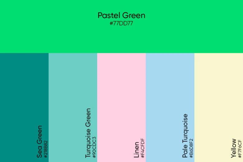
Pair pastel green with Sea Green (#218B82), Turquoise Green (#90CDC3), Linen (#F4CFDF), Pale Turquoise (#B6D8F2), and Yellow (#F7F6CF) for a gentle spring feel.
Parisian
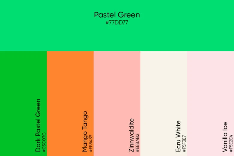
To design a sophisticated palette reminiscent of French macarons, combine pastel green with Dark Pastel Green (#03C03C), Mango Tango (#FF8439), Zinnwaldite (#EEBAB2), Ecru White (#F5F3E7), and Vanilla Ice (#F5E2E4).
Pastel Silhouette
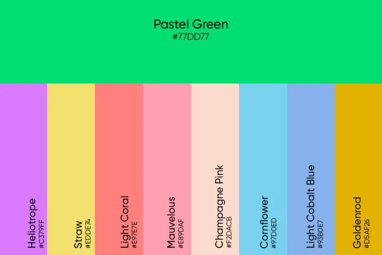
To create this palette pair pastel green with Heliotrope (#C379FF), Straw (#EDDE74), Light Coral (#E97E7E), Mauvelous (#E89DAF), Champagne Pink (#F2DACB), Cornflower (#97D0ED), Light Cobalt Blue (#93B0E7), and Goldenrod (#D5AF26).
Create Fantastic Photos Using this Color
Ready to incorporate pastel green into your designs? Picsart can help you weave pastel colors into your work in all kinds of awe-inspiring ways.
Editing On Mobile
1. Open the Picsart app and tap on the plus sign at the bottom of the screen to start your design.
2. Scroll down to Drawings, tap on the Create New button and select the Color tool, inputting the RGB pastel green color values (46.7% red, 86.7% green and 46.7% blue).
3. Scroll to the Fit tool and select your preferred canvas size.
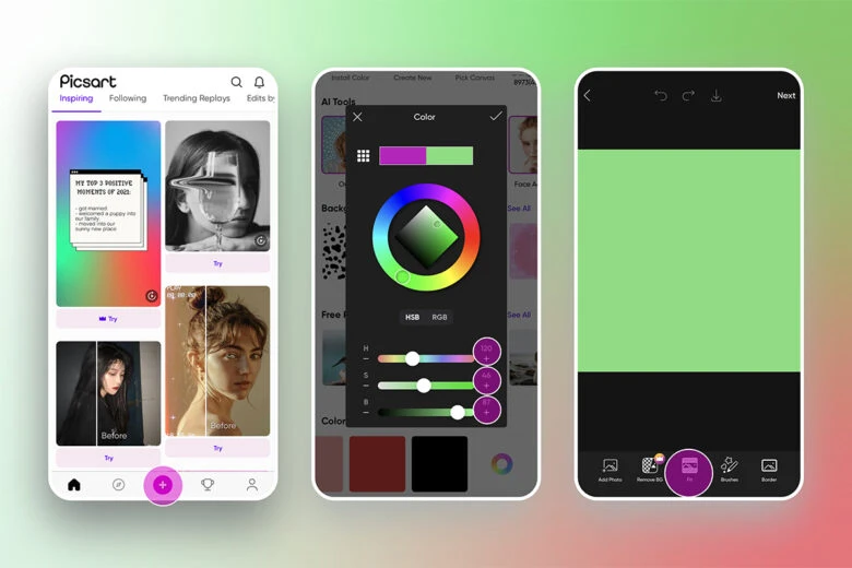
4. Tap on Ratio and depending on what you’re designing for, adjust the canvas accordingly.
5. From the tools menu, select Text.
6. Input your text and adjust the font, size, and other visual elements.
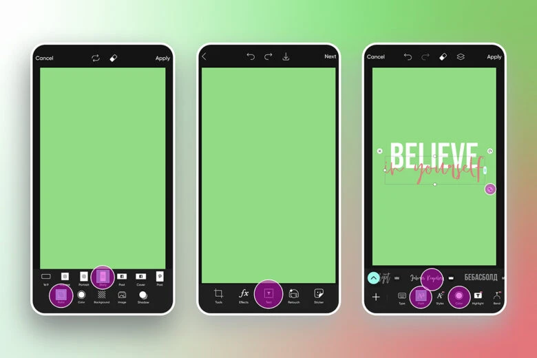
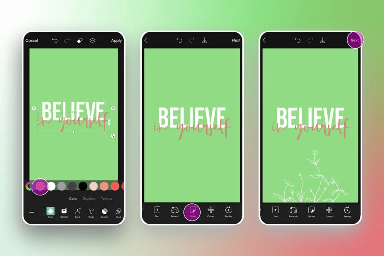
7. With the text box highlighted, tap on the Color tool to select a hue that will work well with pastel green, remembering we’ve learned earlier.
8. Add some finishing touches like Stickers and edit them to work with your pastel aesthetic.
9. Tap on Next to save your work when you’re done.
Editing On Desktop
1. Open the Picsart desktop editor and either click on New Project or choose your canvas from the Designing For menu, depening on the final destination of your image.
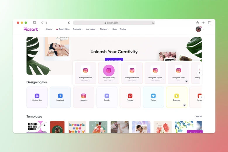
2. Click on the Color tool above the canvas and input the pastel green color codes in the panel on the left.
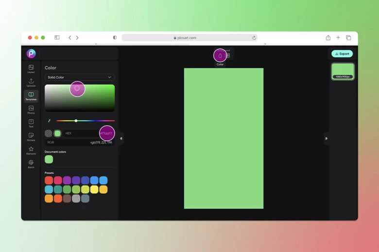
3. Add a text box by clicking on the Text button, selecting Add a Heading, clicking on the Adjust button and choosing a font. You can also edit the color, play with the sizing and placement, as well as making other visual adjustments.
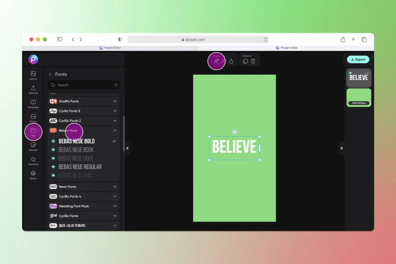
4. Make a second text box by clicking on the Duplicate button.
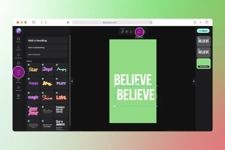
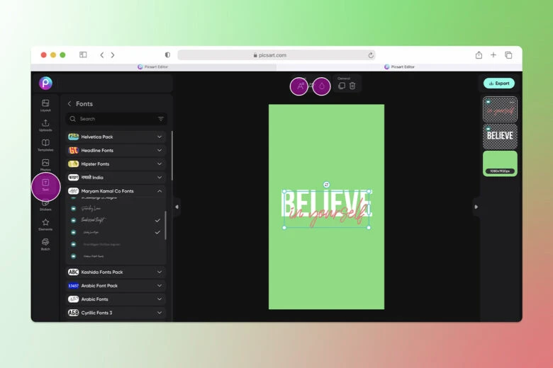
5. Here you can change the copy, text, color, style, size, and more.
6. You can add shapes and stickers here, by clicking on the Elements or Stickers buttons.
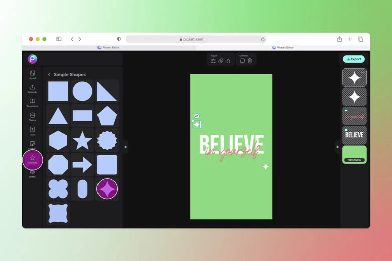
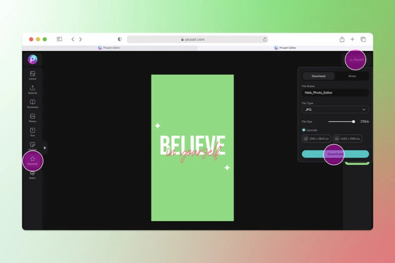
7. When you’re happy with the final design be sure to click on the Export button and Download your work.
Create at the Speed of Culture
Picsart is a full ecosystem of free-to-use content, powerful tools, and creator inspiration. With a billion downloads and more than 150 million monthly active creators, Picsart is the world’s largest creative platform. Picsart has collaborated with major artists and brands like BLACKPINK, Taylor Swift, the Jonas Brothers, Lizzo, Ariana Grande, Jennifer Lopez, One Direction, Sanrio: Hello Kitty, Warner Bros. Entertainment, iHeartMedia, Condé Nast, and more. Download the app or start editing on web today to enhance your photos and videos with thousands of quick and easy editing tools, trendy filters, fun stickers, and brilliant backgrounds. Unleash your creativity and upgrade to Gold for premium perks!


