Why spend hours researching, preparing, and rehearsing pages of content for a major presentation, only to scramble at the last minute to come up with creative presentation ideas? We’ve got the solution. In this article, you’ll find some fun slide examples (not to be confused with the kind you find in playgrounds) to help you prepare the perfect presentation designs.
Whether you’re using Microsoft Powerpoint templates or Google slides, the goal is the same: avoiding a boring presentation that captures your audience’s attention.
Stick around to learn everything there is to know about the best elements of a good presentation template, including color palette, color scheme ideas and complimentary fonts to use. No need to worry all your hard work will go to waste on a boring presentation.
Elements of a Good Slide For Presentations

There are many elements that go into creating an engaging presentation. The ultimate goal is avoiding a boring presentation that fails to engage your audience.
The most important thing to keep in mind is that these aren’t the end all be all, but guidelines that you should try to stick to as much as possible.
You’ll find some fun slide examples shortly too, but here are 10 elements to keep in mind when you make your next slide:
- Keep a consistent theme and color palette across the entire presentation.
- Make good use of the color wheel to make sure each slide shines.
- Avoid text overload. Only include the most critical information on the slides.
- A captivating and visually interesting background will keep your audience engaged.
- Use graphic design, infographics, and iconography to keep text to a minimum.
- When using text make sure to use unique and interesting typography.
- Use humor only if you’re confident enough to deliver it.
- On text-heavy slides, make sure to highlight important parts in bold or a different color.
- Use stickers and illustrations instead of photos to keep the noise to a minimum.
- Use shapes to keep everything framed in a tidy manner.
- Choose one layout before you start creating your slides and stick to it throughout the whole thing.
Good Presentation Examples and Why They Work
No matter what theme or audience you prepare your presentation for, it can be challenging to get started. It’s no surprise people take special classes to get better at making fun presentations, but not everyone has the time or the resources to do that. So we’ve compiled a list of creative presentation ideas that can help you master the art of making amazing slides.
Business Presentation Examples

Making a business presentation for the first time can be quite challenging. A good, memorable business presentation is much more than a collection of flashy slides. You should concentrate on conveying a certain message while preserving your brand’s voice. Here are some examples that can help you make a great first impression and stand out from the competition:
Minimalist Theme
The most memorable slide designs are often simple. A minimalist presentation design will allow you to focus information through sleek and organized slides. If you want to follow this presentation example then only a few stock photos, icons and fonts is advisable. Pick a maximum of three fonts and go for a simple background. To make your own minimalist presentation simply open the Picsart Web Editor on your device. Here you’ll be able to find a great collection of minimalist backgrounds and beautiful presentation fonts.
Mockup Slides
These are especially relevant if you’re presenting for a tech company. Mockups can make it so much easier for your audience to visualize what you’re presenting. To create your own mockup for a business presentation select the Stickers section in the Picsart Web Editor. Search “mockups” and select the device you want. Now you can simply position your design underneath the sticker and you’re done.
Visualize and Label Data
Despite the business setting, presenting excessive data can become boring fast. In order to avoid losing the attention of your audience, it’s best to visualize the data through graphs and charts. Don’t be afraid to add pops of color to your charts in order to ensure that you have the full attention of your audience. Lastly, don’t forget to label the graphs and the charts in order to be as clear as possible.

Consistent Design Motif
Your presentation should have a theme of sorts. This applies to the topic as well as the overall design. There’s nothing more distracting than switching between slides that don’t make sense next to one another thematically. In order to avoid this you can select a template in Picsart and build all your slides around it. This way you will ensure stylistic consistency.
Consistent Color Scheme
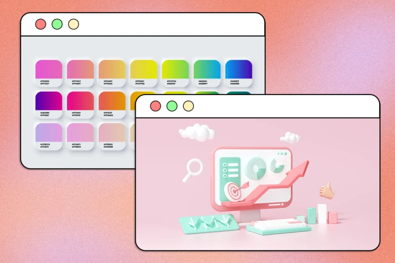
Presentations that use a consistent color scheme are can help companies establish brand awareness. However, it’s easier said than done. Picking a memorable color scheme for your presentation can be difficult, but you can learn about creating your own color palette in no time.
Rule of Thirds for the Layout
While creativity is always welcome when it comes to designing slides, there are certain limitations or rules you should follow. The rule of thirds simplifies the process of designing a layout and ensures that slides are easy to read. On each of your slides there should be a maximum of three ideas, three icons, three columns and so on. Try to stay consistent.
School Presentation Examples
As a student you’ve probably been through many mind-numbing presentations throughout the years. Your goal as the presenter should be to capture the attention of your audience and keep it. Here are a few pointers to help:
Animated Slides
Nothing is sure to bore students more than a presentation slide so static it might as well not be there. The reality is, students barely pay any attention to long presentations, especially ones that are prepared in an incredibly dull way. But, throw in a couple of gifs and some snazzy animated illustrations and you’ll find yourself speaking to a class that’s all-ears.
Alternating Font Weight
If you find yourself including a lot of text that isn’t landing as well as you’d hoped, simply transform small parts of it to grab attention. You can even try playing around with different fonts that have varying weight levels.
Strong Cover
A strong cover can go a long way, especially since you’re limited in the intensity of your design in the slides itself. The cover slide is the perfect opportunity to let go a little bit, to pull off something incredible. Check out ready-to-use Picsart templates to easily create an amazing cover slide for your presentation.
Large Fonts
Keeping text on the shorter side means that you can make it appear much larger than normal, which is a great way to ensure everyone in the room be able to read the information on the slides. Simply open the Text tool in the Picsart Web Editor and pick a font that will make every word on your slides stand out.
Fun Slide Examples

No matter what the context, it’s always nerve wracking to face a room full of people. If you want to make a presentation that’s fun and memorable follow these examples:
Tasteful Memes
Memes are incredibly hard to pull off in general, let alone in a presentations with slides. But if you’re able to pull it off right, then it’ll work wonders. Just try to make sure the meme template you go for is current, and try to make it yours by editing its content. You can use Picsart to edit memes in seconds.
Alternating Slide Layouts
While staying consistent throughout your presentation is important, so is avoiding repetition. In order for a presentation to be extra fun, you can always spice things up by mixing in different elements here and there. However, make sure that you don’t let things spin out of control. An easy and safe way to add variety to your slide layouts is to alternate between vertical and horizontal orientations.
Condense the Text
A fun presentation example is one that doesn’t contain too much text and instead focuses on storytelling through visuals. In order to keep your audience engaged at all times it’s better to avoid huge chunks of text. Most long sentences you want to include in your slides can be easily condensed to a few key words. To make things even clearer include complimentary visual elements. Check out the Picsart Sticker collection for ideas on how to fill your fun slide examples with engaging information.
Photography Slides
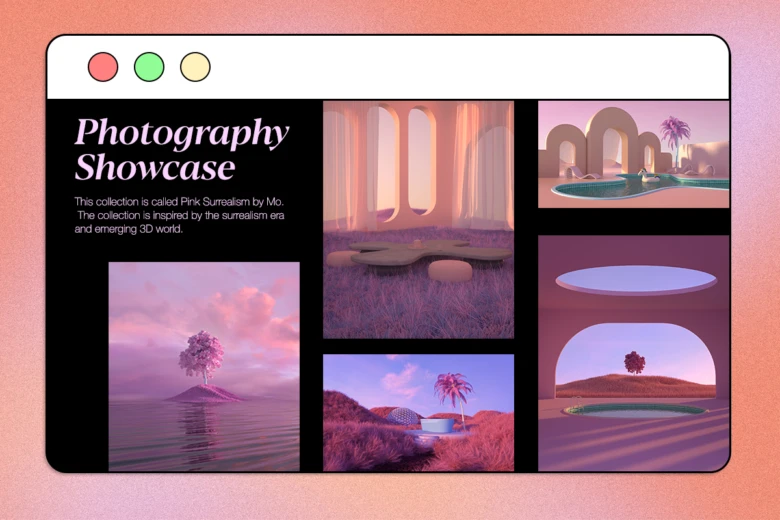
Incorporating photography into slides can be a great way to make your presentation more fun. To ensure that the photos you use in your presentation have a consistent style add a semi-transparent color overlay over them. The overlay color you pick can also determine the mood of the entire presentation.
Visual Hierarchy
Fun slide examples will organize visuals in order of importance. When it comes to text, it’s best when headers use large uppercase fonts while body paragraphs consist of lowercase fonts. Using visual hierarchy to convey information makes it easier for your audience to know what to focus on.
Create at the Speed of Culture
Picsart is a full ecosystem of free-to-use content, powerful tools, and creator inspiration. With a billion downloads and more than 150 million monthly active creators, Picsart is the world’s largest creative platform. Picsart has collaborated with major artists and brands like BLACKPINK, Taylor Swift, the Jonas Brothers, Lizzo, Ariana Grande, Jennifer Lopez, One Direction, Sanrio: Hello Kitty, Warner Bros. Entertainment, iHeartMedia, Condé Nast, and more. Download the app or start editing on web today to enhance your photos and videos with thousands of quick and easy editing tools, trendy filters, fun stickers, and brilliant backgrounds. Unleash your creativity and upgrade to Gold for premium perks!


