It is hip to be a square. With clean lines, sharp angles, and symmetrical curves, geometric shapes are core elements of both intricate patterns and minimalist designs. These shapes are also versatile–easily layered and scalable. Sometimes, it’s the simplest geometric shapes that do the most work.
The next natural question is how and when to use them. Here are a few starting points, from which you can then let your creativity run wild.
How to Use Geometric Patterns in Graphic Design
Keep the below tips in mind when considering what cool patterns to use next. Whether you’re looking for geometric shapes, patterns, or line art, we have you covered with these tips.
-
Keep It Minimal
One of the advantages of using a geometric shape in a sleek design is that most of these shapes are minimalist in and of themselves. In designs like business cards or brand logos, where it’s best to stick to the essentials, minimalism is the name of the game. Choose big geometric shapes with straight lines for the background of your image, and you’ll create contrast and visual interest while not taking attention away from the text or other details.
Part of the beauty of sticking to one or two simple shapes (or a shape on a solid background) is that for just a little bit of design work, you get an impactful result. Minimalism celebrates a less-is-more attitude and a love for aesthetic clarity. So, you can make a statement without saying much at all. You can also turn the volume up or down on that statement by playing with other elements like color. Softer colors are more reserved while bolder tones make a splash.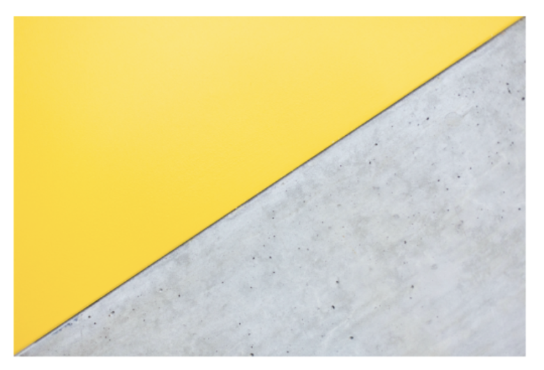
-
Take It to the Max
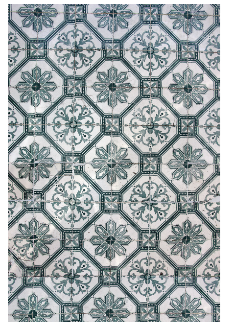
Nothing says opulence like an intricate geometric design with careful lines and a perfectly curated color scheme. From the world’s most stunning tilework and embroidery to contemporary event invites, we can find a maximalist use of geometric shapes and incredible attention to detail. Symmetrical designs (see below for tips on patterns) create the illusion of complexity. I say “illusion” because with drag-n-drop tools like those on Picsart, you can quickly fill a space with digital handiwork.
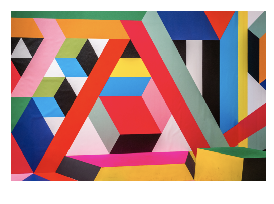
Your other option is to break the mold and experiment with a variety of asymmetrical shapes in the same space. This gives your design edge, not to mention playful dimensions. Before you know it, you’ll be creating images that look like they came straight from a museum of modern art.
Get Into a Pattern
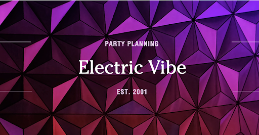
Usually the phrase “get into a pattern” sounds boring but geometric patterns are anything but. Whether simple or complex, patterns always stick to a few key properties: they create order and structure and help our eyes move around a space. Some prime spaces for a good pattern are envelope liners, book covers, posters and, as I mentioned above, invites. These designs can be as involved or simple as you want; the repetition itself will create a detailed look. If you’re thinking about creating your own pattern from a photo, we can show you how to make mirror images right from your phone.
If you use a patterned background, this almost demands simplicity elsewhere–in your lettering choices and so on. It’s a simple question of balance. This makes for stunning designs, as clear and communicative as they are artful.
-
Stay in The Frame
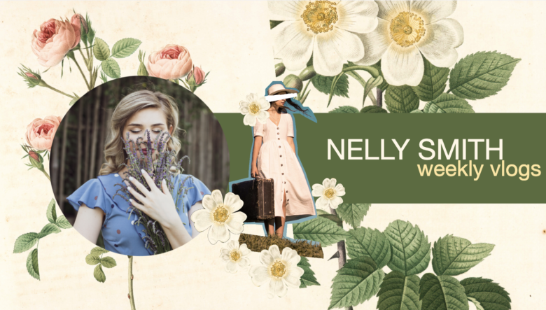
Geometric shapes create natural boundaries. We can easily identify and separate them. This means that geometric figures are perfect for framing photos, text, and more. We can even layer shapes in symmetrical and asymmetrical ways to create frames with more depth and dimension.
In many designs, framing is essential. If your project includes different kinds of elements, you’ll need to set them apart. This said, don’t let your duty to the rules limit you; get poetic about it. Try framing a photo with a shape that’s drastically different from that of the photo itself. Or, create dimension by layering your photo on top of the frame. No, you don’t have to stay within the lines.
Finally, don’t forget to play with color and line. Soften up your frame with pastel tones or hazy outlines. Firm it up with jewel tones, primary colors (blue, red, and yellow), and hard lines. Need to cut your photo out to get it to line up right with your frame? Check out this tutorial on removing backgrounds from images.
-
Back it Up
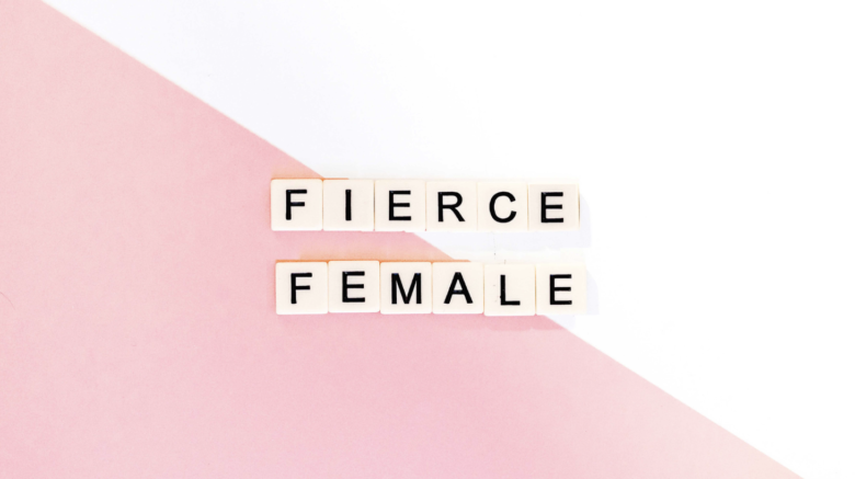
Using geometric shapes is one of the easiest ways to create an impactful background for your text. The canvas itself is a geometric shape. So, when you get designing, think about whether or not to break up that space and by how much. The more intricate the background, the more your text has to compete. That’s not a bad thing, just think about making your text bigger and bolder, or using a contrasting color to help it stand out. Another pro tip is to adjust the transparency settings on the shapes in your background, so that they fade into the canvas a bit, allowing your surface elements to shine.
Whatever you decide, remember that the background of your design can do as little or as much work as you need it to. If it feels right, you can leave it blank and just let the rectangle of the virtual canvas act as a border for your design. But, if you’re thinking about introducing color or pattern into your design, the background is a solid place to start and easy-to-render geometric shapes are your friend. Learn how to make the background of your dreams.
The Basics of Geometric Design in Picsart
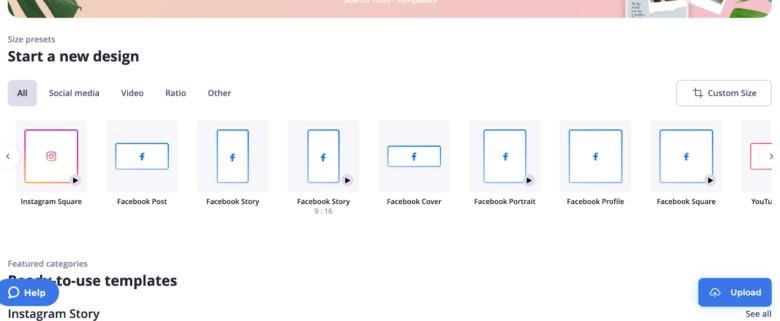
- Open the Picsart web editor and select the canvas size that’s right for your project.
2. First, take a look around the templates and photos offered in the app. One of these might be perfect, say, for a geometric pattern background, and you’ll save yourself some time by not needing to create your own from scratch.
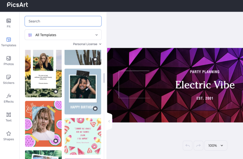
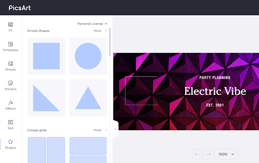
3. If you do decide to add shapes (whether just one or a whole pattern of them), use the drop-n-drag option from the left-hand menu. Choose the shape you want and then play around with the color and opacity settings until you’ve gotten everything just right.
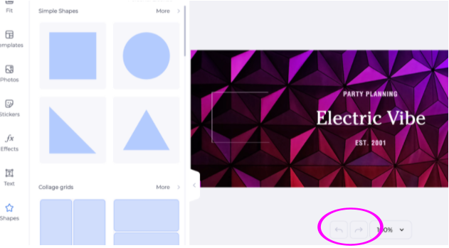
4. Make a mistake? Fear not! Just hit undo whenever you’re not feeling convinced of your last move.
Create at the Speed of Culture
Picsart is a full ecosystem of free-to-use content, powerful tools, and creator inspiration. With a billion downloads and more than 150 million monthly active creators, Picsart isn’t just the world’s largest creative platform; we’re also the fastest growing. Picsart has collaborated with major artists and brands like BLACKPINK, the Jonas Brothers, Lizzo, Sanrio: Hello Kitty, I am a Voter, Bebe Rexha, Maroon 5, One Direction, Warner Bros. Entertainment, iHeartMedia, Condé Nast, and more. Download the app or start editing on web today to enhance your photos and videos with thousands of quick and easy editing tools, trendy filters, fun stickers, and brilliant backgrounds. Unleash your creativity and upgrade to Gold for premium perks!


