Good design is something we can learn. It follows a certain set of principles, ones that don’t limit creativity but guide it. By learning these rules of the trade, you’re sharpening your toolset. What you do with those tools is entirely up to you.
There are 7 key principles of design: balance, emphasis, pattern, movement, proportion, white space, and contrast. As you go through that list, you’ll likely realize some items are intuitive. That’s because our minds are already good at recognizing these principles in well-designed images. As a quick exercise, and as we push these definitions further, think of an image or graphic that you like. Keep this image in mind as we learn more about the 7 principles, and see how they fit into it.
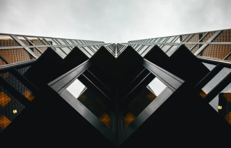
Balance
When we look at a perfectly balanced image, it gives us a sense of calm. It feels good, like everything is right where it should be. Nothing looks like it’s going to tip the visual scales.
It’s likely that we associate balance with being centered, and this definition is spot on for one of the types of balance in design: symmetrical. In this type, you could fold the image in half and each side would contain exactly the same visual information. This is known as mirroring. So many of the world’s most recognizable logos rely on symmetrical balance, from that of Starbucks to Airbnb, and while it’s an excellent, stable option, we have another in our tool kit as well.
Photo by Justin Main on Unsplash
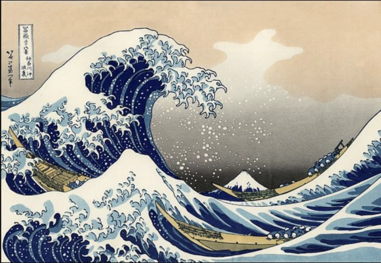
This other option is asymmetrical balance. Balance is all about weight, so it’s helpful to think about a set of scales. If we have graphic elements on each side of the scales, even if these elements are vastly different shapes or sizes, we still achieve overall balance. Consider the famous painting The Great Wave Off Kanagawa. Yes, the cresting wave is clearly more prominent on one side of the painting, but large-scale balance is achieved through the addition of the volcano, the large plume of a cloud, and the smaller waves on the other side of the painting, or (to continue with our metaphor), the other side of the visual scales. Does this kind of composition remind you of something? How about the Nike logo? Strong design principles are everywhere because they make sense and once you understand them, you can’t unsee them.
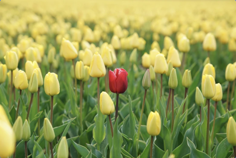
Emphasis
Emphasis is to design as shouting —or, better yet, singing —is to talking. It’s where your eye goes first and, not surprisingly, is often a central or more heavily weighted element. Emphasis is a tool for pulling a viewer’s attention to something important in our design, whether a specific letter or key shape—perhaps a bolded letter or a pop of unexpected color. Emphasis is a visual mode of communication that not only says, “look at me,” but cues you into why you should be looking at that thing.
Photo by Rupert Britton on Unsplash
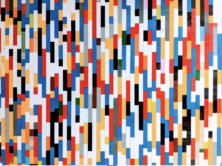
Pattern
We love a pattern. There are stacks upon stacks of psychological and scientific articles on our need as humans to sequence. It’s part of how we understand and parse information, or create order. A very good, albeit meta, example of a pattern is text itself. Letters, not just in a sentence like this one, but in a logo or brand name, are usually the same height, roughly the same width, and bear the same spacing. Shapes also invite patterns.
They create structure but also movement, getting our eye to move around the space and take in everything. Patterned shapes can also create uniformity in a space. For an everyday example look to your bookshelf. Mosaics, pop-art prints, stripes, and those foil embossed fleurs on older books are perfect examples of successful patterns at work.
Photo by Omar Flores on Unsplash
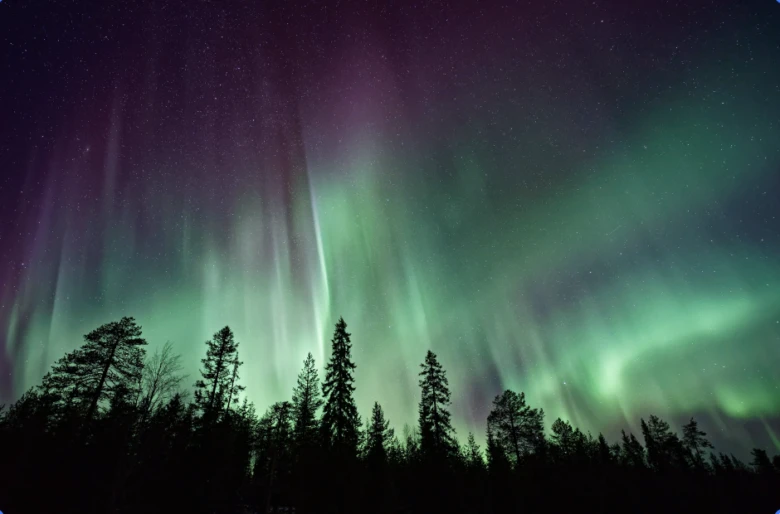
Movement
You’re likely noticing by now that these terms share common ground. We just heard about movement, for example, up in the previous section when talking about pattern. This is no mistake. Good design elements support and inform each other. Movement is about getting the eye to move around the space, and while we already know that a pattern can do this, it is just one of the ways.
Some straightforward examples of graphic elements that create movement are lines, arrows, and text. But, movement doesn’t have to be linear. Want your viewer to wander around an image? Curves, progressions, and color spectrums might be the way. Think of how the eye takes in the wispy lights of the Aurora Borealis or the gradient of a sunset.
Another element that creates movement is one we already have in the bag: balance. If an object in our image leans or suggests physical motion in a certain direction, the viewer’s eye goes along for the ride.
Photo by Vincent Guth on Unsplash
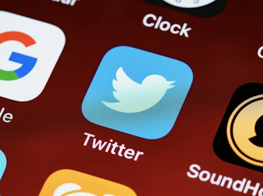
Proportion
Everything in good measure seems like an apt enough motto for proportion. In creating an image that hits all the marks—draws us in, creates a sense of balance, is coherent and expressive, and so on—ensuring that our visual elements are the right size is key. Think of those little application icons on the screen of your phone. You don’t have to squint to distinguish Twitter from Waze, no matter how similar the designs are in color and composition. Why is that? The image at the center of the icon is proportional to the space, making the graphic immediately recognizable, front and center.
We can extrapolate this logic to some of the world’s most famous artwork. The great maestros of sculpture and painting measured proportions as exactly as they could be to get that ratio between, let’s say, a hand and a face just right. And, while designing online with drag-n-drop-n-stretch tools requires no extensive measuring, we can use our good inherent sense of ratio to make sure that no element is too small, getting lost in the mass, or too large, pulling focus from the rest of the image unintentionally.
Photo by Brett Jordan on Unsplash
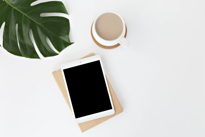
White (or Clear) Space
Design is not a test. It’s ok to leave something blank. Negative space exists in every image, even if in the most subtle shading of an intricate drawing. It’s what gives us a sense of depth and helps our minds understand the dimensionality of objects.
When intentionally carving out a space free of any elements in a design, yes, you might be creating dimension, but it’s possible that you’re just making an image that’s easy on the eyes. Great work. White space is clean, crisp, and contrasting, and it helps create legibility in the case of a design with text. From a practical standpoint it might make your image more easily replicable, allowing it to move easily from white web backgrounds to print materials and so on.
Photo by Leone Venter on Unsplash
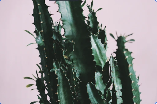
Contrast
You’re probably ready to write this section yourself. There are numerous ways to create this effect in an image, and they are tied to the principles we already know about.
You can create contrast with white space or by placing two different colors side-by-side in a pattern. Use contrasting proportions: distinctly sized elements that offset each other for that perfect balance. Emphasize your text, whether through the use of bold color or letter weight. While strong contrast might be great for getting a message across or designing a logo, more subtle contrast creates a softer, dreamier effect. Let the mood of your piece guide you.
Photo by Anca Gabriela Zosin on Unsplash
Take the image that you thought of at the beginning article. How does it employ the design principles? Does it use them all, even if subtly? Does it leave any out? Why? The same questions you’re asking now are ones you can ask as you get creating. Be fearless; these 7 design principles have got your back. If you want to practice further first, check out this article on 90’s graphic design, and put the images there through the design principles test.
Picsart is a full ecosystem of free-to-use content, powerful tools, and creator inspiration. With a billion downloads and more than 150 million monthly active creators, Picsart isn’t just the world’s largest creative platform; we’re also the fastest growing. Picsart has collaborated with major artists and brands like BLACKPINK, the Jonas Brothers, Lizzo, Sanrio: Hello Kitty, I am a Voter, Bebe Rexha, Maroon 5, One Direction, Warner Bros. Entertainment, iHeartMedia, Condé Nast, and more. Download the app or start editing on web today to enhance your photos and videos with thousands of quick & easy editing tools, trendy filters, fun stickers, and brilliant backgrounds. Unleash your creativity and upgrade to Gold for premium perks!