Logos are incredibly important. Think about it – how many times have you recognized a brand or product out of context purely by its logo? But when was the last time you considered your own brand’s logo design? Whether you’re creating your first logo or going through a rebrand, we’re sharing tips and tricks on how to make a good logo.
Why You Need a Good Logo Design
A good logo helps set your brand apart from another. More than simply giving a viewer an idea of what you have to offer, the right logo gives off a feeling.
What’s more, as your brand’s recognition increases, your logo could become synonymous with a certain product or service itself. Look no further than the Facebook “F” for an example of how a symbol — in this case, a simple letter — has come to signify “social media.”
That’s why it’s important to start with a solid logo that will represent your company well, even far into the future.
Photo by Alexander Shatov on Unsplash
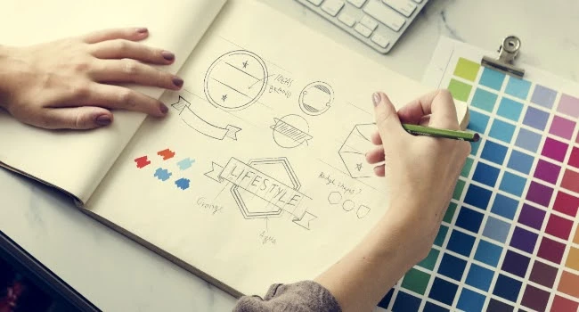
Head to the Drawing Board
Logos are a language, and consumers know how to speak it. This means that a good logo should communicate what your brand does, even if subtly. Think of a logo as a visual elevator pitch. In an instant, a viewer should be able to understand what you do and who you are. So if you run a coffee shop, include a graphic of a steaming latte. If you’re designing a logo for an environmentally friendly company, take cues from the industry and go with a green logo.
Next, think about how your logo can stand out. Take the coffee shop example. Yes, you should use something recognizable in your design like a coffee cup, but don’t use just any coffee cup. Make it yours by including your company name and colors.
Also, think about how to gain the consumer’s trust. Ask yourself what kinds of values are important to you in the companies you support and how this is reflected in their logos.
Is it the solid feel of the lettering? The simplicity of the color scheme? Or perhaps, it’s a shape. The Airbnb logo is a great example. It’s a warm and inviting hue of pink and features a shape that looks like the roof of a house and a heart at the same time.
Finally, when in doubt, refer to the four commandments of logo design. A good logo should check the following four boxes: It should be unique, scalable, simple, and work well in monochrome if you need to print it in black and white. Sticking to these rules will ensure that your logo stands out from the crowd and looks good in a wide variety of formats — large and small, print and digital.
Different Types of Logos
While categorizing logos may sound like a complicating point, having options can actually help you to rule out what you don’t want. Some of the key categories are:
Letter-based logos:
The focal point of this category are the words or initials that make up a brand’s name. Remember the Facebook “F” or the Picsart “P”? These are prime examples of this type of logo design. Take a look at the evolution of the Picsart logo for example. In 2012, our logo had a camera image with a “P” in the center, emphasizing the photo editing software from Picsart. As our product offering expanded and our brand evolved, so did our logo, with streamlined letter-based logo updates in 2018 and most recently in 2021.
Remember that letter-based logo designs aren’t limited to just one letter. You can use your full brand name as the logo design, as in this Ikea example.
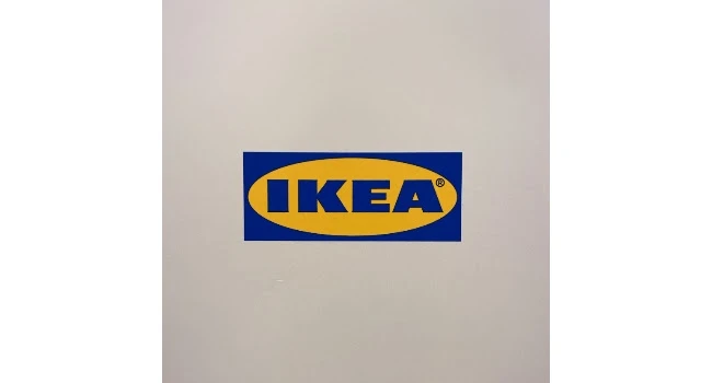
Photo by billow926 on Unsplash
Symbols:
These logos focus on shape. Just think of the Nike Swoosh, which symbolizes speed and movement. Car brands, tech apps, and airlines often use these kinds of logos.

Photo by Doruk Bayram on Unsplash
Character logos:
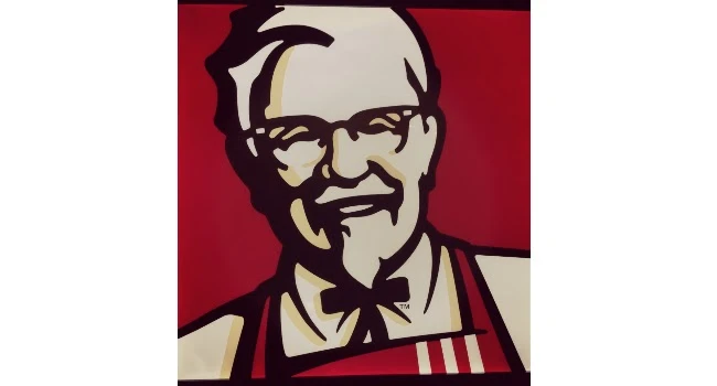
This kind of design has character, literally. This logo features a person who embodies the brand. Food brands, for example, often incorporate the founder’s face in the design. A good example is Newman’s Own or KFC. Putting a face with a name makes a brand personable and human.
Emblem logos:
An emblem is a kind of modern-day coat of arms. These logos are highly detailed and not always the easiest to replicate. That said, their specificity makes them very easy to recognize. Both the UNICEF and Starbucks logos are great examples.
Your Logo Design Toolbox
Color:
A quick internet search on the meaning of colors will result in more than a billion hits on color theory, psychology, and symbolism. Yellow tends to make us feel energized while blue makes us feel calm. Start by thinking about how you want people to feel when they see your logo and do some light research on what colors give off that vibe.
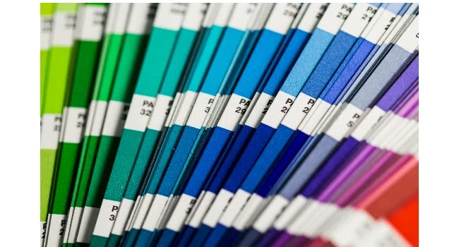
Photo by Christina Rumpf on Unsplash
Font:
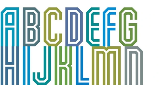
Never underestimate the power of a good font, especially if your logo is going to be mostly comprised of letters. Serif fonts (those with small lines at the edges of the letters) denote history, tradition, or luxury, while sans serif fonts (those without small lines at the letter edge) are modern and chic.
Shapes:
A shape can speak a thousand words, and it might just need to if it’s the central or only element in your logo. Recall the Nike Swoosh or the Airbnb “heart.” These two examples are metaphorical representations of a brand, but you can go literal, too. Just look at Apple: they used a shape that stands in perfectly for the brand’s name.

Photo by Laurenz Heymann on Unsplash
How to Make a Custom Logo Design
One way to figure out what you want in a design is through trial and error. Of course, it’s a good idea to have a plan for your logo, but sometimes playing around with color, shape, and text will lead to that “ah-ha” moment you’ve been waiting for.
1) Head over to our web application, as it’s easier to do more extensive editing there.
2) Choose your canvas. If you aren’t quite sure where your logo will be displayed, choose a shape that is easy to resize for different platforms. A square might be good for an app logo or certain social media platforms, like Instagram, but a rectangle could ultimately work out better as a header for marketing emails or your Facebook page. Later, once you’ve decided on the key elements of your design, you can make versions of your logo in different sizes for different channels.
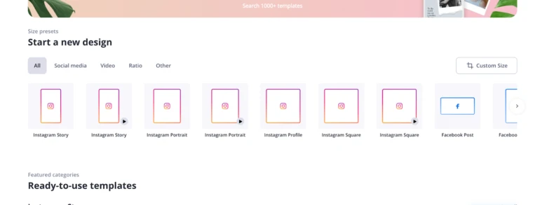
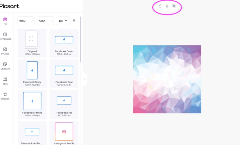
3) Once on the editing screen, decide whether you want to fill your background. You can fill it with a color, gradient, or texture by using the toolbar above the canvas. Just keep in mind that if you fill the space right to the edges, your logo will be the same shape as the canvas itself. If you want another shape for your background, skip down to the next step.
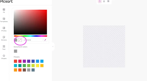
4) If you don’t plan to run your logo to the edges of your canvas, you can make the canvas transparent. Doing so means that any shape you add on top of it will actually define the edge of the canvas when you export. Just be sure to export in PNG, which is the file extension that ensures any transparent elements stay clear after downloading. Turn your background clear by clicking the red slash under the color slider.
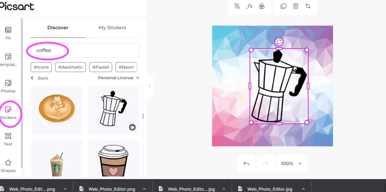
5) Now it’s time to add elements like shapes, text, and stickers. Check out our sticker library before making any shapes of your own because you might find exactly what you need. You can find the “Sticker” option in the left-hand menu and then search our database.
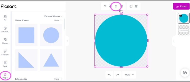
6) If you don’t want to go the sticker route and you want to try making your own shape, select the “Shapes” tool from the left-hand menu and then choose from our ready-made geometric and asymmetrical graphics. You can change the color by clicking on the droplet icon in the menu above your canvas.
7) Now, it’s time for text. Perhaps you plan to add your company name or a slogan or just use one letter to say it all. Whatever you choose, click on the “Text” icon in the left-hand menu and explore our library of fonts. Adding text to your image is as easy as drop and drag.
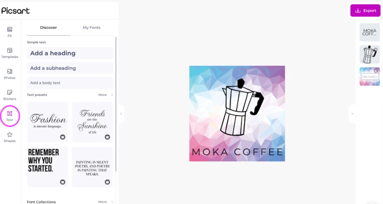
8) Finally, download your finished logo by clicking “Export” in the upper right-hand corner. Remember to make it a PNG if you have a transparent background or elements. Otherwise, you can export to JPG, which is a versatile format that is easy to post wherever.
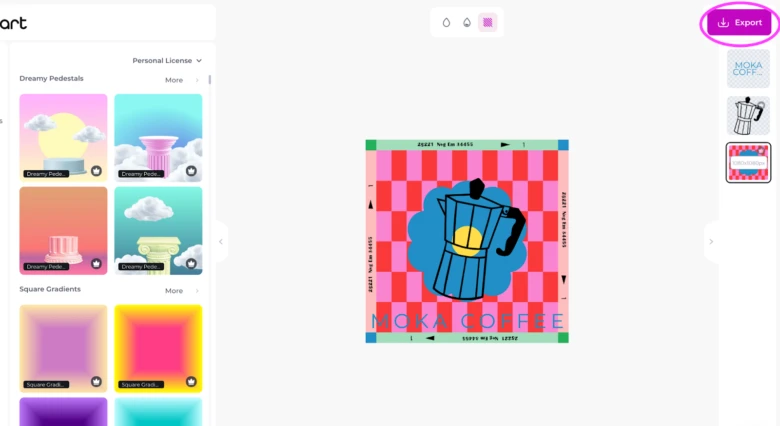
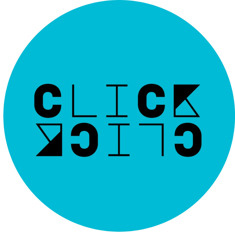
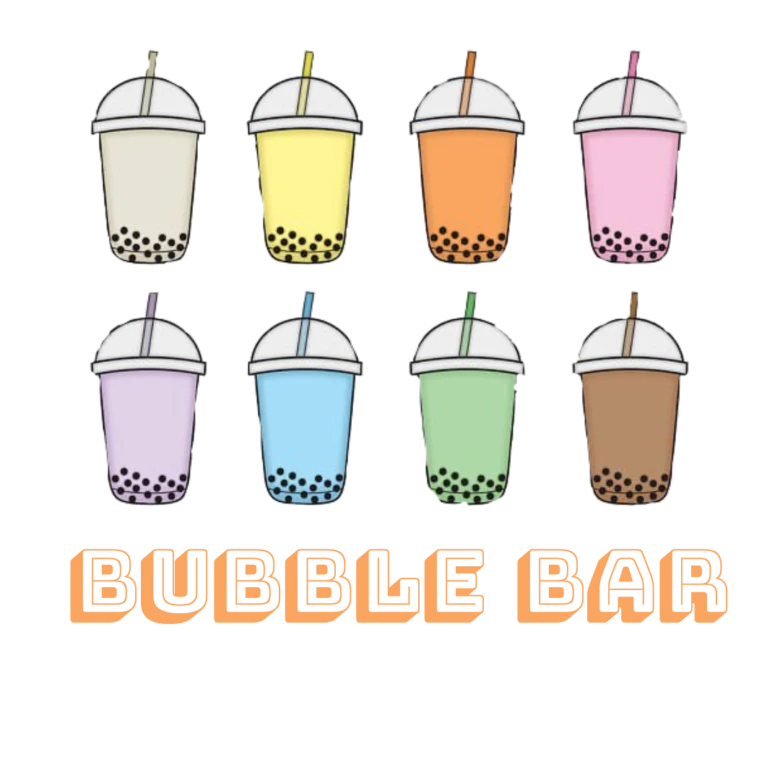
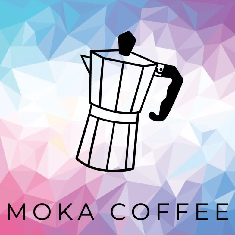
9) Here are three very different designs made using the same steps above. The opportunities are endless, so jump in and get designing.
Create at the Speed of Culture
Picsart is a full ecosystem of free-to-use content, powerful tools, and creator inspiration. With a billion downloads and more than 150 million monthly active creators, Picsart isn’t just the world’s largest creative platform; we’re also the fastest growing. Picsart has collaborated with major artists and brands like BLACKPINK, the Jonas Brothers, Lizzo, Sanrio: Hello Kitty, I am a Voter, Bebe Rexha, Maroon 5, One Direction, Warner Bros. Entertainment, iHeartMedia, Condé Nast, and more. Download the app or start editing on web today to enhance your photos and videos with thousands of quick and easy editing tools, trendy filters, fun stickers, and brilliant backgrounds. Unleash your creativity and upgrade to Gold for premium perks!


