Imagine waking up one day to a world with no color? It’s almost too hard to fathom. Life without color would have little meaning. But what of color meanings themselves? You don’t realize the impact color schemes have on life until you stop to really think about it.
The different colors we see every day give meaning to each object. Besides identifying everyday things, colors can also elicit certain emotions and behaviors. Generally, we associate colors with art. But, in fact, there’s a whole scientific and psychological aspect to color meanings. Let’s dig a little deeper into color symbolism and our relationship with certain hues.
Color meanings and symbolism
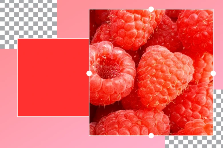
The meaning of colors stem from millions of years of biological conditioning, cultural and societal evolution, as well as individual psychological effects. From a biological perspective, humans have created certain associations between colors and objects or emotions. For example, we associate red with fire and warmth, or blue with water and feeling cold. Another example is how we’re naturally drawn to red and orange fruits over green fruit because biologically, those colors indicate ripeness and sweetness. These associations have been deeply embedded in the human psyche for millions of years.
Color symbolism and associations have also been established by cultural and societal influences. In Western culture, for example, we traditionally associate the color pink with girls and blue with boys. As societies and cultures change over time, so can the meaning and impact of colors. A decade from now, we may no longer associate pink with girls and blue with boys.
Of course, your personal experiences and preferences may override biological and societal factors when it comes to color meanings and associations. In fact, the interpretation of colors can be subjective and vary greatly from person to person. With that said, colors and emotions are closely interconnected. It’s important to understand the psychological effects of colors, especially when faced with a design decision.
The relationship between color meanings and emotion
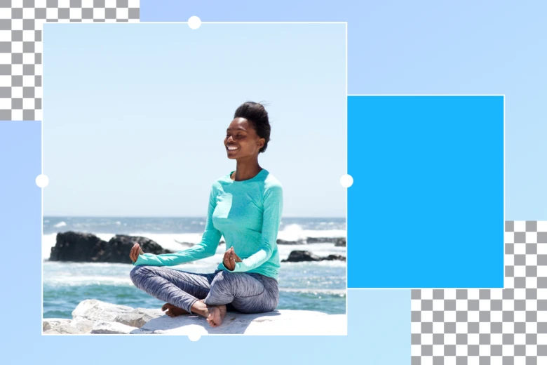
Colors and their meanings can be complex. There is no doubt that certain colors can evoke certain emotions within us. Whether it’s rooted in a biological, evolutionary, or cultural element, there’s a universal understanding of certain colors invoking specific feelings. Let’s take a look at these colors and ask ourselves, what do colors mean and how do they impact us emotionally?
Red
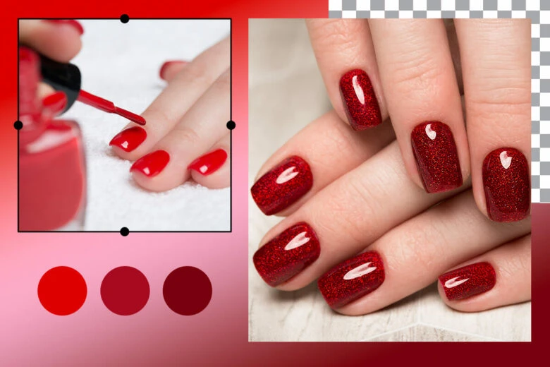
Red exudes intensity, whether it’s love and romance or anger. It’s a bold and energetic color that symbolizes power, strength, and determination. Red also indicates warning or danger, which is why it’s often used in warning labels, stop signs, and stoplights. The color red can even have physical effects on people, such as raising blood pressure, respiration rates and stimulating appetites. This is why red is often used in popular fast-food chain designs. You’ll often see red used to attract consumers to a brand (such as Coca-Cola) and its platform (such as Netflix).
Red symbolizes: warmth, passion, love, romance, anger, danger, heat, blood, fire, power, strength, determination.
How to use it
Red is perfect for food and beverage brands that really want to stand out. It’s also a great call-to-action color for websites and platforms. Red can be a powerful color in a design, but tends to overwhelm if used too much.
Orange

Orange is energetic, youthful, and enthusiastic. It’s commonly used for warning signs in items such as traffic cones and high-visibility clothing. It’s also associated with the fruit, making it feel healthy and fresh. Big brands that use the color orange (Nickelodeon, Gatorade, Fanta) evoke vibrance and activity.
Orange symbolizes the following: energy, youth, enthusiasm, inviting, playful, health, vibrancy, attention.
How to use it
Orange is perfect for creative, fun, youthful brands. It’s an eye-catching color that stimulates action, great for calls to action, or promoting a new product. If you want your next project to give off friendly and inviting vibes, orange is the perfect color.
Yellow
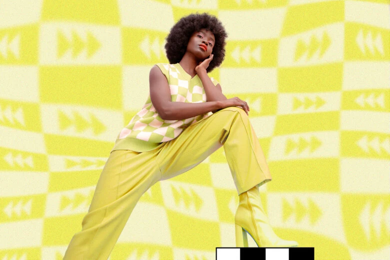
Yellow makes people feel happy and energetic. It’s the color of the sun and thus symbolizes warmth and positivity. Yellow is the most visible color from a distance and has been associated with caution and hazards. It is therefore commonly used for street signs, police caution tape, life vests. It also makes for great logos and signs (think of the McDonald’s arches).
Yellow symbolizes the following: happiness, energy, warmth, joy, hope, sunshine, positivity, caution, hazard.
How to use it
Yellow is perfect for happy and entertaining brands that want to radiate cheerfulness, positivity, and optimism. It’s also used among companies to show a reduced cost for a product, so make sure to use yellow tags in your next product sale.
Green

We’re biologically wired to associate green with nature, especially grass, trees, and plants. The color green gives forth the feeling of being zen and balanced. It also represents growth and renewal, as we see in the spring season. In the U.S., green is associated with wealth and stability as it’s the color of money. You’ll find different shades of green in big brand names such as Whole Foods Market, Starbucks, Heineken, and Spotify.
Green symbolizes the following: nature, zen, balanced, growth, renewal, wealth, stability.
How to use it
Green is perfect for brands that are eco-friendly, organic, sustainable, or representing natural products in general. It can also exude wealth and abundance in your design or company. Be wary of using neon tones of green, as they can feel more artificial versus natural.
Blue
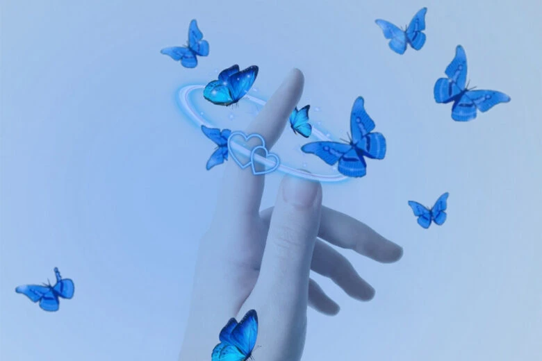
The color blue is associated with the sea and the sky. It gives off a calming effect, makes you feel serene, and instills a sense of trust within. Blue is the most used color in the world, for both personal and professional purposes. Dark blue conveys power, authority, and communication, whereas lighter blues are more relaxing and friendly. Major corporations opt for blue in their logos such as Twitter, Facebook, LinkedIn, and American Express.
Blue symbolizes the following: calm, serene, peace, sky, sea, trust, power, authority, communication, relaxing, friendly.
How to use it
Blue portrays professionalism. It’s a universally liked and used color that’s great for a reliable, trustworthy brand. Blue is perfect for corporations, authoritative and political organizations, and any design project wanting to represent responsibility and dependability.
Purple
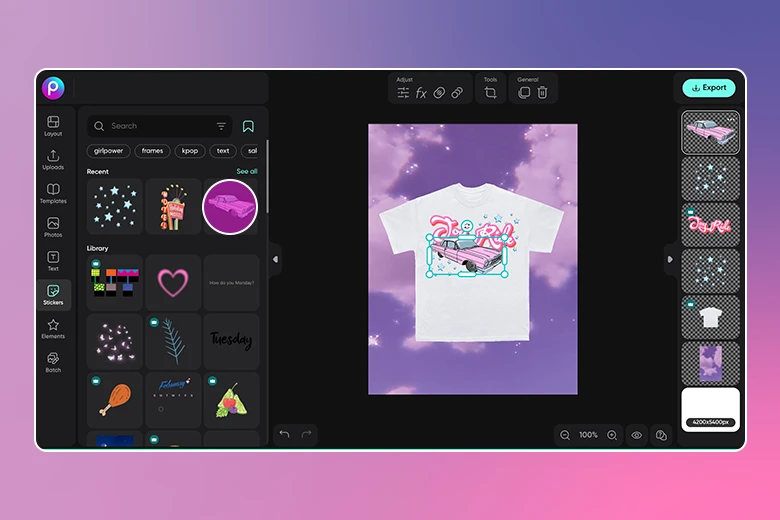
Purple is the color of royalty, luxury, and mystery. It is a combination of both warm and cool colors (red and blue) and is associated with creativity, wealth, and spirituality. Purple has been shown to resonate more with women, which is why you’ll often see it used for a female audience and for female-oriented products (such as beauty products). Some famous brands that use purple are Twitch, Cadbury, Yahoo!, and Hallmark.
Purple symbolizes the following: royalty, luxury, mystery, creativity, wealth, spirituality, honor.
How to use it
Purple is perfect for luxurious, feminine, and unique brands. It adds a royal, soft, mystic touch to your design. Although purple isn’t a common branding color, when used in the right shade, it can make for a perfect logo.
Pink
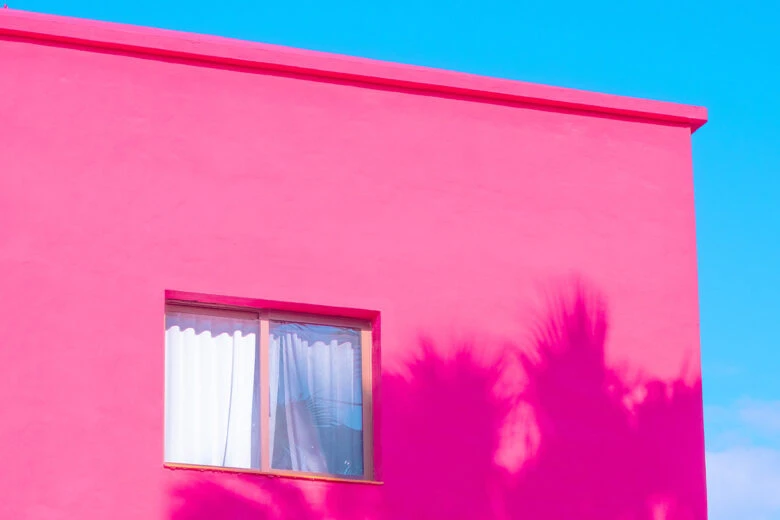
Pink feels playful, feminine, and romantic, especially in western culture. It’s associated with bubble gum, cotton candy, and is intrinsically cute and sweet. When used in lighter pastel shades, it radiates a soft, sentimental feeling. More vibrant pinks, on the other hand, are bold and youthful. Established brands that use variations of pink in their logos include Dunkin Donuts, Lyft, Barbie, T-Mobile, and Baskin Robbins.
Pink symbolizes the following: playful, feminine, romantic, bubble gum, cotton candy, cute, sweet, youthful.
How to use it
Pink is perfect for feminine, playful, and dessert product brands. Pink is not solely a “girly” color, and if used right can be bold, fun, and gender-neutral. It is certainly a memorable color when used in designs.
Brown
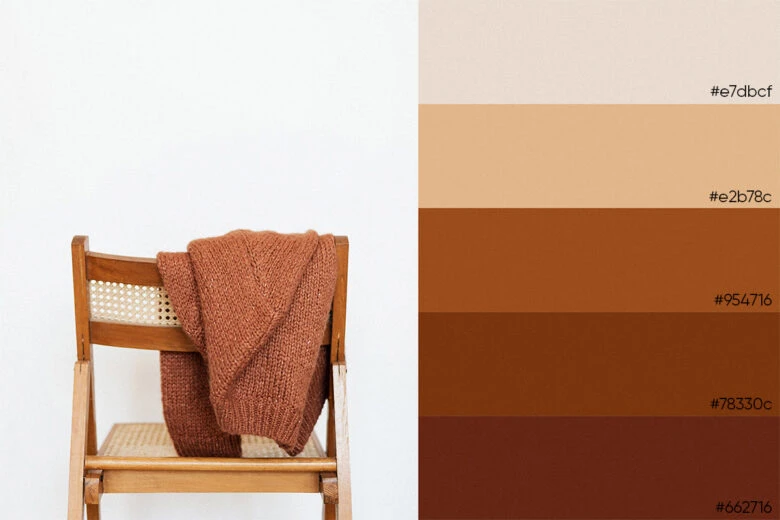
Brown feels wholesome, earthy, and warm. It’s the color of soil, wood, and chocolate, symbolizing durability, strength, reliability, and nature. It reminds us of agriculture and the outdoors, and has been used to represent old-fashioned and well-established vibes in a brand. It’s also famously used in logos like M&Ms, UPS, Dreyer’s, A&W, and Hershey’s.
Brown symbolizes: wholesome, earthy, warm, soil, wood, chocolate, durability, strength, reliability, nature, agriculture
How to use it
Brown is an obvious one for the chocolate industry, but can also be used in whiskey, recreational, natural beauty products, and wood-related brands. Brown looks simple, durable, and well-established.
Black
Black is a powerful color. On one hand, it’s associated with luxury, sophistication, and exclusivity. On the other hand, it denotes death, mourning, and evil. Black is among the most versatile of colors and can be classic, modern, traditional, and unconventional all at the same time. Some iconic brands that use black are Chanel, Dior, Adidas, Sony, and The New York Times.
Black symbolizes: luxury, sophistication, exclusivity, death, mourning, evil, power, sexuality.
How to use it
Black is perfect for luxury, modern, and exclusive brands. It invokes a feeling of power, strength, elegance for classic or contemporary brands. Formal, traditional, and more serious design projects should incorporate black.
Color theory
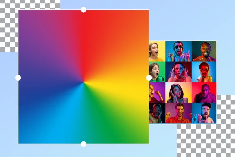
The truth is, colors are much more multidimensional than we think, especially when it comes to how they affect our emotions. Colors have complex nuances that can have different impacts on feelings and behavior. For example, a color’s brightness, shade, tint, tone, and whether it’s cool or warm-toned all can have a different connotation and interpretation. If you take the color red and tweak its brightness, saturation, and tint, it can give off a totally different feeling, even though it’s technically still red.
Warm
Warm colors include red, orange, yellow, and any combination or variation. Red and yellow are both primary colors, and the combination of the two create orange, a secondary color. Warm colors such as these are associated with fire, blood, autumn leaves, sunshine, and sunflowers. Reddish tones reflect a more aggressive, bold, and passionate vibe whereas the orange and yellowish tones reflect a more energetic, happy, and enthusiastic emotion.
Cool
Cool colors include green, blue, and purple. Blue is a primary color, whereas green and purple are secondary colors on the cool spectrum. Green is created by combining blue and yellow, and purple is created by combining blue and red. Cool colors, often associated with nature, are reflective of calming, serene, relaxing feelings.
Neutral
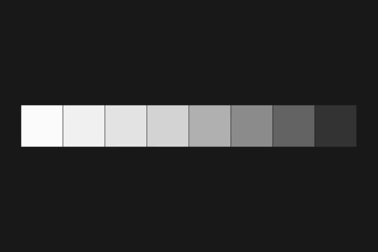
Neutral colors include white, black, brown, and gray. Neutrals are simple and clean when used in a design. They’re not meant to be eye-catching, but rather sophisticated, especially when combined with brighter accent colors. Neutrals are reflective of modern, classic, and pure feelings.
Apply color meanings to your designs with Picsart
Now that you’ve got some context and history behind different color meanings and how they can each exude certain emotions, let’s talk design. To create some colorful designs, follow these easy instructions:
On the web
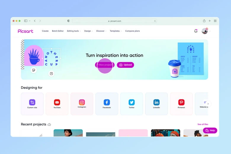
1. Open the Picsart Editor and select a New Project to get started.
2. Select an appropriate layout from the panel on the left.

3. Upload a photo or select any free to edit image to start.

4. Click on any of the filters to preview how they change your image. For a full list of all photo effects, click on Effects on the left-hand bar and select a filter of your choice. You can further edit the filter by clicking Adjust and Blend on top.

5. To add text, click Text on the left-hand side and type in your text. You can adjust the Font, Color, Outline, and Shadow by clicking on each of these tools above your image.
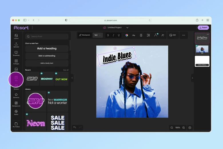
6. Click the Sticker icon and add any desired stickers.
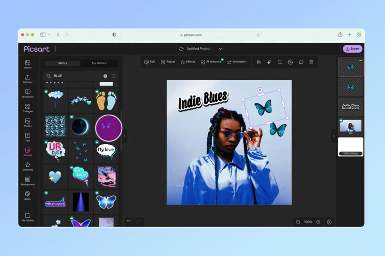
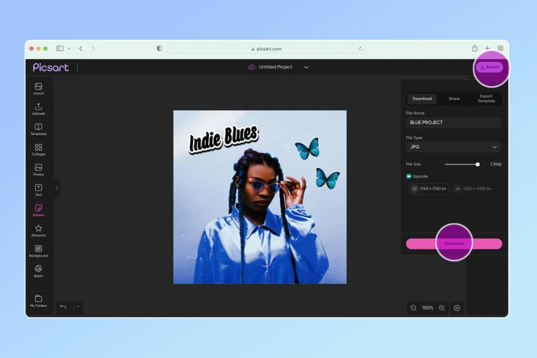
7. All done? Click Export at the top right to Download your work.
On mobile
Creating on the move and fancy flexing your understanding of color meanings? This overview of how to work with colors in Picsart should help.
1. Open the Picsart app and tap on the plus sign at the bottom of your screen.
2. Scroll down to the Drawings category and tap on the Create New option.
3. Tap on Color Picker.
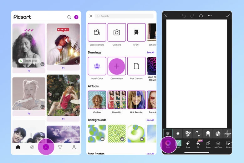
4. Drag the transparent circle around the color wheel to select the color you want, remembering everything you’ve learned about color meanings and color symbolism. You can then adjust the shade of that color by dragging the smaller circle anywhere on the diamond. If you want to adjust the color more specifically, tap on the scale icon on the top left. Here, you can adjust the HSB (hue-saturation-brightness) and RGB (red-green-blue) by scaling left or right for each tab. Once you’ve achieved your desired color, tap on the checkmark on the top right.
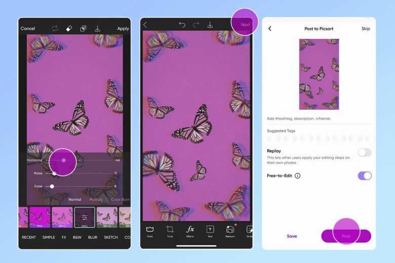
5. Now you have a background to start your design. Use other Picsart tools to add effects, stickers, text, or anything else required.
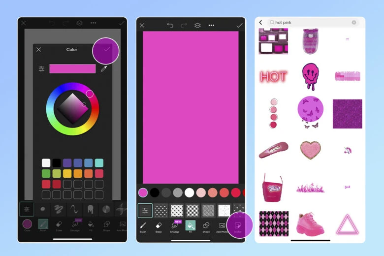
6. Remember to tap Apply on the top right after each edit. Layer on as many edits as you’d like.
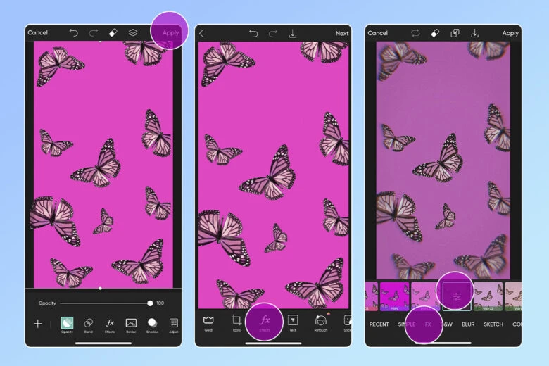
7. When you’re done with your design, tap on Next to Save it to your device or Post it to your profile.
Recommended reading:
Create at the Speed of Culture
Picsart is a photo and video editing platform and creative community. A top 20 most downloaded app worldwide with over 150 million monthly active users, its AI-powered tools enable creators of all levels to design, edit, draw, and share content anywhere. The platform has amassed one of the largest open-source content collections in the world, including photos, stickers, backgrounds, templates, and more. Used by consumers, marketers, content creators and businesses, Picsart tools fulfill both personal and professional design needs. Picsart has collaborated with major artists and brands like BLACKPINK, Taylor Swift, Lizzo, Ariana Grande, Warner Bros. Entertainment, iHeartMedia, Condé Nast, and more. Download the app or start editing on web today, and upgrade to Gold for premium perks!


