Neutrals play an important role in any color scheme. Pleasant and generous, these colors frame the brighter colors, inviting them to hog the limelight. And the cream color can be one of the most versatile neutrals, making it an essential tool in the arsenal of any designer. It is a shade especially fitting for the iridescent season of spring and its holidays, like Easter or Mother’s Day.
What Color Is Cream?
Cream is often described as a light pastel yellow. Named after the famous dairy product, this off-white color does look like it would taste great with a side of pie or in your morning coffee. Cream color code is #FFFDD0. In the RGB space it is made up of 100% red, 99.2% green and 81.6% blue, while in the CMYK system it consists of 0% cyan, 1% magenta, 18% yellow, and 0% black. To make cream paint, mix white and yellow.
Cream Color Meaning Explained
What cream represents depends on the context in which it appears. On its own, it’s a moderate and neat blank canvas. Combined with other neutrals, cream represents seriousness and reliability. In color psychology, it’s said to stand for humility, comfort, and openness.
But drop cream into a color scheme with other more vivid colors and it really shines. It also works well in spring-inspired palettes containing other pastels. Overall, the color symbolizes peace, simplicity, and purity.
How Do You Work With Cream Color?
The versatility of cream makes it really easy to work with, especially if you’re using Picsart, regardless of whether you’re designing on a smartphone or PC.
Let’s see how that works on desktop:
1) Open the Picsart Web Editor and pick a size or ratio to start a new design.
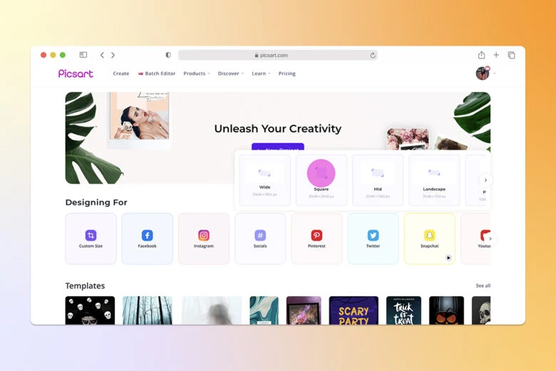
2) Here are some ways you can work cream into your design:
Cream background
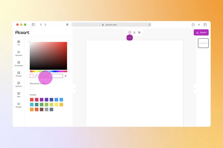
Cream makes for a great background color. Just click on Color (the droplet icon) and type in the cream hex code (#FFFDD0). Now you have a cream background.
Cream font
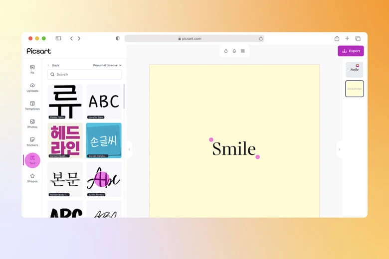
If you want to add text in cream, click on Text in the editing panel and select Add a body text. Type in your text, click on Color and add your hex code. Cream text looks especially good when set against a backdrop of purples and blues. You could even create a cream shadow for your black text.
Cream sticker
Want to add fun graphics in cream color? Just click Stickers and search for ‘pastel yellow’ stickers (pro-tip: searching ‘cream’ will just bring up ice-cream stickers!). Click on the one you like to add it to your design. You can customize the sticker from the menu above.
Cream shapes
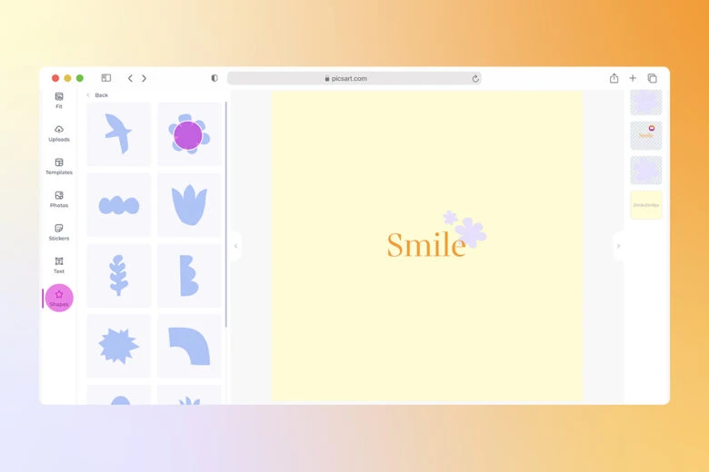
Geometric or decorative shapes serve as bases for a great number of designs. In Picsart, adding cream colored shapes is simple. Just click Shapes from the editing panel, browse through the options, and click on one you want to add to your design. Then click Color and type in the cream color code.
3) When you’re finished with your design, click on Export to Download your work. 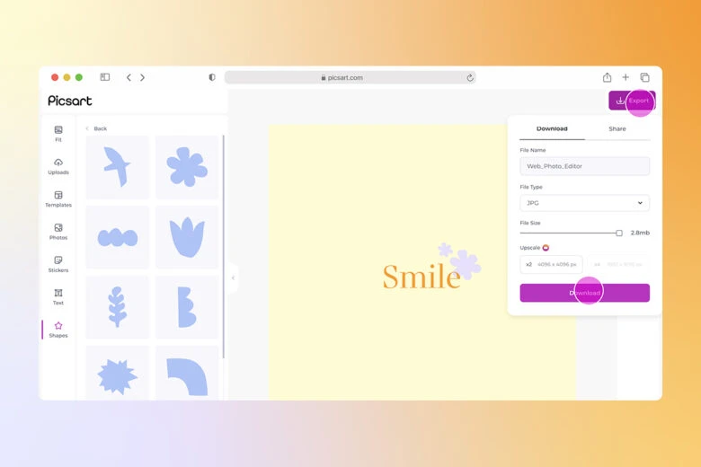
Prefer to edit on a smartphone? Just follow these steps:
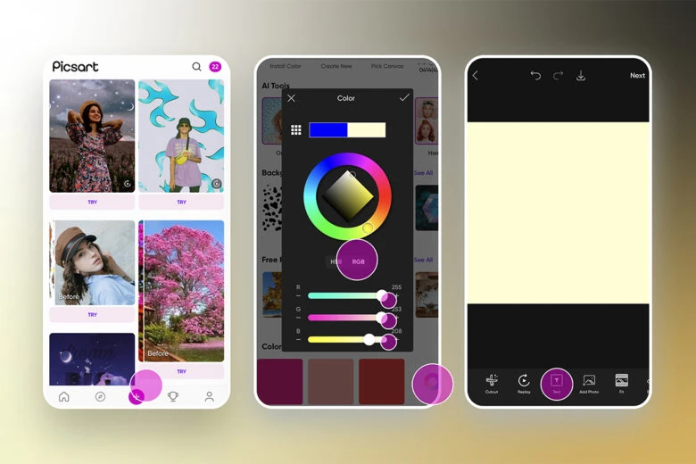
1) Open the Picsart app and tap on the purple plus (+) sign.
2) Pick one of the images in your gallery or tap on Draw & Color and Custom if you want to type in the RGB code and set a cream background.
3) Tap on Text or Sticker from the menu below if you want to add a cream-colored text or sticker.
4) Adjust your Font, Styles, Color, Highlights, and more, resizing and placing the copy wherever you like on the canvas. 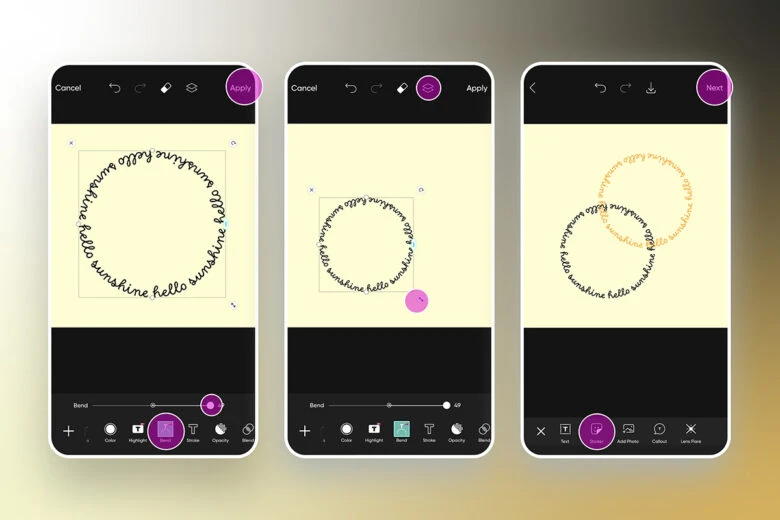
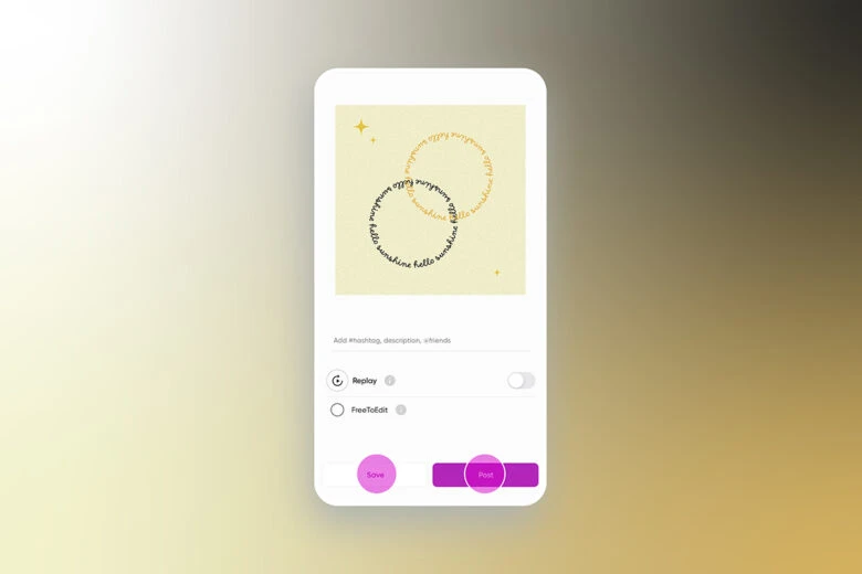
5) Add any Effects or final adjustments your design requires and tap on Next to Save or Post it when you’re done. 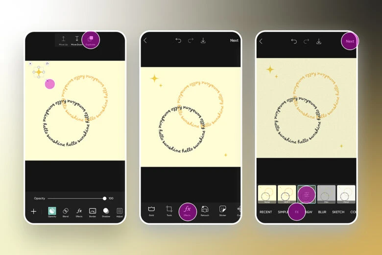
What Colors Go With Cream?
As always, the color theory will tell us everything we need to know about combining cream with the right shades, creating harmonious palettes.
- Complementary Colors
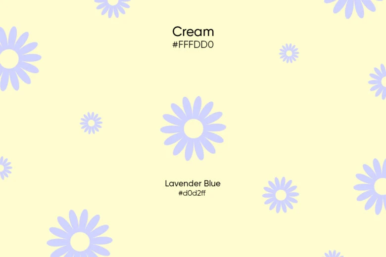
Cream’s complementary color (the color across from it on the color wheel) is light blue, which is approximately Lavender Blue. Lavender Blue has a hex code of #d0d2ff, which is made up of 81.57% red, 82.35% green, and 100% blue in the RGB space. In the CMYK system, it consists of 18.4% cyan, 17.6% magenta, 0% yellow, and 0% black.
- Analogous Colors
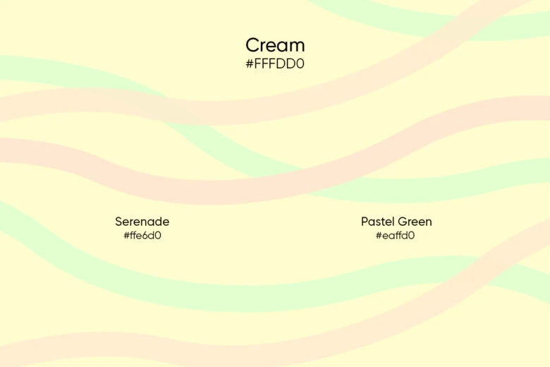
An analogous color scheme is made up of neighboring colors. These palettes are known for setting a balanced and calm mood. Cream’s analogous colors are pastel green (#eaffd0) and light pink, which is approximately Serenade (#ffe6d0). This combination is most closely associated with spring and the idea of renewal.
- Triadic Colors
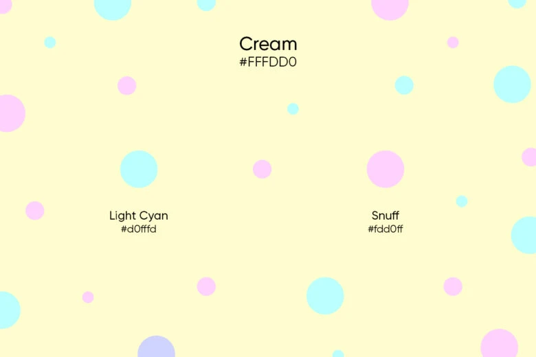
Cream color combined with Light Cyan (#d0fffd) and Snuff (#fdd0ff) forms a triadic color scheme. Triadic harmonies are known for being vibrant and attention-grabbing, although in this case all three colors are muted, which makes for a softer look.
- Monochromatic Colors
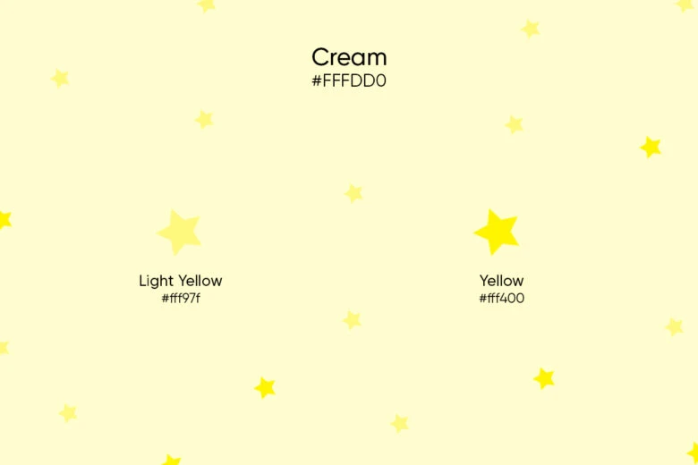
A monochromatic color scheme is an easy-to-work-with combination that’s all about combining different shades of the same hue. Cream color, Light Yellow (#fff97f), and Yellow (#fff400) together is a good example of a monochromatic palette. If you want an even more monochromatic palette, add more shades for extra nuance and detail.
- Split Complements
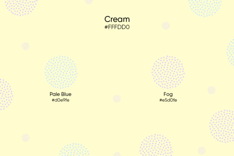
Complementary colors are great, but often the tension of direct opposition doesn’t always suit. That’s where split complements – a color combined with the two neighbors of said color’s complementary color – come in handy. In the case of cream, that means putting it next to Pale Blue (#d0e9fe) and Fog (#e5d0fe). This combination creates a balanced and tranquil color scheme.
Pro tip: If you’re just getting started with color theory, our Color Wheel Quick Tool will help you easily find color pairings.
Are Beige and Cream the Same Color?
Beige and cream are not the same color, but spotting the difference between the two is important. That difference, however, is subtle. Beige has a hex code of #f5f5dc, whereas in the RGB space, that’s made up of 96.1% red, 96.1% green, and 86.3% blue. In the CMYK system, it consists of 0% cyan, 0% magenta, 10.2% yellow, and 3.9% black.
A direct comparison of the components shows that cream consists of a higher percentage of yellow and ends up looking warmer. Where beige goes light grey and brown, cream goes pastel yellow. To differentiate between these two colors, pay close attention to the undertones.
Create at the Speed of Culture
Picsart is a full ecosystem of free-to-use content, powerful tools, and creator inspiration. With a billion downloads and more than 150 million monthly active creators, Picsart is the world’s largest creative platform. Picsart has collaborated with major artists and brands like BLACKPINK, the Jonas Brothers, Lizzo, Sanrio: Hello Kitty, I am a Voter, Bebe Rexha, Maroon 5, One Direction, Warner Bros. Entertainment, iHeartMedia, Condé Nast, and more. Download the app or start editing on web today to enhance your photos and videos with thousands of quick and easy editing tools, trendy filters, fun stickers, and brilliant backgrounds. Unleash your creativity and upgrade to Gold for premium perks!


