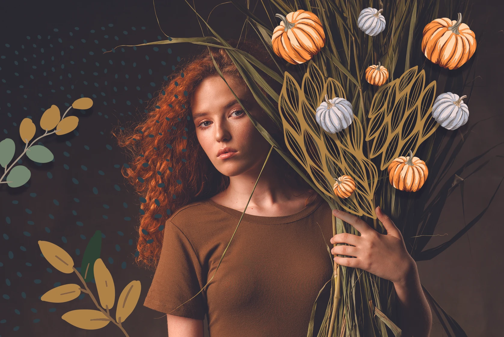
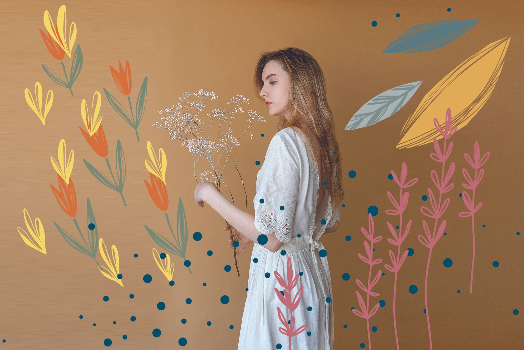
With autumn ushering in shorter days and time spent connecting with nature, summer slowly turns into fall. We begin to snuggle up indoors, exchanging sweltering summer days and ice cold drinks for crisp nights and steaming chai lattes. Wizardry, ceremony, and celebration fill the air of autumn. Creating an autumn-themed color palette is all about capturing the cool but cozy family feel of this glorious season. Fall invites rich, nature-inspired hues on the spectrum of red to purple.
What colors come to mind when you think of fall? Varying shades of brown, mahogany, latte, burnt sienna, magenta, burgundy, plum, and mauve? For some, perhaps a fall color palette implies a burnt orange shade coupled with colors straight from the forest floor. We’re talking browns, reds and deep ochre-yellows reminiscent of the colors of fall foliage. Or maybe it’s a combination of cobalt blue and crimson red, evocative of the darkening blue skies cushioning fall pomegranate orchards. Thankfully, we can derive fall color palette inspiration from it all.
What Is an Autumn-Themed Color Palette?
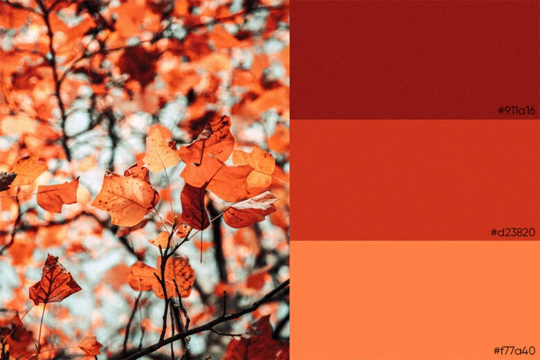
The best themed color palettes not only stir familiar warm feelings associated with the chosen subject, but also bring something bold and original into the mix. If you’re looking to create a fall color palette, you should first take a step back and consider what feelings you want your color theme to evoke. Do you want to call to mind spectacular displays of foliage with the crunch of fallen leaves underfoot? Harvest celebrations filled with apple picking and pumpkin carving? Or the melancholy ache of summer’s end? Or perhaps you favor a warm color palette, to capture that cosy seasonal feeling?
Finding the right themed color palette is all about unearthing the colors, shades, tints, and tones that we connect to, and how they relate to each other to evoke the right mood. Earth inspired nature hues conjure warmth; bright, citrusy colors bring an extra dose of positivity; and green shades of chartreuse, mint, and olive evoke a feeling of harmony and peace with nature.
Whatever your fall color palette preference is, you can create it by picking and choosing color combinations using the Picsart color wheel, or by inputting the color codes to get the exact color you need. With fall color palette ideas ranging from monochromatic and complementary to custom palettes, your designs will surely embrace fall in a tasteful manner and appeal to social media followers and brand fans alike.
Types of Fall Color Combinations
Your fall color palette can breathe new life into a design, and autumn is a fine time to experiment by mixing in rich hues found in nature. Before we dive further into fall color schemes, let’s do a quick refresher on color theory, so that you can choose colors effectively and efficiently. We have summed up some of the most important color theory terms below, to help you create your dream fall color palette in no time.
While there are a variety of color models, they all involve the three essential parameters in terms of color’s purely visual phenomena: hue, value, and chroma.
Hue is a basic term in color theory to denote a pure color. It is the common distinction between colors around the Color Wheel. Value refers to how light or dark a color is. Lighter colors have higher values. For example, dark blue hue has a low value and white the highest. When selecting colors for your fall color palette, favor high contrast values which result in more aesthetically pleasing designs. Chroma refers to the purity of a color. A hue with high chroma has no black, white, or gray added to it. Chroma can be thought of as the brightness of a color in comparison to white. In your design, opt for hues with chromas that are either exactly the same or at least a few steps away from each other, rather than using hues that have a similar chroma.
While HVC (Hue, Value, Chroma) is considered to be true to the visual experience of color and the process of developing color harmonies, HSV (Hue, Saturation, Chroma) is useful for digitally specifying color. In this case, saturation refers to how a hue appears under particular lighting conditions or to how weak or strong a color is. Something with high saturation is considered strong. In design, colors with similar saturation levels make for more cohesive-looking designs. Deeper design skills also include differentiating between shades, tones, and tints of colors by adding grey, black or white to the color.
This brief primer on color terminology should help give you a great starting point to professionally select colors for your fall color palette. Now that you know how colors pair together, it’s time to consider color schemes and find your perfect color inspiration.
Types of Color Schemes
Monochromatic color schemes are comprised of different tones, shades, and tints within a specific hue. They work together, rather than contrast, effectively vivifying the palette. As a true color aficionado, you can create amazing monochromatic color palettes committing to a single color. Just look at what we’ve done with the color slate for example.
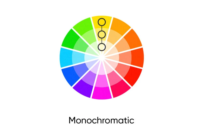
Thinking of creating a single-hued fall color palette with orange as the predominant color? This monochromatic color scheme could include: Persimmon (#F05F00), Heat Wave (#FF7900), Dark Orange (#FE8C00), Beer (#FC9A1D), and Tangelo (#F64F00). It’s a beautiful combination reminiscent of an autumn landscape. Looking for a palette of cooler browns and tans to perfectly capture fall’s crisp but cozy feel? Then consider a brown-tan monochromatic color scheme with these six colors: Sandy Tan (#FDD9B5), Macaroni And Cheese (#FABE86), Cadmium Orange (#ED8E30), Mustard Brown (#D77200), Windsor Tan (#B65900), and Traditional Brown Traditional (#924400).
Analogous color schemes are the next easiest to create. Analogous schemes are created by using three colors that are next to each other on the 12-spoke color wheel. Traditionally, analogous color schemes all have the same chroma level, but by using tones, shades, and tints, we can make these schemes original and adapt them to our needs to create amazing fall color palettes.
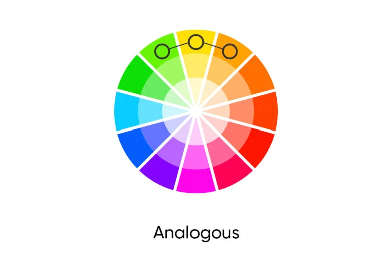
Analogous does not have to mean bright. The color scheme can actually be quite subdued. For an analogous fall color palette, we’d consider Burnt Red (#9f2305), Gamboge Orange (#9f7005), and Olive Yellow (#819f05).
Complementary schemes are created by combining colors from opposite sides of the color wheel. Bold and brilliant, this palette energizes and enlivens a warm autumnal landscape by splashing a dazzling color across it. In their most basic forms, these schemes consist of only two colors, but you can expand them using an exuberant range of tones, tints, and shades to create split complementary schemes.

Split complementary schemes add more complexity than regular complementary schemes by using colors on either side of the hue opposite your base hue. Avoid using colors that are exact opposites with the same chroma and/or value right next to each other either by leaving negative space or by adding another, transitional color between them.
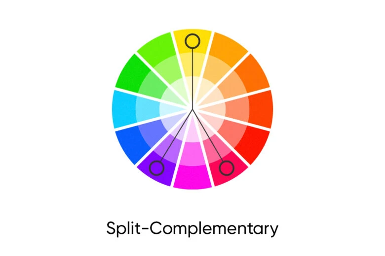
Paying homage to the autumnal landscape cushioned with the deep blue of the sky, we can select two complementary colors: Deep Cobalt Blue (#0047ab) and a medium-dark shade of orange called Rust (#ab4400). Contrast these colors with a range of tints and shades, adding some neutrals. Another complementary fall color scheme can be including a medium-dark shade of orange (#ab4400), Pastel Orange (#ffb854), Cobalt Blue (#0047ab), and a light shade of blue (#bfc1e9). To turn it into a split complementary scheme, make sure to have a difference in chroma and value between the selected colors.
Triadic color schemes are made up of hues equally spaced around the 12-spoke color wheel. Find any 3 colors associated with fall on the color wheel that are equally spaced apart and voilà, you’ve just created your first triadic fall color palette.
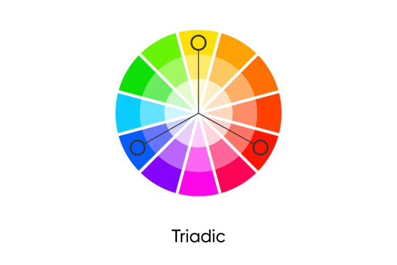
Select your dominant bright hue and pair it with muted hues to make it really stand out. Or, select a very pale or dark version of one color in the triad, along with two shades, tones, or tints of the other two colors to make the single color work as a neutral. Your triadic color scheme, for example, could include Sapphire as the main color (#0f52ba), with Cranberry (#c27277) and Canary yellow (#efde75) acting as accents. Sapphire makes it a bolder take on typical fall colors of yellow leaves and seasonal berries. This is sure to catch your viewers’ attention, while still feeling fitting for the season.
Tetradic color schemes are the most difficult schemes to balance in a harmonious way. They are based on two adjacent colors and their complements. The best way to proceed in making a tetradic color scheme is to let one color prevail and use the other three as accents.
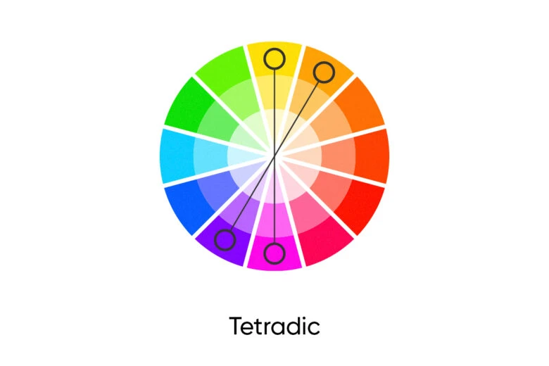
A fall color palette based on the tetradic scheme would be a combination of purple (#800080) as the outstanding hue used in the largest amount, with violet red (#f75394), yellow (#ffff00) and yellow green (#9acd32) serving as accents. This is a lively, sophisticated palette that speaks to the richness of the season.
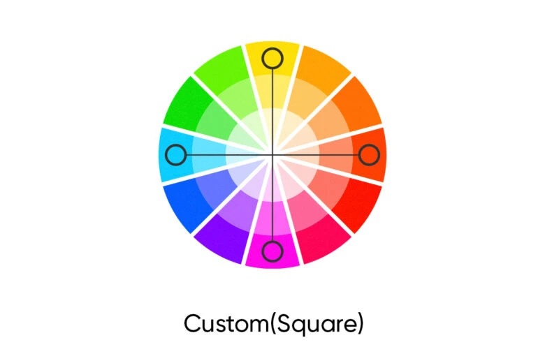
Custom color schemes are ones that don’t follow any of the predefined traditional schemes described above. Go wild and create your own fall color schemes with a beautiful array of fall colors by fusing together a panoply of tones, shades, and tints. Expand the basic 12-spoke color wheel into an infinite number of colors by choosing a few tones, tints, and shades of a given color and adding in another pure hue that’s at least three spaces away on the color wheel as an accent color. Five is a workable number in design, so you may want to start with a palette of five colors and then add or subtract various hues as you like. Maybe start with… teal, for example, and take it wherever you want. The world is your rainbow. You don’t have to have an encyclopedic knowledge of Pantone combinations to make an effective custom color scheme. Just trial and error things until you find what works for you.
What Are the Colors for Fall?
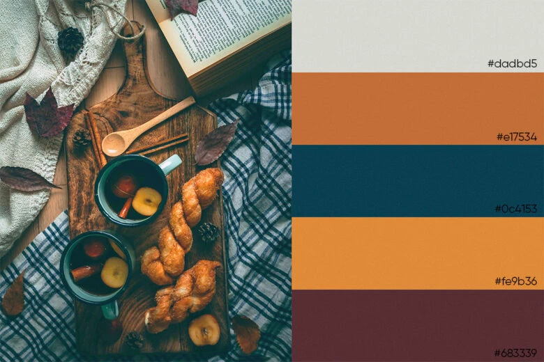
Traditional fall palettes include colors of autumn landscapes with various earthy shades of burnt orange (spiced gingerbread, pumpkin orange), brown (almond, rich chestnut, cinnamon, terra cota), yellow (ochre yellow, soft pastel yellow, mustard), red (maple leaf red, pomegranate, cranberry), and purple (rich eggplant, magenta). As you can see, these color combos conjure up images of items typical of the season. You are also welcome to think outside of the pumpkin to create an original fall color palette for pictures, keeping in mind the designer tips above. Simply add a dash of blush pink, cobalt blue, or a Prism Mask to the standard fall color palette and magical things are likely to happen. Your final edits will surely conjure up some crisp fall feels.
Fall Color Palette Ideas
Looking for more bold and creative fall color palette ideas to inspire your designs? Go for a trendy Cinderella fairytale take on a fall edit with a porcelain doll pink inspired pumpkin. Blend in rich nuances of peach, cream, and light green patches for that fairytale feel. Pair saffron yellow with dark purple and mint green. Create a shimmering palette of purple, gold, and opalescent moon shades. Combine classic fall colors with a few subtle, pale pastels, such as soft peaches, powder blue, soothing vanilla, pastel beige, and pink to balance out the mood.
Feeling a little more regal or traditional? Combine accents of red and amber with a bright yellow, orange, and plum fall color palette for a sophisticated palette. Blend rich hunter green, raw wood brown, bold blue, and hints of magenta for a rustic country feel.
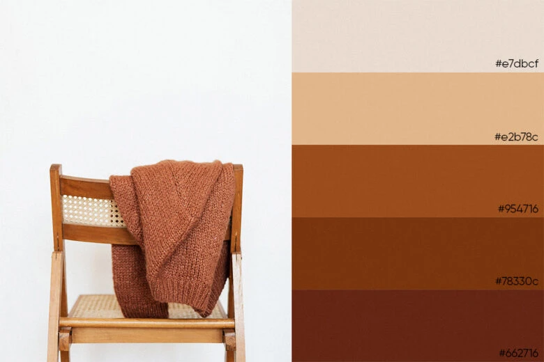
Play around with neutral shades or those found in nature. To create a neutral fall color palette, combine grays, whites, tans, beiges, ivories, creams, or off-whites with darker neutrals such as shades of black, charcoal, midnight blue or olive. Dark olives and sage colors have borrowed their hues from forest foliage and can also act as neutrals because they are relaxing to the eye. Browns, tans, and off-whites tend to make your fall color palettes feel warmer since they are tones, shades, and tints of orange and yellow. Gray, black, and white will take on a warm or cool impression depending on their surrounding colors. Looking to try a new neutral? Incorporate Greige in your palette. It’s a tan hue that’s not quite gray and not quite beige but is the perfect calming neutral taking the design world by storm.
Looking for a fall color palette to inspire your creativity? Designers recommend using bright, uplifting (but not quite neon) shades of lemon yellow as a cheery pop of color for an extra dose of positivity. Pink is another color staging a triumphant comeback in a pastel hue this season, with sorbet pink hitting the common fall color palette. Consider also taking fall color palette inspiration from green shades of chartreuse, mint, and olive; earth-inspired brown hues like camel; teal with green-meets-blue quality; and sleek and chic slate gray hues. You’ll likely notice them all pop out on your Instagram feed. Look out for color trends and consider how you might be able to bring them into play in your work.
How to Create Your Own Fall Color Palette?
A great place to create your fall color palette is the free, all-in-one photo and video editing software, Picsart. Once you download the Picsart app or start designing on the web interface, you can select colors from the Color Wheel and find their hex color codes on sites like Encyclopedia. There’s no shortage of possibilities when creating your ultimate fall color palette with Picsart.
Create at the Speed of Culture
Picsart is a full ecosystem of free-to-use content, powerful tools, and creator inspiration. With a billion downloads and more than 150 million monthly active creators, Picsart isn’t just the world’s largest creative platform; we’re also the fastest growing. Picsart has collaborated with major artists and brands like BLACKPINK, the Jonas Brothers, Lizzo, Sanrio: Hello Kitty, I am a Voter, Bebe Rexha, Maroon 5, One Direction, Warner Bros. Entertainment, iHeartMedia, Condé Nast, and more. Download the app or start editing on web today to enhance your photos and videos with thousands of quick and easy editing tools, trendy filters, fun stickers, and brilliant backgrounds. Unleash your creativity and upgrade to Gold for premium perks!

