Language is beautiful because of what it expresses. Just think of love letters, poetry, and descriptions of springtime landscapes. But language can also quite literally be beautiful depending on the lettering styles you use. Mastering hand lettering, the creative art of hand-drawing letters, will allow you to experiment with different lettering styles and add a human touch to your designs.
The best thing about hand lettering is that it’s fun every step of the way. You’re free to doodle, experiment with lettering styles and ideas, get inspired by cursive calligraphy fonts, and learn more about kerning. Finally, as you get better at drawing letters, you can start hand lettering online and come up with more nuanced ways to play with space and letter meanings.
This article is your comprehensive guide to getting started with hand lettering. We’ll discuss essential tools, introduce you to key lettering styles, ideas for designs, and give you pro tips on starting hand lettering online. Remember: if in doubt, the Picsart font generator is your friend.
What’s the Difference Between Hand Lettering and Calligraphy?
Before we jump into lettering design, it’s important to distinguish between hand lettering and calligraphy. While both are ultimately about creating beautiful letters, calligraphy concerns writing letters and often requires specific tools; however, hand lettering is about drawing them with plenty of going back and forth to adjust or add embellishments. They’re both forms of art, but one focuses on writing whereas the other is about drawing.
What are Lettering Styles?
There are three key lettering styles: Serif, Sans Serif, and Script. These categories of fonts are defined by general qualities. We’ll go over each of the lettering styles to make it more clear:
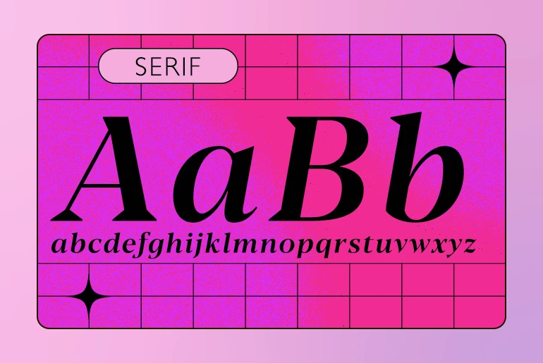
Serif
Open any older book or magazine and it’ll most likely use a Serif font. This category is defined by the short lines at the ends of letter strokes (serifs) that add legibility. Serif lettering design gives off an official, classic vibe, but you can easily make it more fun if you play around with the serifs, exaggerating them or embellishing them. Some examples in this category are Line Serif, where bold and heavy letters end with contrasting thin lines for serifs, and Slab Serif, where the serifs are just as solid-looking as the letters.
Serif lettering is also defined by strokes of different thickness. The rule of thumb when drawing a Serif font is to make the up strokes thin and down strokes thick.
If you want to draw a Serif font, make sure you know where the serifs of each letter are. If you’re a beginner, be sure to have an alphabet in front of you.
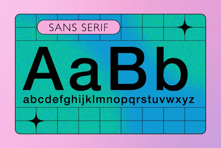
Sans Serif
As the name suggests, Sans Serif fonts are fonts without serifs. Known for being relatively easy to draw, Sans Serif fonts are a great place to start your typography journey. If you’re into minimalist design, then sans serif fonts might be right for you. They’re famous for their simple, modern look and are frequently used on digital platforms.
When drawing Sans Serif fonts, you need to pay extra attention to letterforms and keep the alphabet consistent throughout. We recommend dividing each word into its individual letters and practicing drawing each letter freehand before putting them together to form actual words.
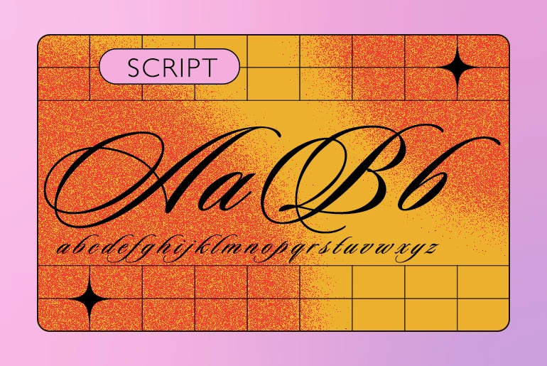
Script or Cursive
The third and final common type of lettering style, script or cursive, is when the letters connect and seem to flow together as they do when you handwrite them. This loose font category looks like a product of calligraphy but as we mentioned earlier, there’s a difference in methods and tools. Script fonts can look classic or modern, the choice is yours. In general, the formal-looking options are perfect for everything from poetry and invitations, to congratulatory cards and tattoos. The more casual script styles are often used in street art or vintage themes.
Note that the most exciting aspects of hand lettering begin where these three types of lettering styles end. They may be great starting points, but there’s a whole new world of symmetries and asymmetries, letter weight distribution, texture, rhythm, and variety out there.
Qualities of Good Hand Lettering
Now that you have a grasp of lettering styles, it’s time to consider what makes for good lettering. Consider these qualities when starting your next hand lettering project:
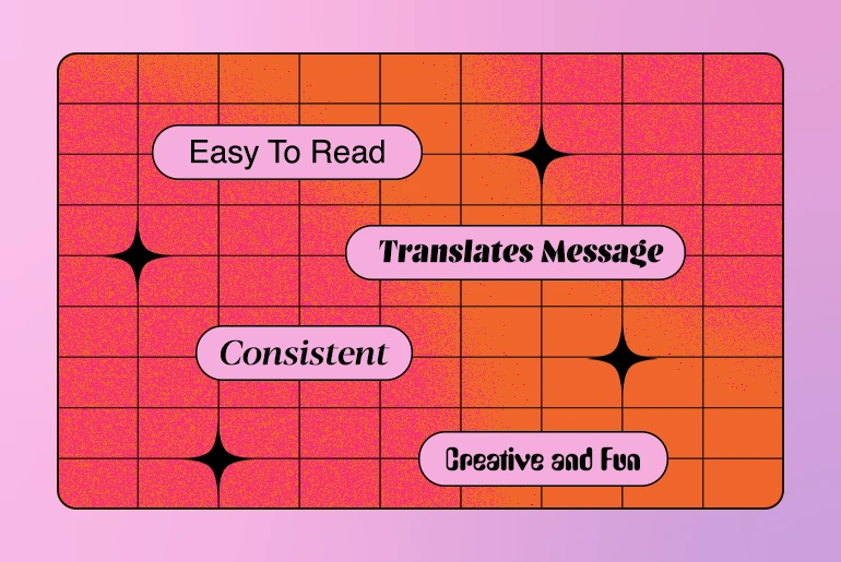
Good lettering is easy to read.
If the reader has to squint and slow down to read what you’ve written, you’ve likely lost them. Moreover, if it’s so hard to read that someone misreads it, then no matter how stunning the artform, your message will be lost. Test out your skills by showing your hand-lettered phrase to a couple of friends or colleagues first and see if they’re able to read it easily.
It translates the meaning of its message well.
Why shouldn’t the word “cake” seem to be made of frosting? And isn’t the word “cordially” just begging for a formal script? The best lettering rises to the occasion and maybe even adds a new dimension to the meaning of the message. After all, if there’s a drop of blood dripping from the font in a Halloween invitation, it’s bound to make all vampire fans excited to get dressed up.
Good lettering is consistent.
This is more about technique than anything else, and in typography, just like in most cases, practice makes perfect. Sure, there are lots of easy fonts to draw. Just aim for consistency throughout in spacing, serifs, accents, letter weight, connection between the letters, and details of the embellishments.
It’s creative and fun.
Most importantly, good lettering is drawn with curiosity, joy, and creativity. It’s important for the author of the font to feel like they have found the exact style that perfectly fits a phrase or idea. And the reader will appreciate it too.
What is Kerning?
Use of space is a major part of hand lettering. That’s why you need to know how to kern letters.
You’re probably thinking, “Okay, but what is kerning?” Kerning is adjusting spacing between the font’s letters depending on their form. If you’re careful, you’ll notice that letters are typically unequally spaced, and that’s what makes the words easy to read. Check out this example of kearning in practice:

Notice how it looks different from this unkerned version?

No doubt, an unkerned version seems a bit unnatural. Even though the space between the letters is actually equal in the unkerned version, we perceive the kerned version as the correct and readable one. One immediately wants to push the “r” toward the “e” and otherwise adjust the spacing to make the letters appear evenly spaced.
Kerning may seem difficult at first, but you’ll get a hang of it with practice. It’s a skill any hand lettering aficionado should master when picking up a brush pen. You can try playing a kerning game online and find out just how good you are at it intuitively.
There are also some basic rules to follow. In general, most letters can be divided into two categories:
- Straight letters, such as I, L, N, K, H, E
- Curved letters, such as O, C, G, S, Q, D
The distance between two straight letters should be the most and the distance between two curved letters should be the least. Another method is to turn the letters upside down before you start kerning. That way you’ll start perceiving those letters as just shapes and will kern them with more precision.
You’ll notice that Sans Serif fonts and Serif fonts need to be kerned differently, as the serifs don’t allow the letters to get as close to each other as in the sans serif fonts.
Why is Kerning Important?
Why are designers so focused on kerning? The number one reason why kerning is so essential is readability. Left unkerned, text has the potential to carry a different meaning. Just think about sometimes you’ve seen a single word split across two lines. Even if it doesn’t change the message, it’s still distracting for the reader to try to piece letters together into words. Our eye has gotten so used to perfectly arranged spacing that we immediately notice when something’s not quite right.
Because most standard fonts have been kerned, this practice is mainly important to consider when hand lettering, as you’re not working off of an already spaced font face.
How to Start Hand Lettering Online
Getting started with hand lettering is not that hard. You’ve likely been doodling or writing most of your life. This is just taking it up a notch. So, here’s how to start:
- Prepare your tools.
A simple sketchbook, pencil, eraser, ruler, and some paper practice sheets are all you need. As you start venturing into more advanced lettering styles, you might expand your toolset to include a compass, and fine-tip and brush pens.
- Understand guidelines.
Guidelines are those lines that make sure your letters are even and consistent throughout. There’s the ascender line at the top and the descender line at the bottom. The X-height is the height of lowercase letters and cap height is the height of capital letters. The baseline is the line upon which all letters rest.
- Choose a lettering style.
As we mentioned above, Sans Serif is the cleanest and easiest to get started with. Make sure your letterforms express how you feel about the words you’re writing. Let your imagination run wild.
- Add shadows, dimensions, details, and embellishments.
You don’t have to add all of them, though. Testing these lettering additions out one at a time on a single word in a journal, then see what style speaks best to the tone of your piece.
- Scan and digitalize your new font.
Now you can add your hand lettering to any digital design.
Apply Kerning Principles to Your Picsart Designs
Did you know that you can add custom fonts and even apply kerning principles to designs in Picsart? Here’s how you can add your font and apply kerning principles to it:
If editing on Web:
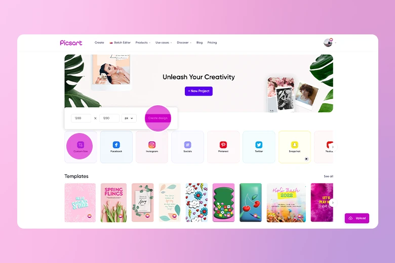
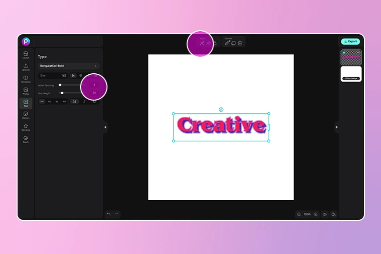
1) Open the Picsart Web Editor and start a New Project. You can select your canvas size at the start or change it later.
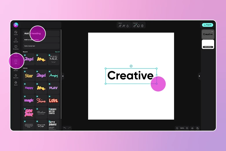
2) Click on the Text icon in the left toolbar, select a heading size, and type in your text. You can adjust the font size later.
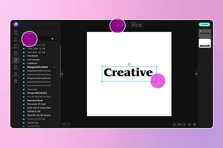
3) Now that your text is written, it’s time to change the font to a hand lettering inspired style. Click on Fonts in the upper toolbar and search for the right font for you. Searching for terms like calligraphy and lettering might help you find the right font for your project.
Pro tip: You can always drag and adjust to resize your font when done.
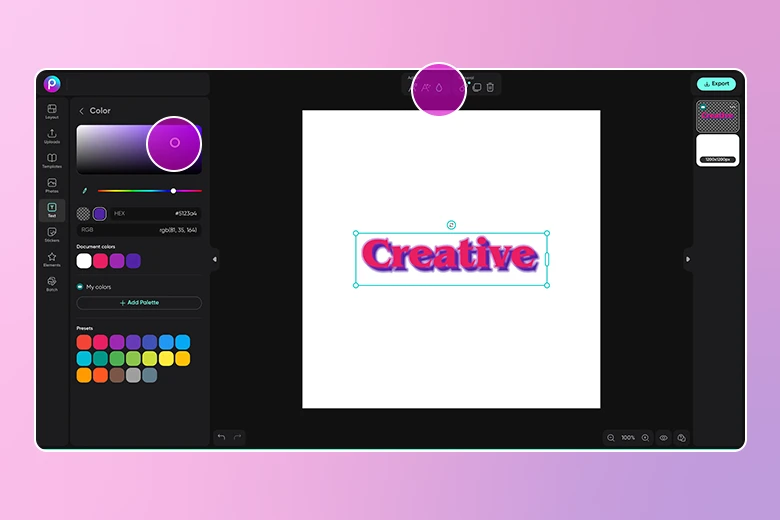
4) Select the color dropper tool in the upper toolbar to change the font color. Here you can also adjust the opacity and shadow. If you’re creating a social media post, this is also a great time to animate your text.
5) If you want to practice kerning, now’s the time! In the font, use the slider bar to adjust the letter spacing. You can also adjust the line height here.
6) When you’re finished editing, click on the Export button to download and save your edit.
If editing on Mobile:
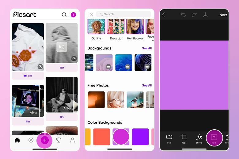
1) Open the Picsart app on your mobile device. Tap on the plus sign (+) at the bottom of the screen and upload a photo you want to add a text to or scroll down and choose a background to start editing. Here, we went with a plain purple canvas to let the lettering stand out.
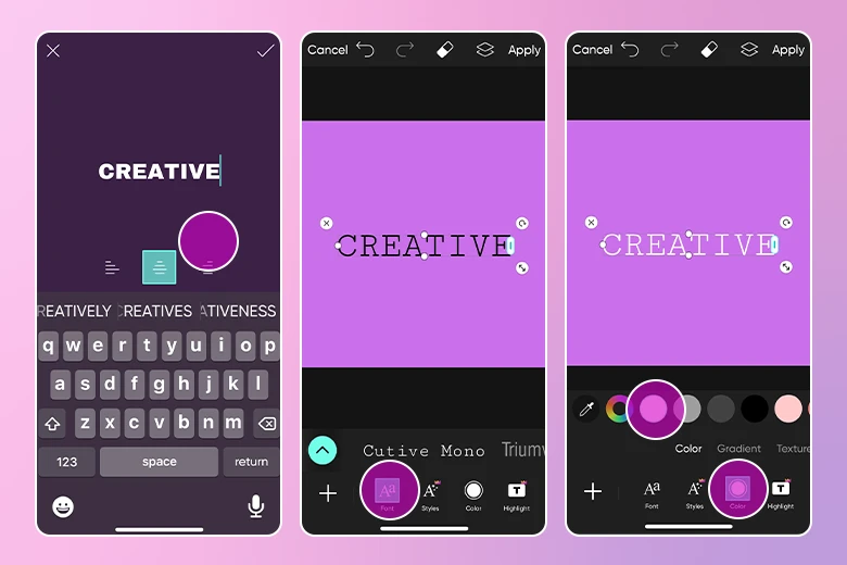
3) Now it’s time to pick a calligraphy style font. Tap on the pink arrow button to browse available fonts. Search for Handwritten or Calligraphy to check out fonts inspired by handwriting.
If you want to use your own font, select My Fonts to find the fonts you’ve uploaded to Picsart. If you haven’t uploaded them yet, download the custom font you’ve created to your phone and choose to Open In Picsart.
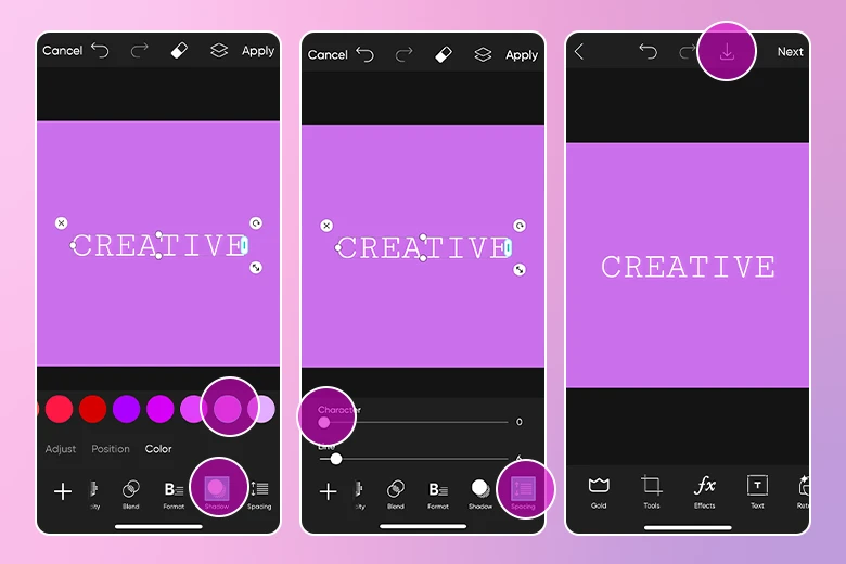
4)You’ll see that there are a lot of different ways you can modify your handwritten font: Tap on “Shadow” to add a shadow to the letters or play around with “Color” or “Opacity,” for example.
6) Once you’ve achieved the perfect handwritten style edit, simply tap the downwards arrow in the upper toolbar to save your edit to your device.
Create at the Speed of Culture
Picsart is a full ecosystem of free-to-use content, powerful tools, and creator inspiration. With a billion downloads and more than 150 million monthly active creators, Picsart is the world’s largest creative platform. Picsart has collaborated with major artists and brands like BLACKPINK, the Jonas Brothers, Lizzo, Sanrio: Hello Kitty, I am a Voter, Bebe Rexha, Maroon 5, One Direction, Warner Bros. Entertainment, iHeartMedia, Condé Nast, and more. Download the app or start editing on web today to enhance your photos and videos with thousands of quick and easy editing tools, trendy filters, fun stickers, and brilliant backgrounds. Unleash your creativity and upgrade to Gold for premium perks!


