
Fonts are so much more than words on a page. Typography, or the way type and text are arranged in design, can transform the feeling and message of the story you’re telling far beyond the words they convey. Even at a glance, letter fonts give readers a sneak peek into the tone of your words before even reading them.
The right font can make or break design, but how can you choose the perfect types of letter fonts for your projects? Here’s everything you need to know about different lettering styles to send the right message.
5 types of font styles
If you’ve ever used an online photo editor, you already know there are tons of fonts you can choose from. But did you know that different lettering styles come from one of five font families? Let’s explore the different types of lettering fonts to guide your next design.
Serif fonts
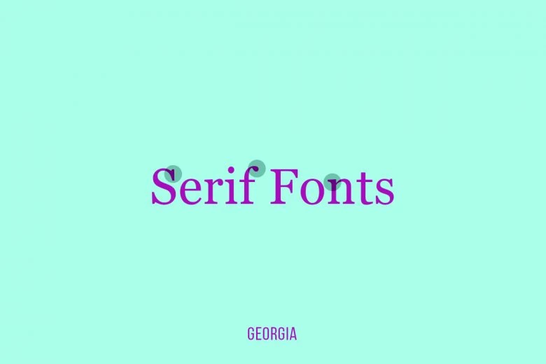
If you imagine the most commonly used font, you’re probably going to picture a Serif font. Serif is named for the little “feet” or small lines or strokes commonly attached to the end of a larger stroke in a letter or symbol. Serif fonts stem back to the Romans, and they rose to popularity in the 15th century.
From signage to social media, Serif font style lettering is everywhere in our daily lives. Think of Times New Roman, Bakersville, and Georgia, they’re all Serif fonts. They’re incredibly popular among print publications thanks to their easy readability.
Slab Serif fonts
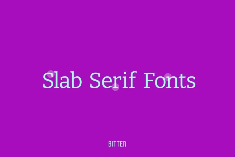
Compared to their Serif counterparts, Slab Serif fonts are more dramatic. They’re great for pamphlets, billboards, and marketing materials because they’re loud and attention-grabbing. Some popular Slab Serif fonts include Sentinel, Egyptian Slate, Rockwell, Memphis, and Soho.
Slab Serif fonts are typically reserved for shorter-form copy, but they can still create a powerful impact on your audience. If you want to evoke a sense of whimsy, Slab Serif font style lettering can be your MVP. Because they’re such a standout font, they can be seen in a lot of branding designs, including brand merch and t-shirt font designs.
Sans Serif fonts
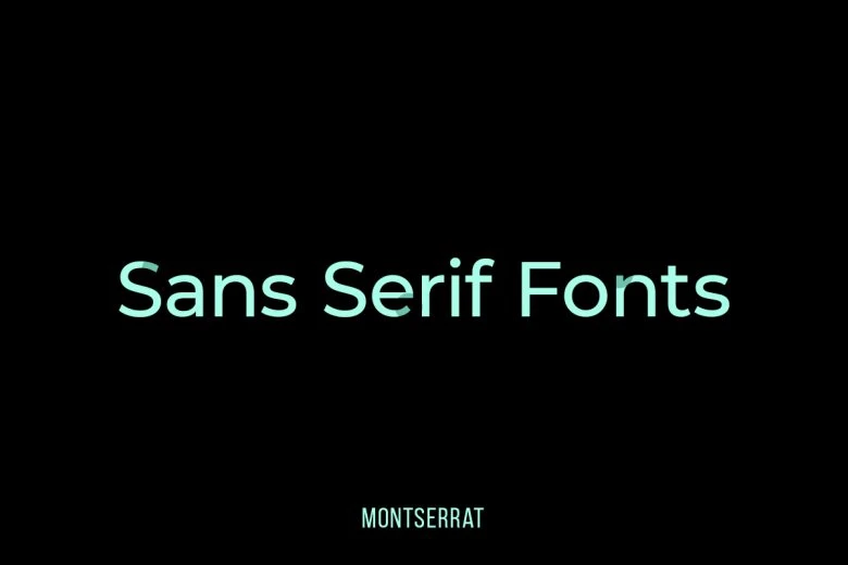
Just as their name implies, Sans Serif fonts lack the “little feet” or embellishments that come with Serif and Slab Serif fonts. Thanks to their minimalist nature, Sans Serif font style lettering is incredibly minimalist and modern. Some of the most popular Sans Serif fonts include Ariel, Helvetica, and Calibri.
Sans Serif is widely considered the most readable and cleanest-looking font family. They can work with a wide range of font sizes, making them the perfect option for graphic design. Plus, they’re simple and bold, which can create a strong impression for scroll-stopping headlines.
Script fonts
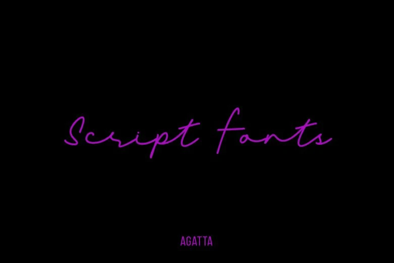
Script fonts, which mimic cursive handwriting, can be broken up into two categories: formal and casual. This font style lettering is based on fluid strokes, creating a dramatic font for wedding invitations and whimsical graphic designs. They’re also incredibly popular as tattoo fonts, especially for shorter-form quotes and song lyrics.
If you’re deciding whether or not to use a Script font, think about your message. These kind of fonts typically make longer-form text (think: paragraphs) harder to read. Formal Script fonts are the best choice for RSVPs, historical documents, or greeting cards. Meanwhile, casual Script fonts make more sense for logos, posters, and pamphlets. Some popular Script fonts include Alex Brush, Amnesty, Great Vibes, Pacifico, and Lobster.
Handwritten fonts
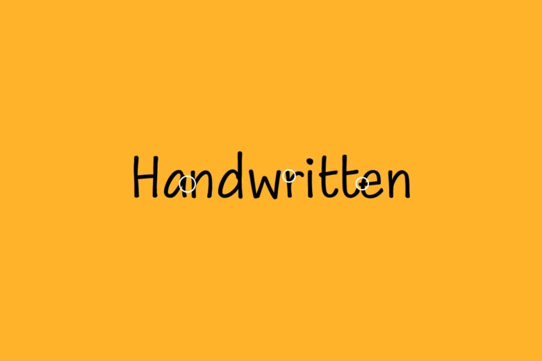
Handwritten fonts are the newest font family. They’ve become increasingly popular over the past few years. Unlike Script fonts, handwritten fonts lack traditional structure and characteristics. Instead, they’re a free-style font that resembles handwriting.
Because handwriting comes in so many shapes and sizes, handwritten fonts pack tons of variety. They’re one of the best choices for creative branding and logo designs. They can also add an artistic flair to headlines and subheads, but handwritten fonts are usually harder to read for larger bodies of text.
Most common letter fonts
Your font style lettering helps you get your message across with your copy, and it can help you set the right tone before your reader even dives in. To choose the best font for your design, you’ll need to consider what message you’re trying to send. Are you trying to be creative and playful? Sleek and modern? Romantic and elegant?
Once you’ve pinned down your tone, it’s time to choose the best font style for your design. Here are some of the most common letter fonts to help you get the creative juices flowing.
Helvetica
Helvetica is one of the world’s most popular Sans Serif fonts. It’s commonly used in signage and documents, like invoices and receipts. If you’re typing a larger body of text, Helvetica is minimalist and effortless to read.
Cambria
Cambria, a classic Serif font, is more condensed than Times New Roman. Like Helvetica, it’s minimal and easy to read, even if you’re sticking with a smaller font size.
Franklin Gothic
Want to make a statement? Franklin Gothic is an old-fashioned Sans Serif font, making it popular for billboards, banners, and headlines. If you’re trying to make a bold statement that packs a punch with your audience, Franklin Gothic is the answer.
Alex Brush
As the go-to Script font, Alex Brush can help you add a beautiful, sophisticated, romantic touch to any design. If you’re choosing the right font for your wedding invitations or greeting cards, Alex Brush can help you send your message in style.
Lazy Day
If you want to go the creative route, try upgrading your next design with Lazy Day. It’s an artistic handwritten font that can help you make your audience stop scrolling. Paired with playful design elements, it’s the perfect font for social media posts, short headlines, and creative logo designs.
How to use different types of lettering with Picsart
Now that you’re a pro on different types of letter fonts, it’s time to start designing.
Choosing the perfect font for your next graphic design project might feel overwhelming, but as long as you consider your tone and message, you can send the right message to your audience with a breathtaking design. And if you’re not sure where to start, you can always type your message into the Font Generator for some design inspo.
Whether you’re creating your next Facebook post, putting the finishing touches on your brand logo, or designing custom greeting cards, it’s easy to upgrade your designs with beautiful letter fonts with Picsart. Let’s dive in!
On the web:
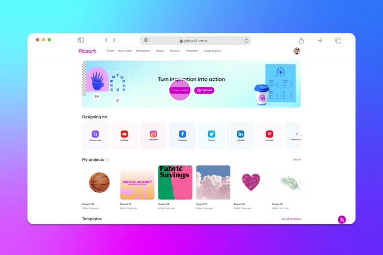
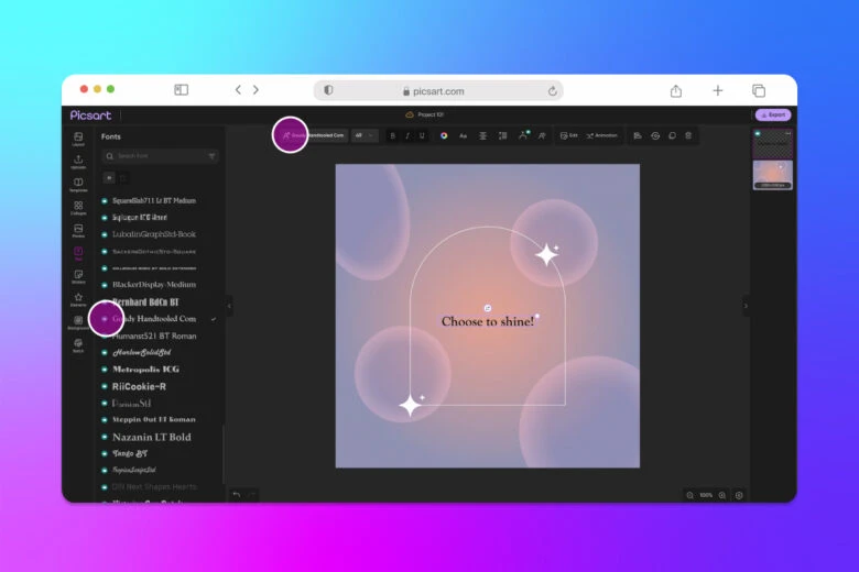
1. Open the Picsart Web Editor and click on New Project to start editing.
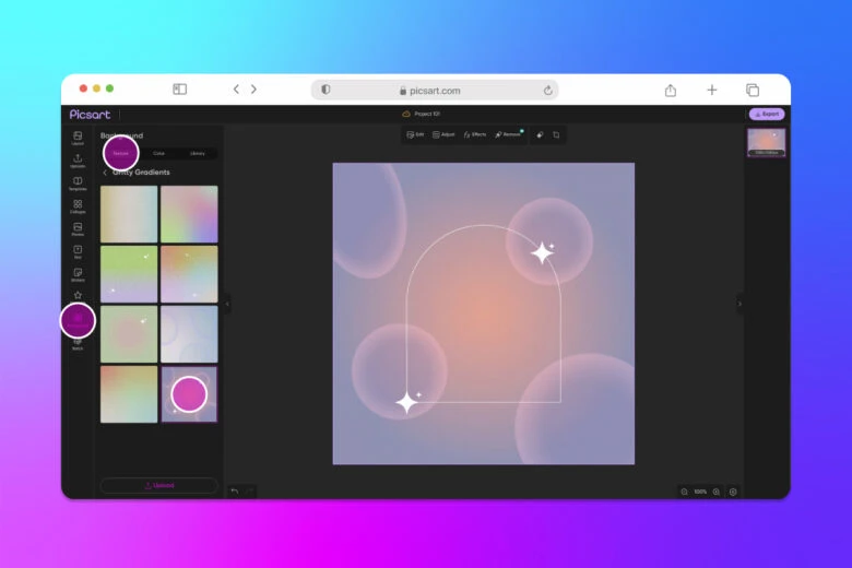
2. Next, click on Background and browse options to lay a foundation to showcase your letter font.
3. Click onText on the left panel toolbar to open the text editor. Choose the type of text you want to use (Heading, Subheading, or Body Text) and scroll through the font library to find the perfect option. After you’ve found the right font, type out your message.
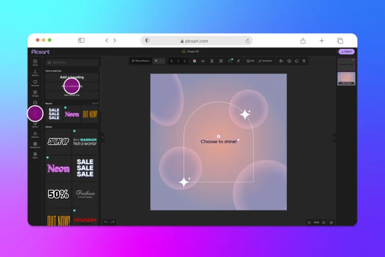
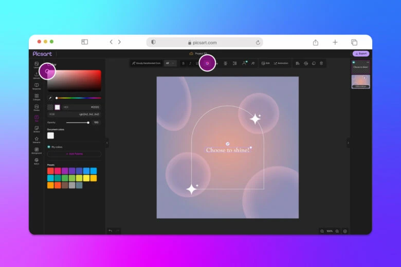
4. Adjust the Color and add Shadows or Outline.
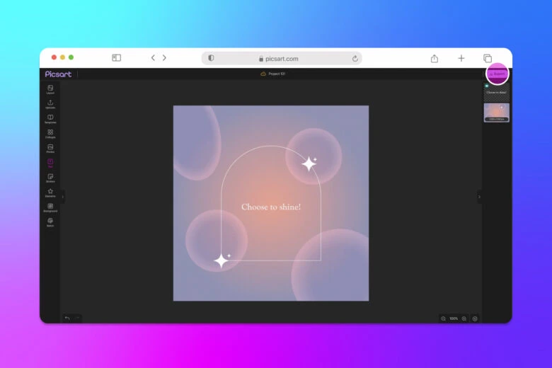
5. When you’re finished editing your text, click Export and save or share your project with the world.
On mobile:
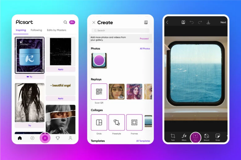
1. Open the Picsart app and tap the plus (+) icon to start a new project.
2. Upload the image you want to edit from your photo gallery or choose from Picsart’s #FreeToEdit gallery. You can also open a blank canvas or preset template.
3. Next, tap Text on the bottom panel toolbar.
4. Input your text. You can choose to left, center, or right-align your copy. Tap the checkbox in the upper right corner when you’re finished to save your changes.
5. Now, it’s time to unleash your creativity. Tap the up arrow on the bottom of your screen to open our font library.
6. Adjust the text color, blend, stroke, opacity, shadow, and spacing.
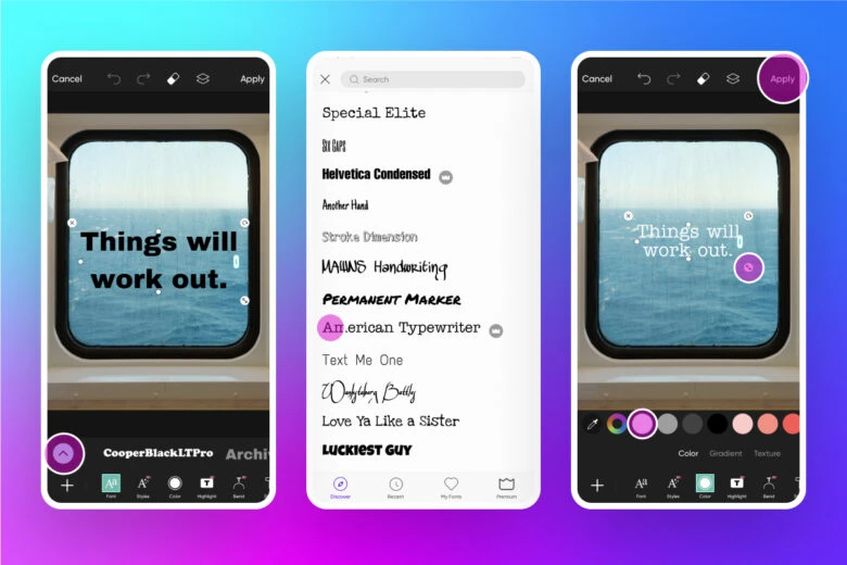
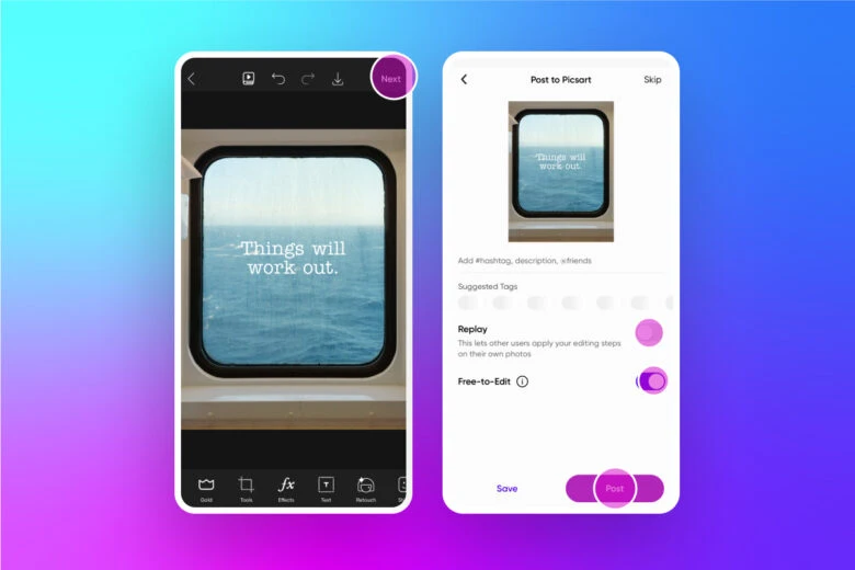
7. When you’re finished editing your text, tap Next in the upper right corner.
8. Save and/or Share your design.
Recommended articles:
- Lettering styles and hand lettering basics
- 10 modern fonts for creative industries
- 50 free styled fonts for creating elegant designs
- Announcing AI-generated fonts: paving the way for unlimited fonts in the future
Create at the Speed of Culture
Picsart is a photo and video editing platform and creative community. A top 20 most downloaded app worldwide with over 150 million monthly active users, its AI-powered tools enable creators of all levels to design, edit, draw, and share content anywhere. The platform has amassed one of the largest open-source content collections in the world, including photos, stickers, backgrounds, templates, and more. Used by consumers, marketers, content creators and businesses, Picsart tools fulfill both personal and professional design needs. Picsart has collaborated with major artists and brands like BLACKPINK, Taylor Swift, Lizzo, Ariana Grande, Warner Bros. Entertainment, iHeartMedia, Condé Nast, and more. Download the app or start editing on web today, and upgrade to Gold for premium perks!


