What makes for a good design? This is a question every designer has asked at least once in their career. There are a ton of different answers on what objectively makes for good design. However, it’s always good to approach this question from the point of design principles, including the use of positive and negative space.
Good designers put thought into every detail in their work, especially the use of space. In this article, we will explore design theories on the use of space, its importance, and helpful tips on how to use space in your designs.
What Does Space Mean for Design?
Space is a measurement of height, depth, and width within which objects move and exist. But, when it comes to design, it is so much more than that. Space is one of the most crucial aspects of design – it can elevate or completely ruin any composition.
If you’ve ever seen a design that feels a little off, it might be because the use of space has made it feel visually unbalanced. The use of space principles in design can be helpful to strike a balance between multiple colors, shapes, and text. Positive and negative space in particular can help create a more coherent design by drawing the viewer’s eye to a specific part of the graphic.

Theory of Space in Design
Space is an essential component of graphic design. But, there’s a difference between simply filling in the empty areas and strategically utilizing the space of a canvas based on design principles. In order to get the best use of space in your designs, you first need to understand the theory of space in design.
Space theory is based on two important principles: balance and message. Both of these principles are equally important and dependent on one another. However, it’s best to look at them separately and consider how they influence the final design.
Balance
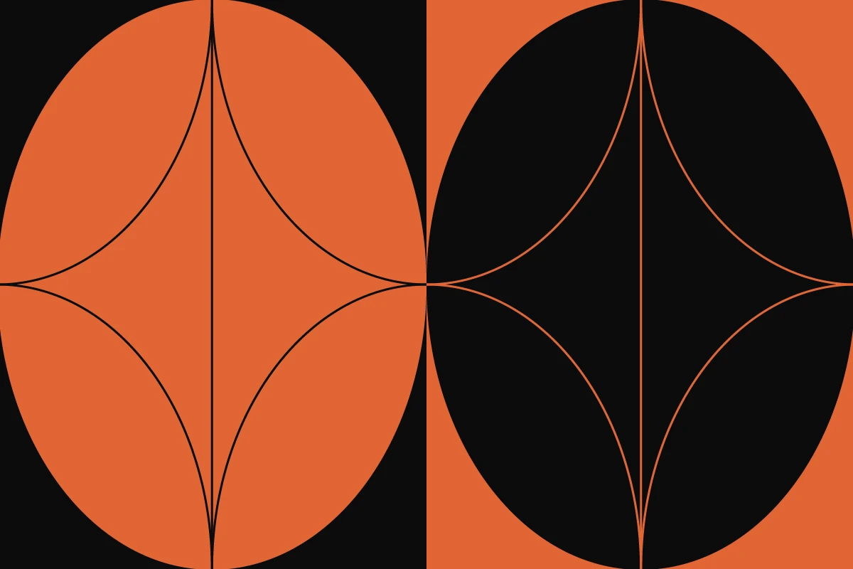
Good designs rely on balance. In terms of space, balance refers to the harmony between positive and negative space. To make enticing designs, you need to find a golden middle when it comes to how much of each you use. For example, if you use too much negative space, it might distract the viewer from your main subject. Similarly, if you use too little of it, your final design might lack the necessary focus.
Don’t be scared to take risks and create unconventional designs. Keep in mind that you neither want to overwhelm people with too much detail nor miss out on sharing important information by using too much white space.
In order to find the right balance between the two, it’s important to explore different types of designs. As there are no hard rules when it comes to space balance, in the end it pretty much relies on your artistic intuition. Look for inspiration online (the Picsart account is a great place to start) and don’t be scared to make mistakes. The more you practice, the easier it will become to find balance in design.
Message
Balance and message are two concepts that go hand in hand in graphic design. While there are no hard rules for finding the balance, understanding the message you want to communicate will help you find the right path.
The use of positive and negative space can communicate different emotions to viewers. Determine the message you want to convey, then it will become easier to understand how much positive and negative space you’ll need to add. For example, minimalist designs with negative space are often used to communicate soothing, calm feelings (much light what you’d see in art at a spa). If you want your design to seem more active and energetic, then consider using more positive space. Keep in mind that these principles are not set in stone and you can always find clever new ways to use them.

Negative vs. Positive Space
Understanding the basics of positive and negative space along with how you can utilize them in your designs is a must for every graphic designer. But what do they actually mean? Once you develop a better understanding of these terms, you’ll notice how much easier it becomes to create great compositions.
Negative Space Definition
So what is negative space? This refers to the areas surrounding the subject of your design. Most people tend to focus on the subjects and details of the piece while completely ignoring the empty (negative) space around them. This is a common rookie mistake that leaves designs feeling cluttered and messy. Negative space is an important factor that often gets overlooked.
Learning to lean into the negative space in your design can drastically improve your images. One of the main advantages of using negative space is that it can help to create optical illusions. If you accurately capture the silhouette of a subject, viewers subconsciously perceive the silhouette as a complicated subject even if there are no further details to indicate it.

Positive Space Definition
What is positive space? This is one people tend to pay the most attention to. Positive space refers to the area that is the subject of your design. In order to make the positive space communicate your design intent, you need to pay close attention to how you use negative space around it.
Your use of negative space influences how the positive space is perceived and vice versa. This spatial relationship is not limited to graphic design; it’s also present in photography and art. When it’s done right, the viewer doesn’t think about the use of space, they simply enjoy it.
Examples of Positive and Negative Space Logos
Positive and negative space are exceptionally effective tools for logo design. If you’re just getting started designing your own logo or you’re looking for inspiration, then check out these four ideas to inspire your own logo.
Obey
Obey is a popular streetwear brand with an iconic positive and negative space logo. If it looks familiar, it might be because you’ve seen other work from the artist behind it. That’s right, American contemporary artist Shepard Fairey is the founder of Obey clothing. The logo design originated from his “Andre the Giant Has a Posse” sticker campaign. The positive space here are the solid black shapes that are tactically placed to create a face.
WWF
Does this logo look familiar? The World Wildlife Fund’s logo communicates the purpose of the company through its great use of positive and negative space. The panda logo originated in 1958 and captures an endangered species through cleverly placed black and white shapes.
The logo is very simple and doesn’t focus on capturing every intricate detail of a panda. Instead the artist chose to highlight the most recognizable areas in black and use the white space around it to create an illusion of a complete image.
Coke: Let’s Eat Together
In their Let’s Eat Together campaign, Coca Cola relies on a precise balance of space to create an optical illusion of a bottle in between silverware. If you look closely enough, you’ll realize that there’s not actually a bottle there, just some well placed positive and negative space.
The positive space in this case is the silverware and the Coca Cola logo. It’s a good example of how positive space art can communicate complicated ideas through simple design.
FedEx
FedEx has one of the most clever negative space logos in the industry. You may not have noticed the clever hidden message within the logo from the first glance, but once you see it, you won’t be able to forget about it.
If you look closely between the letters of the logo, you’ll notice a shape of an arrow created through the brilliant use of negative space. The presence of the arrow in the logo reflects on the overall message of the brand. The arrow signifies the fast and safe delivery of packages from point A to B.
Tips for Negative and Positive Space Art
While learning the theory of space in design is very important, the best way to learn how to use space is through practice. You need to apply everything you’ve learned so far about positive and negative space to a canvas in order to understand these concepts better. To make this process easier, we have developed a step by step guide on how to get started!
Define Your Message
The first step in this process is probably the most essential one. You can’t create a good design without having a clear message in mind. Remember that the theory of space in design relies on balance and knowing your message. Take some time to determine what exactly your design will be about.
Pick a Color Palette
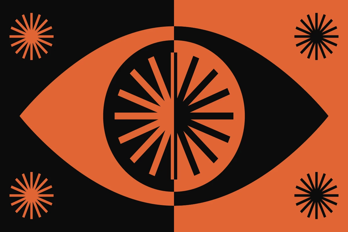
Negative space is often referred to as white space, it doesn’t have to be white per se. It all depends on your color palette. In general, designs with positive and negative space tend to leverage two or three colors. Any more and it can feel cluttered or unfocused. As you can see from the examples above, don’t be afraid to play with unique color combinations.

Combine Elements
While your design should be simple, don’t be scared to add thoughtful elements or textures to it. Consider how text and layout design theories affect your use of positive and negative space.
Don’t be Scared to Take Risks
Sometimes you need to push the limits of design theory to create unique designs. As long as you know the basics, you can afford to take risks while designing. Whether you have an unconventional color palette or space placement, as long as you keep the message and the balance of your design in mind, you’ll get great results.
Share Your Art
Share your positive and negative space designs online with the Picsart community or other creative networks. This will help you better understand your own strengths and weaknesses as a designer and become more confident with your art.
How to Make Negative and Positive Space Art
Ready to start designing with positive and negative space? Here’s how to do it in the Picsart Web Editor:
Step 1) Open the Picsart Web Editor and click on New Project.

Step 2) Click on Layout in the left panel Editor toolbar and pick the right size for your canvas.
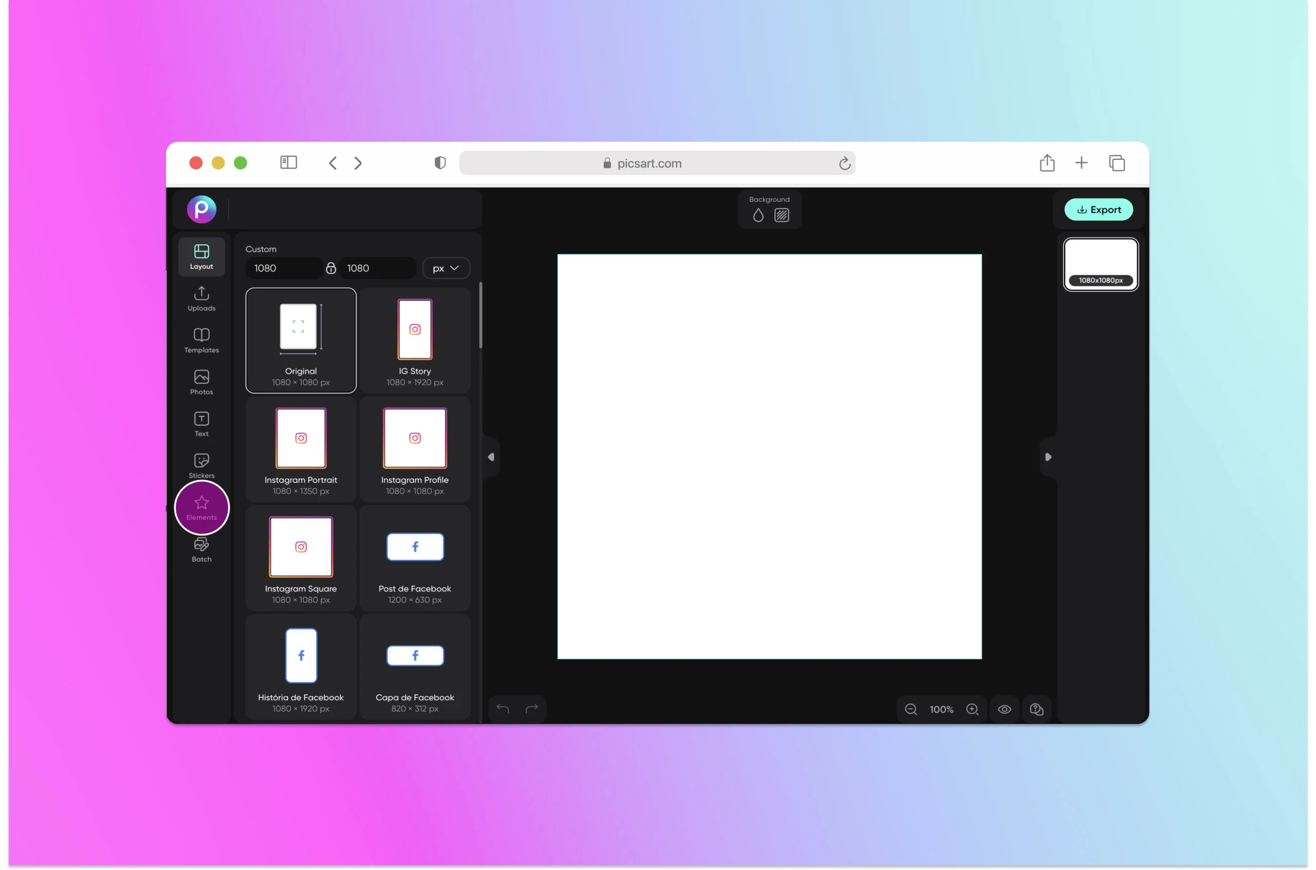
Step 3) Click on Elements in the Editor and select a shape.
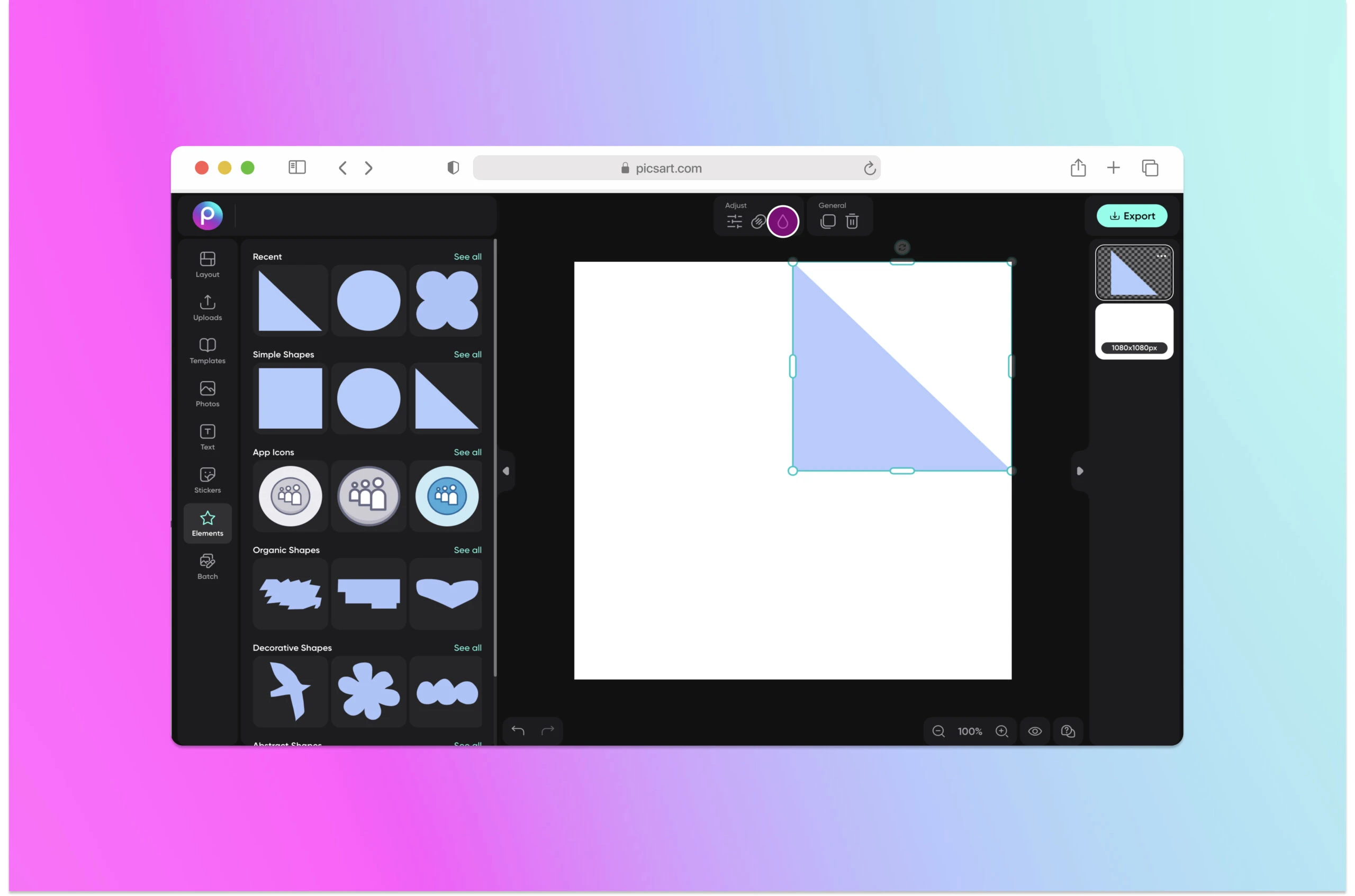
Step 4) Change the color of the shape using the color dropper in the top panel. Here we went with a dark blue shade.
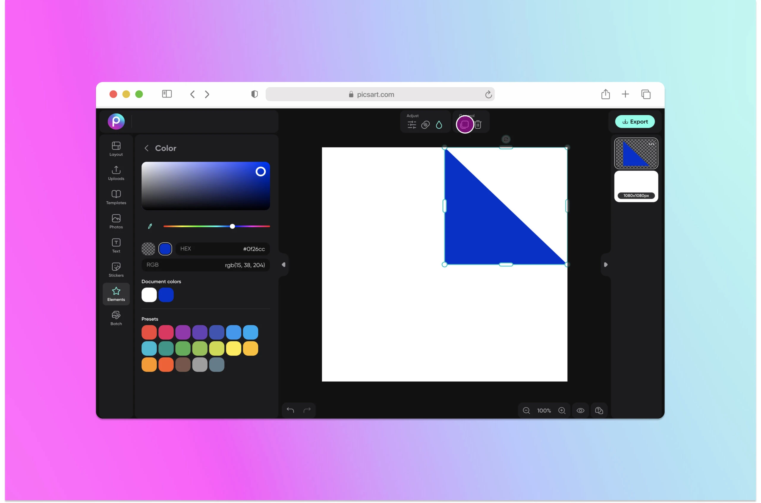
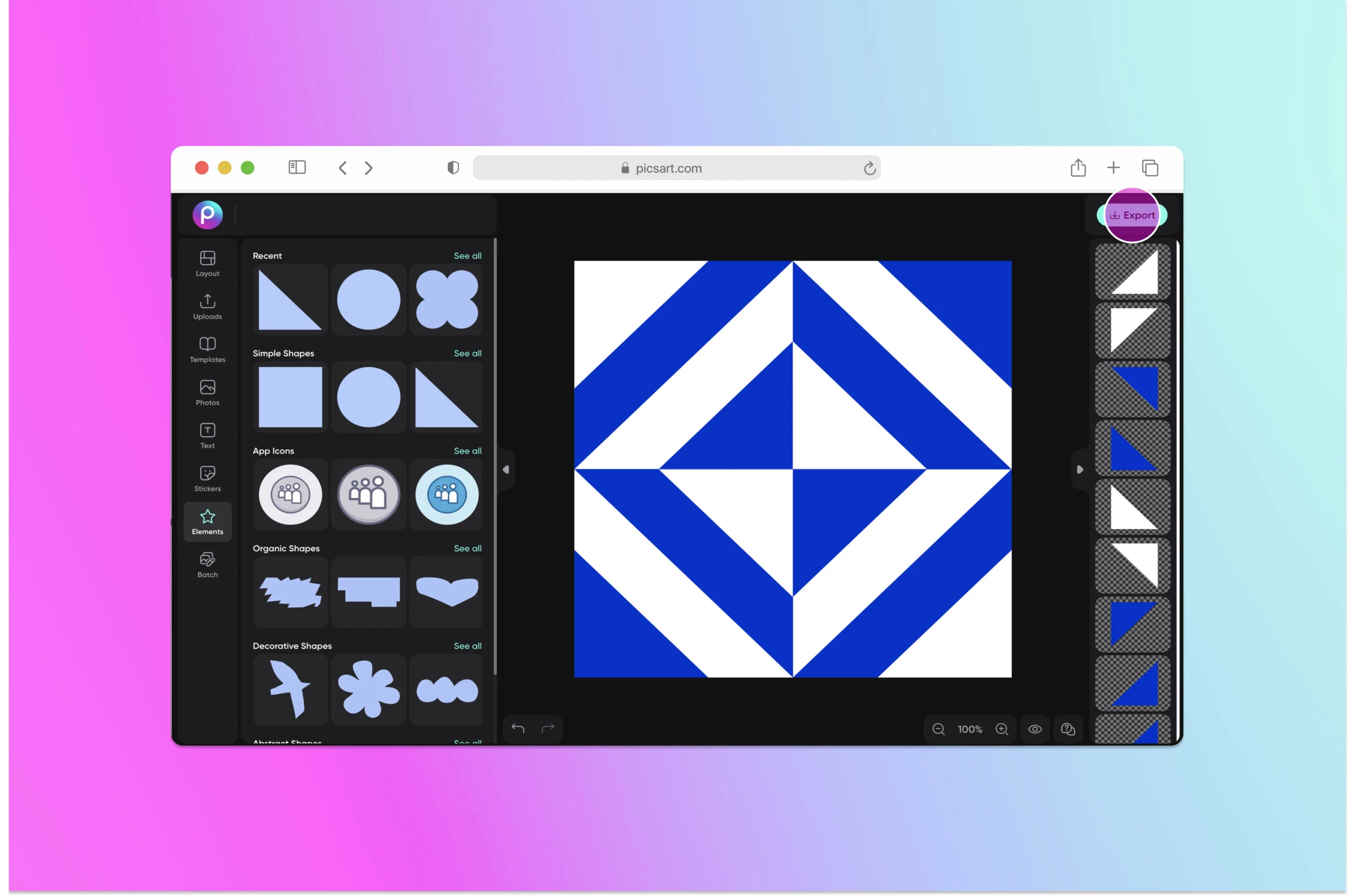
Step 5) Here’s where things get fun. Click on Duplicate in the upper toolbar. Replicate the shapes in a fun geometric pattern, arranging layers and colors as needed to create the right spatial balance. When you’re done with your edit, click on Export to download and save.
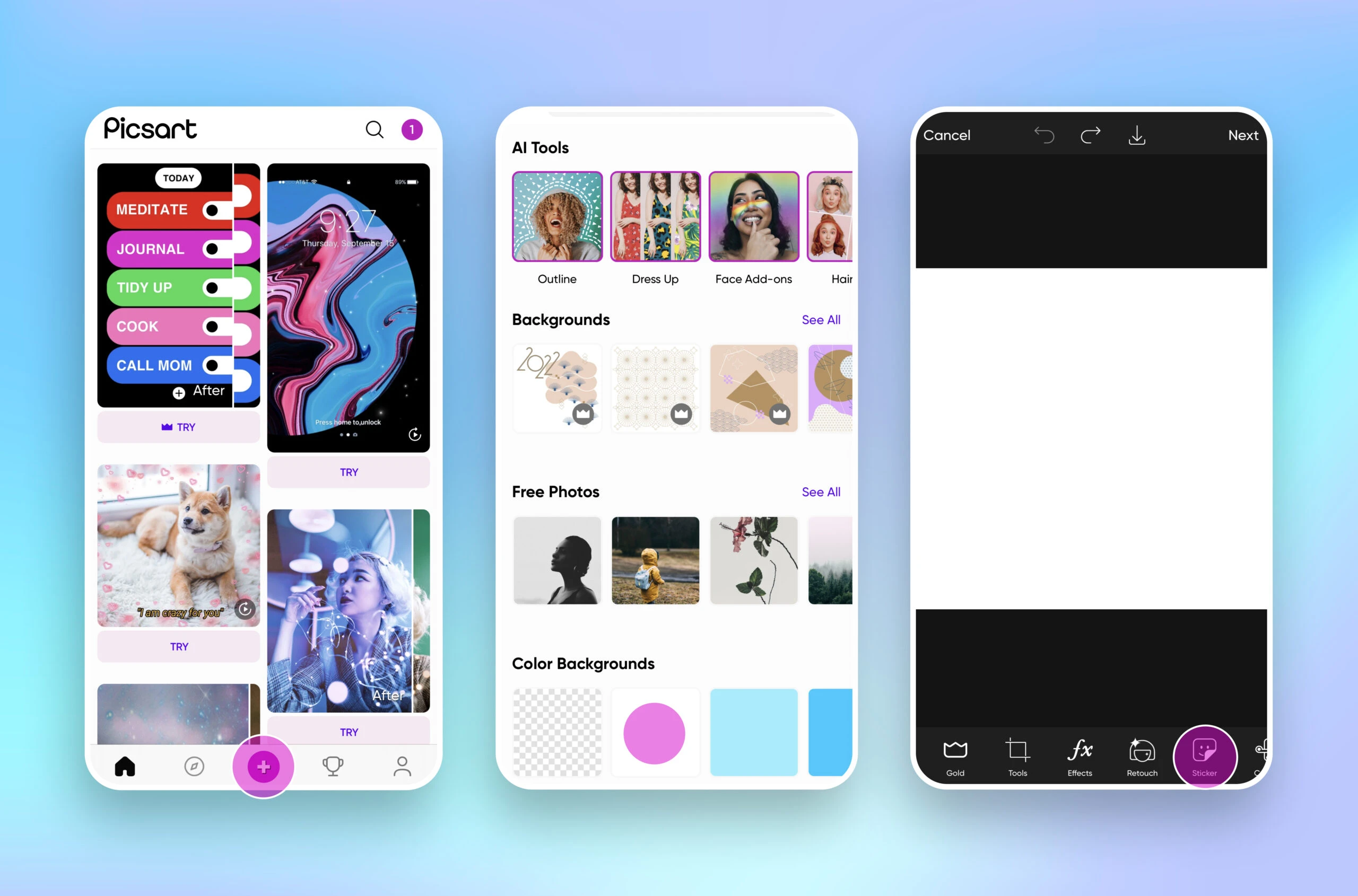
Maybe you prefer to edit on an app? If so, here’s how to create a positive and negative space design in the Picsart app:
Step 1) Open the Picsart app and tap on the plus (+) button at the bottom to start a new edit. Scroll down and select Color Backgrounds and select the background color of your choice.
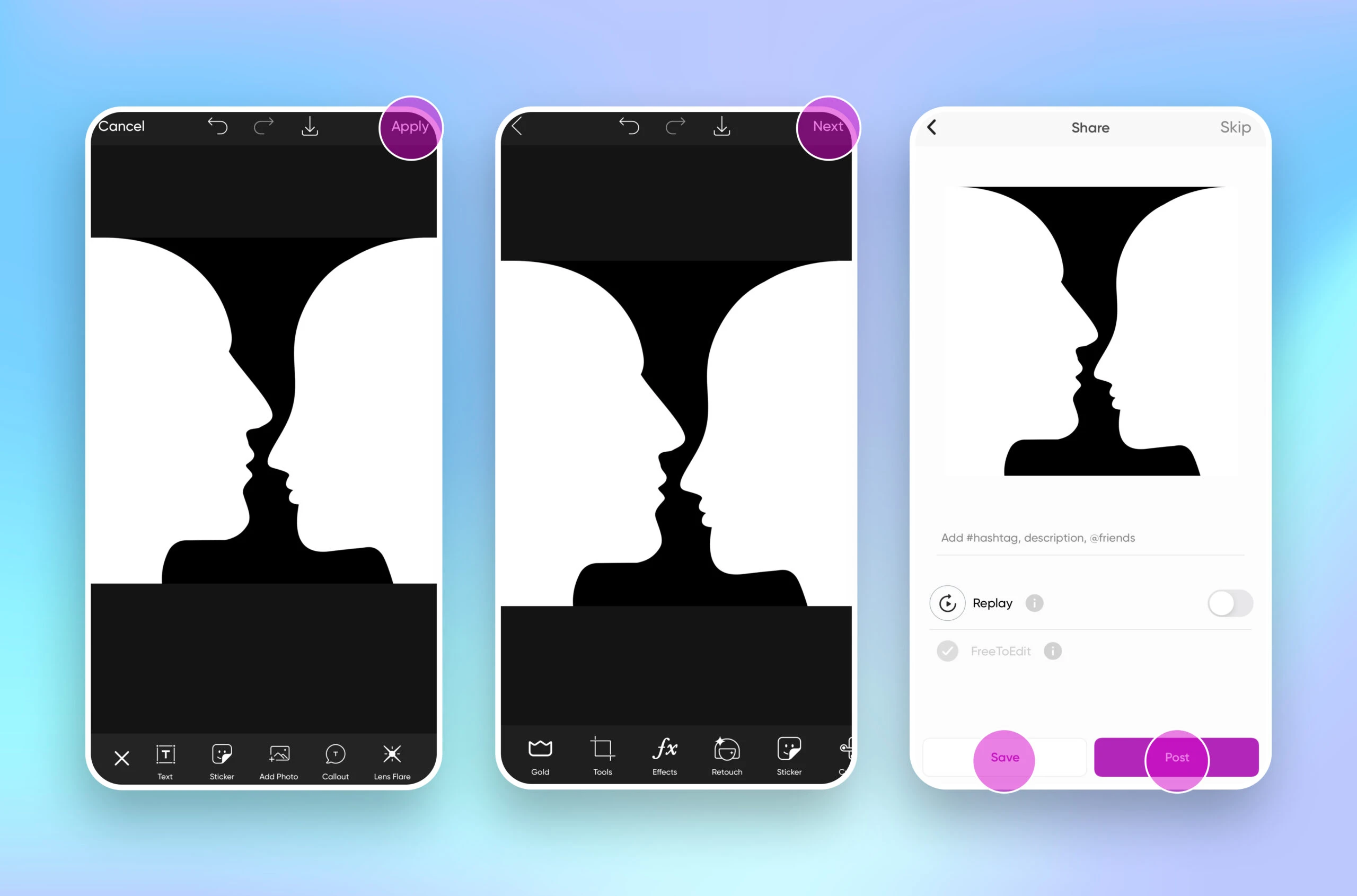
Step 2) Tap on Sticker and search for a silhouette or a sticker that works well on a blank background.
Step 3) Apply your sticker. Tap Next then Save your edit to your mobile device and/or Post it to the Picsart Community.
Create at the Speed of Culture
Picsart is a full ecosystem of free-to-use content, powerful tools, and creator inspiration. With a billion downloads and more than 150 million monthly active creators, Picsart is the world’s largest creative platform. Picsart has collaborated with major artists and brands like BLACKPINK, Taylor Swift, the Jonas Brothers, Lizzo, Ariana Grande, Jennifer Lopez, One Direction, Sanrio: Hello Kitty, Warner Bros. Entertainment, iHeartMedia, Condé Nast, and more. Download the app or start editing on web today to enhance your photos and videos with thousands of quick and easy editing tools, trendy filters, fun stickers, and brilliant backgrounds. Unleash your creativity and upgrade to Gold for premium perks!


