The next time you go outside for a walk, stop for a second and take a look around you. Our entire universe is shaped by brushstrokes of color. We see in color, think in color, and even imagine abstract ideas in color. Green means go; red signals danger. Black is associated with grief, death, power, and a wide range of emotions.
When it comes to the digital age, color transforms into one of the most effective marketing tools that you can leverage for your business. This is especially true if you’re operating an online platform. Today, we’ll talk about website color schemes and how choosing the right color palette for website design helps you scale among the competition!
Why website color schemes matter
Colors can impact user experience, brand identity, and conversion rates – in good ways and bad. We’ll focus on the good in this article.
User experience: When someone shows up on your landing page, you only have a few seconds to grab their attention. Using the right colors for CTAs, headings, fonts, and graphic elements has a substantial effect on how people navigate your website. It also influences user interaction, bounce rates, and readability.
Brand identity: We don’t recognize household brands just by looking at their logos. These businesses spend a fortune on picking colors that people remember and recognize. When people think of Coca-Cola, they probably visualize the iconic red color. The best website color schemes are the ones that complement your brand’s visual identity, making it recognizable in an instant.
Conversions: The idea behind using color schemes is to trigger specific emotions in users that can later turn into conversions. Here’s an example: a button titled “Offer Expires Today” will most likely be more effective in red, as it creates a sense of urgency. At the same time success messages, discounts, and subscription CTAs work best in lighter colors like blue or green. All of these factors influence conversion rates and that’s why designers put a lot of focus on picking the best color combinations for websites.
It’s one thing to know why website color schemes matter. It’s another to know what colors you should pick. But, as they say: if there’s a will, there’s a way!
Using a colorful theory to pick your colors
By understanding the most basic concepts of color theory, you’ll be more skilled at picking the best website color schemes that work for your specific needs.

Read up on color psychology
There’s a ton of academic research out there on color psychology. One thing we know for sure is that we (often subconsciously) associate colors with a wide variety of things – and this can be useful when putting together website color schemes. Find out what colors invoke which emotions, pick them, and align them to your brand’s identity.
Let’s look at Starbucks: it promotes itself as an eco-friendly business and therefore uses the color green. Green is a hue we often associate with nature and health. McDonald’s and KFC rely on the color red, that’s known to increase appetite. The list goes on.
Choose some color palettes
Picking a color palette for website design is equally as fun as it is challenging. There are a few out there that you can experiment with:
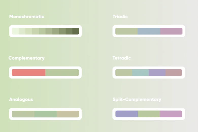
- Monochromes: Monochromatic colors are color variations that are taken from a single base hue. These are great if you’re more of a minimalist and are looking for sleek and simple website color schemes.
- Analogous: A fancy word for colors belonging to the same family on the color wheel: red, orange, yellow, or green and blue. Because they are relative colors, you can combine them to create a cohesive website color palette that’s not too hard on the eyes.
- Complementary: This is a bold color scheme that combines colors on opposite spectrums, like black and white. What do you get out of it? High-contrast designs that grab the user’s attention in the blink of an eye.
And those are just three color schemes! There’s plenty more where they came from.
Unlimited tools and resources
The internet era is the gift that keeps on giving! There are hundreds of online tools at hand that help you pick colors or put color pallets together for your website. You can also use them to find out which colors jell well together, and create the best color combinations for websites.
What’s the best website color palette for you?
Now that you’ve caught up with the theory, it’s time to put it into practice. There are a bunch of factors you should keep in mind when choosing your website color schemes.

- Your target audience: Which demographic are you going to target? This is important to nail down because different demographics may have different interpretations of the same color. For example, red might trigger feelings of love or passion in a Western audience, whereas it signifies danger in the Middle East.
- Brand identity: Even if you pick a color that looks perfect to you, it should still match your brand identity. If you’re in the dairy industry, then picking red or brown probably wouldn’t work! Brands that advocate for nature often use earthy colors in their designs. It’s all about what your audience should resonate with when they see your brand.
- Website goals: What’s the purpose of your website? Let’s say it’s simply a landing page for a pet groomer where users can book appointments. Using lighter color palettes like blue will create a feeling of trust and comfort. If it’s a website for selling sports gear, energetic colors are your best bet.
- Content readability: Don’t overload your website with too much color. Try to create contrast and use the right color combinations to make your headings and CTAs pop out. Keep in mind that some of your users might be visually impaired, so make sure your website color schemes are accessible for everyone.
Brands that nail website color schemes:
Credit must be given where it’s due. Let’s check out some brands with successful website color schemes. These will inspire you to come up with your own website color palette!

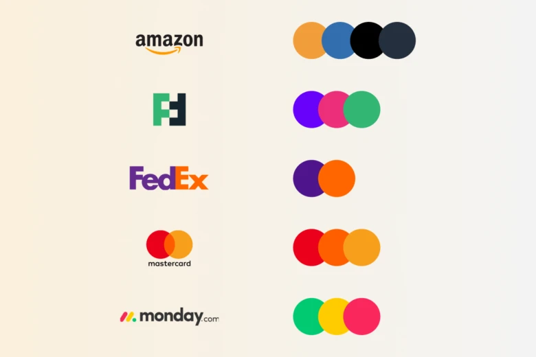
- Amazon
Even though Amazon’s website is chock-full of products in different colors, the brand itself limits its color scheme to black, white, and different shades of gray, with a unique orange color for its famous arrow and button highlights. This creates a cohesive look in a website that could otherwise be super chaotic.
- Futuramo
This collaboration platform has a perfect website color palette that combines monochromatic magenta with unique shades of green and white accents. It’s a pleasure to look at, and everything is easy to spot.
- FedEx: This is a website that mixes two unlikely colors: blue and orange, with white accents. But guess what? It works and everyone recognizes their logo!
- Mastercard: Mastercard’s logo is a prime example of why sometimes less is more. It’s made up of two interlocking circles, and uses a simple color scheme. It’s a prime example of mixing geometric shapes with colors.
- Monday: Last but not least we’ve got Monday, a project management software with a mind-blowing color scheme: tasks are first unfinished (red), then get started (yellow), and are finally done (green). Impressive, right?
Wrapping up:
Website color schemes go a long way when it comes to showcasing your brand in a sea of never-ending competition. It’s not just about picking nice colors. It’s about picking the right website color palette that boosts user experience, enforces brand identity, and leaves a positive emotional impact on your users. You know the concepts, now it’s time to splatter some color on your website!


